

How to Make AI Infographics: 3 Prompts, Korean Text Fixes, and Tool Choices
To make an AI infographic, organize your material, specify the wording and layout, then correct the generated text and numbers. You can quickly create visuals for presentations or social carousels. But an attractive image is not necessarily accurate.

“The infographic looks good, but one character is wrong.”
To make an AI infographic, organize your material, specify the wording and layout, then correct the generated text and numbers. You can quickly create visuals for presentations or social carousels. But an attractive image is not necessarily accurate.
The Carat editors found differences in their Korean samples, too. A result with three cards and short descriptions was readable. Another result with six steps rendered ‘고해상도’ as ‘고해상트’. Even large text, such as headings, needs checking.
This guide covers choosing an AI infographic tool, three prompts to copy and adapt, Korean text errors found in actual samples, and checking numbers and charts. If this is your first attempt, start with the three-card example.
🧭 Choose how to make your AI infographic
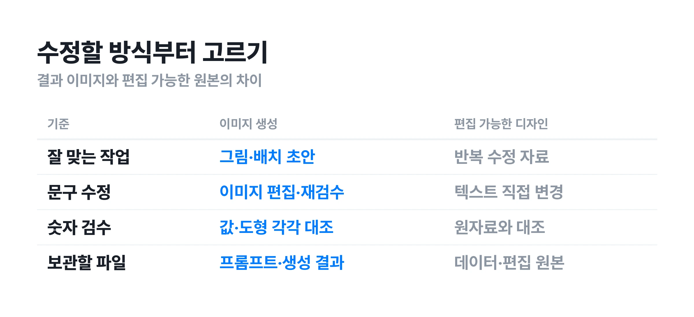
An infographic presents information through text, shapes, icons, and charts. There is more than one way to make one with AI. Decide whether you need a finished image or a design with wording and values you can edit later. That decision makes choosing a tool easier.
When you want to establish the visual layout quickly image generation can work well. You can request a layout and illustration style together. Start with visuals that use little text and depend on their appearance, such as event cards, short instructions, or blog cover images. More text means more reading and correction after generation.
When you need to revise the same material repeatedly editable text and charts matter. For a report with monthly updates, check whether the text is flattened into the image. Editing a single PNG or JPG differs from editing a source file with selectable text boxes.
For editing templates directly: Canva. Canva's infographic guide describes templates, AI generation, chart and spreadsheet connections, and PNG and PDF downloads. It is worth considering for changing an existing template's wording and colors or collaborating on edits. Check which features are free and which elements require payment.
For turning content structure into visuals: Gamma. Gamma's official infographic page describes arranging data and text into charts and icons, then editing wording, spacing, and colors. Consider it for organizing processes or comparisons. Check the export formats you need before starting.
For starting with research: Manus. Manus's infographic guide says it handles research and design after you provide a topic, audience, and key metrics. However, you still need to check original sources and the dates behind the figures. This article does not rank these three services based on testing under identical conditions.
Carat lets you describe an image layout and request revisions through conversation. Provide the Korean wording and desired layout together, then review the result. You can request changes to the finished image's colors or composition. However, for reports with frequently changing values, keep an editable chart source file as well.
✍️ Four things to include in your prompt
A useful infographic prompt combines content with design instructions. Instead of just asking for a clean design, specify the audience and the exact text. Separating text summarization from image generation also makes the result easier to check.
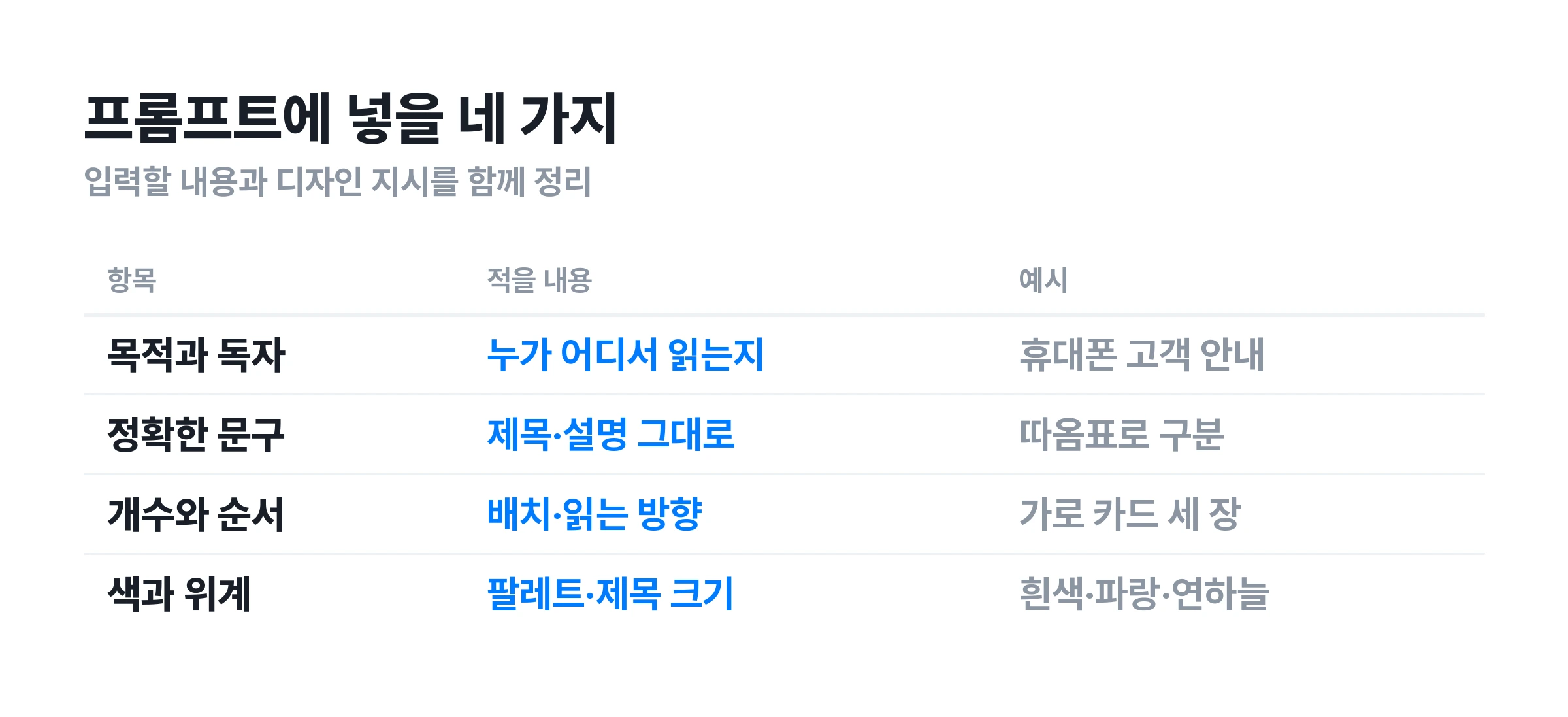
① State the purpose and audience. Instructions for signing up will differ for a first-time customer and an internal staff member. Try “An instructional image for new customers to read on their phones.” Specify the aspect ratio, too. Use a horizontal format for presentations and match social carousels to their destination.
② Finalize the text that will appear. Put titles, card labels, and descriptions in quotation marks. Asking the model to write three benefits also leaves the wording up to it. If you have reviewed the text, provide it as written and request: “Do not add statistics or descriptions beyond the wording below.” You still need to check the result.
③ Specify the count and reading order. Describe the screen: “A title at the top, three horizontal cards below, with steps 1, 2, and 3 from left to right.” Use matching items on both sides of a comparison. Define the direction for a process. Reserve arrows for sequences or causes, and check that they do not connect unrelated items.
④ Set colors and text hierarchy. Limit the palette, for example to a white background, blue accents, and pale blue cards. Request the largest type for the title. Naming a font does not ensure that the exact font appears or that Korean text will be error-free. If you need a specific brand typeface, apply the actual font in an editing tool.
Refining the wording before requesting the design makes revisions easier to diagnose. You can separate a change in content from text that was drawn incorrectly. If the model adds a claim or number absent from the source, remove it or check its source first, even if it looks good.
🗂 Three infographic prompts to copy and adapt
The prompts below are examples written for you to adapt. They are not verbatim input logs for the existing generated samples. Replace the titles and descriptions with your own material, and check that the card count matches the wording for each card.
① Process: customer guidance and instructions Start with three cards, each containing a title and one line of description. The final step below calls for checking numbers and layout as well as text. If a step has several exceptions, keep only the main point in the image and explain the details in the accompanying text.
Create a horizontal 16:9 infographic for first-time customers. Use the title "AI 인포그래픽 만드는 3단계" at the top. Below it, arrange three equal-sized cards from left to right. Card 1 title: "① 자료 정리", description: "숫자와 문구를 먼저 확정". Card 2 title: "② 레이아웃 지정", description: "배치와 색상을 구체적으로". Card 3 title: "③ 생성 후 검수", description: "글자·숫자·배치를 모두 확인". Add one simple line icon that matches each card's meaning. Use a white background, blue #017BFF, and pale blue #EBF2FF. Make the title large and each description easy to read on one line. Do not add statistics or descriptions beyond the supplied wording. Exclude unnecessary 3D effects and watermarks.
② Comparison: assess two methods on the same criteria Match the number and order of items on both sides. Putting price on the left and design on the right makes comparison difficult. If you cover strengths and weaknesses, ask the same questions about both options. Do not add unsupported claims of superiority.
Create a horizontal 16:9 comparison infographic. Title: "인포그래픽 제작 방식 고르기". Divide the image into two equal-width columns. Left heading: "이미지 생성", right heading: "편집 가능한 디자인". First row, left: "그림과 배치를 함께 요청", right: "문구와 요소를 직접 조정". Second row, left: "결과 이미지 전체 검수", right: "원문과 수치 대조". Third row, left: "편집 기능과 파일 형식 확인", right: "수정용 원본 보관". Use a white background, blue headings, and pale blue row separators. Match the text size and row height on both sides. Do not mark a winner or add figures.
③ Data: a draft for presenting verified values The numbers below are practice values, not actual research findings. Use them to check number rendering and bar lengths in a generated image. For accurate charts in presentations or reports, use a spreadsheet or another tool that connects values to shapes.
Create a horizontal 16:9 infographic draft. Title: "연습용 응답 분포". Data: A 40%, B 35%, C 25%. Place a vertical bar chart with these three categories on the left. Set the axis range to 0~50% with ticks at 10% intervals. Put the corresponding percentage above each bar. On the right, include only these two lines: "합계 100%" and "실제 통계가 아닌 예시 데이터". Clearly display "출처: 설명을 위한 가상 데이터" at the bottom. Use a white background, blue bars, and gray axes. Do not invent a research organization, survey period, or respondent count. Do not change the specified figures or wording.
A prompt does not guarantee a particular result. Reusing the same wording can still produce different icons, spacing, and text. Keep the initial image as a reference. For revisions, specify the scope clearly, such as “Change only the second card's description.” Recheck the areas you asked to leave unchanged, too.
🔤 Korean text errors found in existing samples
The Carat editors revisited samples created on September 23, 2026. The model names and low quality setting come from the production records at the time. Because the samples use different layouts, the review focuses on text and layout checks rather than comparing model accuracy.
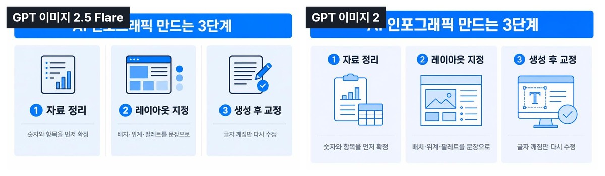
The three cards' subheadings and descriptions are readable. However, a model label covers part of the main title, so this image cannot establish whether the entire title is accurate. The left example places titles below icons; the right places icons below titles. This shows how information order and spacing can differ for the same topic. The image's instruction ‘글자 깨짐만 다시 수정’ is not a sufficient review checklist. Numbers and layout also need checking.
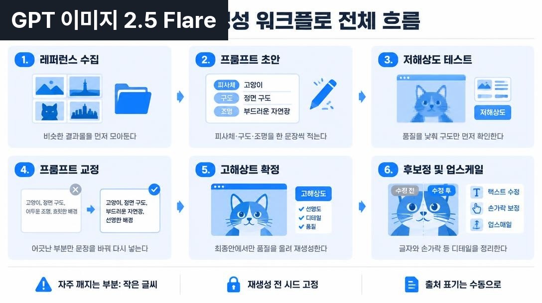
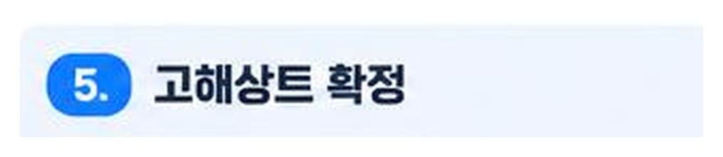
The fifth subheading in the six-step sample reads ‘고해상트 확정’. You could miss it if you only check the small descriptions. Other wording, such as ‘재생성 전 시드 고정’, should not be treated as a feature available in every tool. This image serves as an example for examining errors, not as recommended instructions.
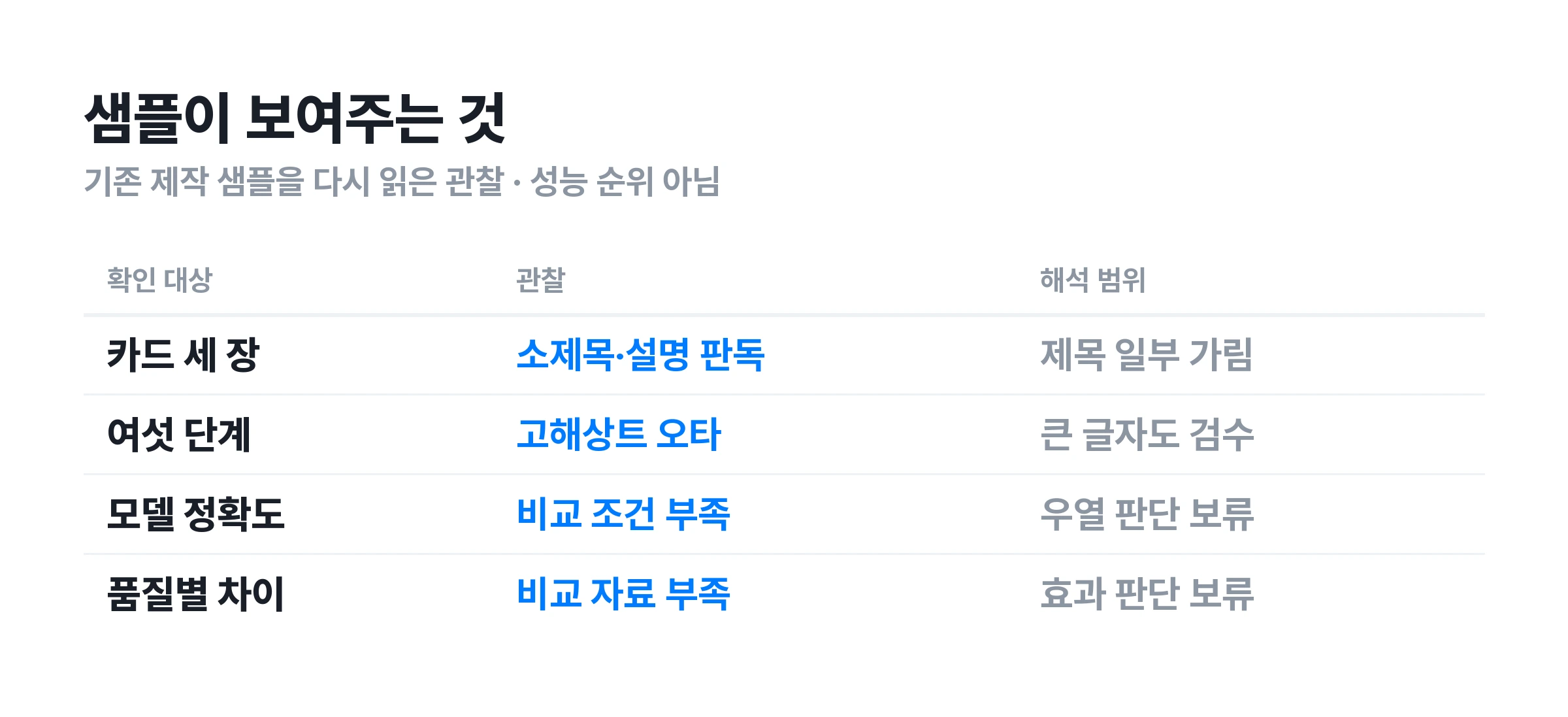
Check the result even when it contains little text. The short card descriptions in this sample were readable. That does not mean every short sentence will render correctly. Text length, font size, layout, model, and generation conditions vary together, making it difficult to isolate one cause. Compare everything with the source, from large titles to small source notes.
Check quality settings and spelling separately. A low quality setting can still produce a useful draft. However, without comparing quality levels under the same conditions, you cannot claim that higher quality leaves accuracy unchanged. Assess blur and wording separately. Change settings and check again only when needed.
📊 Give numbers and charts an additional check
A chart can be wrong even when its numbers are written correctly. For example, labels of 40% and 20% may be correct, but nearly equal bar heights misrepresent the difference. Check the number labels, shape proportions, and agreement with the source data separately.
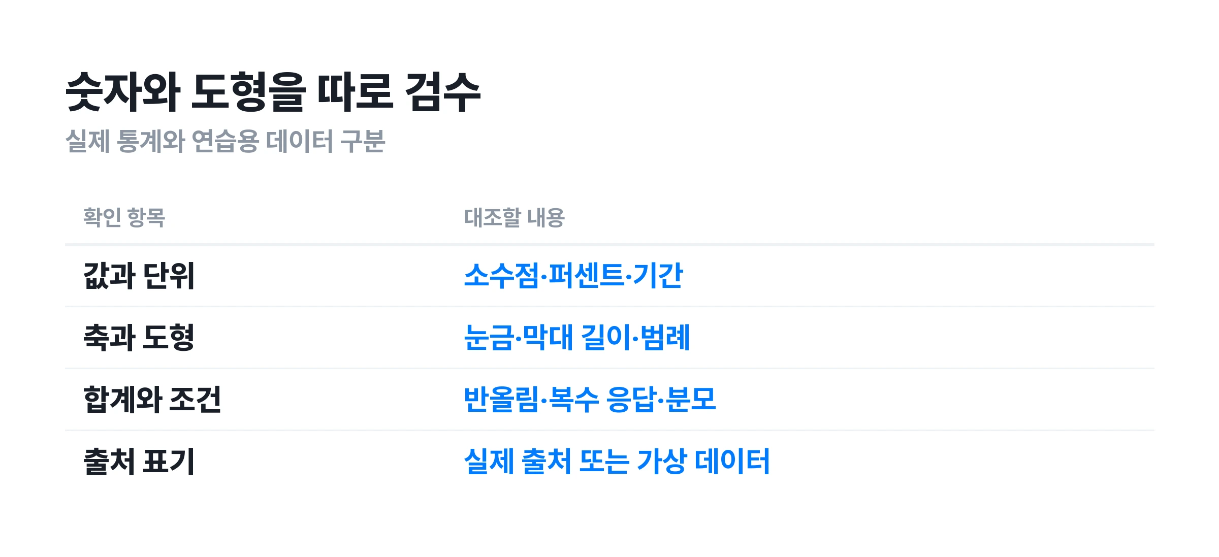
① Check values and units. A count of 1,200 people differs greatly from 12 million, just as 3.5% differs from 35%. Compare decimal points, thousands separators, periods, currencies, and percentage signs with the source. State whether a percentage refers to all customers or survey respondents, alongside its source.
② Check axes and shapes. Check whether bars align with the marked scale and whether category order matches the legend. It also matters whether a bar chart starts at 0. For pie charts, compare slice sizes with their labels. A plausible-looking generated chart does not establish that it represents the data accurately.
③ Check totals and comparison conditions. Rounding can cause percentages to total something other than exactly 100%. Surveys that allow multiple responses can exceed 100%. Do not change figures just to force a total. Check how the source data was aggregated. Do not present values from different periods or populations as directly comparable.
④ Label example data inside the image, too. If only the caption identifies fictional figures, that context disappears when someone saves or shares the image alone. Make the label for example data clearly visible in practice images. Do not cite an internal tally or an invented research organization if no survey took place.
If accurate figures are central to the article, build the chart from data and use AI for surrounding illustrations or backgrounds. Keeping the chart source and data files makes updates easier. Having only a few numbers does not always make image generation the better approach.
🛠 Create and revise an infographic on Carat
Describe your material's purpose and wording in a conversation on Carat. A short instructional image, like the process prompt above, is easier to assess than a long report packed into one image. Check the available models and settings in the workspace.
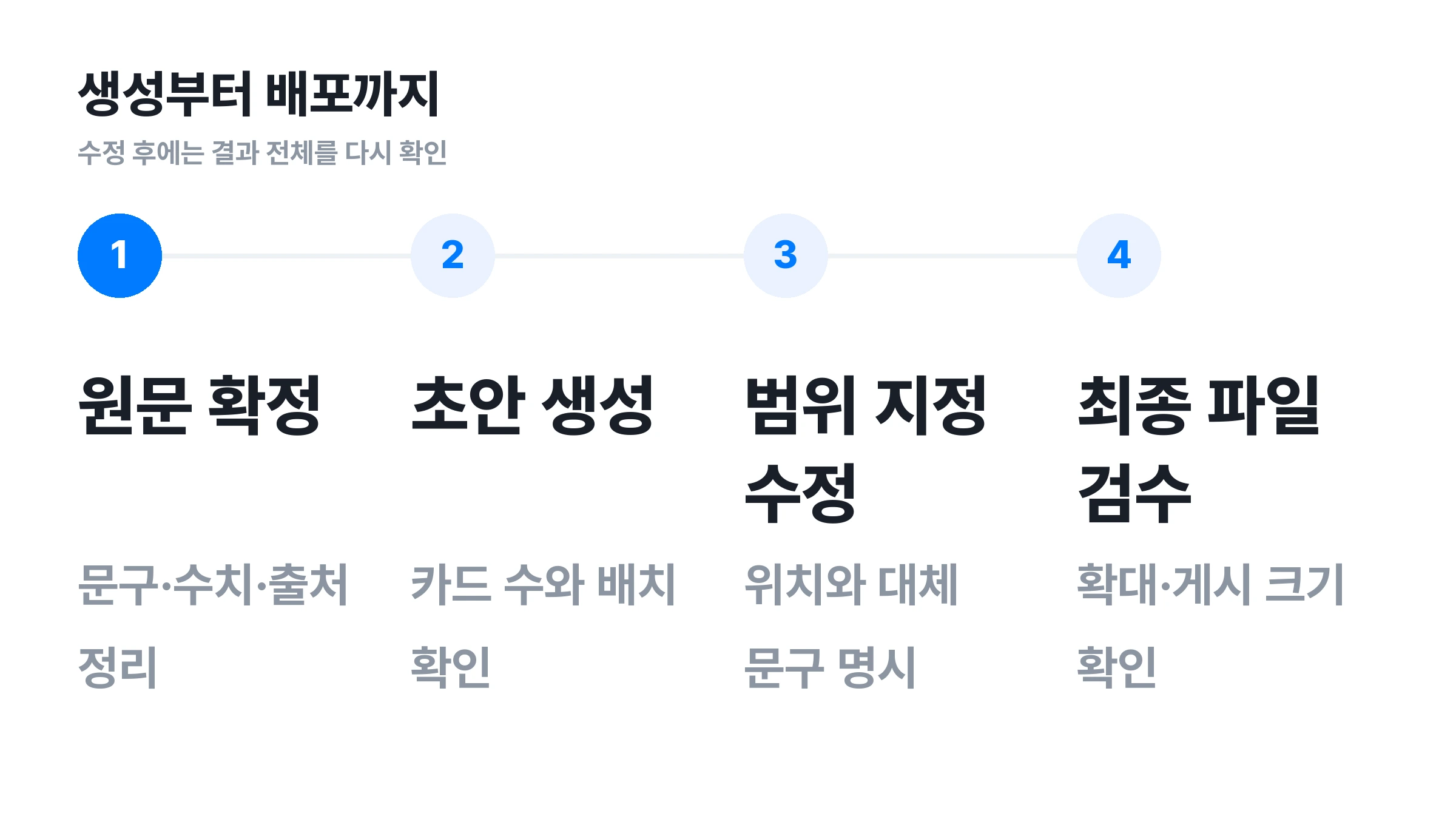
① Finalize the material and wording first. Write the title, card labels, and descriptions separately. For external material, record the source and reference date. If you ask the model to summarize a long document, check that the summary retains its conditions and exceptions before requesting an image.
② Request a draft and check the overall structure. Paste the prompt, then check the card count, reading direction, and title position. Settling the layout first reduces repeated detail corrections caused by later structural changes. If the model offers a low quality setting, you can use it for drafts. That setting does not guarantee accurate Korean text.
③ Specify the location and replacement wording. Instead of “Fix the text,” write “Change the third card's description to ‘글자·숫자·배치를 모두 확인’.” Image editing can also change nearby text or illustrations. If repeated revisions remain inconsistent, try keeping the background and icons while adding the text in an editing tool.
④ Compare the final file with the source. Enlarge the saved file rather than relying only on the small chat preview. Check whether descriptions remain readable at the actual publishing size. Keep the source text, final prompt, generated result, and editable source together as a reference for your next project.
📐 Prepare the result for presentations and social carousels
The same infographic can become harder to read depending on where it appears. Presentations need large titles and simple flows. Small descriptions can become difficult to read on a phone. Consider the final placement and surrounding text before finishing the file.
Spread explanations across presentation slides. Show the main relationship visually, then move detailed figures to another slide or table. Packing in everything the presenter will explain aloud adds clutter. Check that an audience viewing from a distance can tell what to read first.
Give each carousel slide a role. The first can introduce the topic, the next cover the main points, and the last explain what to do. However, generating several images with the same prompt can still produce different colors and icons. Provide a reference image, then compare the finished slides side by side to align text sizes and spacing.
Keep the image's information in the blog text, too. Consider readers who cannot enlarge the image or whose device does not display it. Put key figures and conclusions in the body as well as the image. Explain what the image shows in its caption, and link to the original source for actual statistics.
Distinguish delivery formats from editable source files. PNG and JPG files are convenient to distribute, but their lettering does not automatically become editable text. A PDF can also contain only a single flattened image. If someone will revise the file later, specify which elements they can edit and in which program.
❓ Frequently asked questions
Can you make AI infographics for free?
Some tools let you start for free. Canva's official page describes free infographic creation, and Carat also offers a free trial allowance. However, available models, generation limits, paid assets, and export conditions can vary by service and over time. Check Carat's current terms in the plan guide.
Is there a prompt that guarantees error-free Korean text?
It is difficult to guarantee that Korean text will contain no errors. Specifying the wording and layout gives you a reference for checking. However, as the samples show, even large subheadings can contain incorrect characters. For content that requires exact spelling, consider finishing it with editable text.
Which model is the most accurate?
These samples alone cannot establish a ranking. Comparing model accuracy requires multiple results with the same wording, layout, and output conditions. In practice, the revision process and final file's editability also matter. Make a small draft with your actual wording and assess the review effort as well.
Do prompts have to be in English?
You can start by describing the purpose and layout in Korean. Put the exact text for the image in quotation marks, in the language you want. Check the result for translated titles or added descriptions.
Can AI find statistics and put them in an image?
Tools with research features can help find statistics. However, check whether the material fits your topic, when the data applies, and who was surveyed. Distinguish numbers added during image generation from statistics with verified sources. Finalizing values before requesting a visualization makes comparison with the source easier.
Can you fix just one incorrect character in a generated image?
You can request a correction through image editing features. However, changing one character may also change surrounding text or layout. This differs from selecting and replacing text in a text box. Read the revised result again. If the material needs repeated updates, move it into an editable source file.
Can you turn an infographic into a video?
You can pan and zoom over a still image or request motion from a video generation tool. However, redrawing text can change its wording, so check the finished video, too. If numbers and descriptions must remain exact, first consider animating a checked still image in an editing program.
More articles
 GPT 6 Astra Prompt Guide | Official Traits, Task-Type Skeletons, and How to Prompt It Without StallsCarat Editor · 2026.09.18
 AI BL Drama Explained: Where to Watch and How to Make OneCarat Editor · 2026.09.17
 GPT 6 Astra Video Production and Editing: The Complete Guide | How to Use It, Render Models, CostCarat Editor · 2026.09.15