Animal Poster
Create a practical animal poster with clear layout, color, copy hierarchy, and production checks using AI prompts.
2026.07.16
「Animal Poster」を思いどおりに作りましょう自分だけの「Animal Poster」を作る
ふだんの言葉で伝えるだけで、Caratが最適な画像や動画を生成します。

毎日100クレジット無料で今すぐ始められます
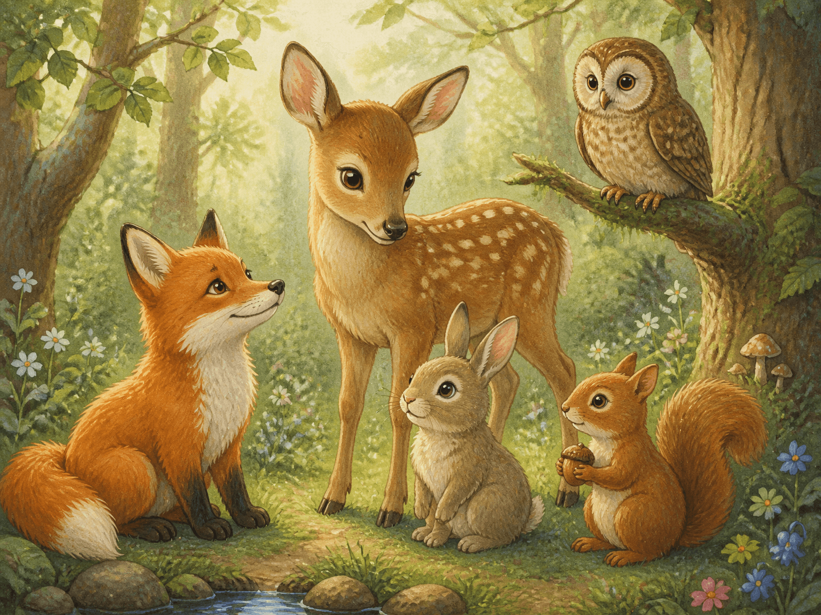
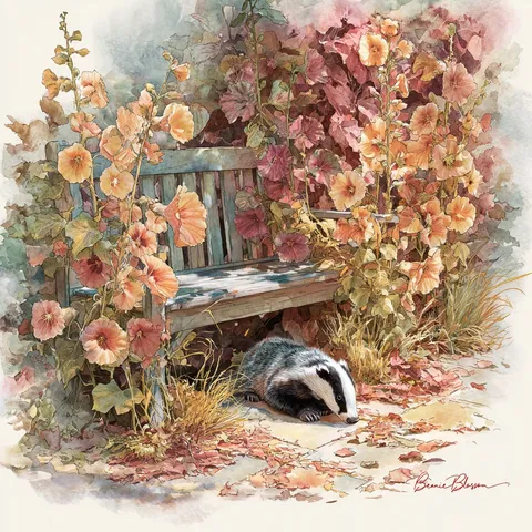
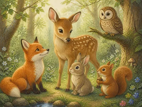
Forest Animal Illustration
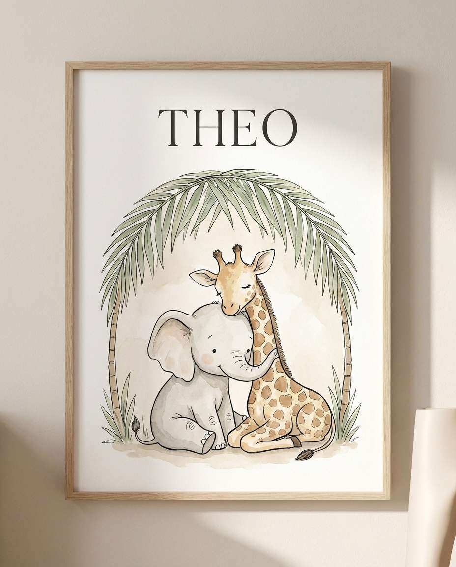
Safari Animal Name Poster
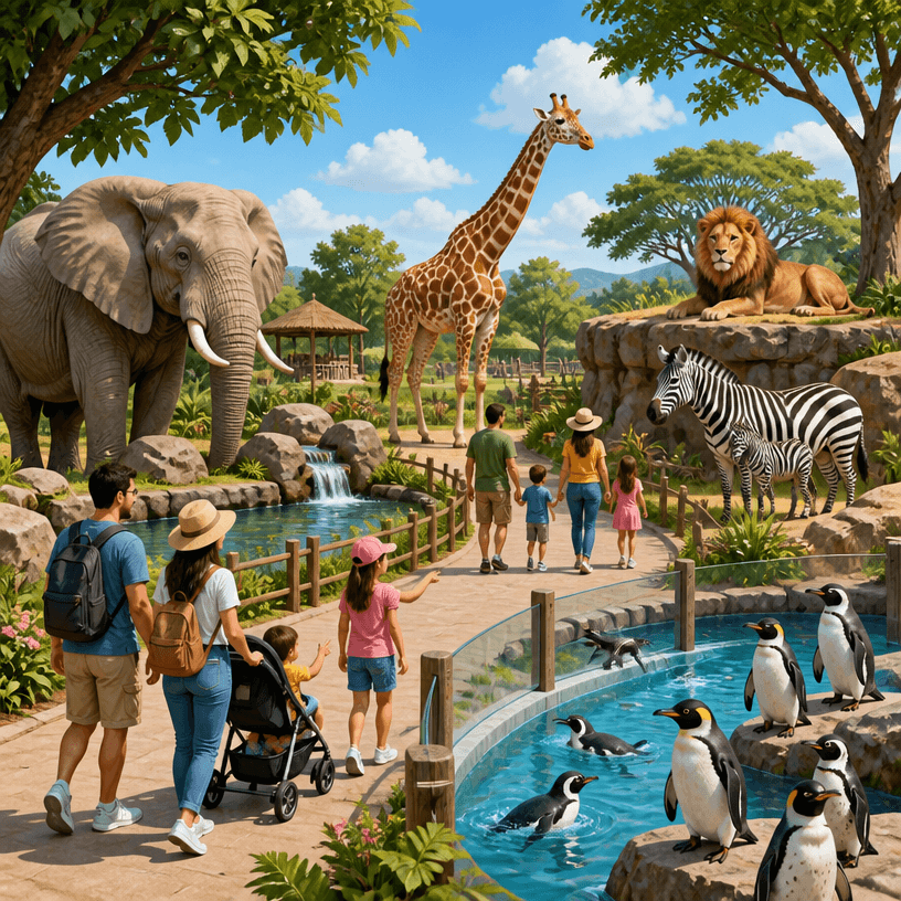
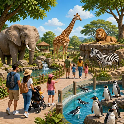
Zoo Illustration
Purpose and viewing context
A Animal Poster is designed for educational and decorative posters that clearly present an animal, its habitat, its name, or a conservation message. Begin by defining who will see it, where it will appear, and how many seconds the viewer has. Common uses include classroom learning, zoo guidance, children’s room decor, ecology campaigns, and pet events, and each setting changes viewing distance and information density. Screen previews and printed output also require separate checks for resolution, safe margins, and contrast even when the ratio looks identical.
Observable prompt ingredients
Build the prompt around an accurate silhouette, a clear eye-level hero, habitat cues, readable labels, and a color system that separates species. Describe the subject, layout, limited palette, headline position, material, and print or lighting texture in observable terms. Replace vague requests such as “make it beautiful” with spatial instructions: reserve the top twenty percent for a headline, place one hero in the center, and keep a clean information block below. Lock one art direction before asking for variations.
Hierarchy and readability
Make the primary title readable at a glance, then reduce size and weight for supporting details. If the background is complex, protect copy with a quiet field or generous negative space and keep essential details away from trim edges. Review the complete layout on a phone, but inspect small type and thin rules at actual print size. For Korean copy, generating a short heading and adding detailed information later is usually more reliable.
Common failures and focused revisions
The main risk is blending traits from different species or sacrificing anatomical and educational accuracy for cuteness. Revise one variable at a time, such as palette, headline scale, or background complexity, instead of regenerating every decision. When contrast fails, lower background saturation or simplify the copy zone rather than stacking heavy shadows. Names, dates, classifications, and institutional wording must be checked against an authoritative source after generation.
Production and preflight checklist
Verify spelling, event details, logo orientation, resolution, and trim allowance in that order. Do not force one master design through automatic crops for portrait, landscape, and square outputs; rebalance the focal point for every ratio. Explore animal-illustration, cute-animal-character, and wildlife-documentary for adjacent visual directions. Finish with both a distant thumbnail review and an actual-size detail proof before publishing or printing.
よくあるご質問
Realism supports species identification and ecology lessons, while simplified illustration feels approachable for early learning and decor. Choose according to age and viewing context.
Six to nine species usually remain readable on one sheet. Keep image boxes and label positions on a consistent grid so scanning is easy.
Show habitat and a practical conservation action rather than only a threatening scene. Verify status classifications and sources before adding final text.
Make each animal name readable from across the room and reduce supporting copy to one or two sentences. Rounded type still needs generous spacing.
State the species, coat pattern, ear and tail shape, body proportion, and habitat. Add a restriction against borrowing traits from similar species.
Light cream and subdued natural colors preserve dark labels and silhouettes. Very dark backgrounds can swallow fine fur and feather detail.
Yes. Feature one recognizable animal and reserve a separate block for date, venue, and booking details so educational visuals do not compete with logistics.