
Course Meal Menu
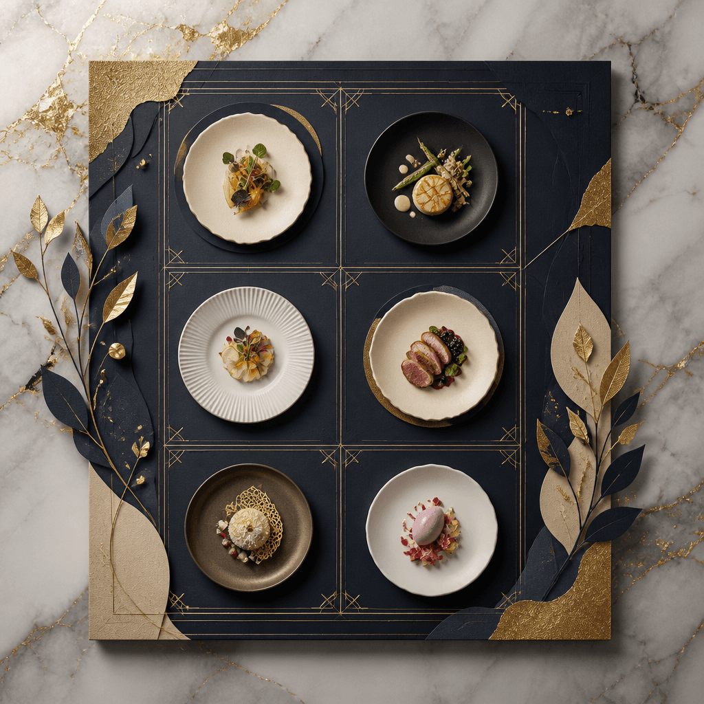
Luxurious sequential tasting menus with thin gold margins, organic linen styles, and cozy table candlelight highlights to design fine dining setups.
2026.07.22
「Course Meal Menu」を思いどおりに作りましょう自分だけの「Course Meal Menu」を作る
ふだんの言葉で伝えるだけで、Caratが最適な画像や動画を生成します。

毎日100クレジット無料で今すぐ始められます
Multi-Course Menu
Topic and intent
An upscale course meal menu template plays a profound ritual role inside gourmet french bistros and premium tasting salons to show sequential culinary pairings. Since multi-course diners look forward to detailed epicurean journeys, course menu designs must abandon dense commercial clutter, employing a highly sophisticated visual balance that features large calm empty spaces alongside minor metallic framing lines.
Composition
Adopt a serene horizontal perspective to align with elegant luxury dining layouts. Position the left-side columns exclusively for structured dish names spanning from amuse-bouche to dessert. Map out the right-side layout fields for complementary vintage wine recommendations and secure the margins with fine linear geometric details, building a structurally comforting paper presentation sheet.
Prompt practice
When writing engineering blocks, tie together visual focus prompts such as 'luxurious dining menu card' and 'minimalist gourmet typography board'. Introduce vivid material keywords like 'matte warm white paper with rough fine textures, geometric gold leaf outlines, soft candlelight lighting and kitchen shadows'. Always launch inside the landscape 4:3 format config to establish steady graphic distribution.
Quality review
Perform methodical quality control on the continuity of the thin golden lines and verify there are no broken ink shapes. Look closely at the background marble or granite material textures to confirm they provide clean readability for menu headlines rather than clashing with letters. Ensure that text-placeholder mock elements do not render as messy blobs or warped digital remnants.
Practical use
F&B general managers and fine-dining entrepreneurs can directly use this clean menu template for actual dinner events. Remove any synthetic English texts from the default file and write down your course lists and curated ingredients using sophisticated serif typography. Print the files on heavyweight 220g textured linen stocks to slide into leather table portfolios or display atop custom metal easels.
よくあるご質問
오프라인 한독 정렬에서는 완전 좌측 편향 정렬보다는, 전체 레이아웃의 안전 중앙 정렬(Center align) 방식을 취할 때 정갈하고 격식 있는 무드가 최대치로 상승합니다.
나무를 베지 않는 사탕수수 부산물로 제작하여 오돌토돌 펄프 질감이 수공예적으로 가슴을 울리는 크래프트 '어스팩(Earth Pact)' 보드지가 탁월한 선택지입니다.
모든 줄 아래 한 치수 작은 8pt 회회색 폰트로 (대두, 글루텐 포함) 처럼 정갈하게 하단 부기해주면, 격조 높은 다이닝의 정교한 의전 배려가 돋보입니다.
통으로 재인쇄하는 번망을 덜어내기 위해, 기본 틀 레이아웃을 고정하고 매일 변경되는 요리 속지만 투명 미싱지로 인입 체체하는 구조를 권유합니다.
음식 도판 면적 가이드에서 2/3 영역을 메인 정찬 목록에 할애하고, 나머지 우측 1/3 격벽을 얇은 골드 분할선과 와인 페어링으로 분리하여 배치하면 정합적입니다.
은박이나 금박 로고를 박을 때는 너무 크거나 넓으면 거부감을 유발하니, 가로폭 4cm 미만으로 최소 지점을 지켜서 우아하게 마스터 박스를 얹는 것이 좋습니다.
채도가 낮고 연필 드로잉 터치가 묻어나는 연한 스케치 스타일로 음식 형상을 다운 톤 처리하여 프롬프트로 다잡으면 디자인 완성도가 정점에 닿습니다.


