carat

Prompt Gallery

/

그리드 레이아웃

Login
Sign Up

그리드 레이아웃

여러 이미지와 텍스트를 균형 있게 배치하는 그리드 레이아웃 AI 디자인 프롬프트를 모았습니다.

2026.07.02

·
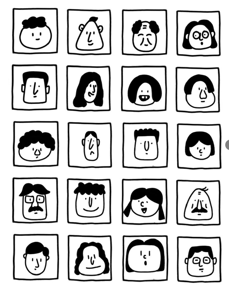
GPT 이미지 2로 생성한 흑백 얼굴 그리드 24

흑백 얼굴 그리드 24

GPT 이미지 2· Image
一张黑白极简手绘人物头像网格图,严格 6 行 4 列,一共 24 个头像,均匀排列在白色背景上。关键结构:每个头像都被一个正方形格子框住,正方形的四条边本身就是人物脸部的轮廓边界。脸部紧贴方格四边,没有额外边距。风格特征:纯黑白线条插画,无填充色块,无阴影,无渐变 手绘质感,线条略带不规则,天真怪趣的编辑插画风格 极简五官:圆点眼睛、小圆圈眼睛、短线眉毛、小点鼻子、直线嘴巴、小微笑、小难过嘴、困倦眼、惊讶O型嘴、面无表情 发型以线条勾勒:波浪线刘海、卷曲线条发、中分帘子发、平头短线、斜刘海、漩涡卷发、条纹发、扇贝状刘海 部分人物有圆眼镜、方眼镜、胡子、雀斑、闭眼、X形眼 人物表情各异:开心、难过、困惑、困倦、惊讶、面无表情 整体风格接近手绘人物图鉴,几何、克制、天真但不松散,平面化,高对比度,无颜色,无背景装饰,无写实细节。
@ponyodong
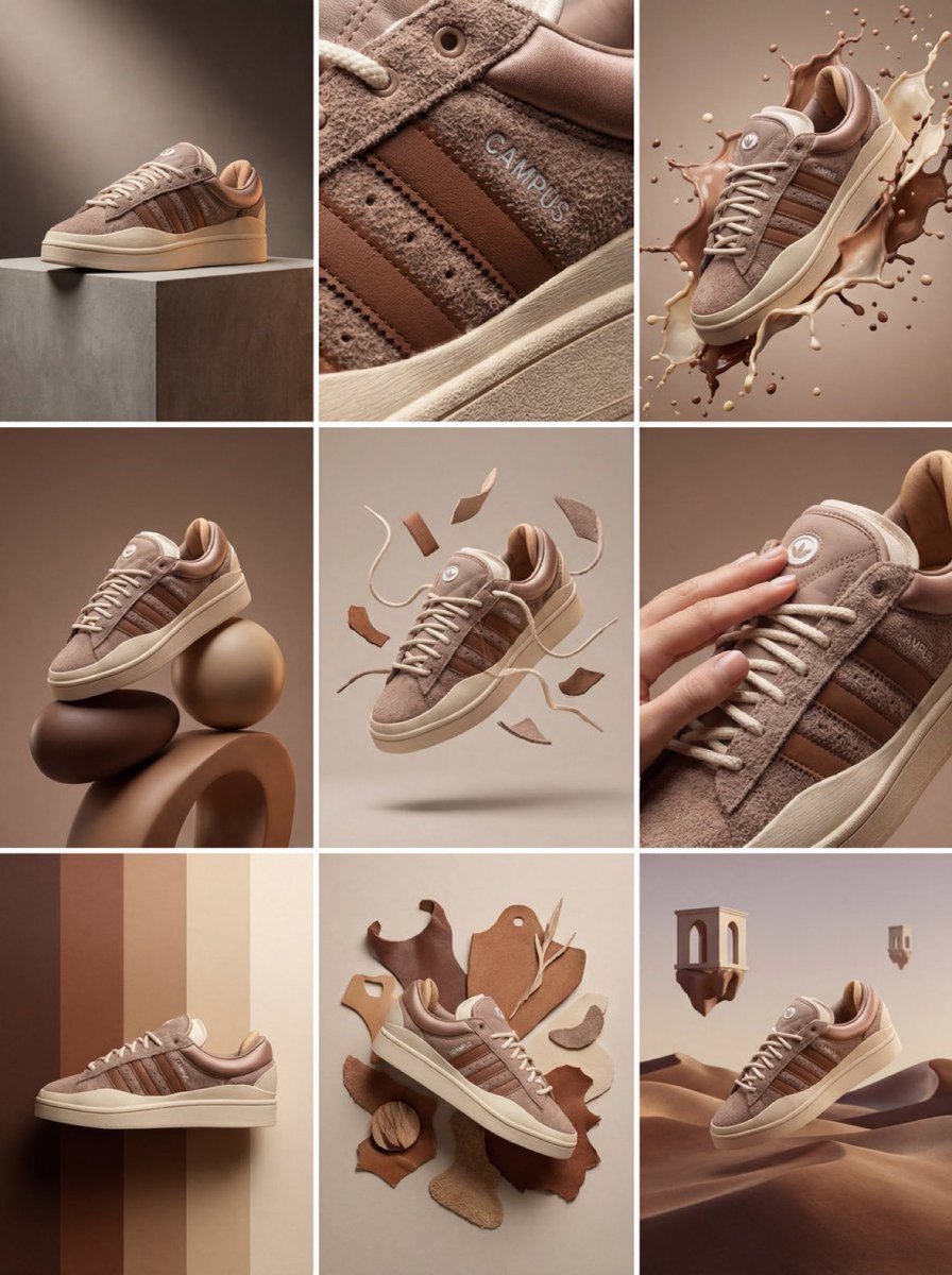
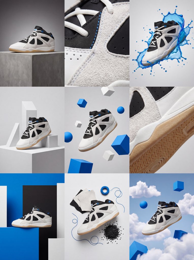
나노바나나 프로로 생성한 3x3 제품 캠페인 그리드

3x3 제품 캠페인 그리드

나노바나나 프로· Image
Create a 3×3 grid in 3:4 aspect ratio for a high-end commercial marketing campaign using the uploaded product as the central subject. Each frame must present a distinct visual concept while maintaining perfect product consistency across all nine images. Grid Concepts (one per cell): 1. Iconic hero still life with bold composition 2. Extreme macro detail highlighting material, surface, or texture 3. Dynamic liquid or particle interaction surrounding the product 4. Minimal sculptural arrangement with abstract forms 5. Floating elements composition suggesting lightness and innovation 6. Sensory close-up emphasizing tactility and realism 7. Color-driven conceptual scene inspired by the product palette 8. Ingredient or component abstraction (non-literal, symbolic) 9. Surreal yet elegant fusion scene combining realism and imagination Visual Rules: Product must remain 100% accurate in shape, proportions, label, typography, color, and branding No distortion, deformation, or redesign of the product Clean separation between product and background Lighting & Style: Soft, controlled studio lighting Subtle highlights, realistic shadows High dynamic range, ultra-sharp focus Editorial luxury advertising aesthetic Premium sensory marketing look Overall Feel: Modern, refined, visually cohesive High-end commercial campaign Designed for brand websites, social grids, and digital billboards Hyperreal, cinematic, polished, and aspirational1
@arceyul
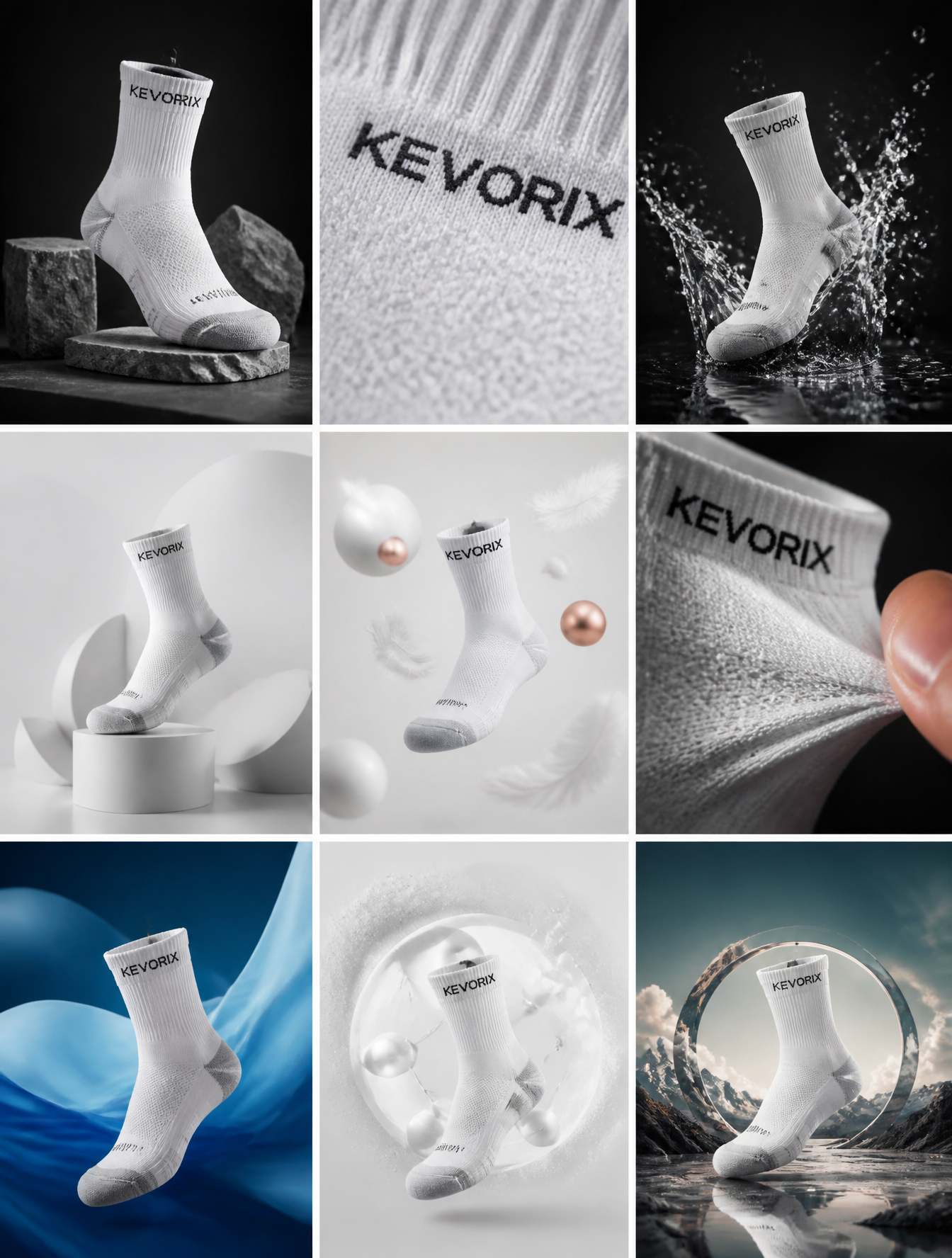
KEVORIX 양말을 중심으로 9가지 상업 광고 콘셉트를 구성한 고급 캠페인 그리드

KEVORIX 양말 캠페인 3×3 그리드

GPT 이미지 2· Image
Create a 3×3 grid in 3:4 aspect ratio for a high-end commercial marketing campaign using the SOCK as the central subject.BRAND NAME IS KEVORIX NO ANY KIND OF LOGO ONLY WRITE IN TEXT. Each frame must present a distinct visual concept while maintaining perfect product consistency across all nine images. Grid Concepts (one per cell): 1. Iconic hero still life with bold composition 2. Extreme macro detail highlighting material, surface, or texture 3. Dynamic liquid or particle interaction surrounding the product 4. Minimal sculptural arrangement with abstract forms 5. Floating elements composition suggesting lightness and innovation 6. Sensory close-up emphasizing tactility and realism 7. Color-driven conceptual scene inspired by the product palette 8. Ingredient or component abstraction (non-literal, symbolic) 9. Surreal yet elegant fusion scene combining realism and imagination Visual Rules: Product must remain 100% accurate in shape, proportions, label, typography, color, and branding No distortion, deformation, or redesign of the product Clean separation between product and background Lighting & Style: Soft, controlled studio lighting Subtle highlights, realistic shadows High dynamic range, ultra-sharp focus Editorial luxury advertising aesthetic Premium sensory marketing look Overall Feel: Modern, refined, visually cohesive High-end commercial campaign Designed for brand websites, social grids, and digital billboards Hyperreal, cinematic, polished, and aspirational
Dirghayu Patel
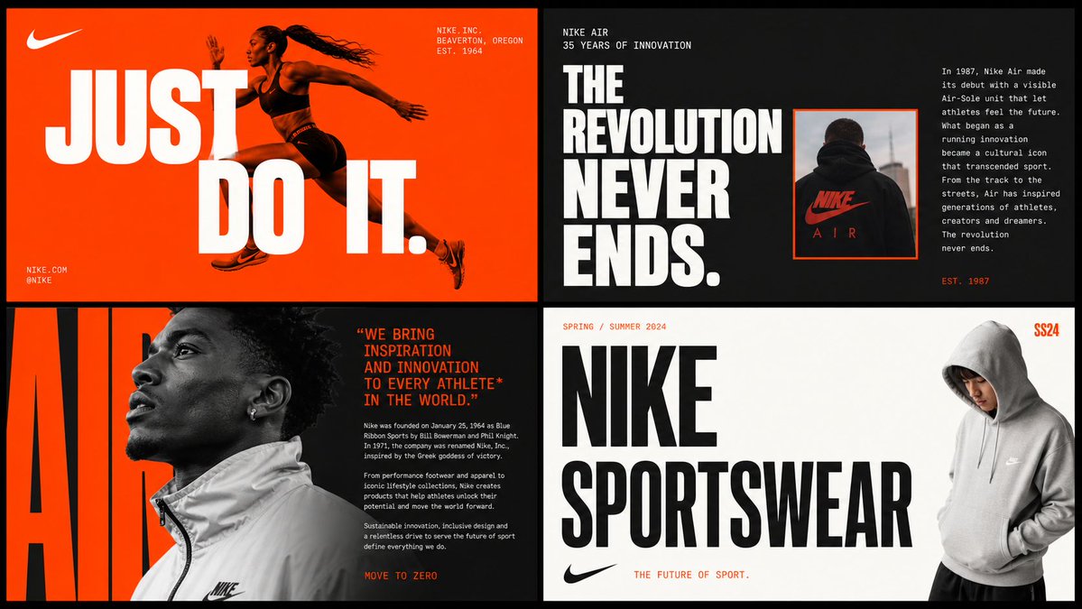
GPT 이미지 2로 생성한 브랜드 무드보드 2×2 그리드

브랜드 무드보드 2×2 그리드

GPT 이미지 2· Image
[BRAND NAME] Act as a Senior Brand Art Director and Editorial Designer creating a 2×2 grid brand moodboard — four distinct editorial cards unified by [BRAND NAME]'s visual identity system. References: Ivy Park campaign editorial, Supreme lookbook layouts, Palace Skateboards zine design, Off-White editorial grids, Highsnobiety brand feature spreads. --- PHASE 0: BRAND INTELLIGENCE — AUTONOMOUS RESEARCH Before generating any visual, perform a complete brand decode of [BRAND NAME] from training data. Extract and apply all of the following autonomously: Color system: identify the exact primary and secondary brand colors — their specific hex values, how they are used in hierarchy (dominant background color, accent color, text color). These colors drive every card in the grid. Typography DNA: identify the exact typeface or typeface category [BRAND NAME] uses — serif, sans-serif, condensed, extended, grotesque, slab. Identify the weight hierarchy: what weight is used for headlines, what for body text, what for labels. Apply this typography system throughout all four cards. Brand language: identify the tone of voice, key phrases, campaign slogans, product categories, founding year, key collaborators, cultural positioning. Extract real factual information about [BRAND NAME] that can be used as text content across the four cards — real product names, real campaign titles, real dates, real locations, real brand statements. Visual codes: identify the photographic style associated with [BRAND NAME] — editorial fashion, sport, street, luxury, industrial. Identify compositional patterns the brand uses — full bleed photography, text-dominant layouts, graphic-only compositions, collage. All text content across all four cards must be real information about [BRAND NAME] — not placeholder text, not generic copy. Real brand slogans, real product lines, real campaign names, real founding information. --- PHASE 1: GRID SYSTEM The output is a single image composed of four equal rectangular cards arranged in a 2×2 grid. Total image dimensions: square or slightly landscape — 1:1 or 4:3 ratio. Each card is identical in size — exactly one quarter of the total image area. A thin gap of 4 to 6px between cards — neutral dark or light depending on brand palette. The four cards form a unified editorial system — they share the same color palette and typography but each has a distinct layout typology. Together they tell the brand story. --- PHASE 2: CARD 1 — HERO EDITORIAL (top left) Layout typology: large bold typography layered over or integrated with photography. Dominant background color: [BRAND NAME]'s primary brand color at full saturation — fills the entire card. Photography: a fashion or lifestyle image relevant to [BRAND NAME]'s visual world — model, product, or environment. The photo is either full-bleed behind the text or cropped into a specific zone of the card with text occupying the remaining space. Photo treatment: slight blend mode integration with the background color — the photo and background feel like one unified surface. Typography: the most recognizable [BRAND NAME] headline or slogan in the largest type size on the card — bold condensed, uppercase, white or brand secondary color. The text is large enough to partially overlap the photo. Secondary small text: brand name, location, date — set in small caps or tracking-heavy small type in a corner. The overall feeling: a magazine cover or campaign poster. --- PHASE 3: CARD 2 — EDITORIAL TEXT LAYOUT (top right) Layout typology: text-dominant editorial layout with a small photo inset. Background: [BRAND NAME]'s secondary brand color or a dark neutral consistent with the brand palette. Large headline: a real [BRAND NAME] campaign title or brand statement broken across multiple lines — each line a different size or weight, creating a typographic staircase effect. The largest line is very large, the smallest is medium, they are left-aligned creating a ragged right edge. Small body text column: a real paragraph of brand information — founding story, product description, or campaign context — set in small regular weight type, positioned in the upper right or lower right of the card. Photo inset: a small rectangular photo — 20 to 30% of card area — positioned where it interrupts or overlaps the headline text, creating editorial tension. The photo has a colored border or frame in the brand primary color. --- PHASE 4: CARD 3 — FASHION EDITORIAL (bottom left) Layout typology: photography-forward with typography as structural background element. Photography: a strong fashion or product image — model wearing [BRAND NAME] product, or a key product hero shot. The photo is positioned in the left 50 to 60% of the card, cropped tightly. Photo treatment: slightly desaturated or high contrast — editorial black and white or brand-tinted. Background typography: behind and around the photo, a very large single word or letterform from [BRAND NAME]'s identity — set at 200 to 300% of the card height, in the brand primary or secondary color, acting as graphic wallpaper behind the photo. This background type is partially obscured by the photo. Body text: a column of real [BRAND NAME] editorial copy — 3 to 5 short paragraphs, small regular weight, positioned to the right of the photo. Pull quote: one sentence extracted from the body copy, set larger and in brand accent color, positioned between the photo and the body text. --- PHASE 5: CARD 4 — CLEAN BRAND STATEMENT (bottom right) Layout typology: minimal, graphic, brand identity statement. Background: white, off-white, or the lightest tone in [BRAND NAME]'s palette — maximum contrast with the other three cards. Primary element: [BRAND NAME]'s wordmark or brand name set in massive type — ultra-bold, condensed or extended depending on the brand's typographic DNA. The wordmark is broken across 2 to 3 lines, each line flush left, occupying 70 to 80% of the card width. Type color: black or the darkest brand color — maximum contrast on the light background. Secondary element: a model or product image positioned at the right edge of the card, slightly cropped — human presence that grounds the graphic layout. The model/product is not the focus — the typography is. Accent element: a year, a number, a collection identifier, or a brand slogan set small in the brand primary color — positioned as a superscript or footnote near the main wordmark, adding a handwritten or stamped quality. --- PHASE 6: UNIFIED VISUAL SYSTEM Typography consistency across all four cards: all type is set in typefaces consistent with [BRAND NAME]'s identity. Headline type: one typeface, one weight — the boldest, most brand-representative option. Body type: one typeface, regular weight — legible at small sizes. No decorative or unrelated typefaces. Color consistency: only the colors identified in PHASE 0 appear across all four cards — primary brand color, secondary brand color, neutral (white or black), and one accent. No colors outside this palette. No gradients. No drop shadows. No textures on type. Information consistency: all text is real [BRAND NAME] information. No lorem ipsum. No generic placeholder text. Every word on every card is either the brand name, a real product name, a real campaign title, a real date, a real location, or a real brand statement. Grid alignment: elements across cards share implied alignment axes — a headline that starts at a certain x-position in card 1 aligns with an element in card 3 at the same x-position. This creates visual cohesion across the 2×2 grid when viewed as a whole. --- PHASE 7: TECH SPECS Output: a single flat image of the complete 2×2 grid. No separate files. Aspect ratio: 1:1 square or 4:3 landscape. Total resolution feel: high enough to read all body text clearly. Typography rendering: all type anti-aliased and crisp — no blurry text. Photography: editorial quality, not stock photography aesthetic. Color accuracy: brand colors exactly as identified in PHASE 0 — not approximated. No film grain unless it is a brand-authentic texture. No vignettes. No lens flare. Clean, precise, editorial. Output feel: this moodboard could be published on Hypebeast, Highsnobiety, or used as an internal brand presentation deck slide.
@AmirMushich
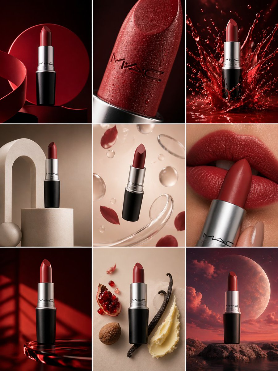
업로드한 제품을 중심으로 9가지 콘셉트를 일관된 제품 형태로 보여주는 상업 캠페인 그리드

고급 제품 캠페인 3×3 그리드

GPT 이미지 2· Image
Create a 3×3 grid in 3:4 aspect ratio for a high-end commercial marketing campaign using the uploaded product as the central subject. Each frame must present a distinct visual concept while maintaining perfect product consistency across all nine images. Grid Concepts (one per cell): 1. Iconic hero still life with bold composition 2. Extreme macro detail highlighting material, surface, or texture 3. Dynamic liquid or particle interaction surrounding the product 4. Minimal sculptural arrangement with abstract forms 5. Floating elements composition suggesting lightness and innovation 6. Sensory close-up emphasizing tactility and realism 7. Color-driven conceptual scene inspired by the product palette 8. Ingredient or component abstraction (non-literal, symbolic) 9. Surreal yet elegant fusion scene combining realism and imagination Visual Rules: Product must remain 100% accurate in shape, proportions, label, typography, color, and branding No distortion, deformation, or redesign of the product Clean separation between product and background Lighting & Style: Soft, controlled studio lighting Subtle highlights, realistic shadows High dynamic range, ultra-sharp focus Editorial luxury advertising aesthetic Premium sensory marketing look Overall Feel: Modern, refined, visually cohesive High-end commercial campaign Designed for brand websites, social grids, and digital billboards Hyperreal, cinematic, polished, and aspirational
2051058241455505412
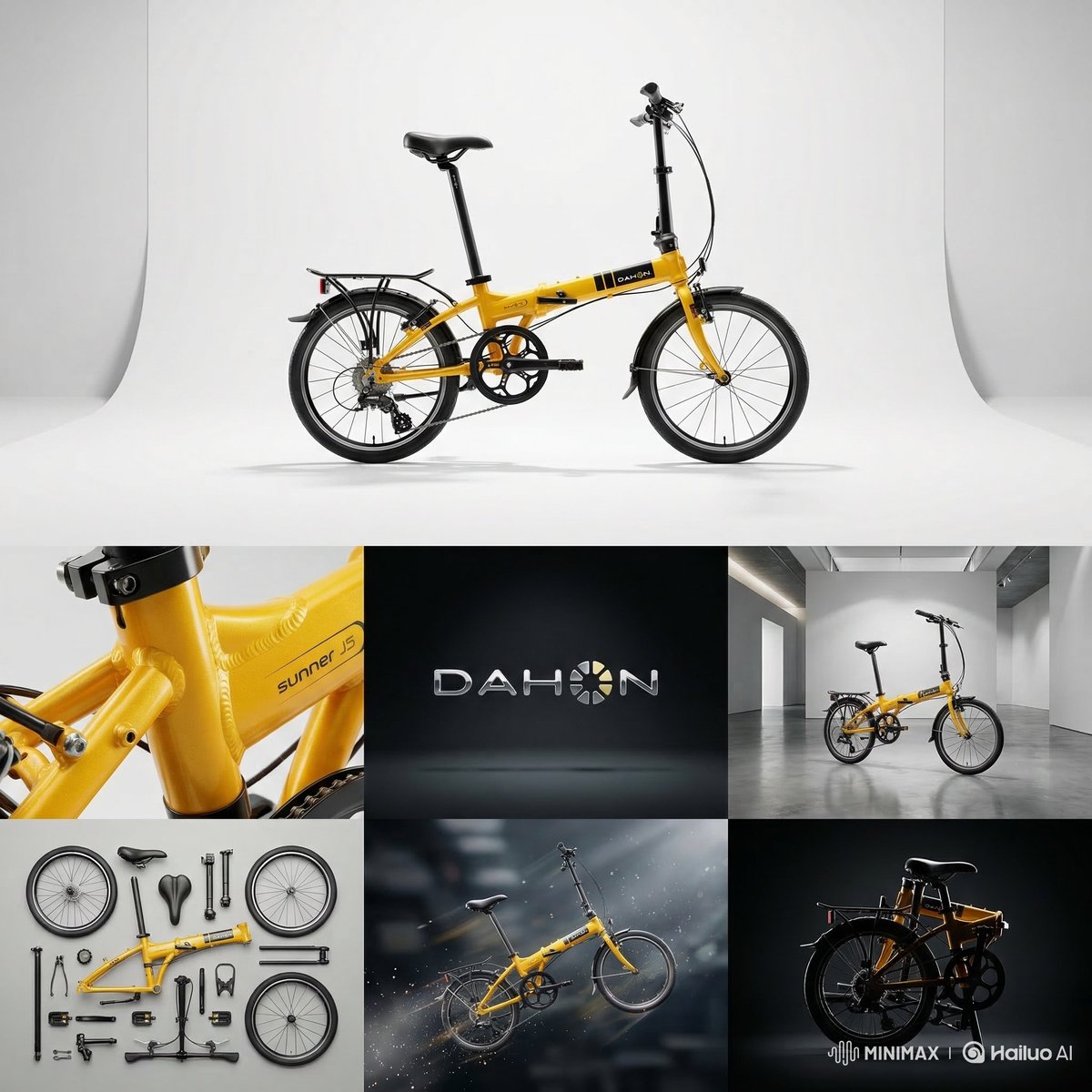
나노바나나 프로로 생성한 7패널 제품 스튜디오 그리드

7패널 제품 스튜디오 그리드

나노바나나 프로· Image
CORE OBJECTIVE: Create a professional 8k studio editorial based on [ATTACHED_INPUT_IMAGE]. Analyze subject geometry, material, and branding to maintain logic across 7 seamless panels. STEP 1: DYNAMIC ANALYSIS Identify: Subject, logo (or name), and material. Material Logic: Tech (sharp rim lights), Glass (refraction/caustics), Organic (soft light), Fashion (matte/satin sheen). COMPOSITION & STRUCTURE Single seamless image. Top: 1 Hero Panel. Bottom: 2x3 Grid (6 panels). Total 7 views. No text or borders (except Frame 2). PANEL SPECIFICATIONS MAIN HERO: Centered master portrait on infinite-curve background. Lighting highlights primary material. F1 (Macro): Extreme close-up on material "DNA" (microscopic grain, textures, or circuitry). F2 (Logo): 3D premium brand emblem centered on a minimalist studio backdrop. F3 (Scale): Subject in size-appropriate context (gallery for large, pedestal for small). F4 (Rhythm): High-angle "knolling" or grid repetition of components. F5 (Motion): Weightless action-still with environmental cues (vapor, sparks, or splashes). F6 (Form): High-contrast rim-lit profile focusing purely on the iconic silhouette. VISUAL ENFORCEMENT Style: Ultra-high-end Studio Editorial. Consistency: 100% identical color and design details across all views. Technical: 8k, ray-traced reflections, professional grading, global illumination.
@firatbilal
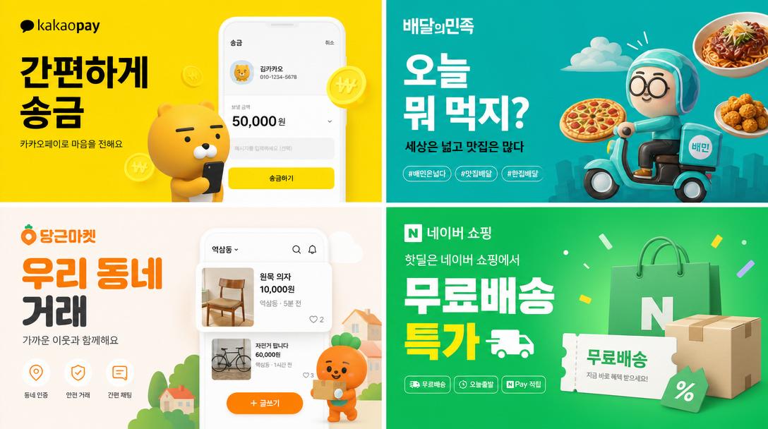
GPT 이미지 2로 생성한 한국 디지털 광고 배너 그리드

한국 디지털 광고 배너 그리드

GPT 이미지 2· Image
2×2 grid of Korean digital advertisement banners. 1: 카카오페이 fintech banner with Korean text '간편하게 송금'. 2: 배달의민족 food delivery banner '오늘 뭐 먹지?'. 3: 당근마켓 secondhand marketplace '우리 동네 거래'. 4: 네이버 쇼핑 '무료배송 특가'. Each uses Korean typography, Korean brand colors, modern Korean app ad aesthetic.
@makaneko_AI
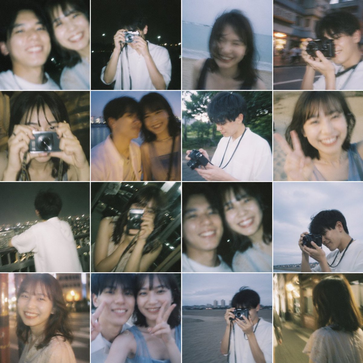
GPT 이미지 2로 생성한 추억의 커플 16장 그리드

추억의 커플 16장 그리드

GPT 이미지 2· Image
{"type":"16-photo nostalgic contact sheet collage","style":"dreamy film photography, soft blur, slightly underexposed, candid youthful romance, flash snapshots mixed with ambient dusk light, subtle grain, sentimental and bittersweet mood","subject":{"people_count":2,"relationship":"young couple or former lovers spending time together","ages":"early 20s","appearance":{"male":{"build":"slim","hair":"short dark hair","clothing":"loose white short-sleeve shirt, camera strap around neck in several shots"},"female":{"build":"slim","hair":"shoulder-length dark hair","clothing":"light sleeveless tops or soft casual summer clothes"}},"faces":"intentionally obscured by soft rectangular blur blocks over every visible face"},"layout":{"grid":{"rows":4,"columns":4,"count":16,"border":"thin white dividers, equal square cells"},"images":[{"position":"row 1 col 1","description":"close cropped portrait of the woman in a white top at night, soft flash, dark background"},{"position":"row 1 col 2","description":"close cropped blurred two-person selfie framing, both subjects partially visible, dark nighttime setting"},{"position":"row 1 col 3","description":"young man standing at night and holding a compact silver camera up to his face, white shirt, distant lights behind him"},{"position":"row 1 col 4","description":"woman on a beach or shoreline in low light, softly blurred, ocean horizon behind her"},{"position":"row 2 col 1","description":"street candid of the man holding a camera near his face while walking outdoors in the evening, urban background with motion blur"},{"position":"row 2 col 2","description":"close-up of the woman indoors or in a dim warm setting, hand raised near her face, flash-lit snapshot"},{"position":"row 2 col 3","description":"blurred two-shot of the couple sitting close together by water at dusk, intimate candid composition"},{"position":"row 2 col 4","description":"young man outdoors in greenery during daytime or early evening, looking down at a camera in his hands, white shirt and camera strap visible"},{"position":"row 3 col 1","description":"woman close to the camera giving a peace sign, casual sleeveless top, sandy or beachlike background"},{"position":"row 3 col 2","description":"back view of the man in a white shirt looking out over a cityscape at night from a high vantage point"},{"position":"row 3 col 3","description":"woman indoors at night holding a compact camera directly toward the viewer, city lights beyond a window, flash aesthetic"},{"position":"row 3 col 4","description":"tight cropped two-person selfie-like frame with both subjects partially visible, dark background"},{"position":"row 4 col 1","description":"young man at the waterfront at dusk holding a camera to his eye, cloudy blue sky and distant shoreline behind him"},{"position":"row 4 col 2","description":"soft night portrait of the woman on a city street with warm bokeh lights in the background"},{"position":"row 4 col 3","description":"close intimate couple snapshot with both faces near each other, one subject making a peace sign, heavy blur and flash look"},{"position":"row 4 col 4","description":"rear view of the woman walking alone down a warmly lit narrow street at night, shoulder-length hair and light top visible"}]},"composition":"each square feels like a memory fragment from one summer evening and a few nearby outings, varied framing, natural imperfection, casual amateur photography","color_palette":"muted blues, warm tungsten yellows, soft skin tones, dark greens, charcoal night shadows, faded white clothing","camera_look":"35mm point-and-shoot or disposable camera feel, shallow focus, motion blur, bloom around lights, occasional flash overexposure","quality":"high-resolution collage with authentic analog softness, emotionally evocative and realistic"}
@zenkaiAI
업로드한 제품을 중심으로 아홉 가지 상업 광고 콘셉트를 3×3 그리드로 구성한 마케팅 캠페인 이미지

3×3 제품 캠페인 비주얼 그리드

GPT 이미지 2· Image
Create a 3×3 grid in 3:4 aspect ratio for a high-end commercial marketing campaign using the uploaded product as the central subject. Each frame must present a distinct visual concept while maintaining perfect product consistency across all nine images. Grid Concepts (one per cell): 1. Iconic hero still life with bold composition 2. Extreme macro detail highlighting material, surface, or texture 3. Dynamic liquid or particle interaction surrounding the product 4. Minimal sculptural arrangement with abstract forms 5. Floating elements composition suggesting lightness and innovation 6. Sensory close-up emphasizing tactility and realism 7. Color-driven conceptual scene inspired by the product palette 8. Ingredient or component abstraction (non-literal, symbolic) 9. Surreal yet elegant fusion scene combining realism and imagination Visual Rules: Product must remain 100% accurate in shape, proportions, label, typography, color, and branding No distortion, deformation, or redesign of the product Clean separation between product and background Lighting & Style: Soft, controlled studio lighting Subtle highlights, realistic shadows High dynamic range, ultra-sharp focus Editorial luxury advertising aesthetic Premium sensory marketing look Overall Feel: Modern, refined, visually cohesive High-end commercial campaign Designed for brand websites, social grids, and digital billboards Hyperreal, cinematic, polished, and aspirational
2047419255931748377
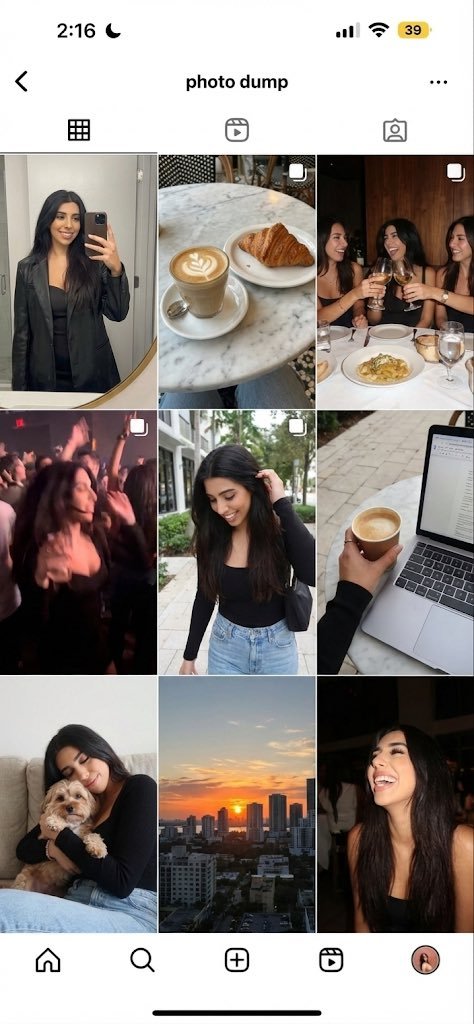
나노바나나 프로로 생성한 주말 포토덤프 9컷 그리드 예시 이미지

주말 포토덤프 9컷 그리드

나노바나나 프로· Image
Generate a 9-image ‘photo dump’ grid of this person’s weekend: a mirror selfie, a café shot, friends at dinner, a blurry party photo, a walking shot, a laptop/coffee work shot, a pet moment, a sunset, and a candid laugh.
@imaxichuhai
나노바나나 프로로 생성한 모노라인 기하학 포스터

모노라인 기하학 포스터

나노바나나 프로· Image
Minimal geometric poster drawn with continuous monoline strokes, thin black lines forming abstract faces and circles, lots of negative space, off-white textured paper, elegant modern art print, small caption placeholder, clean and sophisticated gallery aesthetic, 85mm lens, shallow depth of field, soft cinematic lighting --ar 4:5
media.io:monoline-geometry
나노바나나 프로로 생성한 아이소메트릭 도시 블록 포스터

아이소메트릭 도시 블록 포스터

나노바나나 프로· Image
Isometric geometric poster illustration, simplified city blocks made of clean cubes and prisms, limited palette (slate, teal, cream), long shadows, crisp vector style, minimal label area, modern infographic-meets-art poster, balanced composition and clear hierarchy, soft cinematic lighting --ar 4:5
media.io:isometric-city-blocks

그리드 레이아웃 AI 프롬프트란?

그리드 레이아웃 프롬프트는 이미지, 텍스트, 아이콘, 카드 요소를 규칙적으로 배치해 정돈된 디자인을 만드는 데 쓰입니다. 카드뉴스, 포스터, 랜딩 페이지, 포트폴리오, 무드보드처럼 여러 정보를 한 화면에 담을 때 유용합니다. 캐럿의 그리드 레이아웃 프롬프트는 주제, 스타일, 구도, 색감, 질감, 출력 비율을 함께 설계해 바로 사용할 수 있는 제작용 문장입니다. 복사해서 실행한 뒤 대상, 배경, 조명, 소품, 문구 위치만 바꾸면 SNS 콘텐츠, 광고 이미지, 상세페이지, 포트폴리오 시안까지 빠르게 확장할 수 있습니다.

주요 활용 장면

  • 카드뉴스와 인스타그램 캐러셀 구성
  • 포트폴리오, 무드보드, 브랜드 보드
  • 랜딩 페이지 섹션과 서비스 소개 화면
  • 제품 카탈로그와 비교표 디자인
  • 여러 이미지를 한 장에 보여주는 갤러리 레이아웃

이 태그가 유용한 이유

그리드는 정보가 많을수록 더 중요합니다. clean grid layout, consistent spacing, visual hierarchy, modular cards, balanced margins처럼 간격과 구조를 지정하면 결과물이 깔끔해집니다. AI 이미지 생성은 같은 키워드라도 구체성에 따라 결과가 크게 달라집니다. 이 태그는 핵심 오브젝트, 배경 밀도, 색상 팔레트, 카메라 거리, 여백, 후편집 가능성을 함께 다루기 때문에 결과물이 산만해지는 문제를 줄여줍니다. 특히 여러 시안을 빠르게 비교해야 하는 마케터, 디자이너, 크리에이터에게 유용합니다.

관련 프롬프트 더 보기

  • 캠페인 이미지
  • 카드뉴스 템플릿
  • 클로즈업 이미지
  • 라이프스타일 사진
  • 스트리트 사진
  • 드라마 예고편

프롬프트 구성 팁

  1. 먼저 사용할 채널을 정하세요. 프로필 이미지는 1:1, 쇼츠 커버는 9:16, 블로그 썸네일은 16:9가 안정적입니다.
  2. 스타일을 구체적으로 지정하세요. 실사, 3D, 벡터, 손그림, 미니멀처럼 결과를 크게 바꾸는 단어를 앞쪽에 둡니다.
  3. 배경과 여백을 함께 지시하세요. 텍스트를 얹을 디자인이라면 clean background, generous negative space 같은 표현이 도움이 됩니다.
  4. 금지 요소도 넣으세요. 불필요한 로고, 깨진 문자, 과한 장식, 흐릿한 선을 제외하면 후편집 시간이 줄어듭니다. 컬럼 수, 행 수, 여백, 카드 비율을 먼저 정하면 디자인 시스템처럼 반복 활용하기 좋습니다.

Frequently Asked Questions

Related Prompts

포스터

포스터

575 prompts

그리드 디자인

그리드 디자인

14 prompts

미니멀

미니멀

71 prompts

멤피스 디자인

멤피스 디자인

12 prompts

Carat Prompt Gallery

Create trending AI prompts instantly

Prompts

  • Logo
  • PPT Design
  • Thumbnail
  • Poster
  • Web Novel Cover
  • ID Photo
  • Caricature
  • Product Detail Page
  • Banner

Models

  • GPT Image 2
  • Seedance 2.0
  • NanoBanana Pro
  • NanoBanana 2

Carat

  • Get started
  • About
  • Blog
  • Careers
  • Contact
  • Partnership
  • Terms
  • Privacy

© 2026 Paradot.Inc All rights reserved.