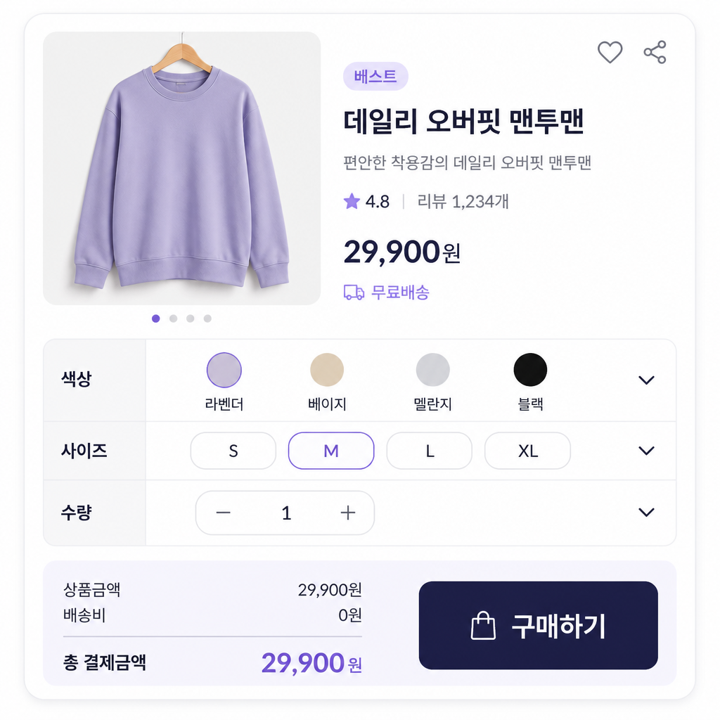
Product Detail Page Option Table
Prompts for organizing color, size, quantity, and configuration choices on a product detail page.
2026.07.17
「Product Detail Page Option Table」を思いどおりに作りましょう自分だけの「Product Detail Page Option Table」を作る
ふだんの言葉で伝えるだけで、Caratが最適な画像や動画を生成します。

毎日100クレジット無料で今すぐ始められます
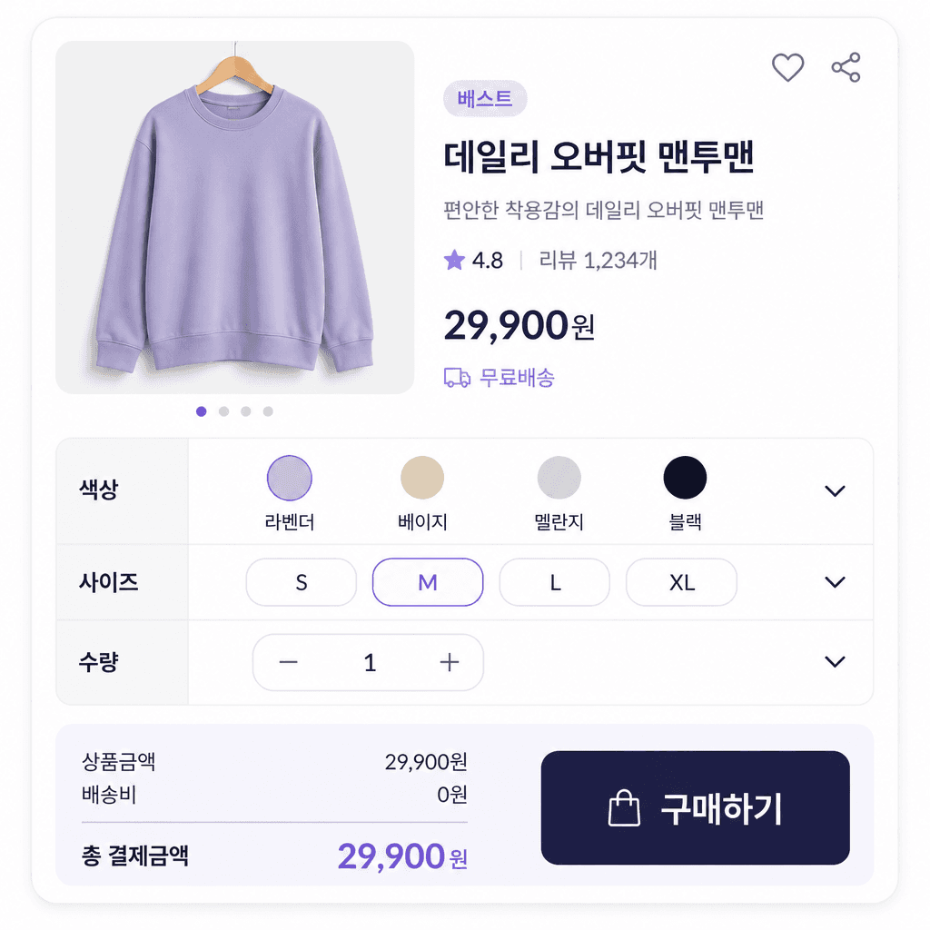
상세페이지 옵션표
What are product detail page option table AI prompts?
Product detail page option table AI prompts describe a shopping interface for choices such as color, size, configuration, quantity, and extra charges. As the number of variants grows, shoppers need to see which combination is selected and how price or availability changes. A useful prompt defines rows, columns, selection states, sold-out states, and the summary of the chosen options instead of asking for a generic table.
Common use cases
- Color and size selectors for apparel
- Configuration comparisons for furniture and home goods
- Weight and bundle choices for food products
- Add-on options with extra charges
- Purchase sections for mobile product pages
How to structure the result
Decide the order in which a customer should make choices. Put required options such as color and size first, then separate add-ons and quantities that affect the final price. Give option labels, selected states, sold-out states, extra charges, and the final summary distinct visual roles. On mobile, grouped cards and collapsible sections are often easier to scan than a wide grid. On desktop, wider columns can support direct comparison.
Prompt tips
Specify the product category, number of variants, screen format, brand colors, and button priority. Treat prices and stock counts as sample values until real data is inserted. Asking for both an unselected state and a completed selection state makes the concept easier to review. Because models may distort small table text and numbers, use generation to establish hierarchy and spacing, then finalize accurate copy and interaction details in a design tool.
Final checks
Never assume that generated prices, stock, shipping fees, discounts, or sold-out labels match a live store. Test every relevant combination, confirm that selected options reach the order form correctly, and check touch target size on mobile. Make sure states are not communicated by color alone and that long option labels remain readable.