
X Banner Design
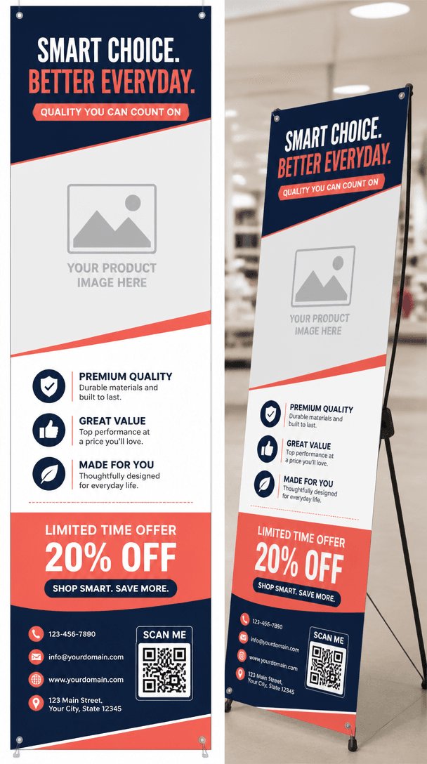
Create a vertical X-banner that keeps offers readable from a distance at store entrances and exhibition booths.
2026.07.15
「X Banner Design」を思いどおりに作りましょう自分だけの「X Banner Design」を作る
ふだんの言葉で伝えるだけで、Caratが最適な画像や動画を生成します。

毎日100クレジット無料で今すぐ始められます
X-Banner Design
What Is a X Banner Design AI Prompt?
Create a vertical X-banner that keeps offers readable from a distance at store entrances and exhibition booths. A useful prompt defines the main silhouette, expression or material, spacing, and background instead of naming the subject alone. These instructions give the image model a stable visual target and produce an asset that is easier to reuse.
Designing the Visual Language
Dividing headline, product visual, benefits, and QR area along a vertical flow keeps information clear in a narrow format. Sticker-style assets benefit from one focal subject, clean edges, restrained color, and enough negative space. Check the result at thumbnail size because fine details that look attractive at full resolution may disappear in chat or mobile interfaces.
Practical Uses
This format works for store openings, promotions, trade show booths, academy and clinic notices. Keep the core proportions and rendering rules fixed when building a set, then vary expression, accent color, or surface treatment. This method creates variety without losing visual consistency across channels.
Prompt Construction Tips
Set print dimensions and safe margins, and keep important information away from the lower area hidden by hardware. Describe lighting direction, surface texture, viewing angle, and background color with concrete terms. Avoid mixing conflicting art styles. After the first generation, lock the successful geometry and adjust only one variable at a time so you can identify what improved the result.
Related Prompt Ideas
Use neighboring themes to plan a coordinated asset family while keeping this topic visually distinct. Review the final image at its actual display size, confirm that the silhouette and focal detail survive reduction, and regenerate with wider padding or softer reflections if edges or highlights become distracting.
よくあるご質問
Store openings, promotions, trade show booths, academy and clinic notices.
Set print dimensions and safe margins, and keep important information away from the lower area hidden by hardware.
Dividing headline, product visual, benefits, and QR area along a vertical flow keeps information clear in a narrow format.
Ask for generous padding on a plain background so the asset is easy to crop and reuse.
Gallery prompts are free to copy, while generating an image requires credits.
A model such as GPT Image 2 is suitable because it can coordinate shape, material, and expression.
Lock the composition, then change only one variable such as expression, accent color, or gloss level per version.


