carat

프롬프트 갤러리

/

포트폴리오 디자인

로그인
회원가입

포트폴리오 디자인

AI로 제작하는 감각적인 포트폴리오 디자인 프롬프트 모음

2026.07.09

·
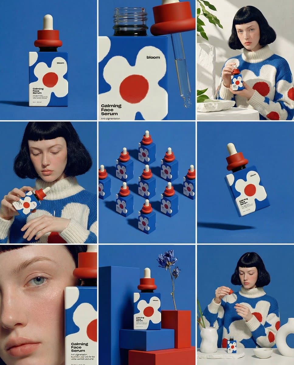
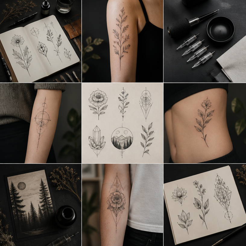
나노바나나 프로로 생성한 3x3 제품 스토리보드 목업

3x3 제품 스토리보드 목업

나노 바나나 프로· 이미지
Create ONE final image. A clean 3×3 [ratio] storyboard grid with nine equal [ratio] sized panels on [4:5] ratio. Use the reference image as the base product reference. Keep the same product, packaging design, branding, materials, colors, proportions and overall identity across all nine panels exactly as the reference. The product must remain clearly recognizable in every frame. The label, logo and proportions must stay exactly the same. This storyboard is a high-end designer mockup presentation for a branding portfolio. The focus is on form, composition, materiality and visual rhythm rather than realism or lifestyle narrative. The overall look should feel curated, editorial and design-driven. FRAME 1: Front-facing hero shot of the product in a clean studio setup. Neutral background, balanced composition, calm and confident presentation of the product. FRAME 2: Close-up shot with the focus centered on the middle of the product. Focusing on surface texture, materials and print details. FRAME 3: Shows the reference product placed in an environment that naturally fits the brand and product category. Studio setting inspired by the product design elements and colours. FRAME 4: Product shown in use or interaction on a neutral studio background. Hands and interaction elements are minimal and restrained, the look matches the style of the package. FRAME 5: Isometric composition showing multiple products arranged in a precise geometric order from the top isometric angle. All products are placed at the same isometric top angle, evenly spaced, clean, structured and graphic. FRAME 6: Product levitating slightly tilted on a neutral background that matches the reference image color palette. Floating position is angled and intentional, the product is floating naturally in space. FRAME 7: is an extreme close-up focusing on a specific detail of the label, edge, texture or material behavior. FRAME 8: The product in an unexpected yet aesthetically strong setting that feels bold, editorial and visually striking. Unexpected but highly stylized setting. Studio-based, and designer-driven. Bold composition that elevates the brand. FRAME 9: Wide composition showing the product in use, placed within a refined designer setup. Clean props, controlled styling, cohesive with the rest of the series. CAMERA & STYLE: Ultra high-quality studio imagery with a real camera look. Different camera angles and framings across frames. Controlled depth of field, precise lighting, accurate materials and reflections. Lighting logic, color palette, mood and visual language must remain consistent across all nine panels as one cohesive series. OUTPUT: A clean 3×3 grid with no borders, no text, no captions and no watermarks.17

@Dari_Designs
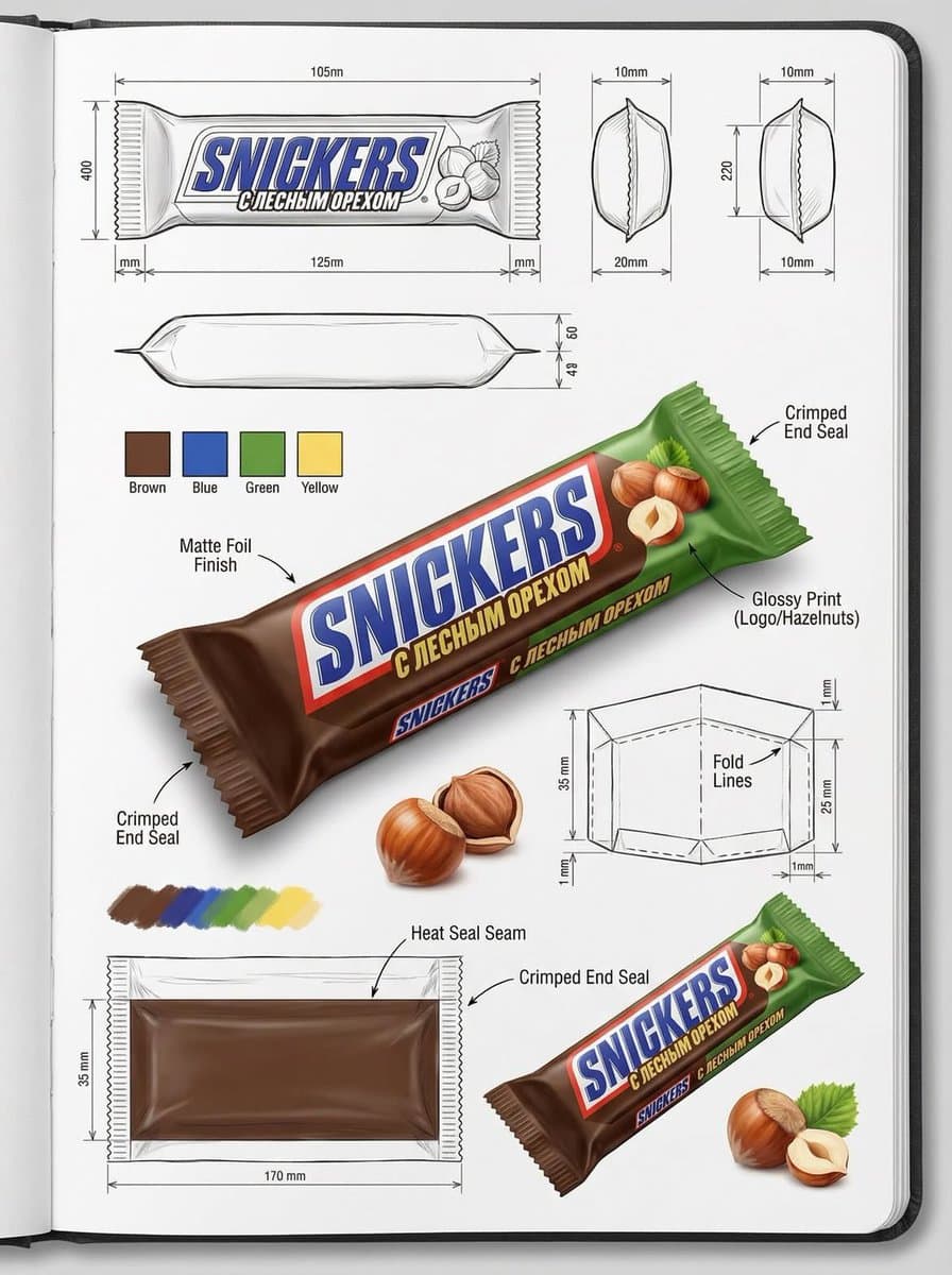
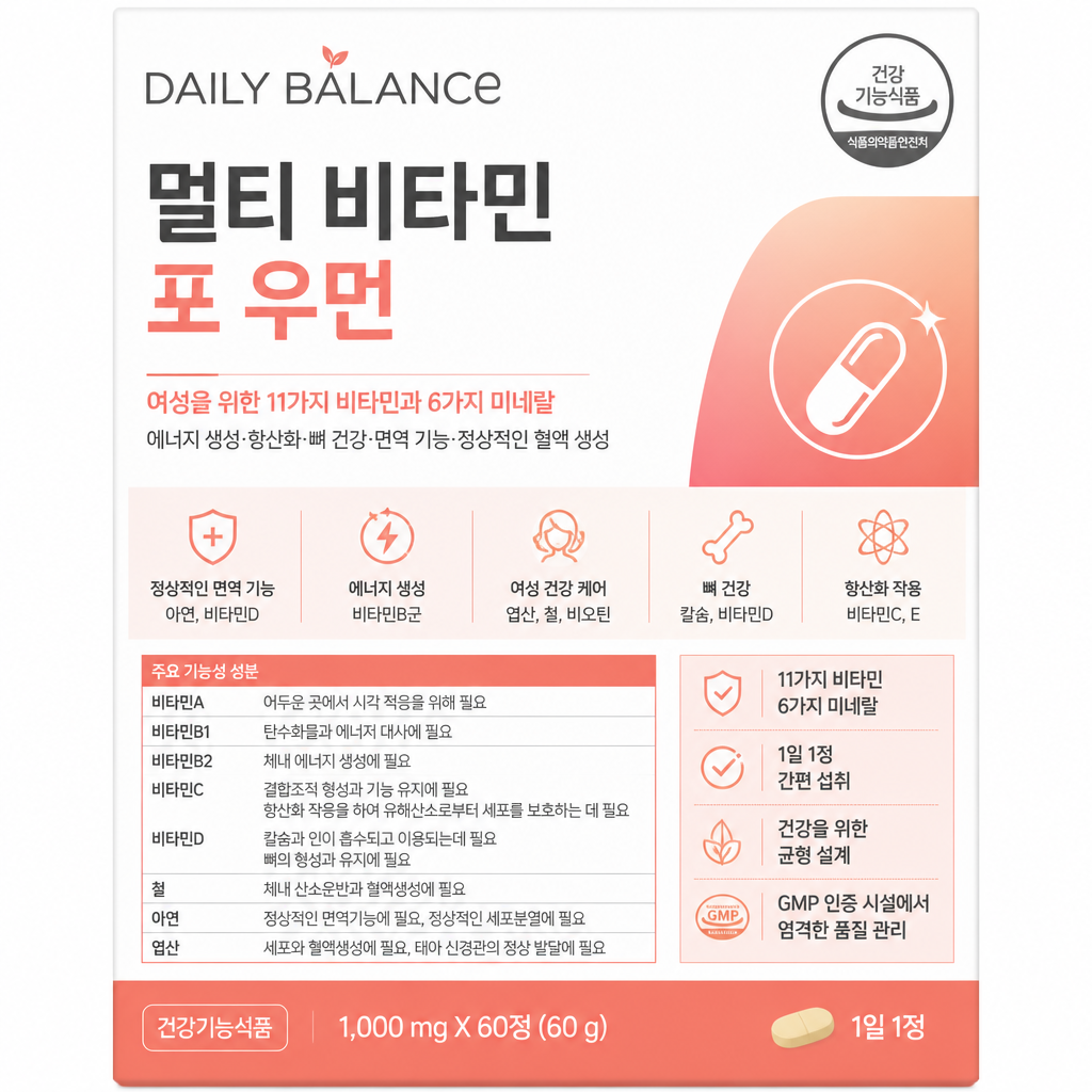
나노바나나 프로로 생성한 패키지 디자인 도면 시트

패키지 디자인 도면 시트

나노 바나나 프로· 이미지
Using the attached image, create an illustration sheet of professional industrial design packaging for the package (PACKAGE TYPE). A centered heroic 3D rendering with realistic materials, soft studio lighting and commercial quality finishes. Surrounded by technical views: front, side, top, bottom, oblique perspective and flat position. Include sketches of the frame structure, crease lines, seam details, and size arrows in millimeters. Show materials and finishes (matte, glossy print, plastic, paper, glass, etc.) in handwritten annotations. Add color swatches, realistic product illustrations, and subtle shadows. Clean sketchbook background, realistic rendering + pencil sketch style, modern design design, ultra-detailed, portfolio ready.
@gudanglifehack
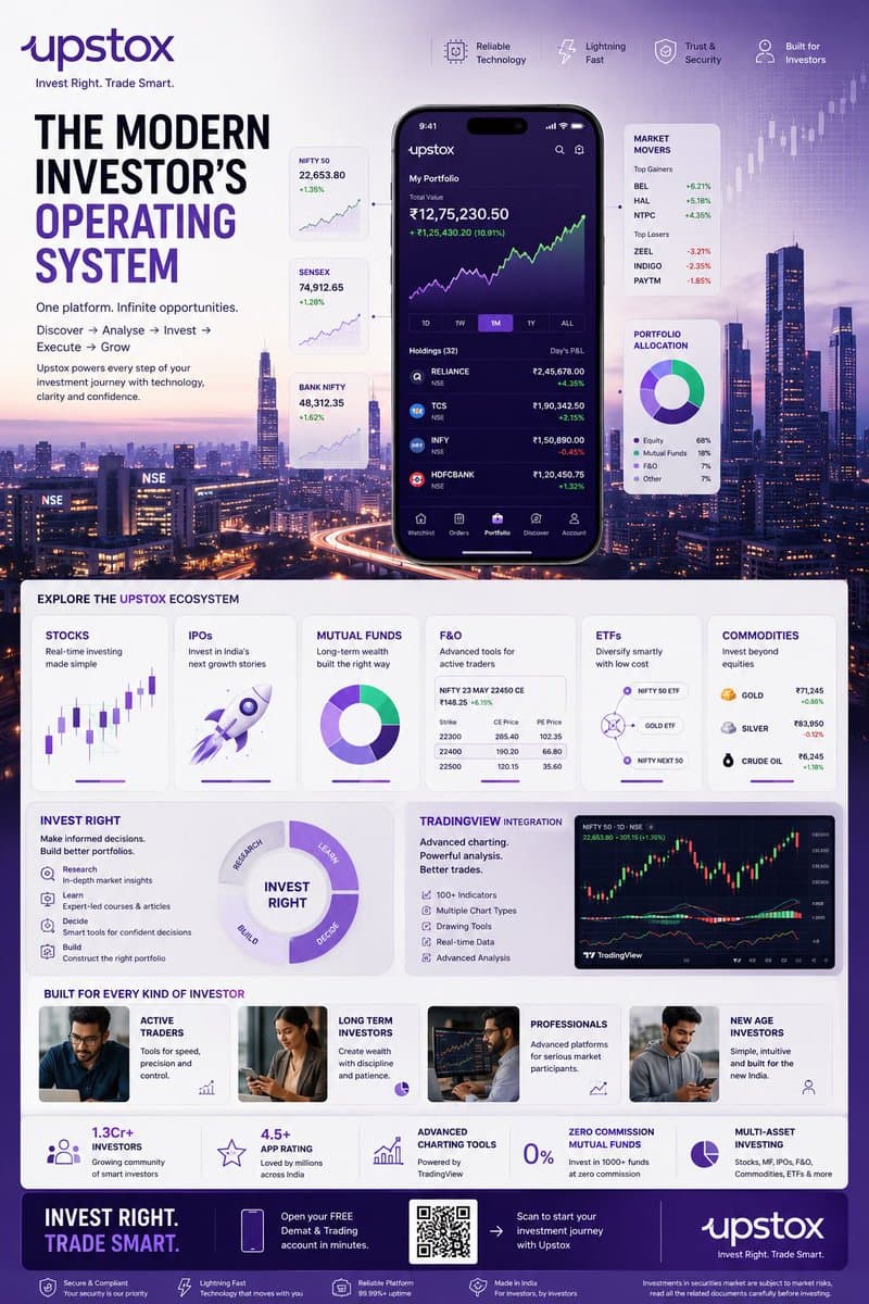
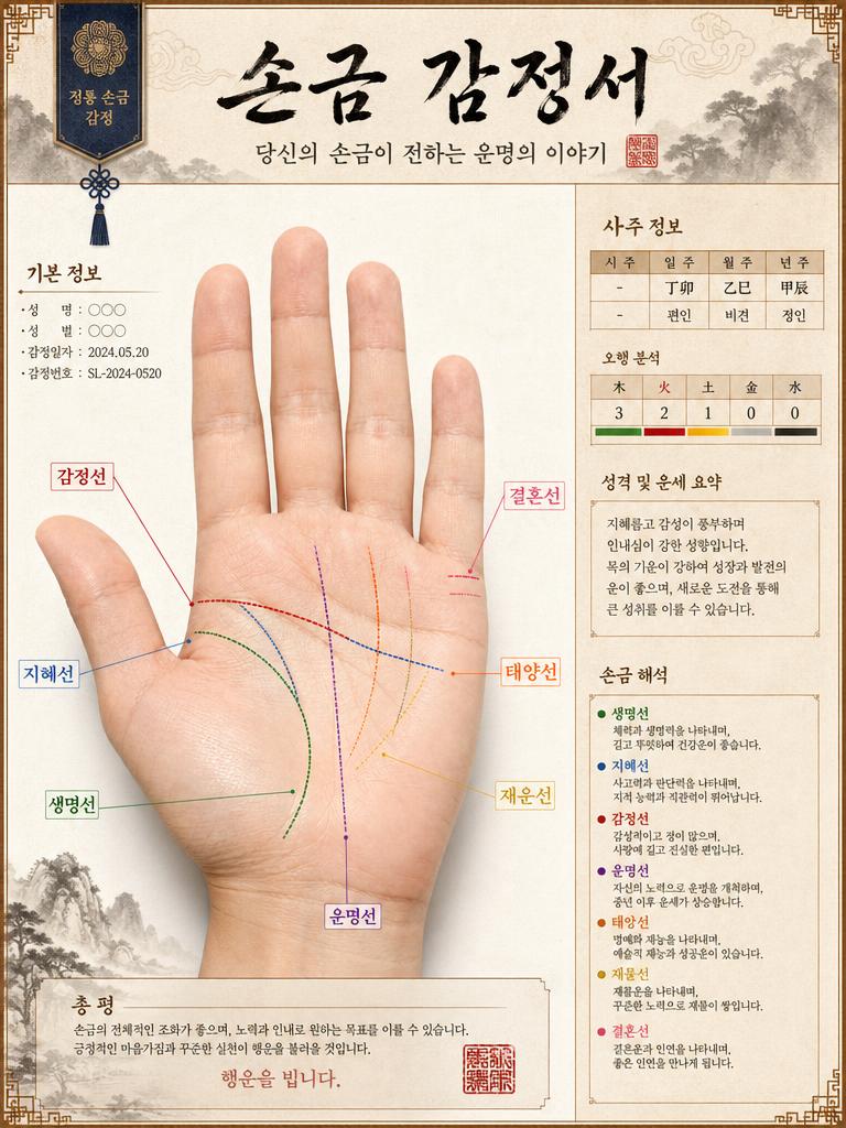
GPT 이미지 2로 생성한 핀테크 투자 인포그래픽 포스터

핀테크 투자 인포그래픽 포스터

GPT 이미지 2· 이미지
TOPIC: UPSTOX Create an ultra-premium vertical SMM infographic poster for Upstox, designed as a next-generation fintech editorial infographic focused on high-performance investing, intelligent execution, and modern wealth creation. The final design should feel like a fusion of: - Apple Pro Display aesthetics - TradingView interface design - Bloomberg editorial systems - Formula 1 telemetry dashboards - modern Indian investing culture - premium startup branding The design should visually communicate: "INVEST RIGHT. TRADE SMART." CORE CONCEPT: "THE MODERN INVESTOR'S OPERATING SYSTEM" The entire composition should visualize Upstox as the central financial platform powering every stage of investing. The visual narrative should show: DISCOVERY → ANALYSIS → INVESTMENT → EXECUTION → GROWTH Instead of showing random charts and holograms, show a highly structured financial workflow. Everything should feel: - fast - clean - capable - intelligent - efficient - trustworthy NOT chaotic. LAYOUT STYLE: Create a premium modular fintech editorial layout. Use: - floating investment modules - elegant information architecture - structured dashboard systems - large whitespace - asymmetrical composition - premium visual hierarchy The layout should resemble: a luxury financial operating system expanded into a collectible infographic poster. HERO VISUAL: Large central Upstox mobile ecosystem. NOT just a phone mockup. Instead: Create a layered financial command center. At center: large Upstox mobile interface surrounded by: - portfolio systems - investment cards - watchlists - market movers - growth indicators Everything connected through: clean directional pathways representing: the investing journey. BACKGROUND ENVIRONMENT: Beautiful Mumbai financial district atmosphere. Blue-hour cityscape. Subtle references to: - BKC - NSE energy - Indian capital markets Use: soft financial grid overlays thin trajectory lines minimal market architecture NO hologram overload. UPSTOX ECOSYSTEM MODULES: Create premium information cards: STOCKS Real-time investing Visual: clean chart interface IPOs Invest in India's next growth stories Visual: launch trajectory card MUTUAL FUNDS Long-term wealth building Visual: circular diversified portfolio system F&O Advanced trading Visual: structured options matrix ETFs Smart passive investing Visual: connected allocation system COMMODITIES Gold, energy, multi-asset exposure Visual: minimal commodity dashboard THE INVEST RIGHT SYSTEM Large premium section: INVEST RIGHT Visualize: - research - education - decision-making - portfolio building Show: investment clarity NOT gambling energy. TRADINGVIEW POWER MODULE Premium feature card: TradingView Integration Visual: - advanced charting - indicators - drawing tools - market analysis Use sophisticated chart aesthetics. MODERN INVESTOR SECTION Show: young Indian professionals builders creators investors market participants Use: realistic premium lifestyle photography NOT smiling stock-photo energy. The people should feel: ambitious, focused, future-oriented. QUICK STATS SYSTEM Elegant floating metric cards: 1.3Cr+ Investors 4.5+ App Rating Advanced Charting Tools Zero Commission Mutual Funds Multi-Asset Investing Present as: Apple-style information modules NOT corporate blocks. VISUAL KNOWLEDGE ELEMENTS Include: - portfolio allocation wheels - watchlists - market heatmaps - clean candlestick systems - growth trajectories - SIP growth curves - investment timelines - execution indicators Everything should feel: premium, minimal, professional. TYPOGRAPHY SYSTEM Use: large editorial sans-serif strong hierarchy minimal labels clean spacing Typography should resemble: Apple TradingView Stripe Bloomberg Weekend Avoid: techno fonts startup clichés crypto aesthetics COLOR SYSTEM Use actual Upstox-inspired identity: Primary: Deep Upstox Purple
@Diplomeme
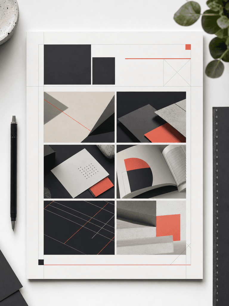
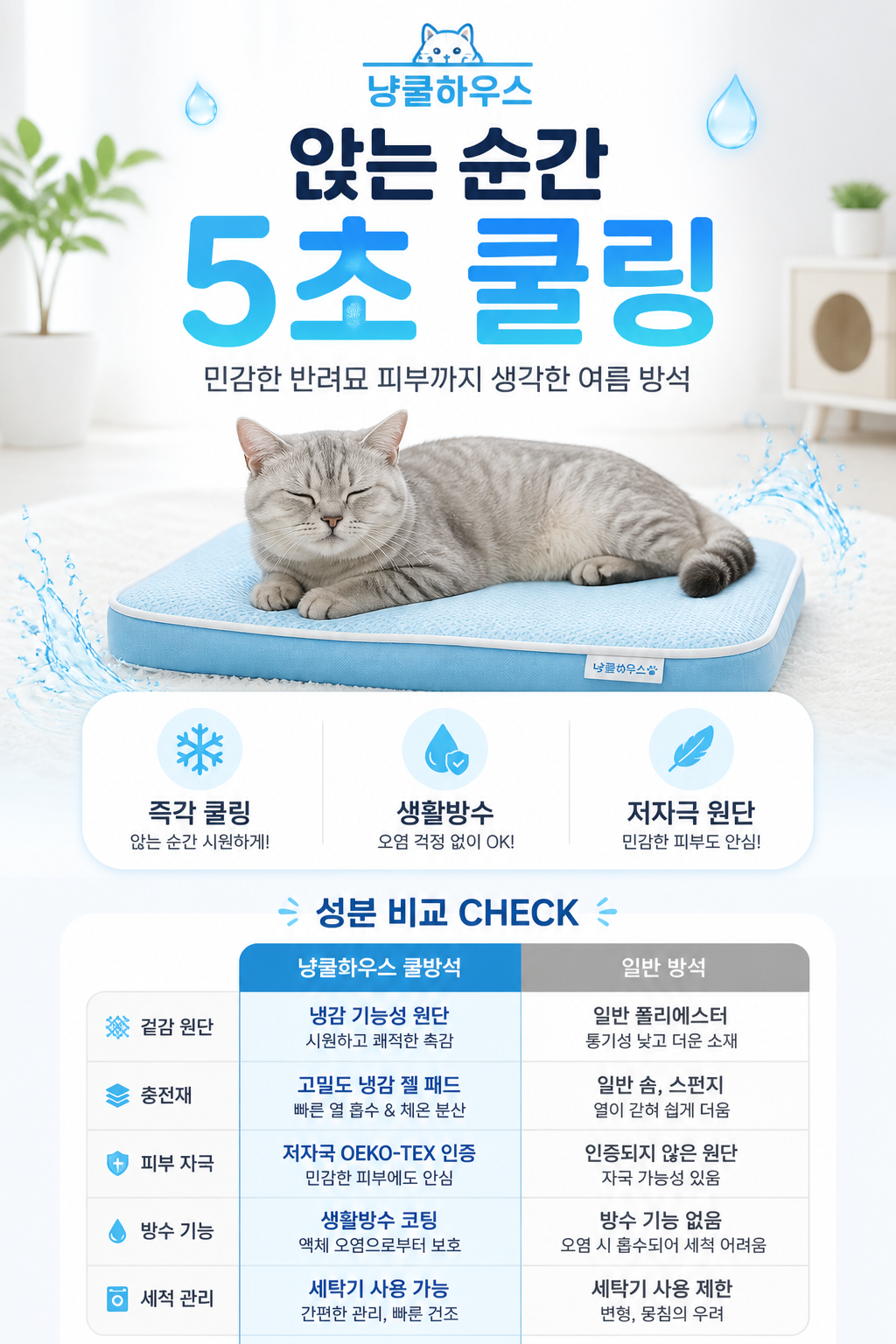
GPT 이미지 2로 생성한 모던 그리드 포트폴리오 커버

모던 그리드 포트폴리오 커버

GPT 이미지 2· 이미지
A modern portfolio cover page design viewed from directly above on a clean white desk. Grid-based layout with 6 rectangular image placeholders arranged in a 2x3 grid, each showing abstract design work snippets. Bold sans-serif header text area at top. Minimalist color palette of charcoal gray, soft white, and a single coral accent line. Thin geometric guide lines visible. Professional editorial design aesthetic, flat lay photography style with soft diffused natural lighting and subtle paper texture. No readable text, no watermark.

포트폴리오는 디자이너의 정체성을 보여주는 가장 중요한 수단입니다. 하지만 깔끔한 그리드 레이아웃, 시선을 끄는 커버 페이지, 효율적인 정보 구조를 갖춘 포트폴리오를 처음부터 만드는 것은 시간이 많이 드는 작업입니다. AI 이미지 생성 프롬프트를 활용하면 디자인 감각이 없어도 전문적인 포트폴리오 레이아웃을 빠르게 시도해볼 수 있습니다.

이 페이지에서는 GPT Image 2 기반의 포트폴리오 디자인 프롬프트를 제공합니다. 그리드형 커버 페이지, 스토리보드 목업, 패키지 디자인 도면, 인포그래픽 포스터 등 다양한 스타일의 프롬프트를 복사해서 바로 사용할 수 있습니다. 각 프롬프트는 조명, 구도, 컬러 팔레트, 레이아웃 구조를 구체적으로 지정하여 일관된 품질의 결과물을 얻도록 설계되었습니다.

포트폴리오 디자인 프롬프트를 사용할 때의 팁은 다음과 같습니다. 첫째, 자신의 전공 분야(그래픽 디자인, UX/UI, 제품 디자인 등)에 맞는 키워드를 프롬프트에 추가하면 더 맞춤화된 결과를 얻을 수 있습니다. 둘째, 컬러 팔레트를 자신의 브랜드 컬러로 교체하면 일관된 아이덴티티를 유지할 수 있습니다. 셋째, 이미지 비율을 출력 매체에 맞게 조절하세요. A4 인쇄용은 portrait_4_3, 웹용은 landscape_16_9가 적합합니다.

취업 준비생, 프리랜서 디자이너, 크리에이티브 에이전시 모두에게 유용한 프롬프트입니다. 특히 포트폴리오 리뉴얼을 고민하고 있다면, AI로 먼저 다양한 방향을 빠르게 테스트해보는 것을 추천합니다.

자주 묻는 질문

관련 프롬프트

패키지 디자인

패키지 디자인

프롬프트 36개

인포그래픽

인포그래픽

프롬프트 66개

상세페이지

상세페이지

프롬프트 70개

목업

목업

프롬프트 116개

캐럿 프롬프트 갤러리

지금 유행하는 AI 프롬프트를 바로 만들 수 있어요

프롬프트

  • 로고
  • PPT 디자인
  • 썸네일
  • 포스터
  • 웹소설 표지
  • 증명사진
  • 캐리커처
  • 상세페이지
  • 배너

모델

  • GPT 이미지 2
  • 씨댄스 2.0
  • 나노바나나 프로
  • 나노바나나 2

캐럿

  • 시작하기
  • 서비스 소개
  • 블로그
  • 채용
  • 문의
  • 파트너십
  • 이용약관
  • 개인정보 처리방침

© 2026 Paradot.Inc All rights reserved.