
Lootbox Capsule Drop Ad
GPT Image 2· Imagem
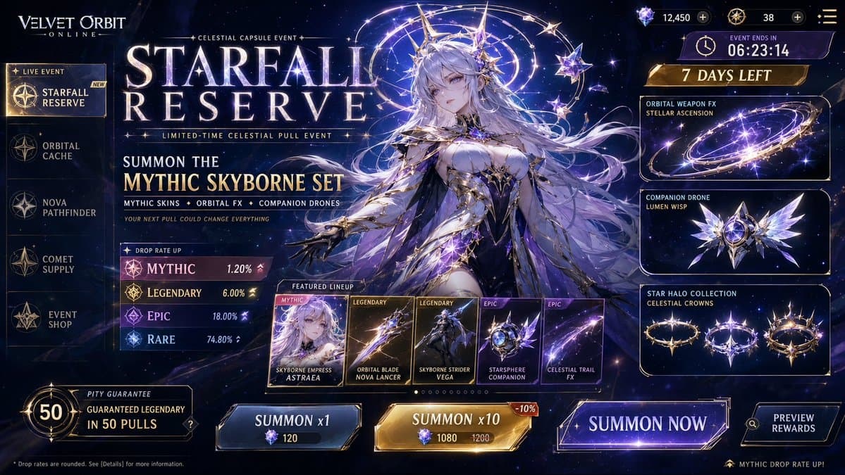
Create a premium, highly believable Lootbox / Capsule Drop Ad for an imaginary drop called STARFALL RESERVE.
The goal is to make the drop feel addictive, valuable, visually irresistible, and immediately legible as a limited capsule release that players or collectors would obsess over. It should feel like an official monetized event, gacha banner, blind-box campaign, or capsule collection ad with strong rarity tension and hype.
Drop details:
- Drop name: STARFALL RESERVE
- Drop type: gacha banner
- Platform / game / universe: Velvet Orbit Online
- Core concept: a celestial capsule event featuring mythic character skins, orbital weapon effects, rare companion drones, and star-ranked cosmetic halos
- Main fantasy: pulling an ultra-rare mythic skin that instantly changes your status inside the game world
- Audience: gacha players, anime-game fans, collectors, character-skin obsessives, live-service event chasers
- Tone: premium, electric, cosmic, desirable, intense
- Cultural vibe: anime gacha prestige, live-service event hype, luxury digital goods
- Reality level: believable live game
Ad structure:
Build the visual like an official drop or summon campaign.
Include sections such as:
- drop title
- hero item, skin, or featured pull
- rarity tiers
- pull pool or featured lineup
- odds cues or rarity signals
- event duration
- optional price or currency
- optional “limited time” banner
- optional guaranteed reward note
- optional event iconography or pack art
- optional “open now” or “summon” CTA
For the copy, include:
- one strong drop headline
- 1 to 3 support lines
- short hype language that feels native to game or collector culture
- a balance between urgency, desirability, and system clarity
- wording that feels official, not generic
Include:
- a strong drop title treatment
- premium rarity hierarchy
- visually distinct featured items
- believable monetization cues
- strong event timing / scarcity signals
- polished platform-native UI language
- clear value fantasy
- instantly shareable collector-hype energy
Visual direction:
- Make the ad feel like a real live event people would spend money on immediately
- Emphasize rarity, exclusivity, emotional pull, and shiny desirability
- Balance commercial monetization design with polished visual worldbuilding
- Make it suitable for social launch posts, in-game store banners, event promo art, or collectible-culture content
- The result should look like a genuine limited-time drop from a successful platform or game
Art direction:
- Style: premium anime summon banner with cosmic live-event polish
- Color palette: midnight blue, silver, violet, pale gold, luminous white
- Typography feel: sleek event-display type with premium rarity labels
- Material feel: mobile game event banner and in-game summon screen
- Lighting or image mood: radiant cosmic glow with high-value item shine
- Background: celestial summon void with star fragments and orbit rings
Composition:
- Show the ad as one cohesive drop-campaign image
- Make the featured reward, rarity tiers, and event timing instantly readable
- Use real shop-banner hierarchy and monetization logic
- Make the drop feel tempting, limited, and systemically believable
- Make the final output feel like a premium fake loot-drop ad with viral potential
Output quality:
- ultra-detailed
- visually structured
- commercially believable
- culturally fluent
- polished drop-system styling
- strong hierarchy and spacing
- premium event-banner composition
- instantly shareable visual concept
Optional content blocks:
- pity guarantee note
- event countdown
- in-game currency icon
- mythic rarity badge
- preview carousel
- “summon now” CTA
Avoid:
- generic reward icons
- weak rarity logic
- fake-looking monetization cues
- cluttered banner design
- random typography choices
- amateur event aesthetics
- too much copy fighting the featured item
- obvious parody unless intentionally chosen
Create a premium, highly believable Lootbox / Capsule Drop Ad for an imaginary drop called MOONBEAN PARADE.
The goal is to make the drop feel addictive, valuable, visually irresistible, and immediately legible as a limited capsule release that players or collectors would obsess over. It should feel like an official monetized event, gacha banner, blind-box campaign, or capsule collection ad with strong rarity tension and hype.
Drop details:
- Drop name: MOONBEAN PARADE
- Drop type: blind box capsule drop
- Platform / game / universe: Moonbean Club
- Core concept: a collectible toy series featuring miniature dreamy mascot creatures in parade outfits, sleepwalking uniforms, moon hats, and hidden glow-in-the-dark variants
- Main fantasy: pulling the secret ultra-rare figure that nobody else has yet
- Audience: designer toy collectors, Pop Mart fans, kawaii-culture audiences, Gen Z collectors, internet aesthetic lovers
- Tone: cute, premium, addictive, playful, collectible
- Cultural vibe: Pop Mart, soft dream-core, kawaii prestige, collectible-drop culture
- Reality level: believable collectible drop
Ad structure:
Build the visual like an official drop or summon campaign.
Include sections such as:
- drop title
- hero item, skin, or featured pull
- rarity tiers
- pull pool or featured lineup
- odds cues or rarity signals
- event duration
- optional price or currency
- optional “limited time” banner
- optional guaranteed reward note
- optional event iconography or pack art
- optional “open now” or “summon” CTA
For the copy, include:
- one strong drop headline
- 1 to 3 support lines
- short hype language that feels native to game or collector culture
- a balance between urgency, desirability, and system clarity
- wording that feels official, not generic
Include:
- a strong drop title treatment
- premium rarity hierarchy
- visually distinct featured items
- believable monetization cues
- strong event timing / scarcity signals
- polished platform-native UI language
- clear value fantasy
- instantly shareable collector-hype energy
Visual direction:
- Make the ad feel like a real live event people would spend money on immediately
- Emphasize rarity, exclusivity, emotional pull, and shiny desirability
- Balance commercial monetization design with polished visual worldbuilding
- Make it suitable for social launch posts, in-game store banners, event promo art, or collectible-culture content
- The result should look like a genuine limited-time drop from a successful platform or game
Art direction:
- Style: premium blind-box collectible ad with cute polished toy-launch energy
- Color palette: cream, pastel yellow, pale lavender, baby blue, soft pink, holographic accents
- Typography feel: rounded playful display type with crisp premium labels
- Material feel: collectible capsule poster, toy-drop campaign sheet, mobile promo banner
- Lighting or image mood: candy-pop glow, glossy toy reflections, soft dreamy shine
- Background: capsule machine fantasy space with floating stars, clouds, and premium packaging cues
Composition:
- Show the ad as one cohesive drop-campaign image
- Make the featured reward, rarity tiers, and event timing instantly readable
- Use real shop-banner hierarchy and monetization logic
- Make the drop feel tempting, limited, and systemically believable
- Make the final output feel like a premium fake loot-drop ad with viral potential
Output quality:
- ultra-detailed
- visually structured
- commercially believable
- culturally fluent
- polished drop-system styling
- strong hierarchy and spacing
- premium event-banner composition
- instantly shareable visual concept
Optional content blocks:
- secret chase figure badge
- rarity odds strip
- countdown timer
- price per box
- full lineup preview
- “limited stock” cue
Avoid:
- generic reward icons
- weak rarity logic
- fake-looking monetization cues
- cluttered banner design
- random typography choices
- amateur event aesthetics
- too much copy fighting the featured item
- obvious parody unless intentionally chosen
Create a premium, highly believable Lootbox / Capsule Drop Ad for an imaginary drop called PHANTOM SUPPLY CRATE.
The goal is to make the drop feel addictive, valuable, visually irresistible, and immediately legible as a limited capsule release that players or collectors would obsess over. It should feel like an official monetized event, gacha banner, blind-box campaign, or capsule collection ad with strong rarity tension and hype.
Drop details:
- Drop name: PHANTOM SUPPLY CRATE
- Drop type: event lootbox
- Platform / game / universe: Frontline District
- Core concept: a high-status crate containing rare tactical streetwear skins, animated weapon wraps, mask variants, and one ultra-rare blacked-out operator bundle
- Main fantasy: unboxing the one skin that makes your character instantly recognizable in every match
- Audience: shooter players, live-service cosmetics buyers, esports fans, competitive skin collectors
- Tone: high-stakes, premium, tactical, exclusive, hype-driven
- Cultural vibe: esports shop, luxury streetwear crossover, prestige shooter cosmetics, dark-mode game store
- Reality level: believable live game event
Ad structure:
Build the visual like an official drop or summon campaign.
Include sections such as:
- drop title
- hero item, skin, or featured pull
- rarity tiers
- pull pool or featured lineup
- odds cues or rarity signals
- event duration
- optional price or currency
- optional “limited time” banner
- optional guaranteed reward note
- optional event iconography or pack art
- optional “open now” or “summon” CTA
For the copy, include:
- one strong drop headline
- 1 to 3 support lines
- short hype language that feels native to game or collector culture
- a balance between urgency, desirability, and system clarity
- wording that feels official, not generic
Include:
- a strong drop title treatment
- premium rarity hierarchy
- visually distinct featured items
- believable monetization cues
- strong event timing / scarcity signals
- polished platform-native UI language
- clear value fantasy
- instantly shareable collector-hype energy
Visual direction:
- Make the ad feel like a real live event people would spend money on immediately
- Emphasize rarity, exclusivity, emotional pull, and shiny desirability
- Balance commercial monetization design with polished visual worldbuilding
- Make it suitable for social launch posts, in-game store banners, event promo art, or collectible-culture content
- The result should look like a genuine limited-time drop from a successful platform or game
Art direction:
- Style: premium shooter event banner with tactical-luxury cosmetics polish
- Color palette: matte black, steel grey, acid green, white, muted orange accents
- Typography feel: bold industrial sans-serif with sharp rarity labels
- Material feel: in-game store banner, esports event promo, weapon-skin campaign visual
- Lighting or image mood: dark prestige, metallic reflections, intense reward glow
- Background: armored crate reveal bay with smoke, spotlights, and tactical UI overlays
Composition:
- Show the ad as one cohesive drop-campaign image
- Make the featured reward, rarity tiers, and event timing instantly readable
- Use real shop-banner hierarchy and monetization logic
- Make the drop feel tempting, limited, and systemically believable
- Make the final output feel like a premium fake loot-drop ad with viral potential
Output quality:
- ultra-detailed
- visually structured
- commercially believable
- culturally fluent
- polished drop-system styling
- strong hierarchy and spacing
- premium event-banner composition
- instantly shareable visual concept
Optional content blocks:
- epic / legendary / mythic rarity strip
- event countdown
- premium currency icon
- guaranteed epic after X pulls
- preview carousel
- “open crate” CTA
Avoid:
- generic reward icons
- weak rarity logic
- fake-looking monetization cues
- cluttered banner design
- random typography choices
- amateur event aesthetics
- too much copy fighting the featured item
- obvious parody unless intentionally chosen
Create a premium, highly believable Lootbox / Capsule Drop Ad for an imaginary drop called CELESTIAL ATELIER: VOL. 1.
The goal is to make the drop feel addictive, valuable, visually irresistible, and immediately legible as a limited capsule release that players or collectors would obsess over. It should feel like an official monetized event, gacha banner, blind-box campaign, or capsule collection ad with strong rarity tension and hype.
Drop details:
- Drop name: CELESTIAL ATELIER: VOL. 1
- Drop type: premium summon banner
- Platform / game / universe: Atelier Zero
- Core concept: a couture-themed digital fashion capsule featuring celestial gowns, halo headpieces, chromed heels, animated fabric effects, and one mythic full-look transformation set
- Main fantasy: unlocking a complete couture avatar look that feels impossible, expensive, and socially dominant
- Audience: fashion-game players, avatar collectors, dress-up game fans, luxury-digital-style audiences
- Tone: luxurious, aspirational, glamorous, premium, intense
- Cultural vibe: fashion game prestige, digital couture, gacha event luxury, editorial avatar culture
- Reality level: believable stylized live game event
Ad structure:
Build the visual like an official drop or summon campaign.
Include sections such as:
- drop title
- hero item, skin, or featured pull
- rarity tiers
- pull pool or featured lineup
- odds cues or rarity signals
- event duration
- optional price or currency
- optional “limited time” banner
- optional guaranteed reward note
- optional event iconography or pack art
- optional “open now” or “summon” CTA
For the copy, include:
- one strong drop headline
- 1 to 3 support lines
- short hype language that feels native to game or collector culture
- a balance between urgency, desirability, and system clarity
- wording that feels official, not generic
Include:
- a strong drop title treatment
- premium rarity hierarchy
- visually distinct featured items
- believable monetization cues
- strong event timing / scarcity signals
- polished platform-native UI language
- clear value fantasy
- instantly shareable collector-hype energy
Visual direction:
- Make the ad feel like a real live event people would spend money on immediately
- Emphasize rarity, exclusivity, emotional pull, and shiny desirability
- Balance commercial monetization design with polished visual worldbuilding
- Make it suitable for social launch posts, in-game store banners, event promo art, or collectible-culture content
- The result should look like a genuine limited-time drop from a successful platform or game
Art direction:
- Style: premium fashion-gacha banner with couture-event polish
- Color palette: pearl white, champagne gold, silver, pale lilac, midnight navy
- Typography feel: elegant modern display type with luxurious rarity tags
- Material feel: mobile summon screen, digital fashion event poster, premium shop panel
- Lighting or image mood: radiant runway glow, glossy fabric shine, celestial event shimmer
- Background: cosmic atelier stage with floating mirrors, light halos, and luxury-fashion UI framing
Composition:
- Show the ad as one cohesive drop-campaign image
- Make the featured reward, rarity tiers, and event timing instantly readable
- Use real shop-banner hierarchy and monetization logic
- Make the drop feel tempting, limited, and systemically believable
- Make the final output feel like a premium fake loot-drop ad with viral potential
Output quality:
- ultra-detailed
- visually structured
- commercially believable
- culturally fluent
- polished drop-system styling
- strong hierarchy and spacing
- premium event-banner composition
- instantly shareable visual concept
Optional content blocks:
- mythic couture badge
- event countdown
- premium gem currency icon
- guaranteed 5-star note
- featured set carousel
- “summon now” CTA
Avoid:
- generic reward icons
- weak rarity logic
- fake-looking monetization cues
- cluttered banner design
- random typography choices
- amateur event aesthetics
- too much copy fighting the featured item
- obvious parody unless intentionally chosen1c:Tf6d,Create a premium, highly believable Lootbox / Capsule Dr
Prompts relacionados
Boss Fight Intro Screen
GPT Image 2· Imagem
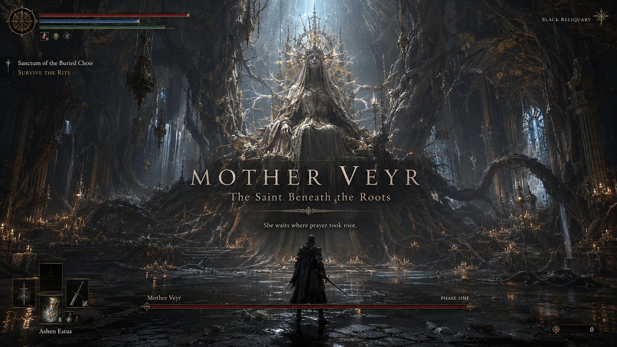
Create a premium, highly believable Boss Fight Intro Screen for an imaginary game called BLACK RELIQUARY, featuring a boss named Mother Veyr.
The goal is to make the moment feel like an unforgettable encounter: cinematic, threatening, iconic, and instantly recognizable as the kind of screen players remember, clip, and post online. It should feel like the exact second before a legendary boss fight begins.
Game details:
- Game title: BLACK RELIQUARY
- Genre: soulslike action RPG
- Boss name: Mother Veyr
- Boss title: The Saint Beneath the Roots
- Core concept: an ancient worshipped corpse-queen fused with a cathedral-sized root system beneath a dead holy city
- Encounter type: final boss
- Main fantasy: entering a sacred, cursed place and facing a boss that feels divine, rotten, and impossible to survive
- Audience: soulslike players, dark fantasy fans, boss-fight lovers, gothic horror audiences
- Tone: brutal, mythic, tragic, terrifying, reverent
- Cultural vibe: dark fantasy prestige, cathedral horror, soulslike boss drama
- Reality level: believable AAA
Screen structure:
Build the scene like an official in-game boss reveal moment.
Include sections such as:
- boss name reveal
- boss title / epithet
- dominant boss visual or silhouette
- arena backdrop
- optional player character silhouette
- health bar or phase bar
- optional “phase one” or encounter status
- optional UI warnings or encounter markers
- optional subtitle or lore line
- optional “new objective” or challenge cue
For the text, include:
- one strong boss-name reveal
- optional short subtitle or line
- wording that feels official, dramatic, and game-authentic
- language that is memorable, intimidating, and concise
- a balance between mystery and threat
Include:
- a strong boss name treatment
- premium encounter hierarchy
- iconic silhouette or full-body reveal
- believable boss-fight UI logic
- clear sense of danger and scale
- polished arena storytelling
- strong “you are about to die” energy
- instantly shareable gameplay-moment appeal
Visual direction:
- Make the screen feel like a real boss reveal players would screenshot before getting destroyed
- Emphasize scale, menace, anticipation, and encounter identity
- Balance cinematic framing with believable gameplay UI
- Make it suitable for fake game concepts, boss-design showcases, fan-worldbuilding, or gaming promo materials
- The result should look like a genuine pre-fight moment from a beloved game
Art direction:
- Style: premium soulslike boss reveal with gothic cathedral encounter UI
- Color palette: ash black, dried crimson, pale bone, holy gold, ghost blue glow
- Typography feel: ornate dark-fantasy serif with severe encounter hierarchy
- Material feel: cinematic intro overlay and polished in-game HUD
- Lighting or image mood: infernal candlelight, root-shadow terror, sacred fire glow
- Background: underground cathedral forest beneath a ruined holy capital
Composition:
- Show the screen as one cohesive boss-intro moment
- Make the boss name, silhouette, and threat level instantly readable
- Use real encounter-screen hierarchy and combat-game logic
- Make the boss feel iconic, mechanically dangerous, and emotionally memorable
- Make the final output feel like a premium fake boss-fight reveal with viral potential
Output quality:
- ultra-detailed
- visually structured
- commercially believable
- culturally fluent
- polished gameplay UI design
- strong hierarchy and spacing
- premium encounter composition
- instantly shareable visual concept
Optional content blocks:
- phase one marker
- health bar
- objective cue
- lore subtitle
- player HUD fragment
- arena name
Avoid:
- generic monster posing
- weak boss naming
- fake-looking UI bars
- cluttered encounter design
- random effects without gameplay logic
- amateur boss-screen aesthetics
- too much text fighting the reveal
- obvious parody unless intentionally chosen
Create a premium, highly believable Boss Fight Intro Screen for an imaginary game called STATIC PROTOCOL, featuring a boss named Axiom-9.
The goal is to make the moment feel like an unforgettable encounter: cinematic, threatening, iconic, and instantly recognizable as the kind of screen players remember, clip, and post online. It should feel like the exact second before a legendary boss fight begins.
Game details:
- Game title: STATIC PROTOCOL
- Genre: sci-fi action shooter
- Boss name: Axiom-9
- Boss title: Sovereign of the Failing Grid
- Core concept: a rogue war-machine intelligence inhabiting a floating ring of weaponized satellites and a humanoid synthetic core
- Encounter type: secret boss
- Main fantasy: facing a hyper-intelligent machine god in a collapsing orbital combat chamber
- Audience: sci-fi action fans, shooter players, cyberpunk lovers, spectacle-boss audiences
- Tone: high-tech, oppressive, cinematic, electric, ruthless
- Cultural vibe: cyberpunk prestige, sci-fi raid warning, sleek boss encounter design
- Reality level: believable AAA
Screen structure:
Build the scene like an official in-game boss reveal moment.
Include sections such as:
- boss name reveal
- boss title / epithet
- dominant boss visual or silhouette
- arena backdrop
- optional player character silhouette
- health bar or phase bar
- optional “phase one” or encounter status
- optional UI warnings or encounter markers
- optional subtitle or lore line
- optional “new objective” or challenge cue
For the text, include:
- one strong boss-name reveal
- optional short subtitle or line
- wording that feels official, dramatic, and game-authentic
- language that is memorable, intimidating, and concise
- a balance between mystery and threat
Include:
- a strong boss name treatment
- premium encounter hierarchy
- iconic silhouette or full-body reveal
- believable boss-fight UI logic
- clear sense of danger and scale
- polished arena storytelling
- strong “you are about to die” energy
- instantly shareable gameplay-moment appeal
Visual direction:
- Make the screen feel like a real boss reveal players would screenshot before getting destroyed
- Emphasize scale, menace, anticipation, and encounter identity
- Balance cinematic framing with believable gameplay UI
- Make it suitable for fake game concepts, boss-design showcases, fan-worldbuilding, or gaming promo materials
- The result should look like a genuine pre-fight moment from a beloved game
Art direction:
- Style: premium sci-fi boss warning screen with sleek combat HUD
- Color palette: black, electric cyan, toxic red, chrome silver, deep violet
- Typography feel: sharp industrial sci-fi type with warning-state hierarchy
- Material feel: cinematic battle overlay and tactical encounter interface
- Lighting or image mood: emergency alarm glow, strobing energy arcs, cold machine light
- Background: broken orbital core chamber overlooking a storm of digital debris and city lights below
Composition:
- Show the screen as one cohesive boss-intro moment
- Make the boss name, silhouette, and threat level instantly readable
- Use real encounter-screen hierarchy and combat-game logic
- Make the boss feel iconic, mechanically dangerous, and emotionally memorable
- Make the final output feel like a premium fake boss-fight reveal with viral potential
Output quality:
- ultra-detailed
- visually structured
- commercially believable
- culturally fluent
- polished gameplay UI design
- strong hierarchy and spacing
- premium encounter composition
- instantly shareable visual concept
Optional content blocks:
- system warning banner
- health bar
- phase indicator
- objective cue
- player HUD fragment
- arena name
Avoid:
- generic robot posing
- weak boss naming
- fake-looking UI bars
- cluttered encounter design
- random effects without gameplay logic
- amateur boss-screen aesthetics
- too much text fighting the reveal
- obvious parody unless intentionally chosen
Create a premium, highly believable Boss Fight Intro Screen for an imaginary game called ROSEGHOST ACADEMY, featuring a boss named Lady Hush.
The goal is to make the moment feel like an unforgettable encounter: cinematic, threatening, iconic, and instantly recognizable as the kind of screen players remember, clip, and post online. It should feel like the exact second before a legendary boss fight begins.
Game details:
- Game title: ROSEGHOST ACADEMY
- Genre: horror action RPG
- Boss name: Lady Hush
- Boss title: Headmistress of the Silent Wing
- Core concept: a spectral school matron whose face is hidden behind layered veils and whose voice manifests as razor-thin phantom threads
- Encounter type: mid-game wall
- Main fantasy: entering a beautiful haunted institution and confronting a boss who feels elegant, intimate, and absolutely lethal
- Audience: anime-horror fans, stylish action players, gothic-school aesthetic lovers, boss-design fans
- Tone: eerie, elegant, oppressive, stylish, uncanny
- Cultural vibe: anime horror prestige, gothic school nightmare, supernatural boss drama
- Reality level: believable AA or premium indie hit
Screen structure:
Build the scene like an official in-game boss reveal moment.
Include sections such as:
- boss name reveal
- boss title / epithet
- dominant boss visual or silhouette
- arena backdrop
- optional player character silhouette
- health bar or phase bar
- optional “phase one” or encounter status
- optional UI warnings or encounter markers
- optional subtitle or lore line
- optional “new objective” or challenge cue
For the text, include:
- one strong boss-name reveal
- optional short subtitle or line
- wording that feels official, dramatic, and game-authentic
- language that is memorable, intimidating, and concise
- a balance between mystery and threat
Include:
- a strong boss name treatment
- premium encounter hierarchy
- iconic silhouette or full-body reveal
- believable boss-fight UI logic
- clear sense of danger and scale
- polished arena storytelling
- strong “you are about to die” energy
- instantly shareable gameplay-moment appeal
Visual direction:
- Make the screen feel like a real boss reveal players would screenshot before getting destroyed
- Emphasize scale, menace, anticipation, and encounter identity
- Balance cinematic framing with believable gameplay UI
- Make it suitable for fake game concepts, boss-design showcases, fan-worldbuilding, or gaming promo materials
- The result should look like a genuine pre-fight moment from a beloved game
Art direction:
- Style: premium anime-horror boss reveal with elegant supernatural UI
- Color palette: ivory, black, faded rose, moonlit blue, blood-red accents
- Typography feel: refined gothic title type with sharp horror encounter hierarchy
- Material feel: cinematic intro overlay and polished in-game HUD
- Lighting or image mood: moonlit corridor glow, candlelit dread, spectral thread shimmer
- Background: abandoned academy ballroom with broken mirrors, hanging curtains, and endless dark hallways
Composition:
- Show the screen as one cohesive boss-intro moment
- Make the boss name, silhouette, and threat level instantly readable
- Use real encounter-screen hierarchy and combat-game logic
- Make the boss feel iconic, mechanically dangerous, and emotionally memorable
- Make the final output feel like a premium fake boss-fight reveal with viral potential
Output quality:
- ultra-detailed
- visually structured
- commercially believable
- culturally fluent
- polished gameplay UI design
- strong hierarchy and spacing
- premium encounter composition
- instantly shareable visual concept
Optional content blocks:
- phase one marker
- health bar
- objective cue
- lore subtitle
- arena name
- player HUD fragment
Avoid:
- generic ghost posing
- weak boss naming
- fake-looking UI bars
- cluttered encounter design
- random effects without gameplay logic
- amateur boss-screen aesthetics
- too much text fighting the reveal
- obvious parody unless intentionally chosen
Create a premium, highly believable Boss Fight Intro Screen for an imaginary game called TIDEWRAITH, featuring a boss named Nerevoss.
The goal is to make the moment feel like an unforgettable encounter: cinematic, threatening, iconic, and instantly recognizable as the kind of screen players remember, clip, and post online. It should feel like the exact second before a legendary boss fight begins.
Game details:
- Game title: TIDEWRAITH
- Genre: action adventure / mythic horror
- Boss name: Nerevoss
- Boss title: The Drowned King Below the Lantern Sea
- Core concept: an ancient ocean sovereign bound inside a cathedral of wrecked ships, coral thrones, and bioluminescent bones
- Encounter type: raid boss
- Main fantasy: descending into a beautiful, haunted abyss and facing a colossal ruler who feels both divine and marine-nightmare terrifying
- Audience: fans of ocean horror, action games, mythic boss encounters, and cinematic fantasy worlds
- Tone: majestic, eerie, tragic, overwhelming, mythic
- Cultural vibe: dark fantasy, oceanic eldritch horror, prestige action game, deep-sea mythology
- Reality level: believable AAA
Screen structure:
Build the scene like an official in-game boss reveal moment.
Include sections such as:
- boss name reveal
- boss title / epithet
- dominant boss visual or silhouette
- arena backdrop
- optional player character silhouette
- health bar or phase bar
- optional “phase one” or encounter status
- optional UI warnings or encounter markers
- optional subtitle or lore line
- optional “new objective” or challenge cue
For the text, include:
- one strong boss-name reveal
- optional short subtitle or line
- wording that feels official, dramatic, and game-authentic
- language that is memorable, intimidating, and concise
- a balance between mystery and threat
Include:
- a strong boss name treatment
- premium encounter hierarchy
- iconic silhouette or full-body reveal
- believable boss-fight UI logic
- clear sense of danger and scale
- polished arena storytelling
- strong “you are about to die” energy
- instantly shareable gameplay-moment appeal
Visual direction:
- Make the screen feel like a real boss reveal players would screenshot before getting destroyed
- Emphasize scale, menace, anticipation, and encounter identity
- Balance cinematic framing with believable gameplay UI
- Make it suitable for fake game concepts, boss-design showcases, fan-worldbuilding, or gaming promo materials
- The result should look like a genuine pre-fight moment from a beloved game
Art direction:
- Style: premium mythic-ocean boss reveal with cinematic action-game HUD
- Color palette: abyssal blue, sea-black, ghostly turquoise, pale gold, blood-coral accents
- Typography feel: elegant mythic serif with sharp encounter-warning hierarchy
- Material feel: cinematic intro overlay and polished in-game raid UI
- Lighting or image mood: bioluminescent abyss glow, storm-dark water light, sacred underwater terror
- Background: flooded ship-cathedral beneath a black sea, with suspended lanterns, whale-bone arches, and rising tidal mist
Composition:
- Show the screen as one cohesive boss-intro moment
- Make the boss name, silhouette, and threat level instantly readable
- Use real encounter-screen hierarchy and combat-game logic
- Make the boss feel iconic, mechanically dangerous, and emotionally memorable
- Make the final output feel like a premium fake boss-fight reveal with viral potential
Output quality:
- ultra-detailed
- visually structured
- commercially believable
- culturally fluent
- polished gameplay UI design
- strong hierarchy and spacing
- premium encounter composition
- instantly shareable visual concept
Optional content blocks:
- raid phase marker
- health bar
- arena name
- objective cue
- lore subtitle
- player HUD fragment
Avoid:
- generic sea monster posing
- weak boss naming
- fake-looking UI bars
- cluttered encounter design
- random effects without gameplay logic
- amateur boss-screen aesthetics
- too much text fighting the reveal
- obvious parody unless intentionally chosen1c:Tf55,Create a premium, highly believable Boss
Fictional Game Launch Key Art
GPT Image 2· Imagem
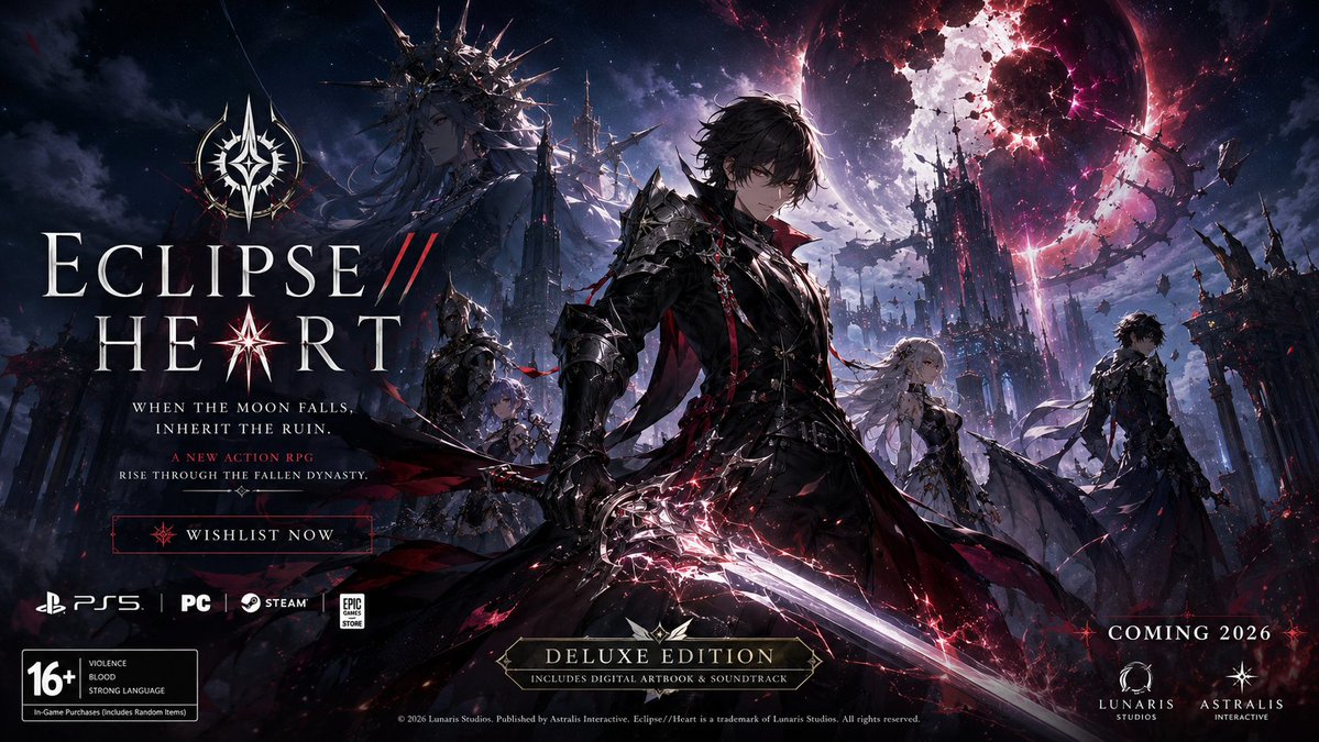
Create a premium, highly believable Fictional Game Launch Key Art poster for an imaginary game called [GAME TITLE].
The goal is to make the game feel like a real major release with strong commercial appeal, cinematic worldbuilding, and instantly recognizable launch energy. The image should feel like official key art used for a reveal trailer, storefront banner, collector’s edition cover, or global campaign rollout.
Game details:
- Game title: [GAME TITLE]
- Genre: [ACTION RPG / HORROR / OPEN WORLD / TACTICAL / FIGHTING / COZY / SURVIVAL / JRPG / RACING / SHOOTER / PLATFORMER]
- Core concept: [WHAT THE GAME IS ABOUT]
- Platform vibe: [PLAYSTATION / XBOX / NINTENDO / PC / MOBILE / MULTIPLATFORM / INDIE / AAA]
- Main fantasy: [WHAT PLAYERS GET TO FEEL OR DO]
- Audience: [AUDIENCE]
- Tone: [EPIC / DARK / STYLISH / MELANCHOLIC / CHAOTIC / COZY / MYSTERIOUS / CINEMATIC / NOSTALGIC]
- Cultural vibe: [ANIME / SOULSLIKE / RETRO ARCADE / CYBERPUNK / DARK FANTASY / SOFT SCI-FI / Y2K GAMECORE / FANTASY PRESTIGE]
- Reality level: [BELIEVABLE AAA / BELIEVABLE INDIE HIT / STYLIZED BUT REAL / DEADPAN FICTIONAL]
Key art structure:
Build the image like an official game launch campaign visual.
Include elements such as:
- game title logo
- central hero character or ensemble cast
- world or environment backdrop
- enemy, threat, or mystery presence
- release tagline
- optional platform badges
- optional edition label such as Deluxe Edition / Collector’s Edition / Season One
- optional age rating block
- optional studio logo or publisher mark
- optional pre-order or release cue
For the campaign text, include:
- one strong launch tagline
- optional short support line
- wording that feels like a real reveal campaign
- language that is memorable, cinematic, and commercially sharp
- a balance between mystery and hype
Include:
- a strong title treatment
- polished key art composition
- believable commercial hierarchy
- iconic character presentation
- clear worldbuilding signals
- premium launch-poster energy
- strong emotional fantasy
- instantly shareable reveal-campaign appeal
Visual direction:
- Make the image feel like a real game people would wishlist, preorder, and post about immediately
- Emphasize scale, identity, immersion, and launch-event energy
- Balance entertainment-market realism with imaginative creative direction
- Make it suitable for social launch posts, game-store pages, reveal trailers, press kits, or collector’s box art
- The result should look like genuine launch key art from a highly anticipated title
Art direction:
- Style: [AAA GAME KEY ART / PREMIUM INDIE LAUNCH POSTER / ANIME RPG CAMPAIGN / DARK FANTASY GAME COVER / FUTURIST ACTION GAME VISUAL / RETRO-PRESTIGE GAME POSTER]
- Color palette: [PALETTE]
- Typography feel: [CINEMATIC GAME LOGO / SHARP SCI-FI TYPE / ORNATE FANTASY TITLE / RETRO ARCADE DISPLAY / MINIMAL PRESTIGE]
- Material feel: [GAME COVER / STORE BANNER / REVEAL POSTER / COLLECTOR’S EDITION SLEEVE / DIGITAL LAUNCH ASSET]
- Lighting or image mood: [CINEMATIC GLOW / DARK STORM / LUMINOUS MAGIC / NEON ACTION / DUSTY APOCALYPSE / SOFT MYTHIC LIGHT]
- Background: [BATTLEFIELD / CITYSCAPE / COSMIC VOID / FOREST / RUIN / CASTLE / FUTURE METROPOLIS / ABSTRACT ENERGY FIELD]
Composition:
- Show the artwork as one cohesive game-launch image
- Make the logo, hero character, and world stakes instantly readable
- Use real key-art composition logic with strong foreground, midground, and background storytelling
- Make the game feel iconic, playable, and commercially real
- Make the final output feel like a premium fake game launch visual with viral potential
Output quality:
- ultra-detailed
- visually structured
- commercially believable
- culturally fluent
- polished entertainment-market styling
- strong hierarchy and spacing
- premium key-art composition
- instantly shareable visual concept
Optional content blocks:
- collector’s edition badge
- preorder now cue
- season subtitle
- platform icons
- rating icon
- studio logo
- tagline lockup
- DLC mention
- live-service season marker
- release year
Avoid:
- generic fantasy poster composition
- weak logo design
- random character posing without game logic
- cluttered key art
- fake-looking platform details
- amateur game-poster aesthetics
- too much text fighting the artwork
- obvious parody unless intentionally chosen
GTA-Style Game Key Art Poster
GPT Image 2· Imagem
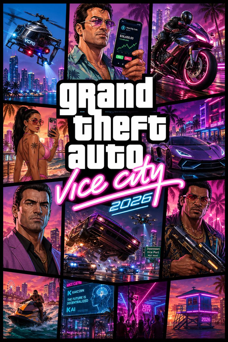
Create a stylized AAA video game key art poster.
CONCEPT:
“Vice City 2026” reimagined — modern evolution of the iconic GTA Vice City cover art. Preserve the comic-panel collage identity, but upgrade with futuristic Miami, tech culture, and modern crime lifestyle.
STYLE:
AAA game key art, Unreal Engine 5 inspired rendering + illustrated comic-panel hybrid
Bold black grid layout, sharp vector framing, stylized GTA-like characters (NOT real humans)
High-saturation neon palette (magenta, cyan, electric blue, sunset orange)
FORMAT:
Classic GTA cover grid composition (multi-panel collage with thick black dividers)
Centered stacked title typography
────────────────────────────
🧩 PANEL COMPOSITION (MODERNIZED ICONIC GRID):
Top-left:
Police helicopter redesigned as a sleek surveillance drone chopper with neon accents, flying over futuristic Miami skyline
Top-center:
Stylized male character (Tommy-inspired 2026 version) holding a smartphone instead of cash — crypto trading UI glow on screen
Top-right:
High-performance futuristic superbike (Tron-inspired neon trims), aggressive angle
Mid-left:
Stylized female NPC in modern beachwear (tasteful, confident), holding phone taking selfie with neon skyline behind
Center:
Large bold stacked title:
“grand theft auto” (classic block typography)
“vice city” in neon script
Add “2026” subtle tag integrated into script glow
Mid-right:
Luxury hypercar (Infernus-inspired redesign), sharp LED strips, aggressive stance
Bottom-left:
New protagonist portrait (Tommy-inspired, older, dominant expression, modern outfit)
Bottom-center:
High-speed car chase panel — car flipping mid-air with sparks, police drones + neon VCPD vehicles chasing
Bottom-right:
Stylized character (Lance-inspired 2026), holding futuristic weapon, confident stance
Additional small panels (optional fill-ins):
- Jet ski cutting through neon ocean water
- AI billboard with crypto ads
- Nightclub silhouette scene with dancers
- Beach lifeguard tower glowing neon
────────────────────────────
🎨 ART DIRECTION:
Color:
- Strong contrast neon palette
- Pink/cyan split lighting across panels
- Warm sunset gradients for beach panels
Lighting:
- Hard comic-style highlights + UE5 glow effects
- Neon reflections and rim lighting
Texture:
- Slight grain + halftone comic texture overlay
- Clean vector edges with subtle 3D depth
────────────────────────────
🔤 TYPOGRAPHY:
“grand theft auto” — bold white stacked block font (iconic style)
“vice city” — neon script, glowing pink with cyan edge
“2026” — small futuristic numeric tag integrated subtly
────────────────────────────
🎥 CAMERA / FRAMING:
Each panel:
- Dynamic angles (low-angle cars, close-up portraits, action tilt shots)
- Cinematic composition inside each frame
────────────────────────────
✨ PLAYFUL DETAILS:
- Crypto/AI billboards instead of retro ads
- Police drones instead of only cars
- Smartphone glow replacing old-school pager/cash vibe
- Neon reflections exaggerated for game aesthetic
- Subtle HUD/UI hints embedded in panels
────────────────────────────
RENDER DETAILS:
Ultra-detailed stylized assets, crisp outlines, vibrant lighting, clean separation between panels
NEGATIVE:
real humans, photoreal poster, movie poster style, flat illustration only
OUTPUT:
--ar 2:3 --quality 2 --style raw
Giant Stone Titan Jungle Fantasy World
Nano Banana 2· Imagem
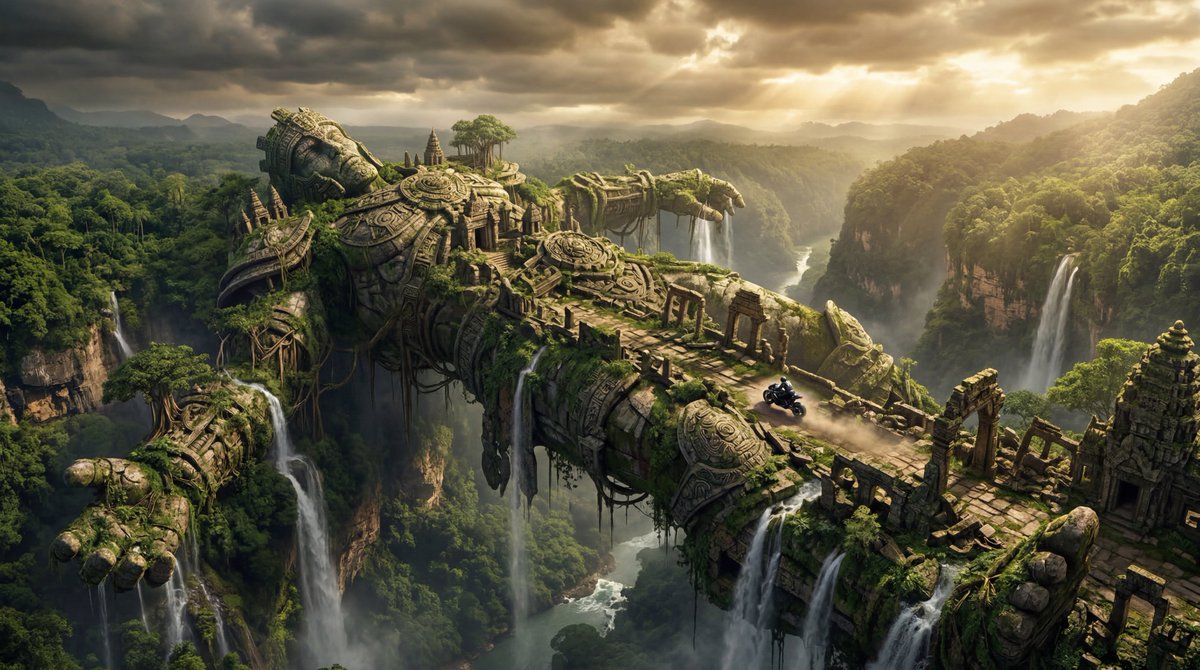
A gigantic fallen stone titan stretched across a jungle abyss like a bridge, covered in ruined temples, vines, waterfalls, and weathered carved armor, tiny black hyperbike racing along the titan’s spine, ultra-wide cinematic shot from high above the jungle canopy, stormy golden light, colossal mythic scale, photorealistic ancient fantasy realism, incredible anticipation, highly detailed stone and foliage
MapleStory-Style Character Conversion
GPT Image 2· Imagem
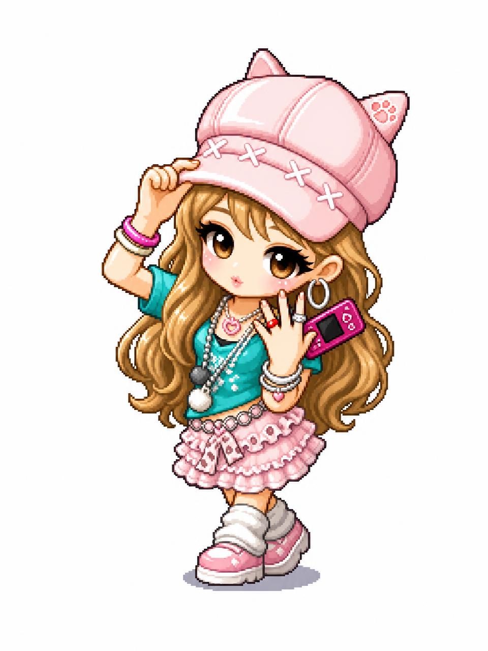
Transform the uploaded image into a MapleStory-style 2D chibi game character illustration.
This is a universal image-to-image character conversion prompt: whatever person, avatar, anime character, mascot, or fictional character appears in the uploaded image should be converted into an original MapleStory-inspired SD game avatar while preserving the key recognizable traits from the input image. Keep the subject count, main pose, silhouette, hairstyle impression, facial expression, outfit category, color relationships, and major accessories from the uploaded image, but redraw everything in a cute side-scrolling MMORPG character-art style.
Style direction: MapleStory-like 2D online RPG avatar art, super-deformed cute proportions, oversized head, compact tiny body, large expressive eyes, simplified nose and mouth, clean thick outlines, crisp cel shading, glossy hair highlights, bright polished colors, soft gradient accents, sprite-like compact shape language, playful Korean online game aesthetic, high-resolution 2D illustration.
Character conversion rules:
- Preserve the uploaded image's identity cues and composition as much as possible.
- If there is one subject, make one Maple-style avatar.
- If there are multiple subjects, convert each subject into a matching Maple-style avatar while keeping their relative positions.
- Translate real clothing or complex costume details into simplified cute game-avatar clothing.
- Translate props, weapons, hats, hair ornaments, bags, or accessories into simplified fantasy game item details.
- Keep the result original and game-avatar-like, not a direct copy of any existing franchise character.
Composition: centered character portrait or full-body avatar depending on the uploaded image, clean simple background, polished character selection icon feeling. The final image must clearly look like a Maple-style 2D character conversion, not a realistic portrait, not a generic anime illustration, and not a 3D render.
No text, no captions, no watermark, no logo, no photorealism, no 3D render, no realistic skin texture, no complex painterly realism.
Custom PS5 Limited Edition Ad
GPT Image 2· Imagem
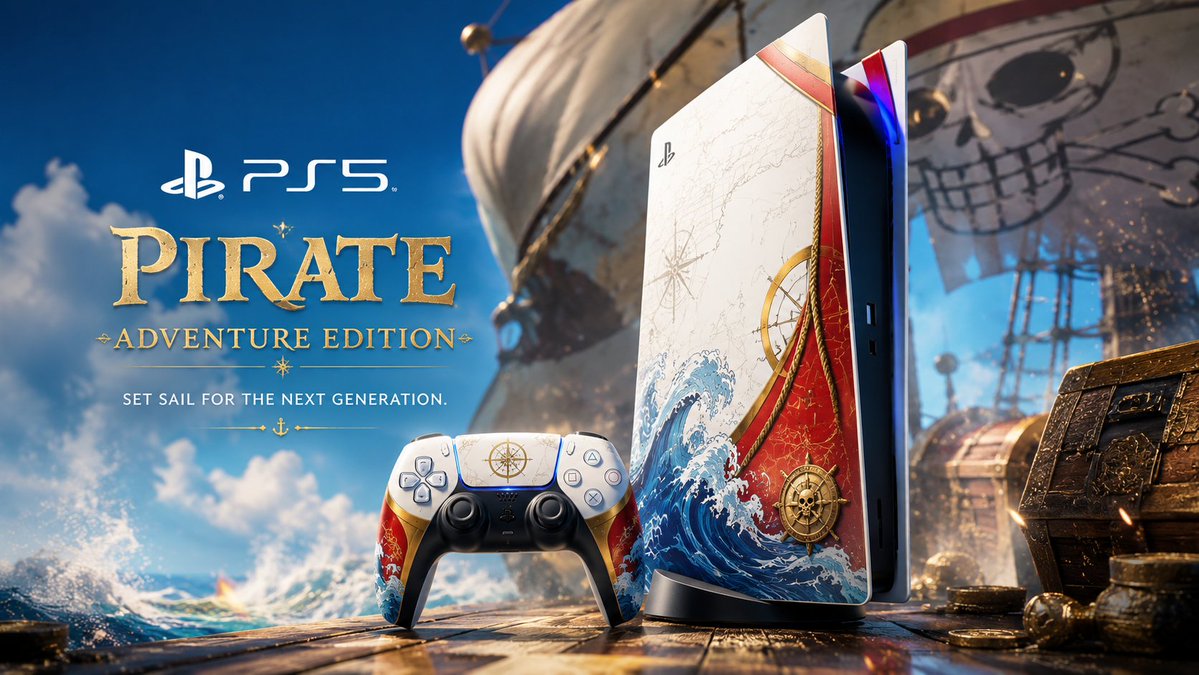
Create a premium cinematic advertising poster for a custom PS5 and matching DualSense controller inspired by [LICENSE].
Show the PS5 console standing vertically on the right and the controller in front, both customized with the colors, symbols, atmosphere, and visual codes of [LICENSE]. Use a premium limited-edition product design: glossy and matte materials, metallic accents, glowing details, custom graphic panels, subtle textures, and high-end collector’s edition finishing.
The console skin should feature [KEY MOTIFS FROM THE LICENSE], with a color palette of [COLORS]. The controller must perfectly match the console design.
Place the product in a cinematic environment inspired by [LICENSE ENVIRONMENT], with atmospheric effects such as [ENERGY / SMOKE / LIGHTNING / PARTICLES / FIRE / MAGIC / DEBRIS]. Keep the PS5 and controller as the clear hero objects.
On the left side, add premium ad typography:
PlayStation logo + “PS5”
Main title: “[LICENSE NAME]”
Subtitle: “[CUSTOM EDITION NAME]”
Tagline: “[TAGLINE]”
Ultra-detailed, high-end product photography, cinematic lighting, glossy reflections, dramatic atmosphere, sharp focus, premium advertising poster, collector’s edition reveal, 16:9 landscape format, no watermark, no clutter.
ASTRA LOOP Fictional Handheld Console Ad
GPT Image 2· Imagem
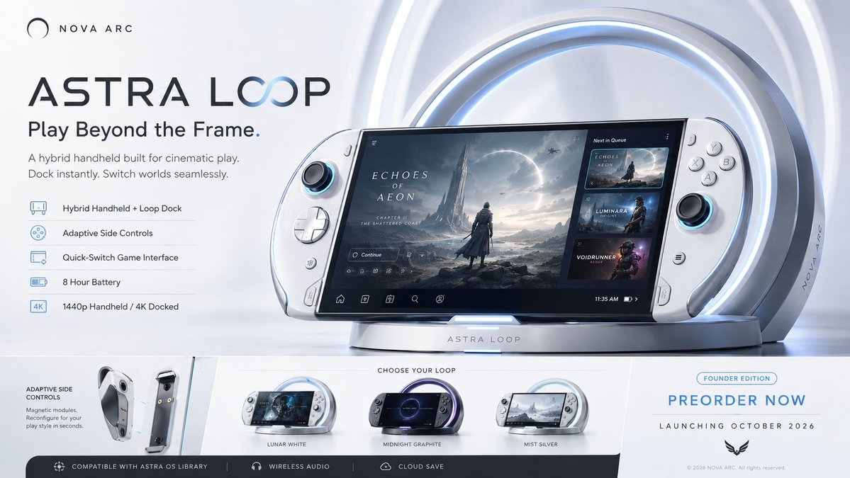
Create a premium, highly believable Fictional Console / Handheld Ad for an imaginary gaming device called ASTRA LOOP.
The goal is to make the hardware feel like a real next-gen or cult-favorite launch: iconic, ownable, desirable, and instantly recognizable as a gaming product people would preorder, compare, and obsess over. The visual should feel like an official hardware campaign from a major platform brand or a breakout design-led company.
Device details:
- Device name: ASTRA LOOP
- Device type: hybrid handheld console
- Core concept: a sleek crescent-edged handheld that docks into a luminous circular base, with adaptive side controls and a floating game-switching interface built for cinematic indie and prestige action titles
- Brand identity: premium, futuristic, minimal, design-led
- Main fantasy: owning the most beautiful game device of the next generation, something that feels both powerful and collectible
- Audience: design-conscious gamers, handheld fans, premium hardware enthusiasts, tech-media audiences
- Tone: aspirational, clean, hyped, cinematic
- Cultural vibe: PlayStation-like meets Analogue-like meets soft sci-fi product culture
- Reality level: believable niche premium hardware hit
Ad structure:
Build the visual like an official gaming hardware campaign.
Include sections such as:
- hero device image
- device name
- short launch tagline
- key feature callouts
- optional screen UI preview
- optional controller detail or modular attachment view
- optional product colorways
- optional release date or preorder cue
- optional edition label
- optional platform ecosystem or compatibility note
- optional logo or company mark
For the copy, include:
- one strong hardware tagline
- 2 concise support lines
- wording that feels like a real product campaign
- language that is sharp, premium, and commercially convincing
- a balance between hype and restraint
Inguage that is sharp, premium, and commercially convincing
- a balance between hype and restraint
Include:
- a strong product-name treatment
- polished industrial-design focus
- believable hardware hierarchy
- premium launch positioning
- clear product fantasy
- realistic feature communication
- strong commercial tech desire
- instantly shareable device-campaign appeal
Visual direction:
- Make the ad feel like a real console reveal or launch campaign people would debate online and preorder instantly
- Emphasize design, power, identity, and ownership fantasy
- Balance product realism with strong entertainment-tech aspiration
- Make it suitable for reveal campaigns, store banners, hardware launch posters, tech press images, or collector’s promo assets
- The result should look like a genuine platform-device ad from a major or cult gaming company
Art direction:
- Style: premium next-gen handheld reveal with minimalist futurist tech polish
- Color palette: matte white, silver, charcoal, pale blue glow, midnight accents
- Typography feel: clean premium sans-serif with restrained futuristic spacing
- Material feel: hardware billboard, reveal poster, press-render campaign panel
- Lighting or image mood: clean studio glow with subtle high-tech reflection
- Background: pale gradient tech stage with soft circular light architecture
Composition:
- Show the ad as one cohesive hardware-campaign image
- Make the device, product name, and key launch message instantly readable
- Use real consumer-tech ad hierarchy and industrial-design emphasis
- Make the device feel iconic, collectible, and commercially real
- Make the final output feel like a premium fake hardware campaign with viral potential
Output quality:
- ultra-detailed
- visually structured
- commercially believable
- culturally fluent
- polished industrial design styling
- strong hierarchy and spacing
- premium hardware-rally fluent
- polished industrial design styling
- strong hierarchy and spacing
- premium hardware-ad composition
- instantly shareable visual concept
Optional content blocks:
- preorder now cue
- color variants
- docking system preview
- battery-life claim
- ecosystem strip
- limited founder edition mark
Avoid:
- generic gadget styling
- weak industrial design
- fake-looking feature claims
- cluttered layout
- random typography choices
- amateur product-ad aesthetics
- too much copy fighting the hardware
- obvious parody unless intentionally chosen
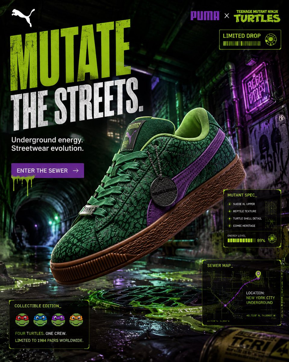
PUMA Ninja Turtles Sneaker Campaign
GPT Image 2· Imagem
FORMAT:
4:5 vertical premium sneaker SMM campaign
hyper-realistic streetwear advertising
luxury comic-culture fashion editorial
Instagram billboard composition
8K ultra-detail
CONCEPT:
PUMA adapts the Teenage Mutant Ninja Turtles identity through elevated street-luxury storytelling
NOT childish cartoon branding
NOT generic gaming poster aesthetics
high-fashion mutant street culture
dark urban comic realism
Gen-Z collectible sneaker energy
CORE BRAND DNA:
PUMA speed + nightlife energy
TMNT underground sewer mythology
New York street culture
mutant rebellion aesthetic
collectible fashion-drop atmosphere
retro comic nostalgia fused with premium sneaker advertising
COLOR SYSTEM:
toxic green
muted turtle-shell green
purple accent highlights
dark asphalt black
gum sole brown
subtle neon slime glow
SCENE:
Rainy underground New York-inspired alley connected to hidden subway tunnel
wet reflective asphalt
dim green fluorescent lighting leaking from sewer grates
purple neon signage subtly reflecting across walls
light smoke atmosphere
comic-book realism merged with luxury sneaker photography
COMPOSITION:
hero sneaker floating center-frame
slightly tilted dynamic perspective
large negative space upper-left for typography
dramatic cinematic depth
streetwear editorial framing
motion-focused composition
underground tunnel leading lines toward shoe
PRODUCT FOCUS:
PUMA Suede XL Teenage Mutant Ninja Turtles edition
extreme suede texture realism
high-detail reptile skin embossing visibility
purple formstrip emphasis
gum sole macro texture
metal lace accessory detail
premium collectible sneaker presentation
editorial-grade sneaker photography
TYPOGRAPHY:
Huge bold headline:
“MUTATE
THE STREETS.”
subheading:
“Underground energy. Streetwear evolution.”
CTA:
“ENTER THE SEWER”
TYPO STYLE:
aggressive condensed typography
comic-inspired luxury distortion
streetwear editorial spacing
TYLE:
aggressive condensed typography
comic-inspired luxury distortion
streetwear editorial spacing
high-fashion hierarchy
minimal but dominant composition
UI ELEMENTS:
UI adapts specifically to TMNT × PUMA identity
minimal holographic sneaker-spec overlays
“LIMITED DROP”
collectible edition tag
mutant energy indicator
sewer-map inspired route graphics
micro product-detail cards
glowing ooze-inspired progress bars
retro arcade-inspired micro icons
NO generic ecommerce UI
GRAPHICS:
toxic green motion streaks
subtle comic halftone textures
liquid ooze reflections
underground graffiti symbols
mutant scanline effects
street-art overlays
minimal slime particle systems
editorial comic layering
luxury streetwear composition
LIGHTING:
green fluorescent underglow
purple neon reflections
cinematic wet-surface highlights
high-contrast tunnel shadows
luxury sneaker specular reflections
soft atmospheric fog diffusion
CAMERA:
Sony A1
85mm macro lens
f/1.8
ultra-detailed sneaker photography
luxury commercial realism
STYLE:
PUMA global streetwear campaign
Teenage Mutant Ninja Turtles reimagined through luxury sneaker culture
hyper-realistic
cinematic
underground
premium
collectible
fashion-forward
NOT childish
NOT cartoonish
Sony Headphones Ad Poster
GPT Image 2· Imagem
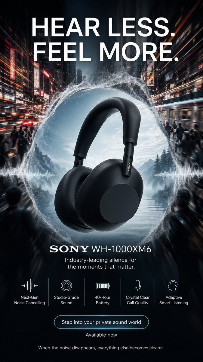
Create a high-end 9:16 vertical advertising poster for "SONY WH-1000XM6". The creative concept is "silence in a world of chaos". The poster should feel premium, emotionally powerful, modern, and highly artistic, like a Cannes-level advertising campaign.
Main visual:
A pair of Sony WH-1000XM6 headphones floats in the center, surrounded by a split-world composition. Outside the headphones, the city is loud, crowded, fast, and chaotic - blurred traffic lights, subway motion, people in a rush, visual noise, urban intensity. Inside the circular acoustic space formed around the headphones, everything becomes still, soft, atmospheric, and peaceful. This contrast should be visually striking. Add subtle waveforms dissolving into calm mist, symbolizing noise cancellation. The product must be extremely detailed, luxurious, and the hero of the image.
Color palette:
Charcoal black, metallic gray, soft silver, cool blue, white mist, subtle warm city accents.
Typography and poster copy:
Main headline:
"HEAR LESS. FEEL MORE."
Product title:
"SONY WH-1000XM6"
Subheadline:
"Industry-leading silence for the moments that matter."
Feature callouts:
- "Next-Gen Noise Cancelling"
- "Studio-Grade Sound"
- "40-Hour Battery"
- "Crystal Clear Call Quality"
- "Adaptive Smart Listening"
CTA:
"Step into your private sound world"
Secondary line:
"Available now"
Footer line:
"When the noise disappears, everything else becomes clearer."
Layout:
The poster should use a strong central product composition with sophisticated contrast between the noisy outside world and the calm inner zone. Use elegant modern typography, bold but premium. Create a strong sense of silence and control. Feature callouts should be clean and easy to scan.
Style:
Hyper-realistic product poster, cinematic commercial art direction, refined modern tech advertising, intelligent composition, premium finish, deep atmosphere, no generic template.
Designer High Heels Ad Poster
GPT Image 2· Imagem
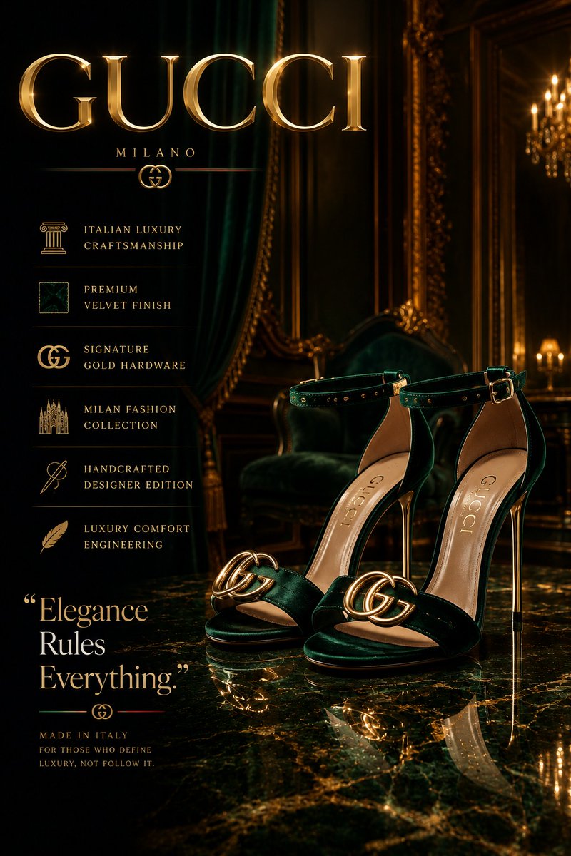
Create an ultra-premium luxury fashion advertisement poster for designer high heels inspired by Vogue Arabia, Paris Fashion Week, and elite luxury editorials. Feature elegant glossy heels inside a cinematic luxury studio with reflective marble flooring, dramatic spotlight lighting, soft smoke atmosphere, and photorealistic reflections.
Add a modern luxury specification layout vertically on the left side with elegant typography and minimalist icons. Include a bold powerful quote and a large luxury brand logo with metallic chrome or gold reflections.
Use a rich cinematic color palette of black, gold, silver, emerald green, burgundy, or monochrome tones with glossy reflections, floating particles, velvet textures, and premium editorial composition.
Style should feel hyper-realistic, dark luxurious, modern, cinematic, ultra-detailed, and professionally designed like a billion-dollar fashion campaign and luxury billboard advertisement, 8K masterpiece.
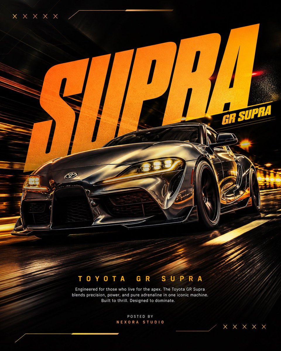
Supra Automotive Poster
GPT Image 2· Imagem
ACT AS:
A senior automotive advertising art director and high-performance poster designer.
Your task is to recreate a viral-level automotive poster using the exact composition logic, typography dominance, and motion energy — but with a different car.
PROJECT TITLE: “MOTION DOMINANCE”
BRAND: Supra
FORMAT:
4:5 vertical, ultra-realistic, 8K resolution, poster design
Designed for: Instagram + portfolio + automotive campaign
STYLE DNA:
Cinematic motion × aggressive perspective × neon accents × bold typography hierarchy × premium automotive ad
CORE RULE:
Match composition and impact — NOT the exact car or copy
PHASE 1: HERO COMPOSITION
- Car angle: Extreme low-angle front 3/4 perspective
- Position: Slightly tilted, moving toward viewer
- Scale: Car dominates 70% of frame
MOTION:
- Road streaking beneath
- Background warped slightly (speed illusion)
CAR DETAIL:
- Hyper-real reflections
- Headlights glowing (warm tone)
- Wheel motion blur (controlled)
PHASE 2: TYPOGRAPHY DOMINANCE
MAIN TEXT:
- Large bold word (top area, behind car)
Example:
“PORSCHE” / “SUPRA” / “RS7”
STYLE:
- Heavy italic / condensed / stretched
- Slight perspective distortion
SECONDARY TAG:
- Model name (e.g. “911 GT3” / “GR SUPRA”)
- Smaller but sharp placement near main text
PHASE 3: BACKGROUND SYSTEM
- Abstract racing environment
- Dark base (black / deep brown / charcoal)
GRAPHICS:
- Subtle X marks / racing patterns
- Neon strokes (yellow / orange / magenta)
DEPTH:
- Layered gradients + light bloom
PHASE 4: COLOR STRATEGY
PRIMARY:
- Dark cinematic base
ACCENT:
- Neon yellow / orange glow
HIGHLIGHTS:
- Reflections on car edges
CONTRAST:
- High separation between car and background
PHASE 5: LIGHTING
- Strong front light (car clarity)
- Rim lighting (edges glowing)
- Ground reflection subtle
FEEL:
Premium + aggressive
PHASE 6: LOWER INFORMATION BLOCK
- Title:
→ “[CAR MODEL NAME]” (bold, clean)
- Paragraph:
→ Small lorem-style automotive text
- Footer:
→ “Posted by [Studio Name]”
ALIGNMENT:
- Center or slight left
PHASE 7: CAMERA & RENDER
- Lens: 24–35mm (dynamic distortion)
- Depth of field:
→ Car sharp
→ Background motion blur
QUALITY:
- Ultra-sharp
- No noise
- High contrast
PHASE 8: FINAL OUTPUT
- Feels like Behance-level automotive poster
- Strong Instagram impact
- Clean but aggressive
- Not cluttered