carat

Galeria de prompts

/

Sticky Note Sticker Design

Entrar
Cadastrar

Sticky Note Sticker Design

A focused visual guide for Sticky Note Sticker Design with practical usage notes.

2026.08.29

Faça “Sticky Note Sticker Design” exatamente do jeito que você querCrie o seu próprio “Sticky Note Sticker Design”

É só pedir com suas palavras — a Carat gera imagens e vídeos otimizados para você.

Comece agora com 100 créditos grátis por dia
·
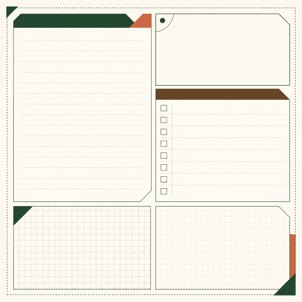
GPT 이미지 2로 생성한 스티커 메모지 디자인

스티커 메모지 디자인

GPT Image 2· Imagem
A single-sheet graphic sticky-note memo design, one cohesive printable composition with generous blank writing areas, subtle ruled lines and small grid sections, framed by dotted and solid-line borders plus restrained color-block divisions. Use an editorial-crisp Korean design-studio aesthetic: asymmetrical modular layout on an 8px rhythm and 12-column grid, balanced margins, clear hierarchy, refined but practical, with distinctive geometric details rather than generic stationery clip art. Choose a topic-appropriate palette of off-white, forest green, and brown, with a small terracotta accent; Pretendard Korean sans-serif, bold headings and medium labels, tight optical tracking. Include only functional blank areas and decorative lines; do not print any words, logos, brand names, institutional names, source notes, dates, credits, or statistics. Flat graphic design, clean paper-like surface, one image only, print-ready appearance. Negative quality blockers: no watermark, no 3D render, no AI-generated artifacts, no generic stock-illustration default, no uniform unrealistic smoothness, no warped Korean text, no broken Hangul, no templated stock template feel, no random numbers, no misleading data, no busy background, no excessive decoration, no lopsided composition.

This reference presents a sticky-note sticker as a functional graphic object, not merely a decorative paper illustration. Its defining parts are open writing zones, light ruled or gridded guides, and borders made from dotted lines, solid lines, or divided color blocks. Begin by deciding what the space must hold: a short reminder, a checklist, an idea, or a diary note. The blank area should remain generous enough for handwriting, while guides should support alignment without becoming the main image. Borders can separate functions, signal a cut edge, or create a visual rhythm across one sheet. Limited color helps writing remain visible and makes the set easier to print. Test the design at the intended physical size before adding copy or branding. Check trim margins and the safe area around each writable panel. In a prompt, name the blank region, line system, grid, and border treatment explicitly. This page is a practical starting point for stationery concepts, planner decoration, and sticker-sheet development. It also gives a clear checklist for reviewing whether the result remains useful after the decorative details are reduced.
Perguntas frequentes

Prompts relacionados

100-Day Celebration

100-Day Celebration

3 prompts

16-Panel Grid

16-Panel Grid

0 prompts

2D Anime

133 prompts

2D Character Design

2D Character Design

5 prompts

Galeria de prompts da Carat

Crie na hora os prompts de IA em alta

Prompts

  • Logo
  • Design de apresentação
  • Miniatura
  • Pôster
  • Capa de webnovel
  • Foto 3x4
  • Caricatura
  • Página de produto
  • Banner

Modelos

  • GPT Image 2
  • Seedance 2.0
  • Nano Banana Pro
  • Nano Banana 2

Carat

  • Começar
  • Sobre
  • Blog
  • Carreiras
  • Contato
  • Parcerias
  • Termos
  • Privacidade

© 2026 Paradot.Inc All rights reserved.