Announcement Popup
Design an accessible announcement popup UI with AI prompts for hierarchy, actions, and dismissal behavior.
2026.07.16
Сделайте «Announcement Popup» именно так, как хотитеСоздайте свой «Announcement Popup»
Просто попросите своими словами — Carat создаст для вас подходящие изображения и видео.

Начните сейчас со 100 бесплатных кредитов в день
공지 팝업

공지 팝업
Role of an announcement popup
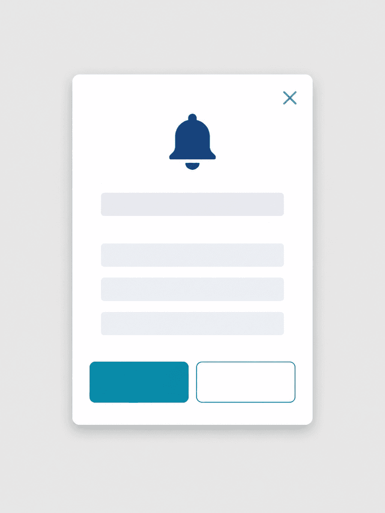
Announcement Popup AI prompts create a modal for maintenance notices, policy changes, feature launches, or urgent updates. Clarify the relationship among the title, concise body, primary action, secondary action, and dismiss control. Define severity, display period, and audience conditions before showing the popup repeatedly.
Clear interface hierarchy
Place a notification bell, one title line, and three body lines inside a white vertical modal. Distinguish a filled teal primary button from an outlined secondary button. The upper-right close icon needs a generous target and an accessible name for keyboard and screen-reader users.
Accessibility and responsive behavior
Maintain WCAG contrast and never communicate status through color alone. Leave horizontal margins on mobile and allow translated titles to wrap without covering actions. In implementation, trap focus inside the modal while open and return it to the invoking control after dismissal.
Functional review before launch
Inspect bell and close icon strokes, button dimensions, corner radii, spacing, and shadow consistency. After inserting real copy, verify dates, destinations, action labels, and expiration timing. Test dismissal, Escape behavior, outside-click policy, zoom, dark mode, and screen-reader output.