
Inflatable Product Ad
GPT Image 2· Изображение
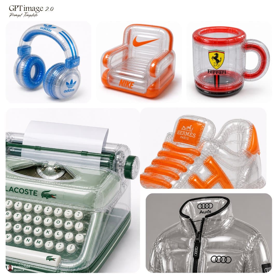
inflatable [product], transparent plastic material, high-gloss reflective surface, visible seams, air chambers, soft inflated structure, bold [brand] logo placement, vibrant accent colors, retro-futuristic aesthetic, clean product photography, studio lighting, sharp focus, white background, 1:1 aspect ratio
Похожие промпты
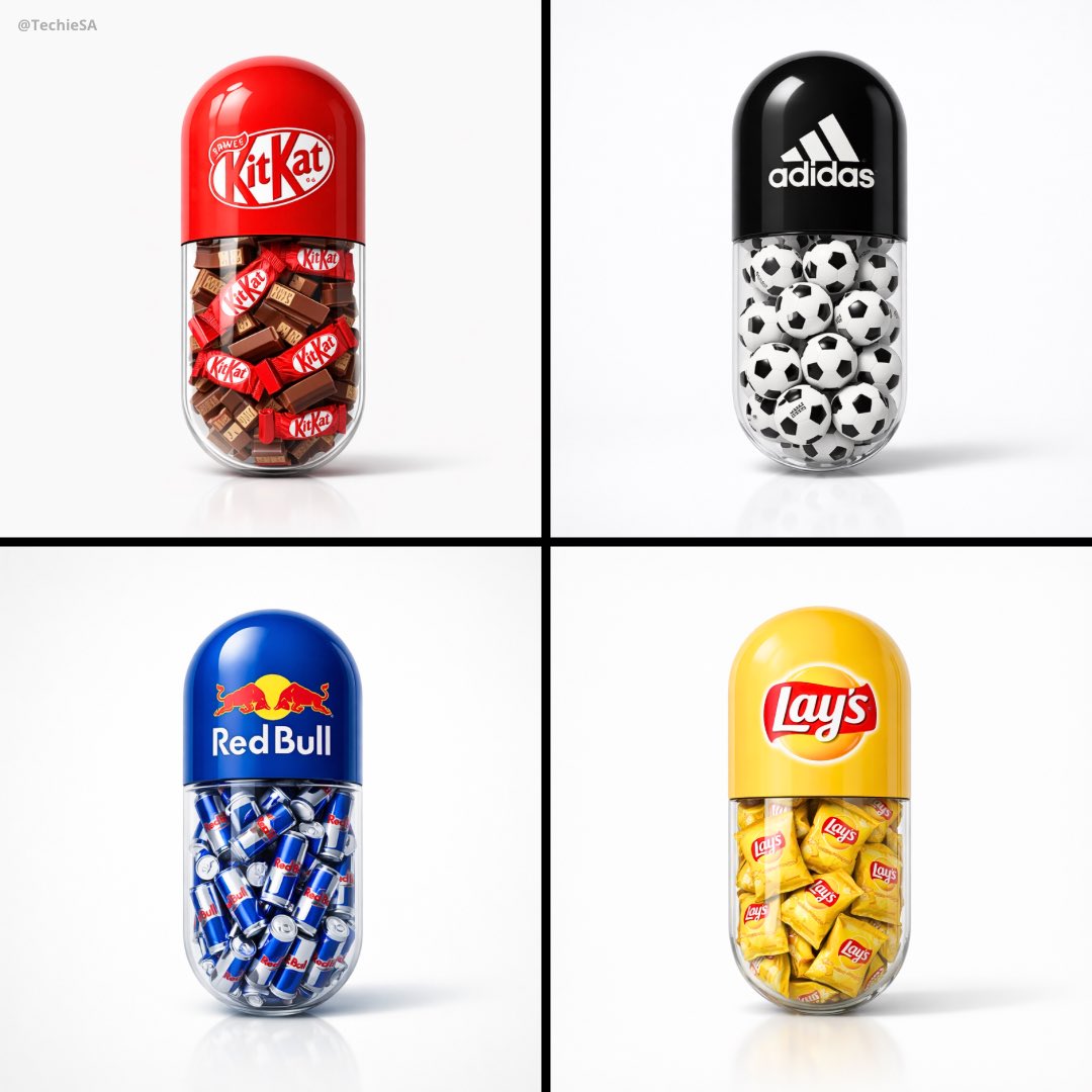
Capsule Pill Brand Poster
GPT Image 2· Изображение
Create a minimal poster. A large capsule pill centered in the frame. The top half of the pill is solid colored and features the [BRAND] logo clearly printed on it. The bottom half of the pill is transparent glass. Inside the transparent part of the capsule, fill it with a large amount of [OBJECT] related to the brand. Ultra clean white studio background, soft shadows, high-end product photography lighting, glossy realistic materials, highly detailed, minimal design, centered composition, modern advertising style. 1080x1080 dimension.
Japanese Confectionery Packaging
GPT Image 2· Изображение
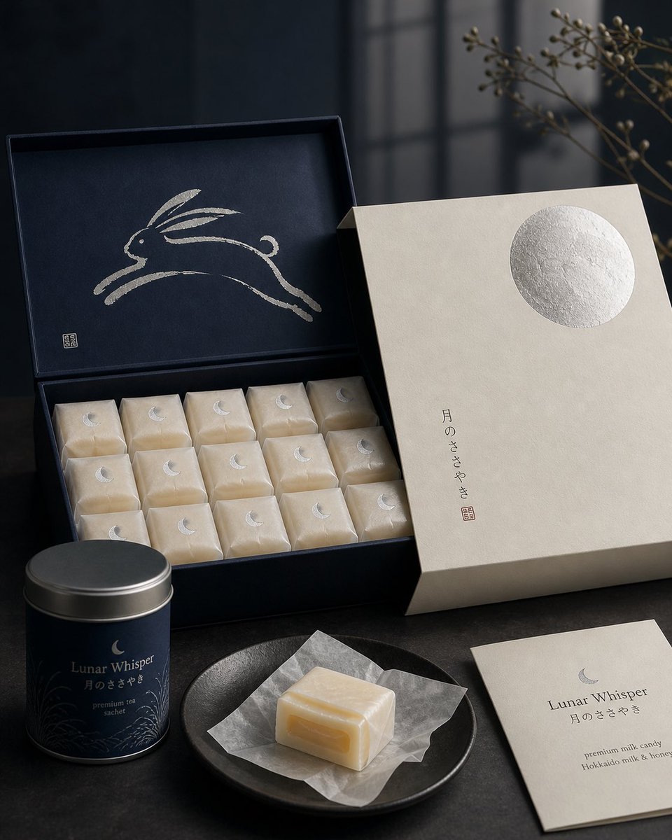
Premium Japanese confectionery packaging concept, “Lunar Whisper” / 月のささやき, inspired by moon rabbit folklore and refined milk candy nostalgia, rigid uncoated cream paper outer sleeve with smooth eggshell texture, minimal negative space, single cool silver embossed full moon in upper-right corner, small vertical Japanese sumi ink typography, sleeve sliding open to reveal deep matte midnight indigo inner box, inside lid printed with elegant single brushstroke leaping rabbit in shimmering pearl ink, sumi-e style, abstract folkloric rabbit, rows of individually wrapped milk candies in translucent washi-style paper, tiny silver crescent moon stickers, pale ivory candies glowing softly through paper, one candy partially unwrapped showing silky nama caramel like milk core with delicate edible rice paper film, Hokkaido cream and honey feeling, quiet ceremonial unboxing, reusable keepsake tea sachet container, Japanese minimalism, luxury packaging design, tactile paper materials, pearl ink, silver foil embossing, soft diffused moonlight, editorial product photography, refined negative space, calm nocturnal atmosphere, award winning packaging render, high end boutique confectionery brand presentation.
Product Perspective Lighting Blend
Nano Banana Pro· Изображение
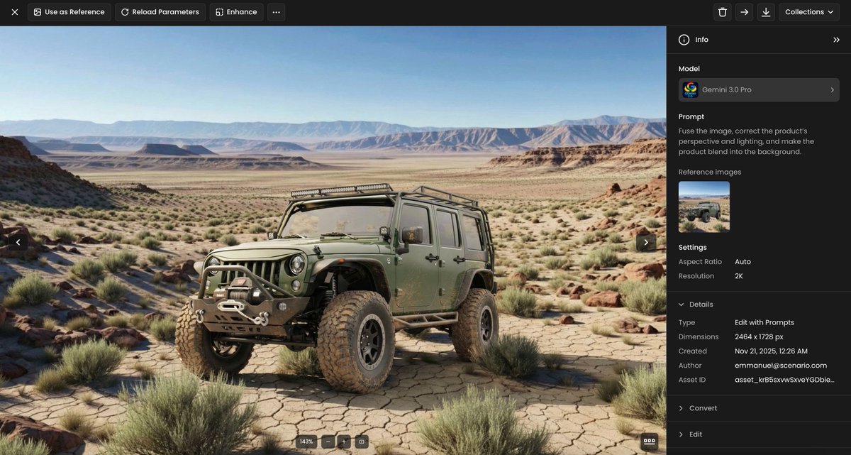
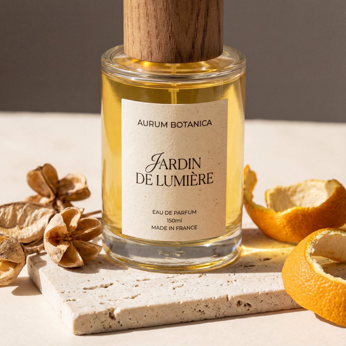
Fuse the image, correct the product’s perspective and lighting, and make the product blend into the background.
Product Diagram Template
Nano Banana Pro· Изображение
Please place the product image onto the diagram template. Remove all existing text from the diagram. Add subtle, harmonized borders that complement the overall design concept—keep the border thickness minimal/thin.
Nine Image Product Instagram Feed
Nano Banana Pro· Изображение
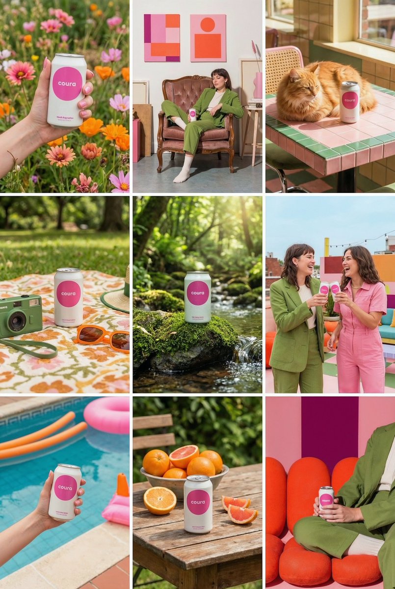
Create a 9-image Instagram feed for this product in the same aesthetic. Use different locations, angles, and compositions, incorporating people, animals, nature, and various environments while maintaining a cohesive visual style.
Luxury 3D Packaging Box Mockup
Nano Banana Pro· Изображение
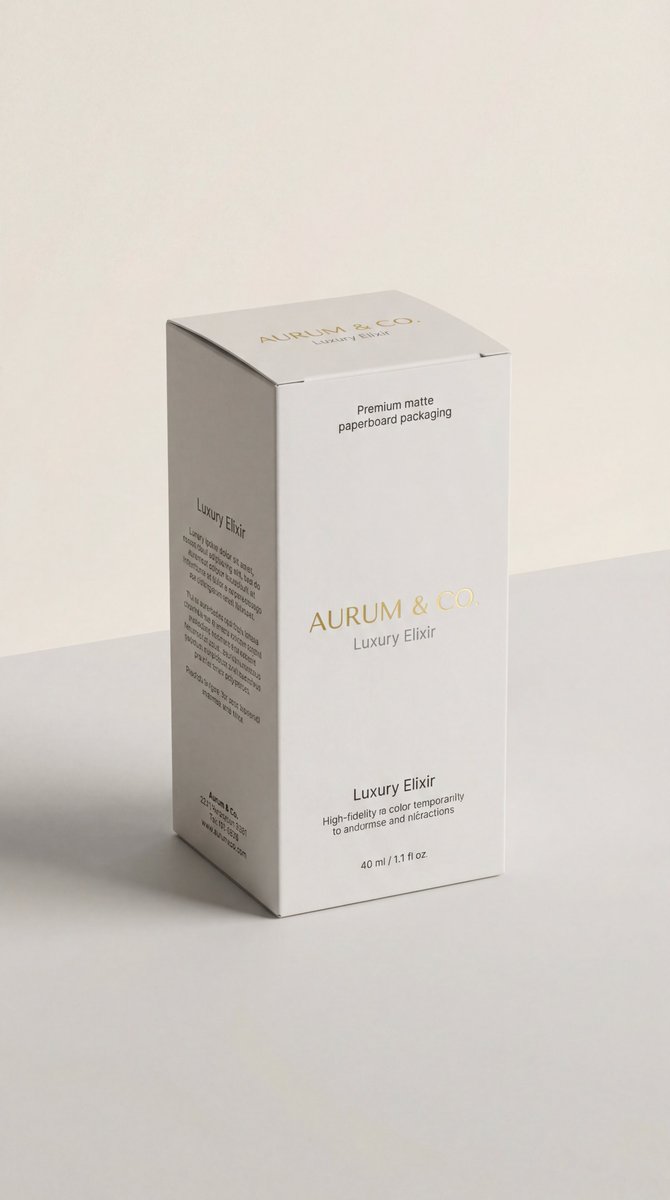
{"scene_description":"A photorealistic, high-end 3D product visualization of a perfectly assembled packaging box derived from a dieline, set in a pristine minimal studio.","subject":{"type":"Assembled Packaging Box","material":"Premium matte paperboard","features":{"structure":"Perfectly folded, accurate panel placement, sharp clean edges","surface":"Smooth matte texture with high-fidelity print rendering"},"position":"Upright, angled at a refined ¾ perspective view to show front and side panels","artwork_state":"Undistorted typography, preserving original design exactly"},"action":{"primary":"Standing static on a surface","secondary":"Casting a gentle shadow","effect":"Demonstrates structural integrity and design elegance"},"environment":{"setting":"Minimalist High-End Studio Void","foreground_elements":["Clean, smooth surface","Soft contact shadows"],"background_elements":["Soft neutral seamless backdrop (light grey/cream)","Zero distractions","No extra props"]},"lighting":{"style":"Soft Commercial Product Lighting (Global Illumination)","key_light":{"type":"Large Diffused Softbox","color":"Neutral White (5500K)","illuminates":["The face of the box evenly","The matte texture of the paper"]},"fill_light":{"type":"White Reflector","effect":"Softens shadows to ensure artwork visibility"},"shadows":"Subtle, soft gradient shadows anchoring the object"},"style":{"medium":"3D Rendering / Product Photography","aesthetic":"Premium Editorial, Mockup Style, Minimalist Luxury","quality":"8k resolution, ray-traced optics, physically based rendering (PBR)","details":"Crisp folds, zero distortion, matte paper grain visibility"},"scene_composition":{"subject_action":"Static presentation","camera_behavior":"Locked-off tripod shot","depth_layering":"Sharp Subject -> Infinite Soft Background"},"visual_description":{"core_subject":"A flawless 3D box assembled from a flat dieline.","attire_physics":"N/A - Rigid Body physics.","surface_rendering":"Non-reflective matte finish that absorbs light softly, ensuring text is readable and colors are true."},"lighting_and_atmosphere":{"type":"Clean Studio","specifics":"Even light distribution, ambient occlusion in the creases.","color_grade":"Natural, color-calibrated, neutral tones."},"attire_customization":{"current_clothing":"N/A","customizable_clothing":"N/A"},"brand_product_customization":{"current_brand_product":"Packaging Design","customizable_brand":"User: Insert Brand Name/Logo for the box","customizable_product":"User: Describe the box type (e.g., cosmetic box, tuck-end box)","product_placement_area":"All visible panels (Front, Side, Top)"},"objects_and_props":{"main_objects":["The 3D Box"],"secondary_objects":[]},"camera_and_lens":{"focal_length_feel":"85mm or 100mm (Telephoto to eliminate perspective distortion)","aperture_effect":"f/16 (Deep depth of field for edge-to-edge sharpness)","camera_angle":"Isometric or ¾ perspective","lens_type":"Studio Macro Lens","bokeh_style":"None (Smooth gradient background)"},"technical_tags":"--v 6 --ar 4:5 --stylize 150 --no warping, distortion, messy background, props, glossy reflection, low poly"}
Brand Capsule Collection Mockup
Nano Banana 2· Изображение
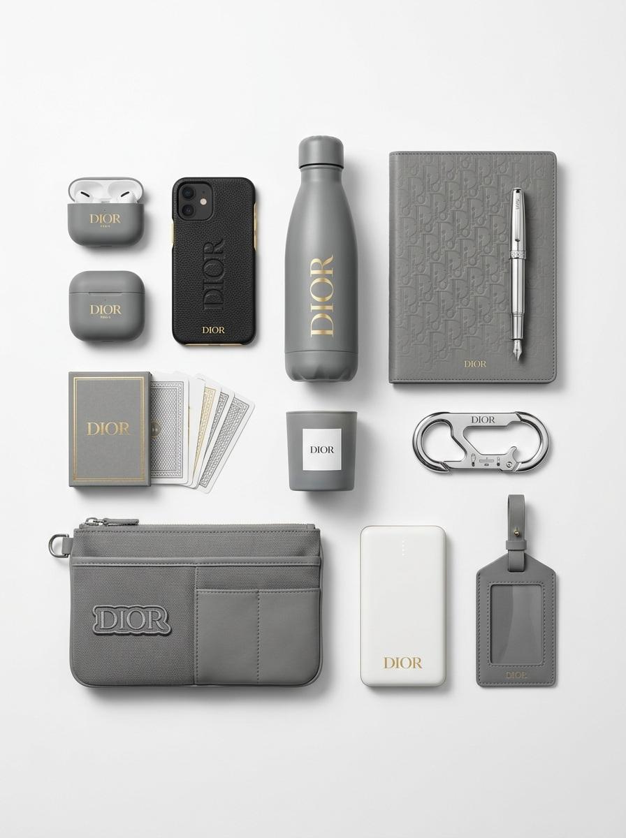
[Brand Name], conceptualized as a cohesive, premium "capsule collection" of branded merchandise and functional souvenirs. The image displays a curated set of various physical objects (such as tech accessories, utility gear, lifestyle items, or stationery) that are semantically relevant to the brand's specific industry and audience. Every item is designed using the brand's official signature color palette and features bold logo integration.
The objects are arranged in a clean, organized group composition (knolling or isometric perspective) on a seamless, infinite studio white background. The lighting is soft and professional, creating subtle shadows. The framing is wide, ensuring significant negative space (air) surrounds the product grouping on all sides.
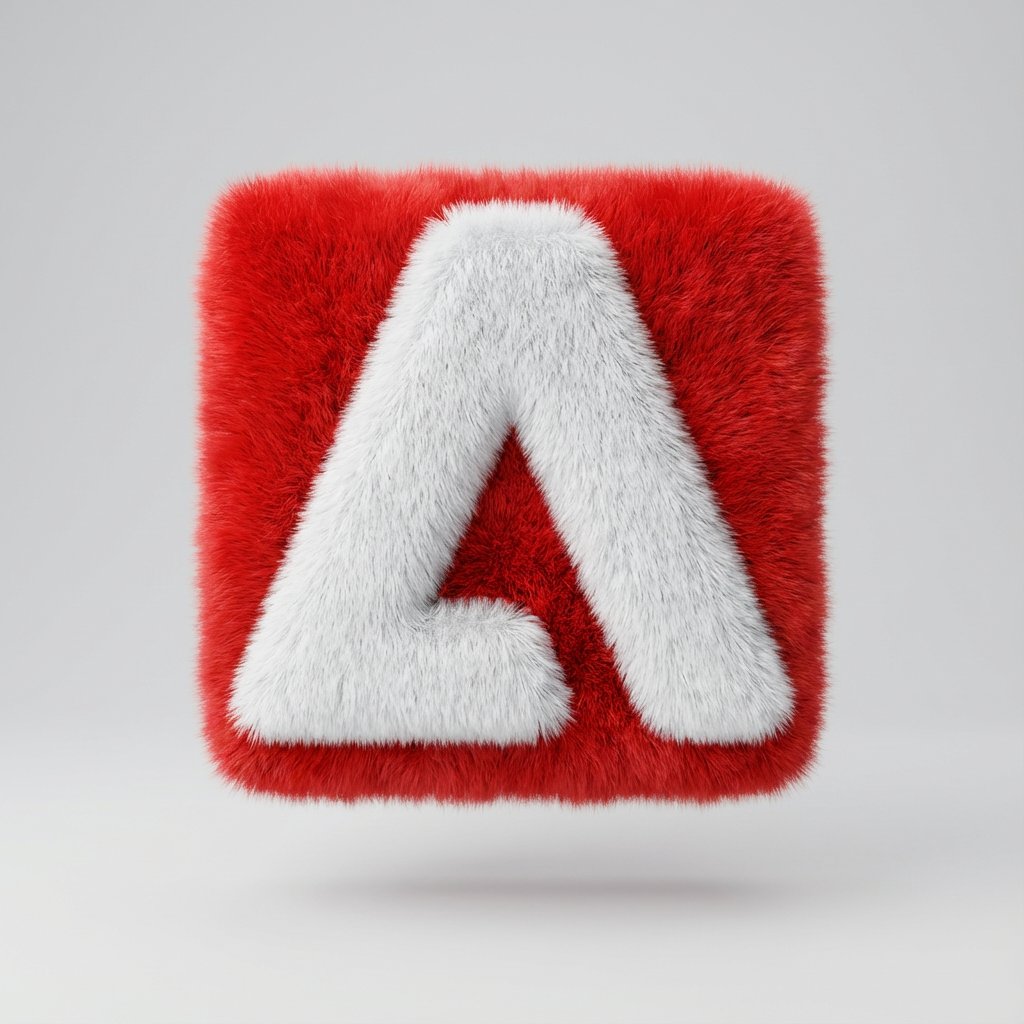
Fluffy 3D Logo Object
Nano Banana Pro· Изображение
Transform a simple flat vector logo into a soft, 3D fluffy object. Use the exact colors. The shape is fully covered in fur, with hyperrealistic hair texture and soft shadows. The object is centered on a clean, light gray background and floats gently in space. The style is surreal, tactile, and modern, evoking a sense of comfort and playfulness. Studio lighting, high-resolution render.
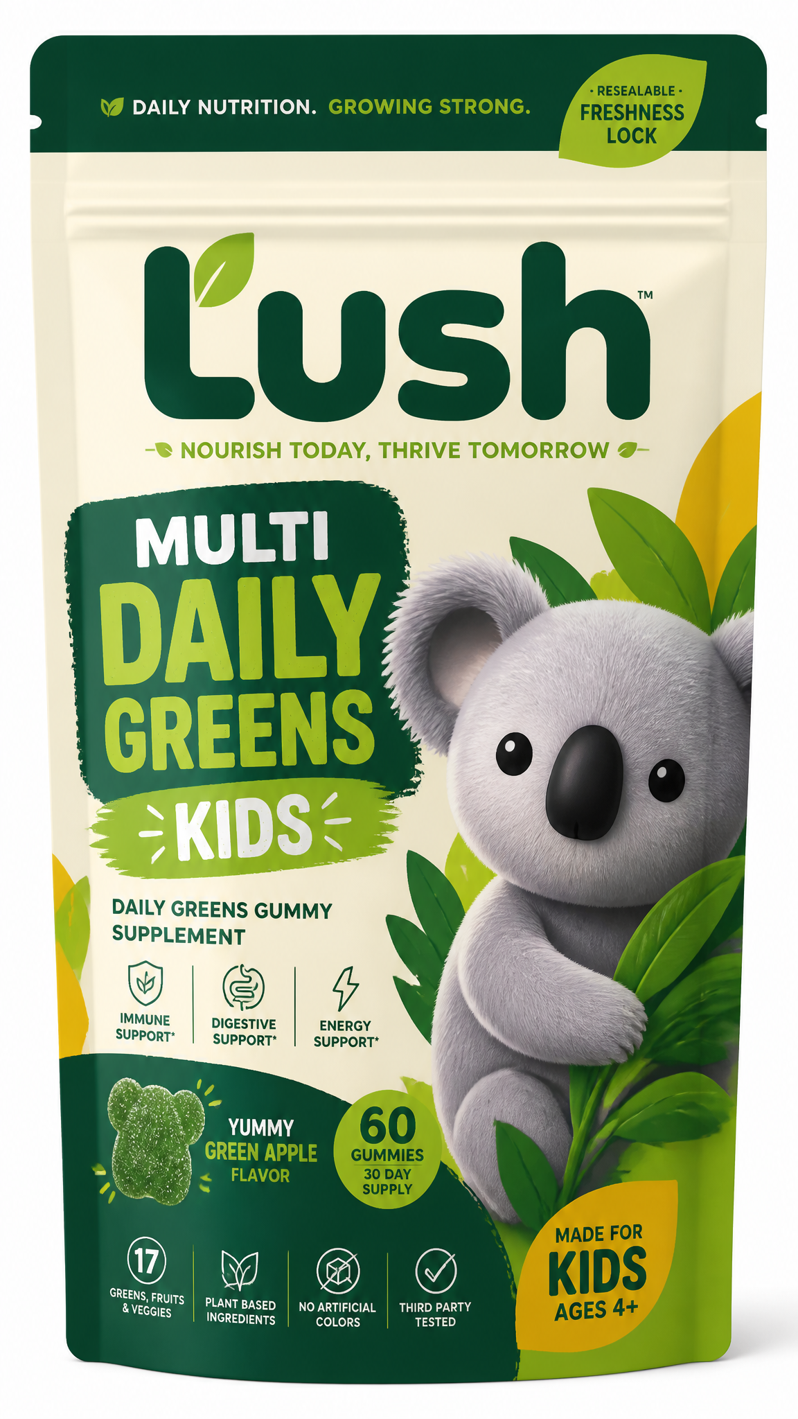
Kids Supplement Pouch Packaging
GPT Image 2· Изображение
Create a distinctive packaging concept for a kids daily greens gummy supplement line designed primarily for online sales through D2C, Amazon, and TikTok Shop. The product should be packaged in a stand-up resealable supplement pouch and must feel highly recognizable, premium, and eye-catching in crowded digital marketplaces, particularly when viewed as a small thumbnail. The brand identity should balance health, convenience, trust, and playful personality, while remaining modern and commercially viable. The packaging should clearly communicate that the product is a daily greens gummy supplement, with strong visual hierarchy and memorable shelf presence. Include a prominent brand mascot on the front of the pouch. I have been exploring a koala as the mascot, so use this as the initial direction. The koala should feel friendly, distinctive, and brandable, but not overly childish. Importantly, the mascot must not have a mouth, keeping its facial expression neutral, calm, and versatile across future products and marketing applications. The final design should feel suitable for a scalable wellness brand: bold enough with vibrant colours to stand out on Amazon and TikTok, while still appearing trustworthy, clean, and premium for a D2C audience. For the interim logo and brand name, please use “Lush.” Ensure the packaging also clearly identifies the product as “Multi Daily Greens” and for "Kids".
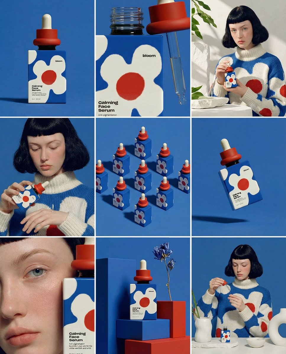
3x3 Product Storyboard Mockup
Nano Banana Pro· Изображение
Create ONE final image.
A clean 3×3 [ratio] storyboard grid with nine equal [ratio] sized panels on [4:5] ratio.
Use the reference image as the base product reference. Keep the same product, packaging design, branding, materials, colors, proportions and overall identity across all nine panels exactly as the reference. The product must remain clearly recognizable in every frame. The label, logo and proportions must stay exactly the same.
This storyboard is a high-end designer mockup presentation for a branding portfolio. The focus is on form, composition, materiality and visual rhythm rather than realism or lifestyle narrative. The overall look should feel curated, editorial and design-driven.
FRAME 1:
Front-facing hero shot of the product in a clean studio setup. Neutral background, balanced composition, calm and confident presentation of the product.
FRAME 2:
Close-up shot with the focus centered on the middle of the product. Focusing on surface texture, materials and print details.
FRAME 3:
Shows the reference product placed in an environment that naturally fits the brand and product category. Studio setting inspired by the product design elements and colours.
FRAME 4:
Product shown in use or interaction on a neutral studio background. Hands and interaction elements are minimal and restrained, the look matches the style of the package.
FRAME 5:
Isometric composition showing multiple products arranged in a precise geometric order from the top isometric angle. All products are placed at the same isometric top angle, evenly spaced, clean, structured and graphic.
FRAME 6:
Product levitating slightly tilted on a neutral background that matches the reference image color palette. Floating position is angled and intentional, the product is floating naturally in space.
FRAME 7:
is an extreme close-up focusing on a specific detail of the label, edge, texture or material behavior.
FRAME 8:
The product in an unexpected yet aesthetically strong setting that feels bold, editorial and visually striking.
Unexpected but highly stylized setting. Studio-based, and designer-driven. Bold composition that elevates the brand.
FRAME 9:
Wide composition showing the product in use, placed within a refined designer setup. Clean props, controlled styling, cohesive with the rest of the series.
CAMERA & STYLE:
Ultra high-quality studio imagery with a real camera look. Different camera angles and framings across frames. Controlled depth of field, precise lighting, accurate materials and reflections. Lighting logic, color palette, mood and visual language must remain consistent across all nine panels as one cohesive series.
OUTPUT:
A clean 3×3 grid with no borders, no text, no captions and no watermarks.17
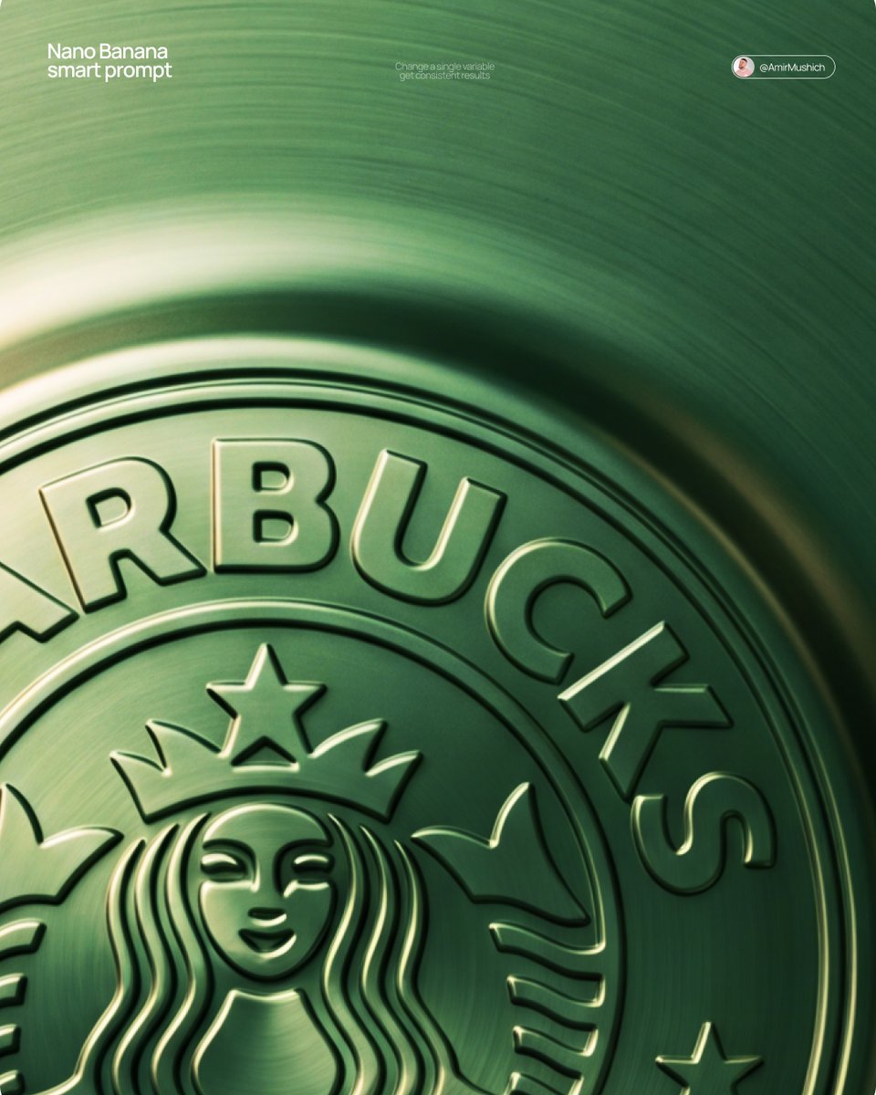
Embossed Metal Logo
Nano Banana Pro· Изображение
[BRAND NAME] + [METAL COLOR]
Act as a Senior CGI Artist and Brand Identity Director specializing in premium logo materializations. Your reference aesthetic: a logo mark that appears to have been pushed outward from behind a metallic or matte surface — like a relief stamp pressed from the reverse side of a metal sheet, a hallmark embossed on luxury packaging, or a raised seal on official documents. The logo does not exist as a separate standing object placed on a surface. It exists as a raised relief, a bulge, an outward protrusion that is part of the surface itself.
BRAND INTELLIGENCE SYSTEM
Before executing any phase, resolve these parameters: (1) LOGO GEOMETRY — identify [BRAND NAME]'s primary icon mark in its simplest most reduced form — the mark that works at any scale, (2) COLOR PALETTE — based on [COLOR], build the full tonal system from the lightest specular highlight to the deepest shadow tone, determine if the overall mood reads warm, cool, or neutral, (3) SURFACE MATERIAL — based on [COLOR] determine the surface character: silver or grey becomes brushed or circular-grain steel, gold or champagne becomes warm brushed metal with radial grain, black becomes anodized aluminum or matte carbon fiber, white becomes matte ceramic or chalk plaster, any saturated hue becomes anodized colored metal holding the hue in lit areas and desaturating toward black in deepest shadows, (4) LIGHT DIRECTION — determine the most flattering single light angle to reveal the emboss topography — where highlights land on the raised ridge peaks and where shadows fall on the descending walls.
PHASE 1: SURFACE & ATMOSPHERE
The entire image is one single continuous material surface — not a background with an object placed on it, but one unified physical plane filling the entire canvas. This surface is made of the SURFACE MATERIAL resolved above. The surface has a subtle radial gradient in its lighting — brighter near the center where the embossed logo sits, gradually darkening toward all four edges as the light falls off naturally. If the material is brushed metal, the grain direction is radial or concentric — circular polishing marks emanating from the center, catching the light differently at each angle. Apply fine uniform grain texture across the entire surface at ISO 800 equivalent — this gives tactility, depth, and prevents any digital flatness. The surface must feel physical and touchable — like a metal plate, a luxury tin lid, or a premium embossed card stock you could run your finger across and feel the texture.
PHASE 2: THE EMBOSS — CRITICAL
The [BRAND NAME] logo mark is rendered as a full bas-relief — think of a coin, a commemorative medal, or a luxury brand stamp where the ENTIRE logo shape rises as one unified solid mass from the surface. Not just the outline. Not just the stroke path. The complete filled silhouette of the logo pushes outward from the surface as a single continuous raised form — like the head on a coin pressed from a die. The interior of the logo is NOT hollow or open. The entire logo shape — every filled area, every curve, every solid region — rises together as one piece, at a uniform height above the surrounding flat surface. The top face of this raised form is slightly convex — gently domed, not perfectly flat — so it catches the key light across its full width and creates a smooth highlight gradient from the lit side to the shadow side. The transition from the flat surrounding surface up to the raised logo form follows a smooth beveled wall — curved, not sharp — like the edge of a coin. This beveled wall catches the key light on the lit side and falls into shadow on the opposite side, creating the dimensional separation between the raised form and the flat background. Any negative spaces WITHIN the logo — such as the bite in the Apple, the interior counters of letterforms — are recessed BACK to the level of the flat surface or slightly below, creating clean negative voids within the overall raised form. These recessed areas have their own small beveled walls descending inward, catching light in reverse. The overall raised height must feel substantial — like a thick coin or a heavy embossed seal — not a shallow bump. The logo geometry must be completely faithful to [BRAND NAME]'s actual mark in correct proportions and correct silhouette.
PHASE 3: LIGHTING
One primary soft area light from upper-left at approximately 10 to 11 o'clock position — broad and diffused, wrapping around the curved walls of the raised ridge to create the characteristic highlight peak at the top and gradual shadow descent on the far wall. Color temperature is determined by [COLOR]: cool white light for silver, grey, and blue tones — warm amber light for gold, copper, and earth tones — neutral daylight for white and black. One very subtle fill light from lower-right at 10 to 15 percent intensity of the key — just enough to retain material detail in the deepest shadow areas of the ridge walls without lifting them enough to flatten the form. No hard shadows anywhere on the surface. No spotlight pools. No rim light. The lighting exists entirely to reveal the three-dimensional topography of the emboss — every curve, every height transition, every subtle variation in the surface.
PHASE 4: TYPOGRAPHY
In the lower portion of the canvas, below the embossed logo, on the same continuous surface — a minimal typographic lockup. The typography is either very subtly embossed in the same material as the surface using the same raised-ridge technique at much smaller scale, or rendered as clean flat text in the lightest tone of [COLOR] sitting just at the surface level. Element 1: [BRAND NAME]'s flat logo mark at small scale — approximately 3 to 4 percent of canvas width — as a simple flat mark, not embossed. Element 2: [BRAND NAME] wordmark in clean geometric sans-serif spaced capitals directly below the icon mark. Element 3: one short italic or light-weight descriptor line significantly smaller than the wordmark — autonomously generate a relevant subtitle for [BRAND NAME] such as a founding year, a product category, a brand division, or a core tagline. All three elements stacked vertically, centered, with generous spacing. No decorative elements. No lines or rules. Pure typographic restraint.
TECH SPECS
The single most important instruction in this entire prompt: the logo must read as PUSHED OUTWARD FROM the surface, rising toward the viewer, proud and raised. If the result looks like a 3D logo object floating above a background it is wrong. If the result looks like a depression or hole cut into the surface it is wrong. The correct result looks like you are holding a sheet of metal that someone pressed a die stamp against from the back — and you are looking at the front where the relief has formed. Ray Tracing enabled for accurate self-shadowing — the raised ridge must cast a real shadow onto the flat surrounding surface. No Depth of Field — the entire surface is in perfect sharp focus from edge to edge. Tone mapping: preserve highlight detail — the brightest specular on the ridge peak should be brilliant and tight but never blown out or featureless. Film grain applied uniformly across the full final render. No chromatic aberration. No lens distortion. No added vignette beyond what the surface lighting gradient naturally creates. Anti-aliasing maximum — the ridge edges must be perfectly clean. Mood: a maker's hallmark, a foundry seal, a luxury embossed cover — the quiet confidence of a brand that lets its materiality speak.
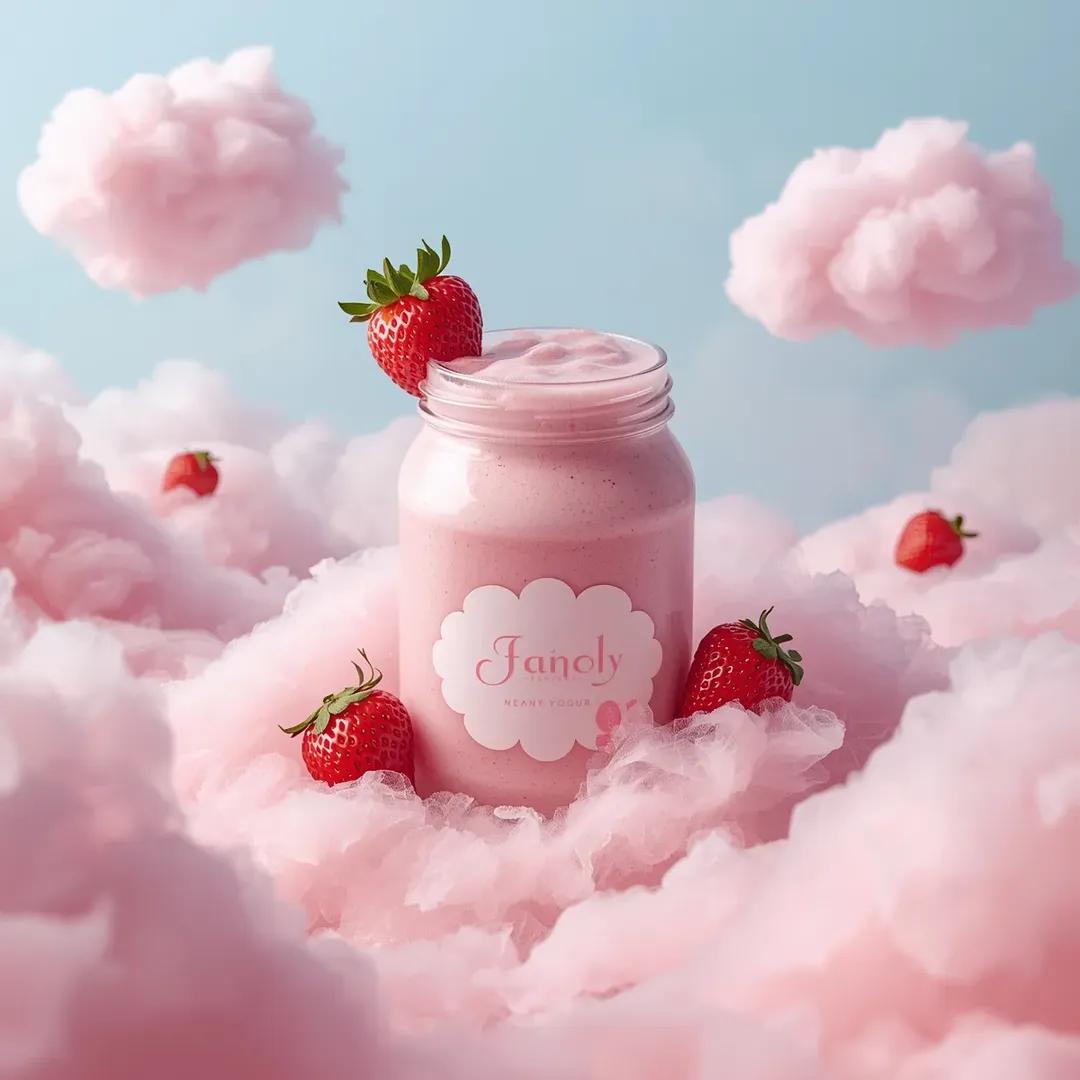
Strawberry Yogurt Smoothie Product Shot
Nano Banana 2· Изображение
Ultra-realistic dreamy product photography in a surreal pastel sky environment. A transparent plastic jar filled with thick pink strawberry yogurt smoothie sits centered and slightly embedded inside fluffy cotton-candy-like pink clouds, the jar open at the top with creamy surface visible and a fresh whole strawberry resting on the rim. The jar label is a soft white scalloped shape with simple elegant pink brand text and small strawberry illustrations around the container.
Additional ripe strawberries are placed around the jar partially resting on the clouds. The background is a soft pale blue sky filled with multiple floating pink cotton candy clouds, some clouds containing small strawberries nestled inside them. Lighting is soft diffused daylight creating gentle shadows and glossy highlights on the creamy texture and plastic surface. Clean symmetrical composition, whimsical dessert advertising aesthetic, soft pastel color palette dominated by pink and light blue, shallow depth of field but product fully sharp, highly detailed textures on clouds and fruit, photorealistic 8k quality.