
Fintech Investing Infographic Poster
GPT Image 2· Изображение
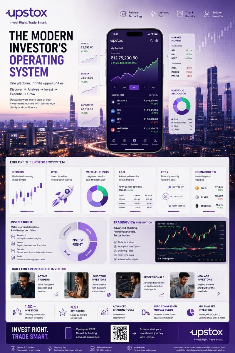
TOPIC: UPSTOX
Create an ultra-premium vertical SMM infographic poster for Upstox, designed as a next-generation fintech editorial infographic focused on high-performance investing, intelligent execution, and modern wealth creation.
The final design should feel like a fusion of:
- Apple Pro Display aesthetics
- TradingView interface design
- Bloomberg editorial systems
- Formula 1 telemetry dashboards
- modern Indian investing culture
- premium startup branding
The design should visually communicate:
"INVEST RIGHT. TRADE SMART."
CORE CONCEPT:
"THE MODERN INVESTOR'S OPERATING SYSTEM"
The entire composition should visualize Upstox as the central financial platform powering every stage of investing.
The visual narrative should show:
DISCOVERY
→ ANALYSIS
→ INVESTMENT
→ EXECUTION
→ GROWTH
Instead of showing random charts and holograms,
show a highly structured financial workflow.
Everything should feel:
- fast
- clean
- capable
- intelligent
- efficient
- trustworthy
NOT chaotic.
LAYOUT STYLE:
Create a premium modular fintech editorial layout.
Use:
- floating investment modules
- elegant information architecture
- structured dashboard systems
- large whitespace
- asymmetrical composition
- premium visual hierarchy
The layout should resemble:
a luxury financial operating system expanded into a collectible infographic poster.
HERO VISUAL:
Large central Upstox mobile ecosystem.
NOT just a phone mockup.
Instead:
Create a layered financial command center.
At center:
large Upstox mobile interface
surrounded by:
- portfolio systems
- investment cards
- watchlists
- market movers
- growth indicators
Everything connected through:
clean directional pathways
representing:
the investing journey.
BACKGROUND ENVIRONMENT:
Beautiful Mumbai financial district atmosphere.
Blue-hour cityscape.
Subtle references to:
- BKC
- NSE energy
- Indian capital markets
Use:
soft financial grid overlays
thin trajectory lines
minimal market architecture
NO hologram overload.
UPSTOX ECOSYSTEM MODULES:
Create premium information cards:
STOCKS
Real-time investing
Visual:
clean chart interface
IPOs
Invest in India's next growth stories
Visual:
launch trajectory card
MUTUAL FUNDS
Long-term wealth building
Visual:
circular diversified portfolio system
F&O
Advanced trading
Visual:
structured options matrix
ETFs
Smart passive investing
Visual:
connected allocation system
COMMODITIES
Gold, energy, multi-asset exposure
Visual:
minimal commodity dashboard
THE INVEST RIGHT SYSTEM
Large premium section:
INVEST RIGHT
Visualize:
- research
- education
- decision-making
- portfolio building
Show:
investment clarity
NOT gambling energy.
TRADINGVIEW POWER MODULE
Premium feature card:
TradingView Integration
Visual:
- advanced charting
- indicators
- drawing tools
- market analysis
Use sophisticated chart aesthetics.
MODERN INVESTOR SECTION
Show:
young Indian professionals
builders
creators
investors
market participants
Use:
realistic premium lifestyle photography
NOT smiling stock-photo energy.
The people should feel:
ambitious,
focused,
future-oriented.
QUICK STATS SYSTEM
Elegant floating metric cards:
1.3Cr+ Investors
4.5+ App Rating
Advanced Charting Tools
Zero Commission Mutual Funds
Multi-Asset Investing
Present as:
Apple-style information modules
NOT corporate blocks.
VISUAL KNOWLEDGE ELEMENTS
Include:
- portfolio allocation wheels
- watchlists
- market heatmaps
- clean candlestick systems
- growth trajectories
- SIP growth curves
- investment timelines
- execution indicators
Everything should feel:
premium,
minimal,
professional.
TYPOGRAPHY SYSTEM
Use:
large editorial sans-serif
strong hierarchy
minimal labels
clean spacing
Typography should resemble:
Apple
TradingView
Stripe
Bloomberg Weekend
Avoid:
techno fonts
startup clichés
crypto aesthetics
COLOR SYSTEM
Use actual Upstox-inspired identity:
Primary:
Deep Upstox Purple
Похожие промпты

App Branding Gradient Illustration
GPT Image 2· Изображение
Soft gradient illustration of [SUBJECT], smooth geometric forms, muted color palette, white minimal background, modern app branding style, premium digital art aesthetic.
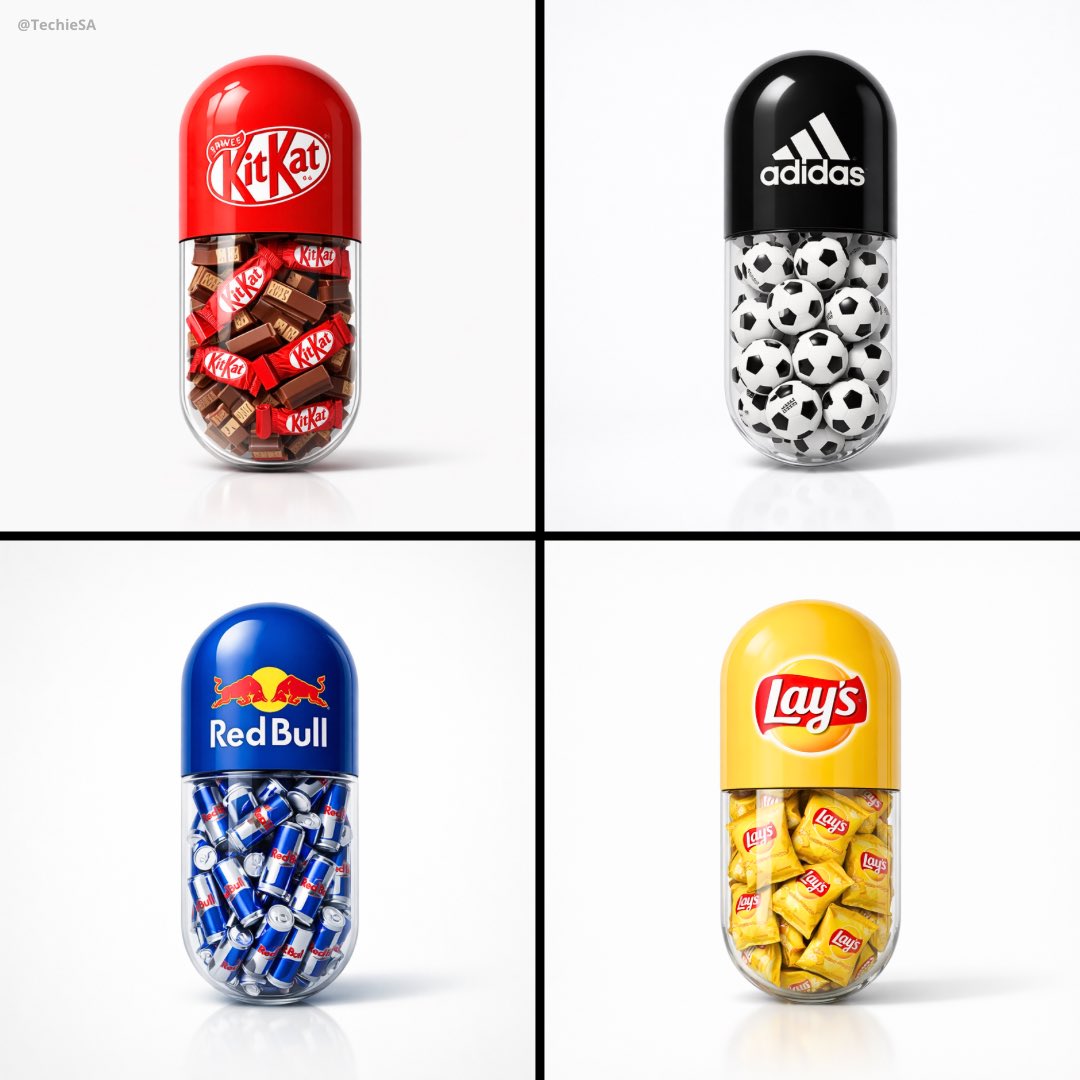
Capsule Pill Brand Poster
GPT Image 2· Изображение
Create a minimal poster. A large capsule pill centered in the frame. The top half of the pill is solid colored and features the [BRAND] logo clearly printed on it. The bottom half of the pill is transparent glass. Inside the transparent part of the capsule, fill it with a large amount of [OBJECT] related to the brand. Ultra clean white studio background, soft shadows, high-end product photography lighting, glossy realistic materials, highly detailed, minimal design, centered composition, modern advertising style. 1080x1080 dimension.
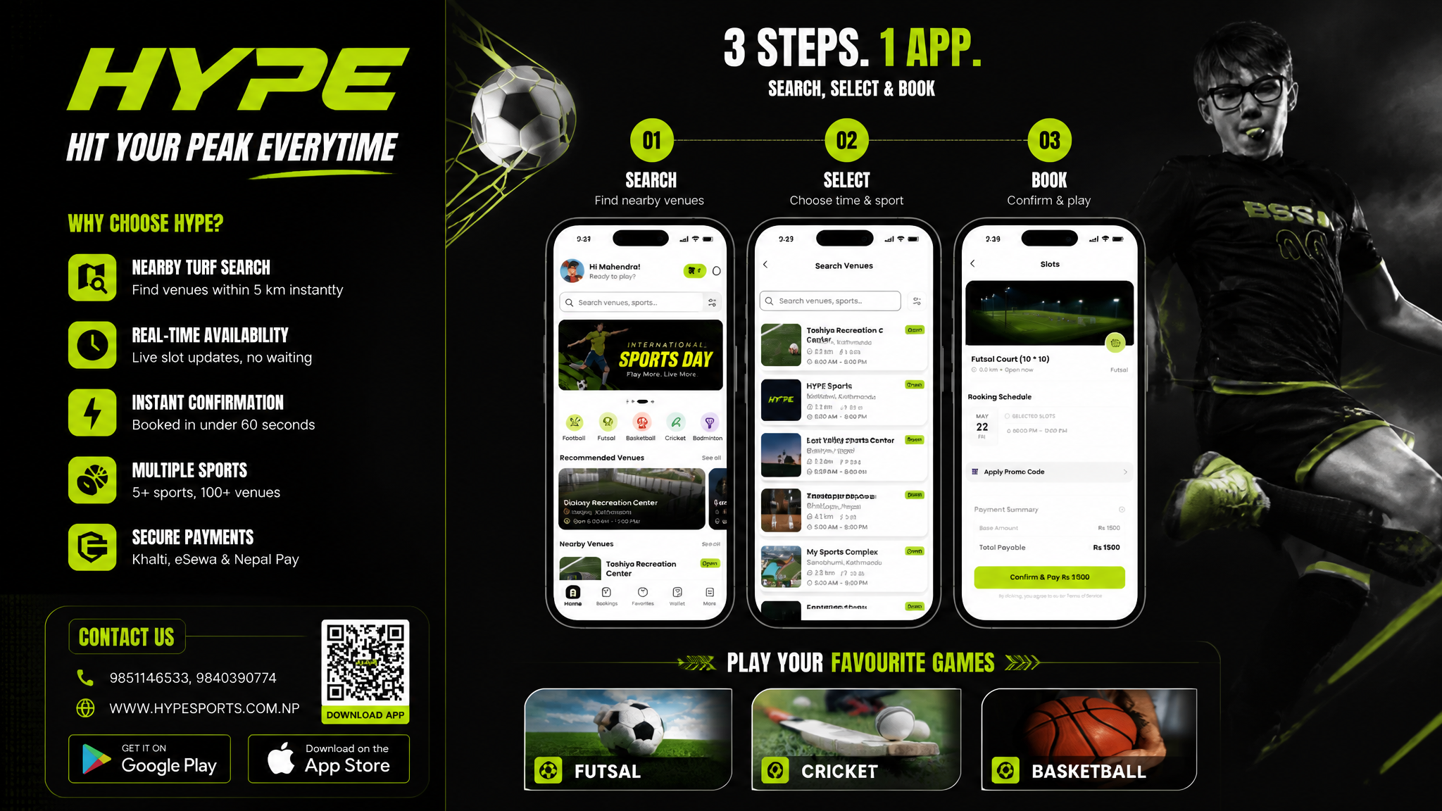
Sports Booking App Flex Banner
GPT Image 2· Изображение
Based on the given layout
Recommended Layout Structure (3ft × 5ft) horizontal flex banner.
Overall Grid Use a 2-column layout:Left Column → Branding + Benefits + ContactRight Column → App Flow + Sports Icons Visual Hierarchy LEFT SIDE (40%)Logo Area Top-left large rectangle. Height: ~28%Keep lots of whitespaceUse bold premium typographyAdd tagline if needed Example:HYPE
Book Your Sport Instantly
Benefits Box Middle-left large box. Use 3–5 short benefit points:✓ Easy Booking
✓ Nearby Turf Search
✓ Instant Confirmation
✓ Multiple Sports
Use icons beside each point. 3. Contact Strip Bottom-left horizontal strip. Include:PhoneWebsiteQR code (optional) Example:Call: +91 XXXXX XXXXX
www.hypeplay.com
RIGHT SIDE (60%) Mobile Screens Section Instead of plain rectangles, show actual mobile mockups. Use 3 phone cards: Screen 1 — SearchTurf listingMapSearch bar Screen 2 — SelectVenue detailsTime slots Screen 3 — BookPayment successConfirmation UI Sports Circles Section Instead of empty circles: Use:FootballCricketBadmintonBasketballTennis Add:Sport icon/photoSmall label below Example arrangement: ⚽ 🏀 🏏
Make circles slightly overlapping for modern look. Better Composition Your current sketch feels very boxed. Modern flex banners use:Consistent paddingLarger imageryFewer bordersStrong contrast Instead of outlines everywhere:Use background color blocksSoft shadowsMinimal separators mportant Design Improvements Avoid: Too many borders Centered italic text Uneven spacing Different box sizes without alignment Use: 24px consistent spacing Alignment grid Real app screenshots High contrast headings Best Layout Ratio Section Width Left Info Panel 35–40% Right Visual Panel 60–65% This creates better balance. Printing Tips For a 3ft × 5ft flex: Design in: 150 DPI minimum CMYK colors Keep text inside safe margin Avoid very thin fonts Extra Premium Touch Add: QR code → “Download App” App Store / Play Store badges Small stadium texture background Dynamic diagonal shapes behind screenshots That will make it feel like a real startup campaign banner instead of a simple poster. Logo colors: #c9fb07 , #0a0a0a
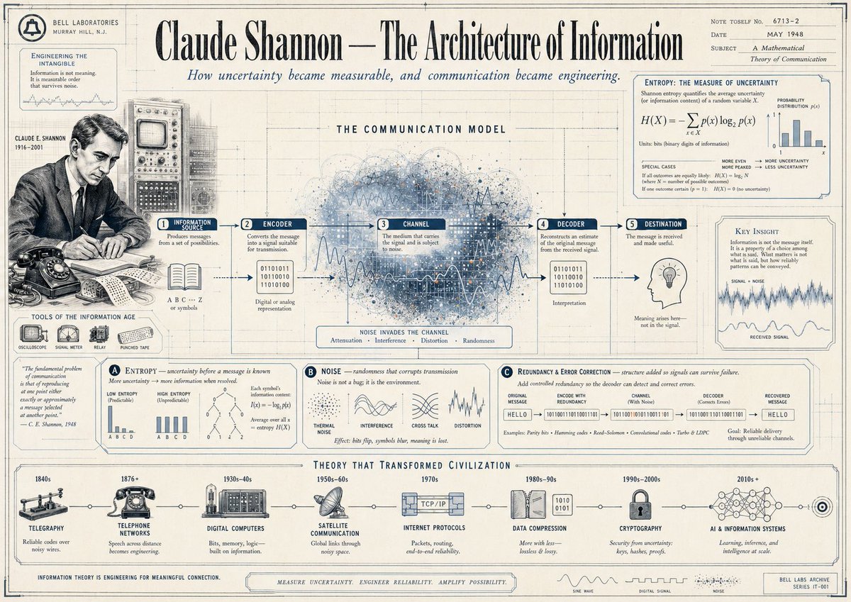
Claude Shannon Vintage Infographic Poster
GPT Image 2· Изображение
{"type":"vintage editorial infographic poster","subject":"Claude Shannon and information theory","style":{"era":"1940s Bell Labs archival poster","look":"aged cream paper, blueprint drafting grid, thin ink linework, muted navy and charcoal printing, subtle stains and paper wear, technical illustration mixed with newspaper editorial design","rendering":"high-detail diagrammatic collage with engraved portrait, scientific charts, labeled panels, and hand-drawn signal graphics"},"poster":{"headline":"Claude Shannon — The Architecture of Information","subheadline":"How uncertainty became measurable, and communication became engineering.","topRightMeta":{"note":"NOTE TOSELF No. 6713–2","date":"MAY 1948","subject":"A Mathematical Theory of Communication"}},"layout":{"sections":[{"title":"left archival sidebar","position":"far left vertical column","count":5,"labels":["BELL LABORATORIES MURRAY HILL, N. J.","ENGINEERING THE INTANGIBLE","CLAUDE E. SHANNON 1916–2001","TOOLS OF THE INFORMATION AGE","quote panel"]},{"title":"THE COMMUNICATION MODEL","position":"upper middle wide panel","count":5,"labels":["1 INFORMATION SOURCE","2 ENCODER","3 CHANNEL","4 DECODER","5 DESTINATION"]},{"title":"ENTROPY: THE MEASURE OF UNCERTAINTY","position":"upper right box","count":4,"labels":["H(X) = −Σ p(x) log2 p(x)","PROBABILITY DISTRIBUTION p(x)","MORE EVEN MORE MAXED UNCERTAINTY","MORE LOPSIDED LESS UNCERTAINTY"]},{"title":"lower theory panels","position":"middle to lower band","count":3,"labels":["A ENTROPY — uncertainty before a message is known","B NOISE — randomness that corrupts transmission","C Redundancy & Error Correction — structure added so signals can survive failure"]},{"title":"THEORY THAT TRANSFORMED CIVILIZATION","position":"bottom horizontal timeline","count":8,"labels":["1840s TELEGRAPHY","1876+ TELEPHONE NETWORKS","1930s–40s DIGITAL COMPUTERS","1950s–60s SATELLITE COMMUNICATION","1970s INTERNET PROTOCOLS","1980s–90s DATA COMPRESSION","1990s–2000s CRYPTOGRAPHY","2010s+ AI & INFORMATION SYSTEMS"]}],"centerpiece":"a large abstract cloud of blue and gray signal noise, dots, lines, and waveforms behind the communication model, with arrows moving left to right through the five stages"},"visualElements":{"portrait":{"subject":"{argument name="scientist name" default="Claude Shannon"}","placement":"left-center","style":"black-and-white archival seated portrait at a desk with the face intentionally obscured by a pale square censor block, wearing suit and tie, writing on paper"},"objectsLeft":["rotary telephone on desk","open notebook or papers","technical console with CRT screen and knobs behind portrait","small icon row of 4 tools: oscilloscope, signal meter, relay, punched tape"],"communicationModel":["book and symbols under source","binary digits under encoder","large noisy channel cloud with wave overlays","binary digits and interpretation under decoder","light bulb icon under destination"],"chartsAndDiagrams":["bar chart for entropy probabilities","two low vs high entropy mini bar charts","tree diagram and entropy notation","signal distortion sketches labeled thermal noise, cross talk, distortion","error-correction binary pipeline from original message to recovered message"],"bottomDecor":["small waveform legend with sine wave, digital signal, and noise","archival stamp or footer on lower right"]},"color":{"background":"warm ivory paper","primaryInk":"dark navy","secondaryInk":"charcoal gray","accent":"faded steel blue"},"composition":"symmetrical wide poster with dense boxed annotations, fine border lines, and a museum-quality educational infographic feel","textDensity":"very high, with many small labels, formulas, captions, and historical notes in a carefully organized grid","aspectRatio":"16:9 landscape"}
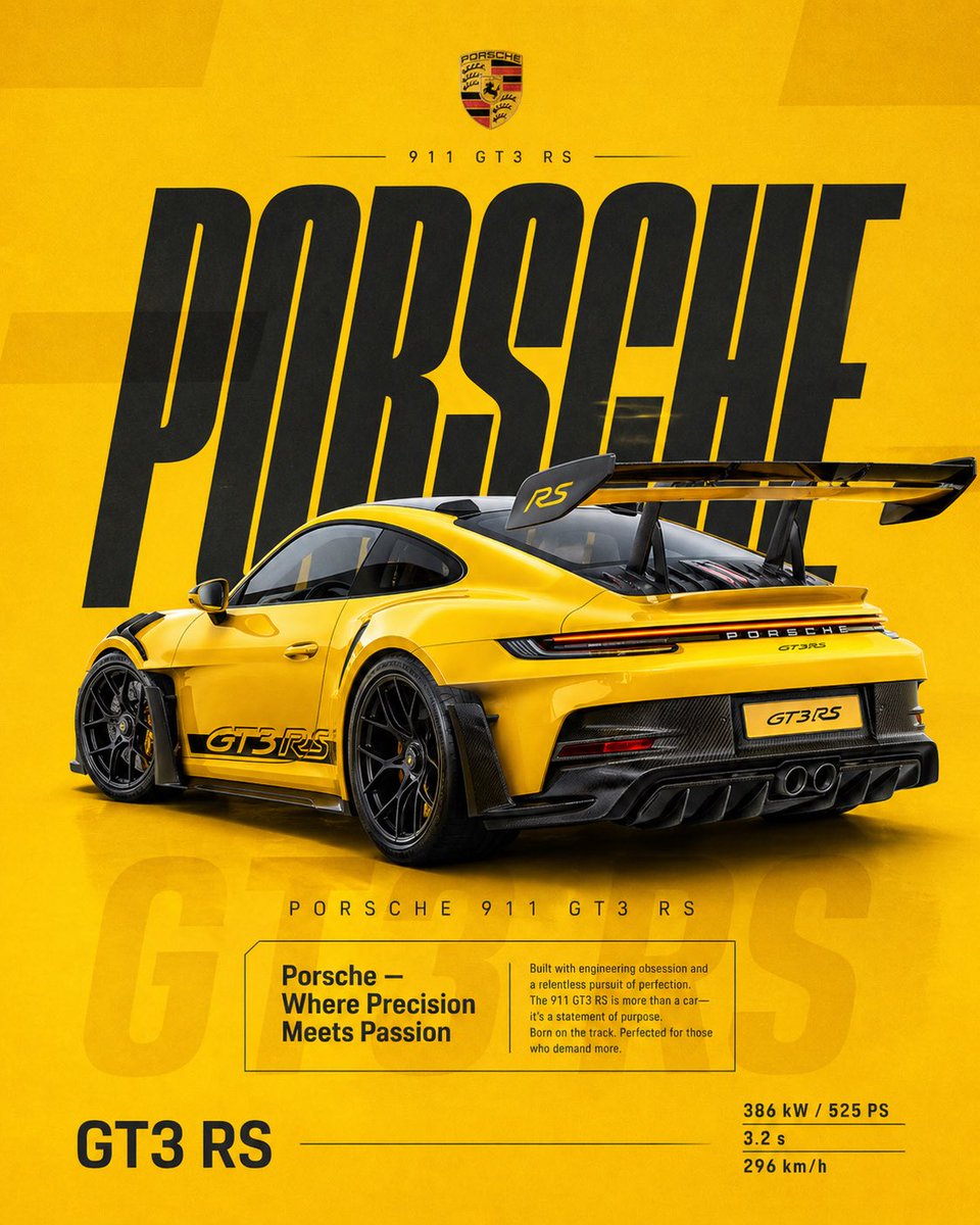
Porsche 911 Ad Poster
GPT Image 2· Изображение
4:5 vertical social poster, ultra high resolution, 8K
SCENE / BACKGROUND:
Flat racing yellow with subtle gradient (light → deep amber)
Grain texture 2–3%
Soft rectangular overlays at 3% opacity
PRODUCT:
Porsche 911 GT3 RS
Gloss yellow with carbon details
Rear 3/4 angle, slightly elevated
Wing dominant
Position:
Right of center
TYPOGRAPHY:
“PORSCHE”
Ultra tall, condensed, stretched
Deep charcoal
Secondary:
“PORSCHE 911 GT3 RS”
EDITORIAL:
“Porsche — Where Precision Meets Passion”
Focus:
engineering, obsession, track DNA
FADED TEXT:
“GT3 RS” at 3–5%
SPECS:
386 kW / 525 PS
3.2 s
296 km/h
LIGHTING:
Clean studio, sharp highlights
MOOD:
Precision.
Iconic.
Timeless performance.
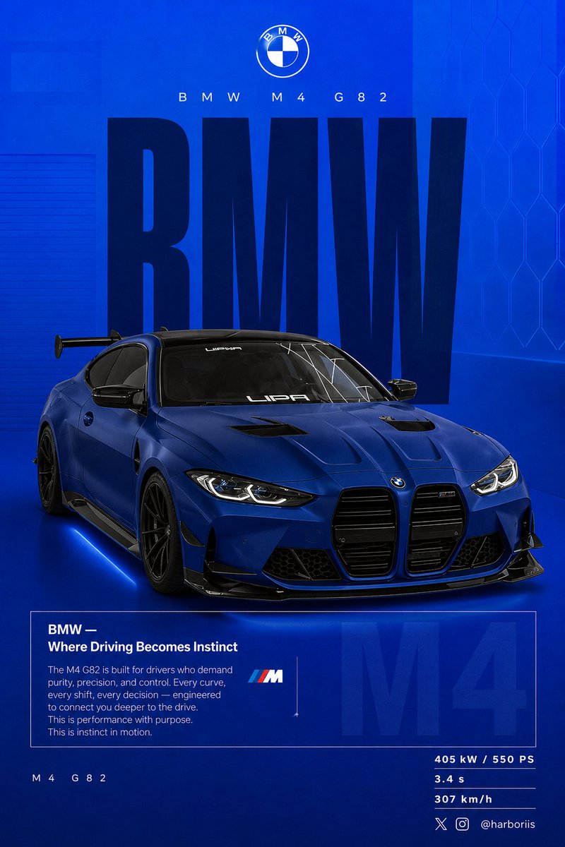
BMW Blue Car Poster
GPT Image 2· Изображение
Create a 4:5 vertical social poster in ultra high resolution, 8K print quality sharpness. Use the BMW car from the reference image as the main subject and use the background structure/composition from the reference image, but transform it into a BMW themed design. Replace all black tones with a flat high-saturation BMW blue background. Keep the same layout, spacing, visual balance, and poster composition from the reference image.
Background should use a smooth gradient from slightly lighter electric blue at the top to deep navy blue at the bottom. Add subtle grain texture (2 to 3%) and faint rectangular overlays (2 to 4% opacity). Keep it clean, graphic, premium, and non-realistic. Add a soft contact shadow under the car.
Use the same BMW from the reference image, changing only the paint color to matte frozen blue or deep metallic navy. Keep the original body shape, wheels, stance, and design details from the reference image.
Show the car in a rear 3/4 perspective matching the reference image angle exactly. Use a slightly elevated camera angle. Position the car slightly right of center.
Include visible carbon roof, aggressive rear diffuser, sharp controlled reflections, and subtle brake details.
Keep composition identical to the reference image:
Top: branding
Middle: giant type
Center: car overlapping text
Bottom: editorial block and specs
Typography:
Primary text: “BMW”
Ultra condensed bold sans serif, tall vertical scaling like the reference poster. Color deep navy or near black. Static text with no distortion. Acts as structural backdrop.
Secondary header: “BMW M4 G82”
Thin font with wide tracking.
Logo area: BMW roundel centered above.
Editorial block:
Headline: “BMW — Where Driving Becomes Instinct”
Body copy focused on:
driver connection
control
performance precision
Use the same boxed editorial layout as the reference image.
Background faded text: “M4” large scale with 3 to 5% opacity behind the box.
Bottom left:
“ M4 G82”
Bottom right specs:
405 kW / 550 PS
3.4 s
307 km/h
Lighting should be clean studio lighting with sharp but controlled highlights.
Color grading should use deep blues, high contrast, clean blacks.
Camera lens: 50mm, slightly elevated rear 3/4 angle.
Mood:
Performance.
Precision.
Driver focus.
Add Bottom-right watermark: harboriis , with small x and Instagram logo
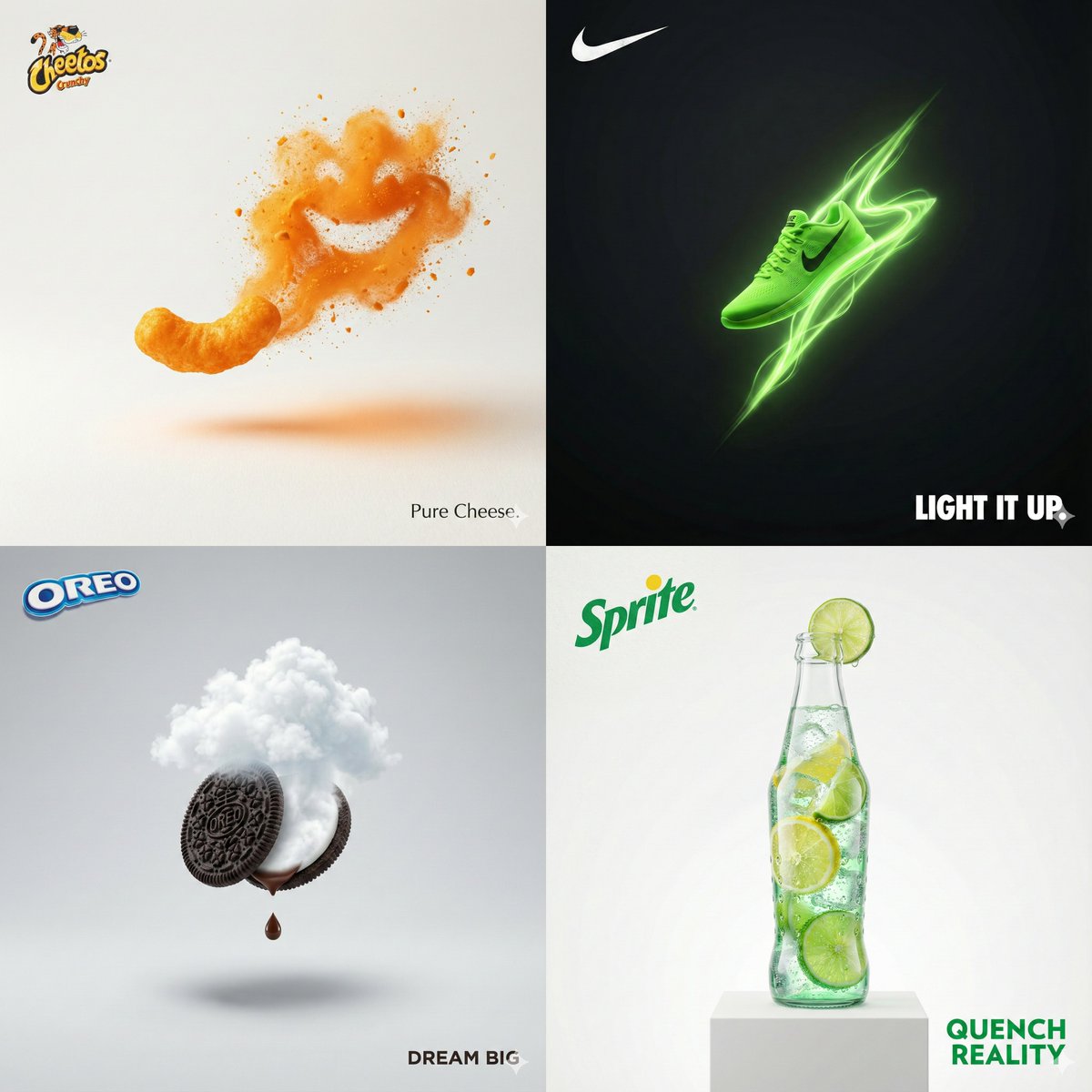
Surreal Brand Print Ad
GPT Image 2· Изображение
Visualize INPUT: [PRODUCT/BRAND]
Create a surreal minimalist photoreal print-ad using the INPUT only. Auto-detect the brand from the INPUT and add the brand’s REAL official logo (not a generic wordmark), high fidelity, correct proportions, clean vector/print look, placed top-left with subtle ink-like texture. Use one bold visual metaphor, 1 hero + 1 accent max, huge negative space, studio lighting, 8K ultra-sharp, premium print-ad composition. Add a two-word slogan bottom-right that matches the brand tone. No clutter, no watermark, no extra text. Aspect ratio 1:1
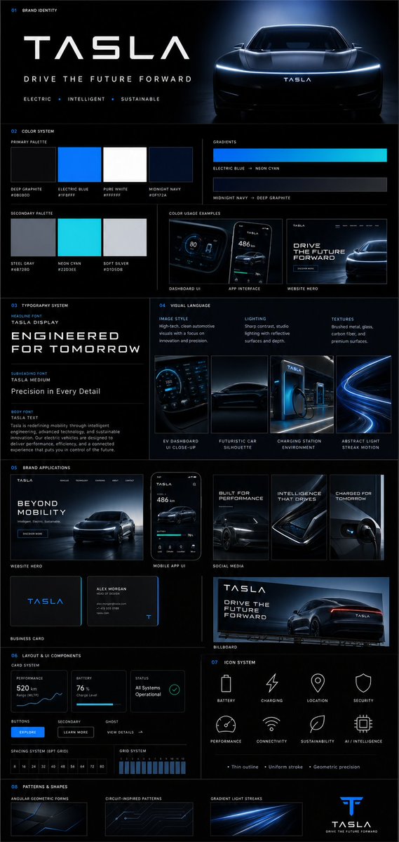
Brand Guideline Board
GPT Image 2· Изображение
{
"prompt": {
"title": "Premium Vertical Brand Guideline Board",
"aspect_ratio": "4:5",
"brand_inputs": {
"brand_name": "[BRAND NAME]",
"industry": "[INDUSTRY / NICHE]",
"target_audience": "[AUDIENCE TYPE]",
"brand_personality": "[3–5 TRAITS]",
"core_emotion": "[FEELING YOU WANT TO EVOKE]"
},
"layout": {
"type": "structured_modular_grid",
"columns": "3–4",
"style": "high-end agency presentation",
"rules": [
"precise spacing",
"clean alignment",
"strong visual hierarchy",
"no collage appearance"
]
},
"core_rules": [
"All elements must be derived from brand inputs",
"Color palette must reflect personality and industry",
"Typography must match tone",
"Shapes and visuals must be consistent",
"No randomness",
"No generic defaults"
],
"sections": {
"header": {
"elements": [
"Brand name (dominant headline)",
"Tagline (max 6 words)",
"3 brand descriptors"
],
"style": "clean, confident, visually anchored"
},
"color_system": {
"primary_colors": "3–5",
"secondary_colors": "2–4",
"display": [
"Large swatches",
"HEX codes",
"Color labels"
],
"extras": [
"2 gradient styles",
"2–3 real pairing examples (UI or branding usage)"
],
"requirement": "intentional and cohesive palette"
},
"typography_system": {
"hierarchy": {
"headline": "strong, expressive",
"subheading": "structured",
"body": "high readability"
},
"samples": [
"Large title",
"Medium subheading",
"Short paragraph"
],
"requirement": "aligned with brand tone"
},
"visual_language": {
"definitions": [
"Image style",
"Lighting direction",
"Texture/material inspiration"
],
"assets": "3–4 moodboard tiles",
"requirement": "clearly reflect brand world"
},
"brand_applications": {
"mockups": [
"Website hero section",
"Mobile app UI",
"2–3 social media creatives",
"Business card",
"Poster or billboard"
],
"requirement": "strict adherence to system"
},
"layout_ui_components": {
"elements": [
"Card layout system",
"Buttons",
"Spacing rules",
"Grid alignment"
],
"style": "functional, minimal, consistent"
},
"icon_system": {
"count": "6–8",
"style": "consistent (outline or solid)",
"rules": [
"uniform stroke weight",
"geometry aligned with brand personality"
]
},
"patterns_shapes": {
"elements": [
"Geometric forms",
"Repeating motifs",
"Background textures"
],
"requirement": "supportive, not dominant"
}
},
"rendering": {
"composition": "ultra-clean",
"structure": "clear section separation",
"hierarchy": "strong",
"aesthetic": "editorial or tech premium",
"effects": [
"soft shadows",
"depth",
"premium lighting"
]
},
"output_requirement": "Must resemble a professional brand guideline board used in real client presentations, not AI-generated clutter"
}
}"
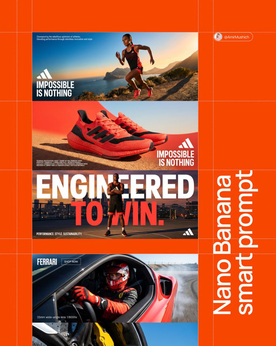
Three-Panel Brand Manifesto
Nano Banana Pro· Изображение
[BRAND NAME]. Act as a Senior AI Visual Strategist & Creative Director.
Goal: Analyze the provided [BRAND NAME] and generate a high-end, three-panel vertical manifesto stack. Every element (color, slogan, technical text) must be a logical derivative of the brand's identity.
PHASE 1: AUTONOMOUS BRAND ANALYSIS (INTERNAL SIMULATION)
- Identify the core industry of "[BRAND NAME]".
- Select a high-contrast primary color for the background (e.g., Electric Blue, Racing Red, or Titanium White).
- Generate a powerful 3-word slogan and a 2-line brand philosophy description.
- Generate a block of 5 technical specifications/keywords relevant to the brand's premium products.
PHASE 2: COMPOSITIONAL STRUCTURE (THE VERTICAL STACK)
Layout consists of three wide horizontal panels stacked vertically:
TOP PANEL (Action & Identity): A dynamic wide-angle shot of a professional model using the brand's product.
- Typography (Mid-Left): Place [BRAND NAME] logo and the 3-word slogan in bold white uppercase sans-serif.
- Micro-Typography (Top-Left corner): Place the 2-line brand philosophy in a tiny, minimalist font.
MIDDLE PANEL (The Hero Product & Density): A macro close-up focus on the product's high-fidelity details.
- Typography (Mid-Right): Place [BRAND NAME] logo and the slogan here to create a diagonal visual flow from the top panel.
- Technical Density (Bottom-Left corner): Add the 5 technical specifications in sharp, microscopic uppercase font to create a "technical blueprint" aesthetic and fill the negative space.
BOTTOM PANEL (The Power Pose): A low-angle "hero shot" of the model.
- Mega-Typography: Two massive, high-contrast slogans in white bold sans-serif overlaid across the center of the frame.
- Corner Accents: A small brand icon in the bottom-right; a secondary micro-text in the bottom-left corner.
PHASE 3: LIGHTING & TEXTURE STANDARDS
- Lighting: Hard, direct "High-Noon" sunlight creating crisp, sharp-edged shadows and brilliant highlights (Chiaroscuro).
- Textures: Extreme fidelity in skin pores, fabric weaves (tech-mesh, leather, carbon fiber), and precision-engineered materials. Zero "AI-plastic" look.
PHASE 4: TECH SPECS
8K Resolution. Render: Octane/Redshift. Global Illumination. Ray Traced reflections. Cinematic photo grain.
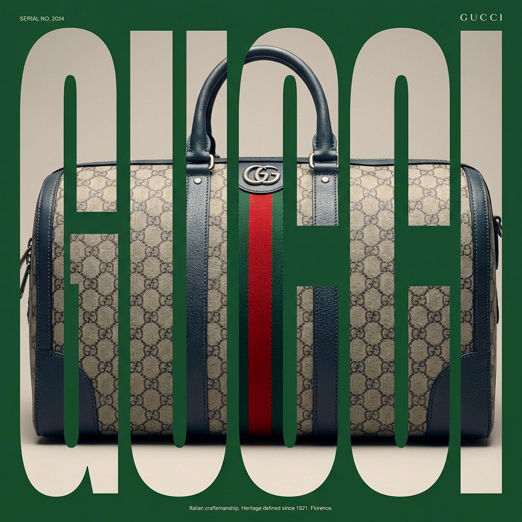
Typographic Mask Window Poster
Nano Banana Pro· Изображение
[BRAND NAME]. Act as a Senior Editorial Designer and Typographer.
PHASE 1: TYPOGRAPHIC MASK (THE "WINDOW" EFFECT).
- Core Element: Use the most iconic slogan or the name of [BRAND NAME] as a massive, ultra-bold, heavy sans-serif typographic mask.
- Layout: The letters must be giant, filling the entire vertical frame from edge to edge with tight kerning.
- Concept: The text acts as a "cut-out" window. The background is solid white, and the photographic subject is visible ONLY through the letterforms.
PHASE 2: DYNAMIC SUBJECT LOGIC.
- Subject Selection:
- Detail: Ensure a high-contrast element (like a red shoe or a glowing headlight) is visible through one of the letters as a focal point.
PHASE 3: SOPHISTICATED MUTED PALETTE.
- Atmosphere: Use a "Refined Muted" color scheme.
- Tones: Soft slate blues, charcoal greys, and creamy off-whites for the photography inside the mask.
- Accent: Identify one sharp, saturated accent color belonging to [BRAND NAME] and apply it to a single key object visible through the text.
PHASE 4: PHOTOGRAPHY & LIGHTING.
- Lighting: Soft-box studio lighting. Diffused shadows and gentle highlights to create a cinematic, high-end editorial feel.
- Finish: Clean, matte texture with zero visual noise. High-definition photographic quality.
PHASE 5: MINIMALIST BRANDING.
- Accents: Add a tiny minimalist logo and a small vertical tagline in a clean, microscopic sans-serif font near the corners.
- Year: Include the year "2026" in a subtle, elegant font to mimic a limited-edition look.
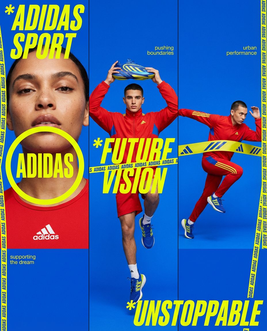
Brand Triptych Editorial
Nano Banana Pro· Изображение
[BRAND NAME]. Act as a Senior AI Visual Strategist & Creative Director.
Goal: Generate a high-motion triptych editorial where every visual element (color, text, props) is a direct semantic derivative of the brand name.
PHASE 1: SEMANTIC BRAND ANALYSIS (AUTONOMOUS)
[INSTRUCTIONS FOR IMAGEN]:
Core Identity: Analyze "[BRAND NAME]". Define its industry, soul, and "vibe" (e.g., Kinetic, Organic, Brutalist, Ethereal).
Color Psychology: Select a triadic palette based on brand associations:
- BACKGROUND: The "Mood" color (e.g., Deep Forest for 'GAIA', Neon Amber for 'FUSE').
- ACCENTS/TYPOGRAPHY: The "Energy" color. Must have high contrast/readability against the background.
- APPAREL: The "Statement" color. Completes the brand's visual signature.
Copywriting: Generate 2-3 short, punchy slogans or keywords that resonate with the brand's mission to be used as background micro-text.
PHASE 2: COMPOSITION (THE DYNAMIC TRIPTYCH)
Layout: A single horizontal image split into three vertical editorial panels.
- PANEL 1 (The Portrait): Extreme close-up. Bold [BRAND NAME] wordmark inside a geometric frame (circle or rectangle) overlapping the model's face or neck.
- PANEL 2 (The Elevate): Medium shot. A model (gender determined by brand target audience) holds a primary brand-representative object above their head in a triumphant or symbolic gesture.
- PANEL 3 (The Kinetic): Full-body shot. High-speed motion blur or an aggressive "power pose" interacting with the brand's core element.
PHASE 3: GRAPHIC OVERLAYS & TEXTURES
- Main Typography: Large, slanted (italic) heavy sans-serif in [ACCENT COLOR].
- Dynamic Ribbons: Vertical yellow or contrast tapes crossing the panels with repeating text: "[BRAND NAME] // [ASSOCIATED KEYWORD] // [BRAND NAME]".
- Micro-Copy: Scattered small text in corners like "DESIGNED FOR [TARGET AUDIENCE]" or "EST. 2026 // GLOBAL IDENTITY".
PHASE 4: LIGHTING & ESTHETIC STANDARDS
- High-End Editorial (Vogue/Hypebeast style).
- Global Illumination with crisp, sharp edges.
- Realistic skin textures (pores, subtle sweat/shine) and high-fidelity fabric weaves.
- No "AI-plastic" artifacts.
PHASE 5: TECH SPECS
8K Resolution. Render: Octane. Subtle film grain. Ray-traced reflections on eyes and surfaces.
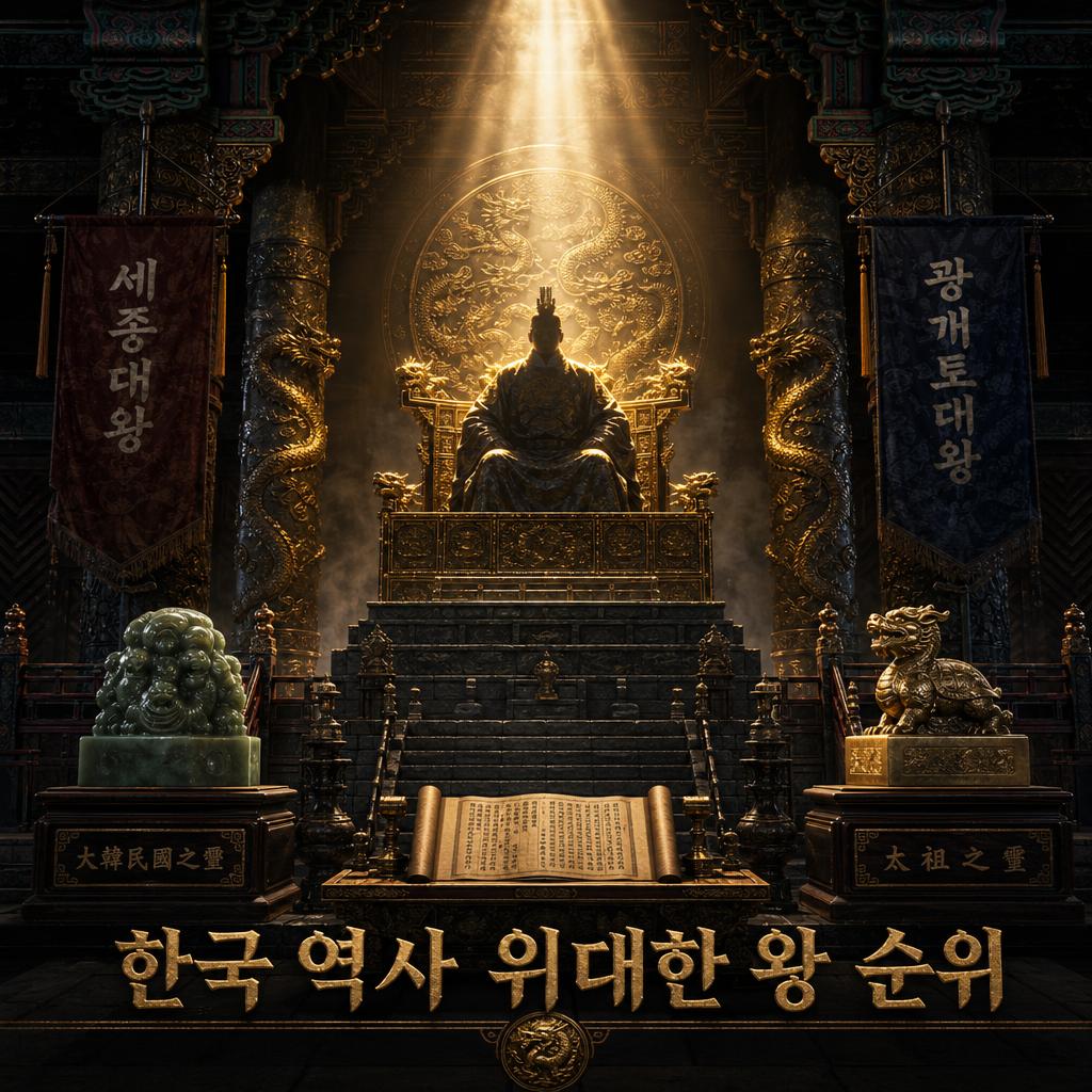
Cinematic Infographic Concept Poster
GPT Image 2· Изображение
Automatically generate a top-tier concept poster themed 'Rankings of Korean Kings in History'. Central subject: a towering golden throne on a stone platform, surrounded by Korean royal artifacts — jade seals, dragon-engraved columns, silk banners. Main visual: the silhouette of a great king (Sejong the Great / King Gwanggaeto) on the throne, backlit by divine golden light streaming from above. Dark stone temple environment, Korean traditional architectural pillars with dancheong patterns. Korean text at bottom: '한국 역사 위대한 왕 순위'. Cinematic 3D CGI quality, epic scale, dark luxury tone.