Abstract Style Painting
Image prompts for original abstract works built from color fields, texture, and intentional nonliteral composition.
2026.08.14
把「Abstract Style Painting」做成你想要的样子做一个你自己的「Abstract Style Painting」
用大白话说出来就行——Carat 会为你生成合适的图片和视频。

每天 100 免费积分,现在就开始
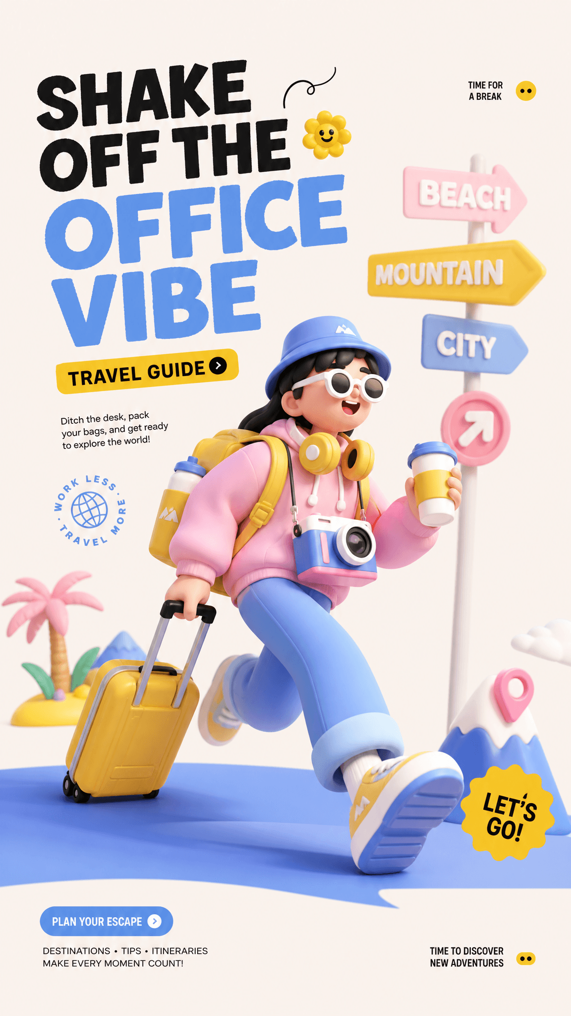
3D Illustration Poster (C4D Style)
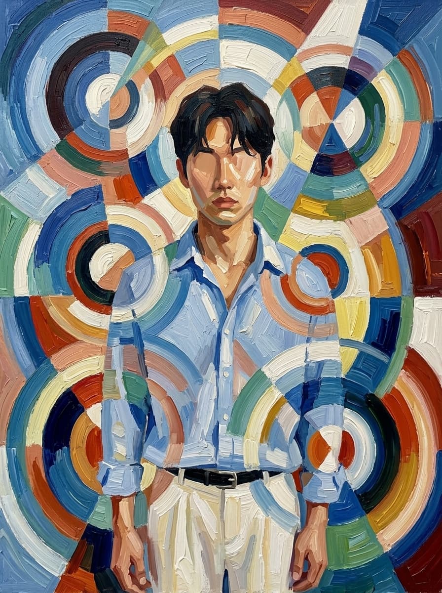
Orphism Circular Color Abstraction
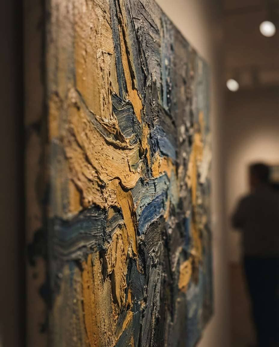
Textured Impasto Fields
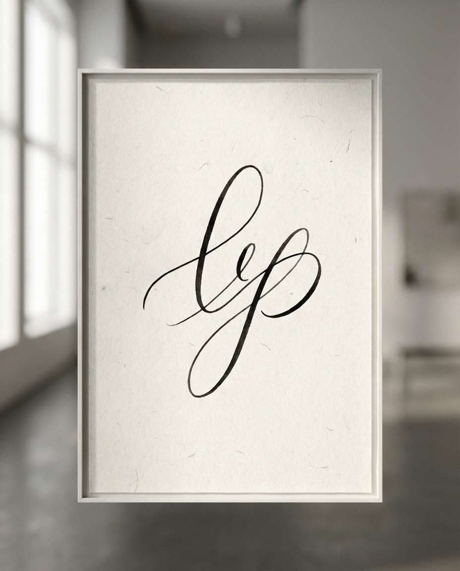
Minimal Line Poetry

Neon Gradient Haze
What is abstract style painting?
Abstract style painting communicates emotion and structure through color, line, shape, texture, and rhythm instead of simply copying a visible subject. It may retain a simplified object or figure, or it may become entirely nonrepresentational. Rather than writing only “abstract,” describe the scale of color fields, direction of marks, material surface, negative space, and visual center so the prompt has a deliberate point of view.
Structure and balance
Choose a focal region before adding secondary marks. Asymmetry, the contrast between large planes and small accents, and a repeated curve or line can create order without making the image literal. For a landscape canvas, describe the left-to-right flow; for a square, specify centered concentration or generous edge breathing room. These choices help the model build a composition rather than a random collection of effects.
Palette and surface
Limit the palette with names such as cobalt blue, vermilion, cream, and charcoal. Material cues like thick acrylic impasto, ink bleed, dry-brush edges, canvas fibers, or rough paper add tactile depth. Keeping one accent color especially vivid gives the thumbnail a readable focal point while the supporting colors remain controlled.
Where to use it
Abstract prompts can support wall-art concepts, album covers, exhibition poster backgrounds, brand moodboards, and phone wallpapers. Decide whether the design should run to the edges or keep a central artwork area. If text will be added later, reserve a quiet zone. Refer to broad compositional principles rather than copying a recognizable artwork, signature, or distinctive arrangement.
Prompt sequence
List the subject or nonliteral theme, visual language, palette, material, lighting, composition, and aspect ratio. If the result is too busy, reduce the number of colors and enlarge the main plane. If it feels flat, add layered pigment, scratched surfaces, transparent washes, or directional marks. Finish by checking the intended negative space and whether logos or watermarks are unwanted.
常见问题
Choose one focal area and reduce the density and contrast of surrounding marks so the image has a visual hierarchy.
Begin with three or four main colors plus one accent so the relationships remain easy to read.
Yes. Describe acrylic impasto, ink bleed, canvas grain, dry-brush edges, or another surface cue.
Yes. State the final ratio, intended margins, and whether the artwork should continue to the edges.
Reserve quiet space when a poster caption, album title, or brand mark will be added later.
Use broad principles such as planes and texture to make an original arrangement instead of copying a work or signature.
Change one variable at a time, such as focal color, element count, mark direction, or aspect ratio, and compare outputs.