Retro Magazine Style
Create original Retro Magazine Style images with practical AI prompt guidance for composition, materials, color, and production-ready variations.
2026.07.14
把「Retro Magazine Style」做成你想要的样子做一个你自己的「Retro Magazine Style」
用大白话说出来就行——Carat 会为你生成合适的图片和视频。

每天 100 免费积分,现在就开始

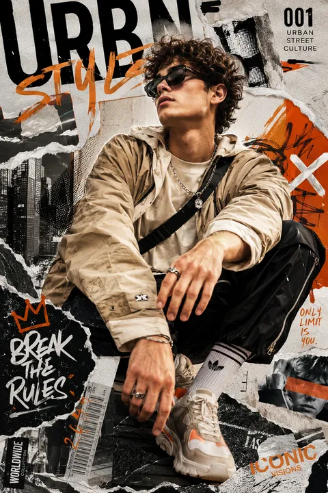
Urban Fashion Collage Poster
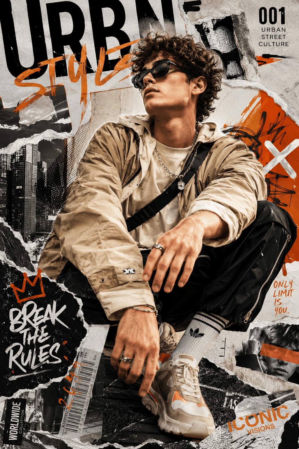
Urban Fashion Editorial Collage
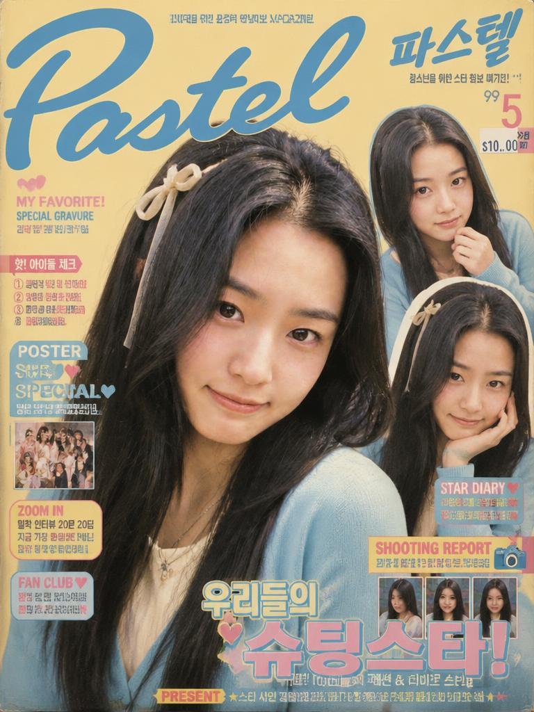
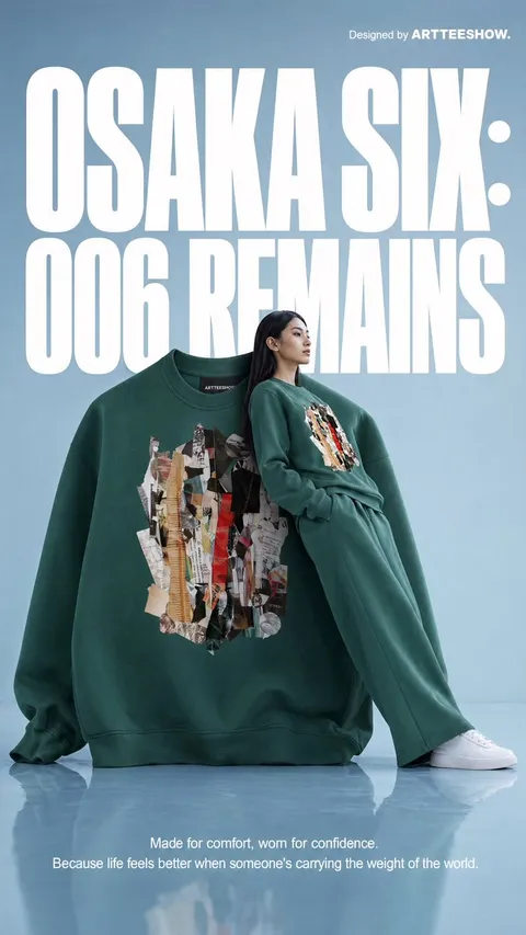
Pastel Teen Magazine Cover
What Are Retro Magazine Style AI Prompts?
Retro Magazine Style prompts are structured instructions for building a clear visual concept rather than relying on a style label alone. A useful prompt separates the subject, material, palette, camera angle, environment, and final medium. This makes the hierarchy easier for GPT Image 2 to interpret and keeps the main silhouette readable when decorative details are added. The examples on this page focus on original visual language instead of reproducing a named artwork, brand, or protected character. They can serve as a starting point for controlled iterations across commercial, editorial, and personal projects.
Practical Use Cases
This visual direction works for 독립 잡지 표지, 브랜드 룩북, 음악 포스터, 에디토리얼 콜라주. A square social thumbnail benefits from a centered subject and immediate color contrast, while a horizontal banner needs deliberate negative space for later copy. For print, simplify tiny details and preserve strong edge definition. Before using a result, inspect cropped edges, malformed ornaments, accidental letters, inconsistent lighting, and resemblance to an existing identity. Treat the first image as a design draft and refine one variable at a time rather than changing every instruction together.
Visual Components and Variations
The defining ingredients include 바랜 인쇄색, 굵은 세리프 제목 영역, 종이 질감, 비대칭 그리드, 아날로그 스캔 흔적. Keep the subject fixed while testing alternate materials, background density, light direction, or accent colors. This produces a coherent family of options and makes comparison easier. State the target aspect ratio and viewing size near the beginning of the prompt. If the asset must work as an icon, ask for a compact silhouette and fewer secondary objects. If it will appear on a detail page, allow richer texture but keep important features away from the frame.
Related Prompts
Prompt Construction Tips
Start with a precise subject and purpose, then specify composition, material, palette, lighting, and exclusions in that order. Describe visual properties instead of citing a particular studio or franchise. Request a full, uncropped subject when anatomy or a complete emblem matters. End with constraints such as no text, no logo, no watermark, and adequate padding. After generation, preserve successful features and revise only one dimension, such as color, camera height, or background complexity. Separate versions for thumbnails, banners, and print layouts usually outperform a single image stretched across every format.
常见问题
Define the intended use and central subject first, then select only the essential visual traits. A clear destination makes decisions about composition, detail, and contrast much easier.
Request a square canvas, centered placement, generous edge padding, and a silhouette that remains legible on a small screen. Specify any area that should remain open for later copy.
Limit the number of secondary ornaments and simplify the background. Numeric constraints, such as one main symbol and two supporting details, give the model a clearer hierarchy.
Fix two main colors, one accent color, the material description, and the lighting direction. Keep those phrases unchanged while varying only one other component per generation.
Describe period, material, palette, geometry, and mood rather than naming a particular artist, brand, or character. Add original symbols and patterns that distinguish the concept.
Check fine lines at final size, cropped borders, inconsistent textures, accidental lettering, and watermark-like artifacts. Regenerate with more padding if important elements touch the edge.
Lock the subject and silhouette first, then revise color, material, and background in separate passes. One change per iteration makes cause and effect easier to evaluate.