Statistics Poster
AI prompts for turning complex data into a clear statistics poster with charts and information blocks.
2026.07.16
把「Statistics Poster」做成你想要的样子做一个你自己的「Statistics Poster」
用大白话说出来就行——Carat 会为你生成合适的图片和视频。

每天 100 免费积分,现在就开始
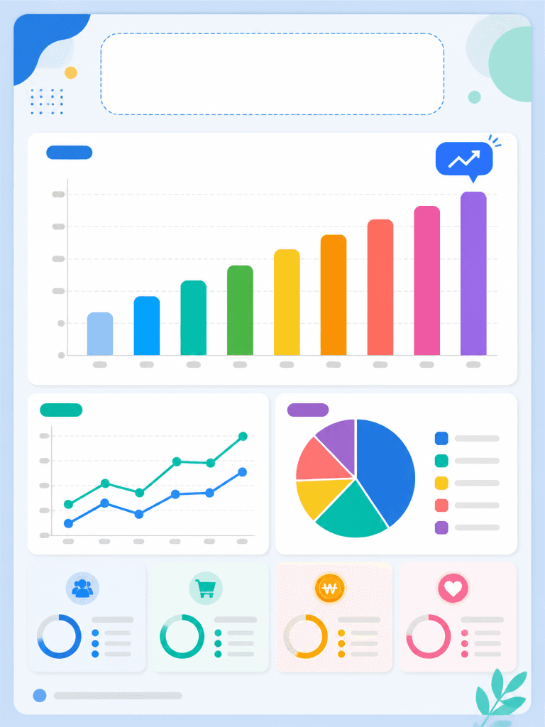
통계 포스터
What a statistics poster should do
A statistics poster is not a wall of numbers. It is a visual communication tool that helps viewers understand one important finding quickly. Define where the poster will be viewed and which question it must answer before choosing a layout. A research poster may lead with the conclusion, while a campaign poster may lead with a number that supports an action. Separate primary metrics from supporting data so the page does not become a spreadsheet.
Create chart and information hierarchy
Place a concise title and the main takeaway near the top, then give the most important bar or line chart the largest visual area. When there are many comparisons, use consistent axes and colors instead of repeating unrelated chart treatments. Pie charts work best for a small number of parts, while bars are easier for close comparisons. Put source, time period, and sample size in a distinct information block near the bottom.
Use color for meaning and legibility
Color should explain the data rather than decorate the page. Choose one base color and one accent, then reuse the same color for the same meaning across charts. Maintain contrast between the background, marks, and future labels, and do not rely on color alone to distinguish categories. Check the smallest axis labels and values at the actual print and mobile sizes before publishing.
Write an editable AI prompt
Specify the poster ratio, chart types, chart count, data-card positions, headline zone, and source zone in the prompt. Do not ask the image model to render exact values or sentences because small errors can change the meaning. Request blank text areas and prohibit pseudo-text, incorrect axis labels, and invented logos. Replace every placeholder with verified data in a design editor after generation.
Review before presenting or sharing
Compare every number, unit, period, source, and sample size against the original dataset. Confirm that axes, legends, highlights, and category colors communicate the intended relationship without exaggeration. A presentation poster should emphasize a conclusion visible from a distance, while a social card should keep one message per screen. Adjust the amount of information for each channel.