
Sticky Note Sticker Design
A focused visual guide for Sticky Note Sticker Design with practical usage notes.
2026.08.29
把「Sticky Note Sticker Design」做成你想要的样子做一个你自己的「Sticky Note Sticker Design」
用大白话说出来就行——Carat 会为你生成合适的图片和视频。

每天 100 免费积分,现在就开始
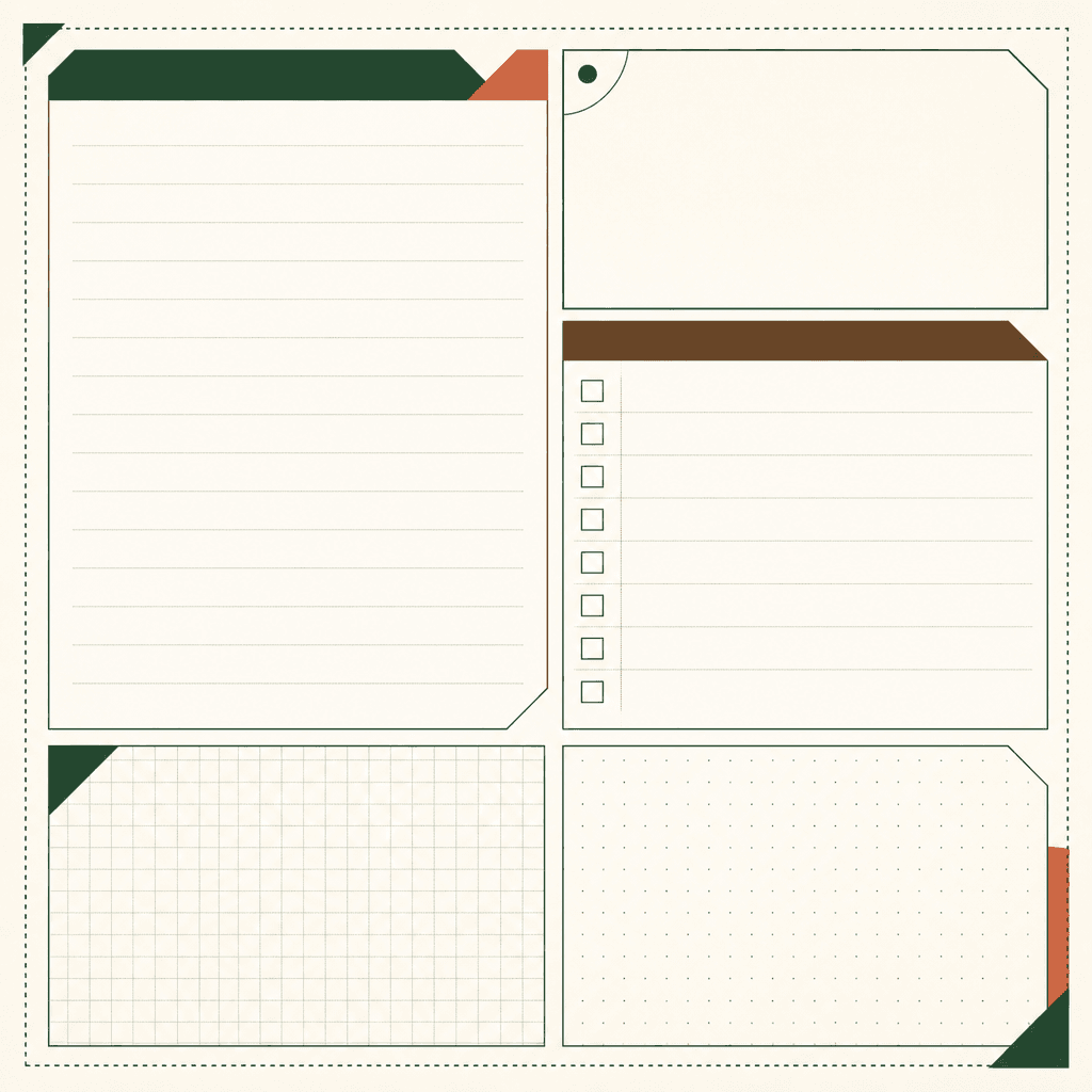
Sticky Note Design
This reference presents a sticky-note sticker as a functional graphic object, not merely a decorative paper illustration. Its defining parts are open writing zones, light ruled or gridded guides, and borders made from dotted lines, solid lines, or divided color blocks. Begin by deciding what the space must hold: a short reminder, a checklist, an idea, or a diary note. The blank area should remain generous enough for handwriting, while guides should support alignment without becoming the main image. Borders can separate functions, signal a cut edge, or create a visual rhythm across one sheet. Limited color helps writing remain visible and makes the set easier to print. Test the design at the intended physical size before adding copy or branding. Check trim margins and the safe area around each writable panel. In a prompt, name the blank region, line system, grid, and border treatment explicitly. This page is a practical starting point for stationery concepts, planner decoration, and sticker-sheet development. It also gives a clear checklist for reviewing whether the result remains useful after the decorative details are reduced.
常见问题
The page focuses on the observable visual signals named in the Korean brief.
It can support a reference board, content planning, or a reusable design brief.
Keep the subject-specific shapes and functional areas readable at the intended size.
Name concrete objects, materials, facial traits, or writing areas instead of vague mood words.
Yes. Add copy, branding, or production marks as separate layers after checking the base image.
Confirm that the defining silhouette and the main functional region remain legible.
It gives a focused visual starting point for this keyword rather than a generic template.


