GPT Image 2· 图片
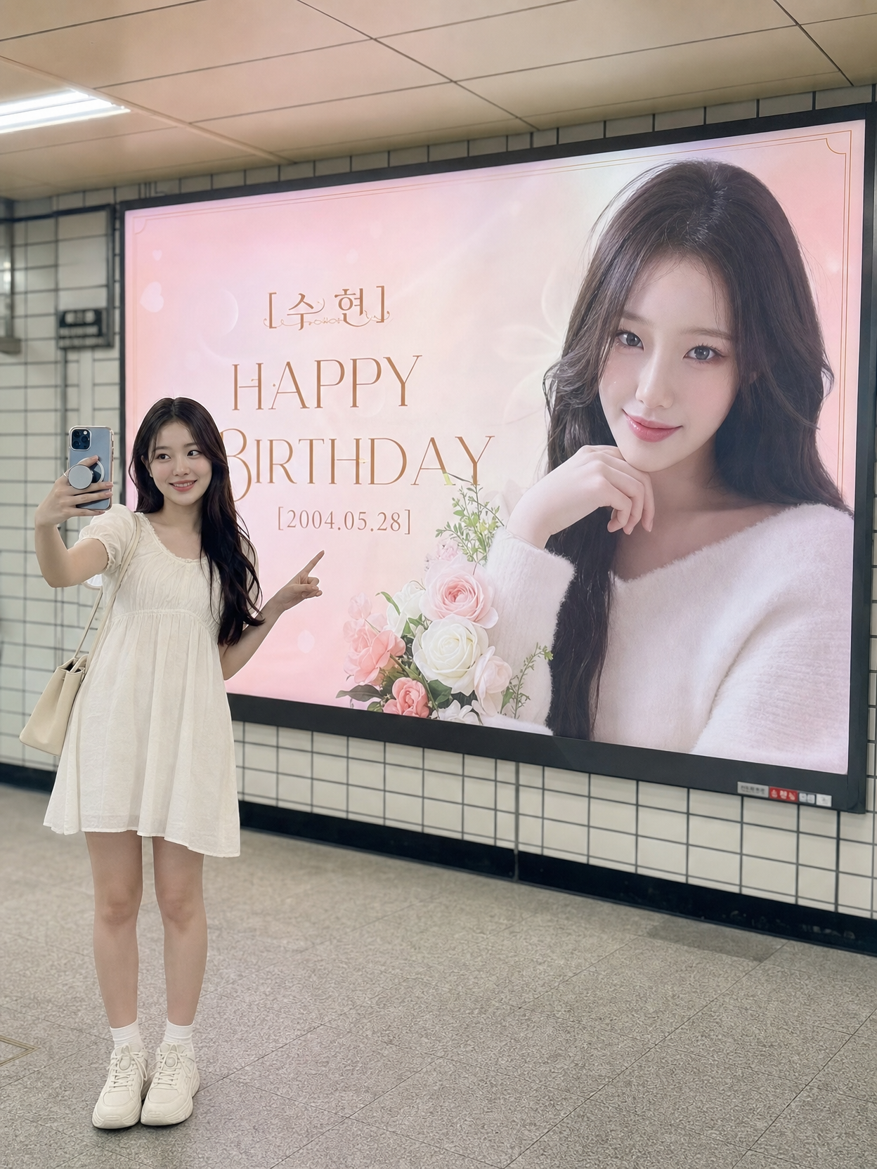
Transform the person in the reference photo into a luxurious Korean subway station birthday advertisement billboard (birthday billboard). This must look like a professionally designed K-POP idol birthday ad printed on a wide horizontal digital display.
=== PERSON (RIGHT SIDE, ~40% of frame) ===
- Place the person on the RIGHT side of the image, framed from the CHEST UP (medium close-up portrait).
- PRESERVE the person's EXACT face, facial features, skin tone, eye shape, nose, lips, and hairstyle from the reference photo. Do NOT alter their identity in any way.
- Expression: gentle, warm, soft natural smile — friendly and celebratory.
- Pose: shoulders relaxed, turned very slightly toward center, looking directly at the camera.
- Outfit: replace with an elegant, delicate cream/ivory ruffled blouse or knit top. Add a thin gold chain necklace with a small pendant.
- Apply soft, flattering, diffused beauty lighting on the face — no harsh shadows. Subtle rim light / halo effect on hair and shoulders from behind.
=== TEXT & LAYOUT (LEFT SIDE, ~60% of frame) ===
All text is CENTER-ALIGNED and stacked vertically on the LEFT side of the image:
1. [TOP] A small, delicate gold line-art crown or filigree flourish ornament, centered.
2. [NAME] "{Name}" — LARGE elegant Korean serif font, champagne-gold metallic color. This is the biggest text element.
3. [Small decorative flourish line below the name]
4. [MAIN TITLE] "HAPPY BIRTHDAY" — large, bold serif typeface with a subtle ombre gradient from light pink to slightly darker mauve/rose. Second largest text.
5. [DATE] "{YYYY. MM. DD}" — clean, modern sans-serif font, high letter-spacing, smaller size, light gold or soft gray color.
6. [Small decorative flourish]
7. [MESSAGE] "{Message, e.g.: Shining OO, I support every moment of yours ♡}" — delicate handwritten-style script font, soft pink/mauve color, smallest text.
=== COLOR PALETTE ===
- Primary: soft cream, pale off-white
- Secondary: muted lavender, pale petal pink, soft rose
- Accents: champagne-gold metallic (for text, borders, ornaments)
- NO saturated or neon colors. Everything is muted, airy, and romantic.
=== BACKGROUND & DECORATIVE ELEMENTS ===
- Smooth, dreamy gradient background — slightly warmer/deeper light in the center, diffusing to creamy-white at the edges.
- BOKEH: fill the entire image with soft-focus circular bokeh highlights of varying sizes in white and light gold. Creates an ethereal, dreamlike quality.
- FLOWERS (lower-left corner): cluster of soft-focus lavender and pink roses/hydrangeas.
- FLOWERS (lower-right corner, near person): wispy white baby's breath (gypsophila).
- PETALS: a few translucent floating pink flower petals scattered on the left side for depth.
- BORDER: very thin, elegant gold-colored border framing the entire image.
=== OVERALL AESTHETIC ===
- Style: ethereal romantic, sophisticated, feminine, celebratory
- Mood: warm, affectionate, wholesome — typical of K-POP idol birthday fan-made subway advertisements
- Quality: professional graphic design level, clean layout, balanced composition between portrait and text
- The final result must look like a REAL printed billboard ad you'd see in Gangnam Station or Hongdae Station.
=== CRITICAL RULES ===
- The person's face identity from the reference photo must be 100% preserved.
- All Korean text must be spelled correctly with no typos.
- Text must be crisp, legible, and beautifully typeset — not distorted or warped.
- Maintain the horizontal wide billboard aspect ratio throughout.