carat

Prompt Gallery

/

디자이너

Login
Sign Up

디자이너

로고, 포스터, 명함, 목업까지 디자이너 업무에 바로 쓰는 AI 이미지 프롬프트. 브랜드 로고 시안과 광고 포스터, 패키지 목업을 빠르게 만들 수 있습니다.

2026.07.01

·
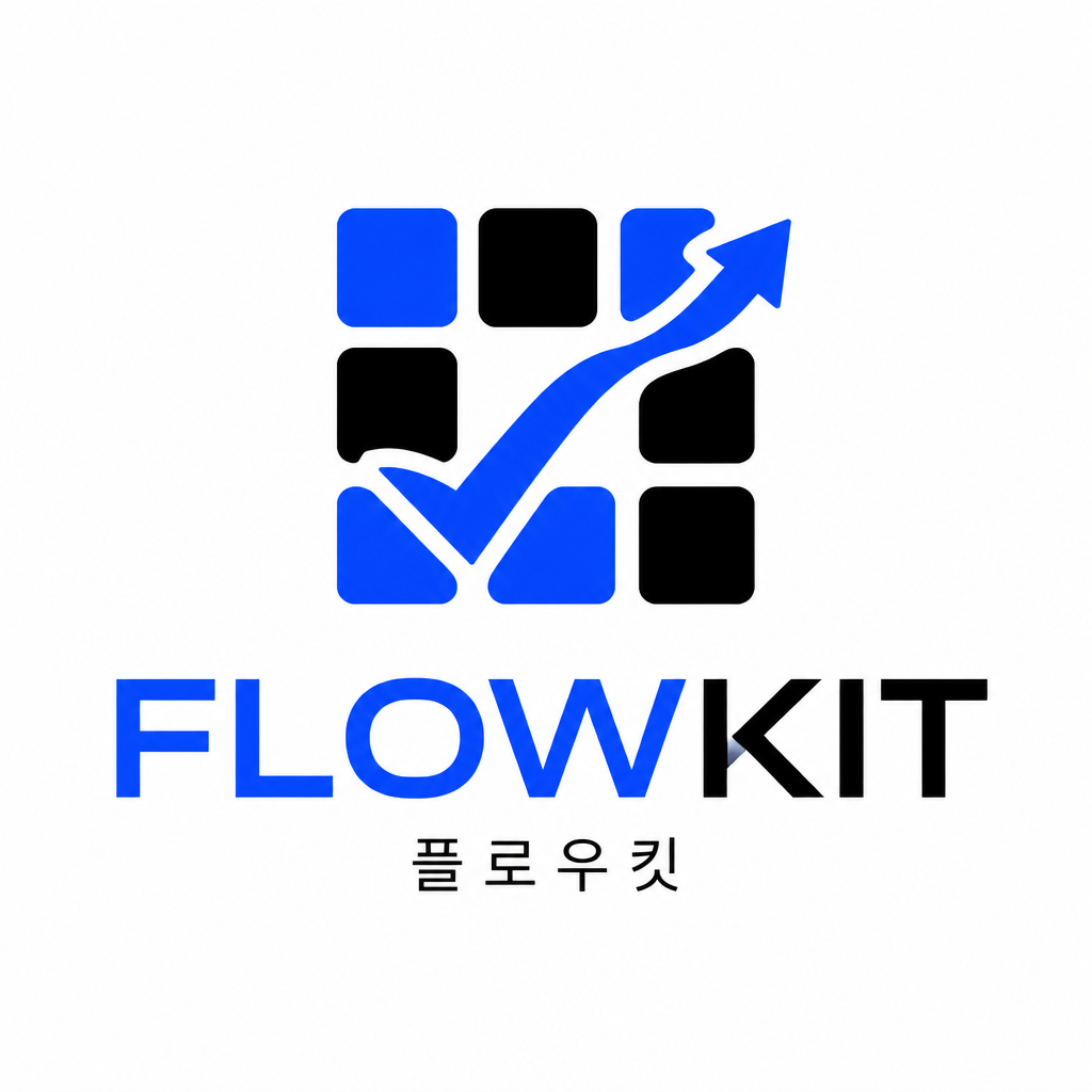
GPT 이미지 2로 생성한 스타트업 로고

스타트업 로고

GPT 이미지 2· Image
Design a crisp technology startup logo for an AI productivity app named 'FLOWKIT'. Use a geometric abstract symbol that combines a check mark, flowing arrow, and modular grid. Use a modern sans-serif wordmark, sharp but friendly. Color palette: electric blue, black, white. Flat vector logo, no 3D, no gradient overload, no mockup. Add a small Korean descriptor '플로우킷' in clean typography below. The logo should feel like a SaaS product used by teams and creators.
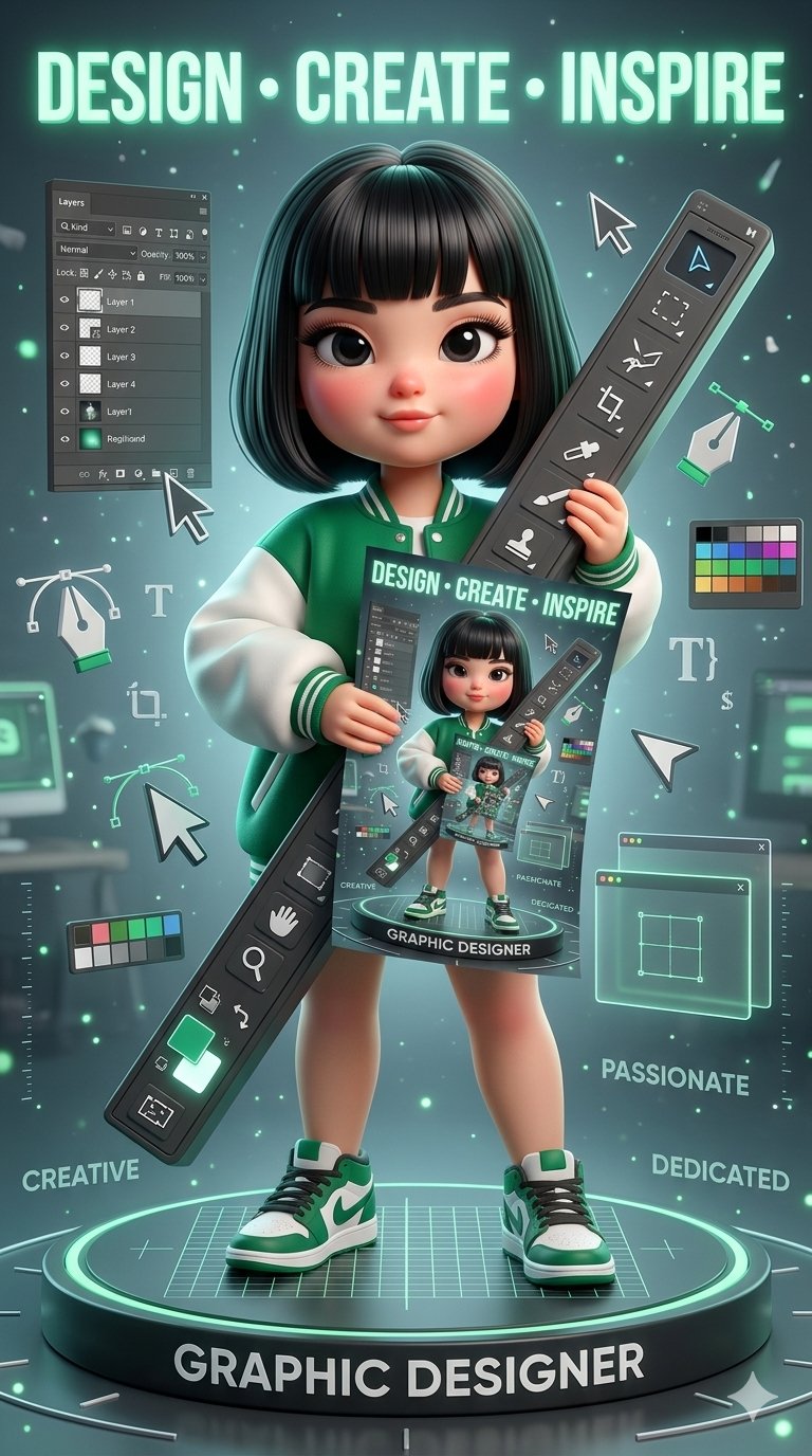
나노바나나 2로 생성한 그래픽 디자이너 3D 포스터

그래픽 디자이너 3D 포스터

나노바나나 2· Image
Stylized cinematic 3D poster of a cute confident female graphic designer in a futuristic studio, glossy dark bob with blunt bangs, doll-like eyes, rosy cheeks, emerald green varsity jacket, holding a giant 3D Photoshop toolbar with infinite recursive poster effect. Floating UI panels, cursors, pen tools, typography symbols, grids, and glowing design elements surround her. Giant glowing text "DESIGN • CREATE • INSPIRE," dramatic lighting, glossy textures, emerald green and charcoal palette, premium animated movie poster style, Adobe-inspired futuristic concept art.
@arghzq
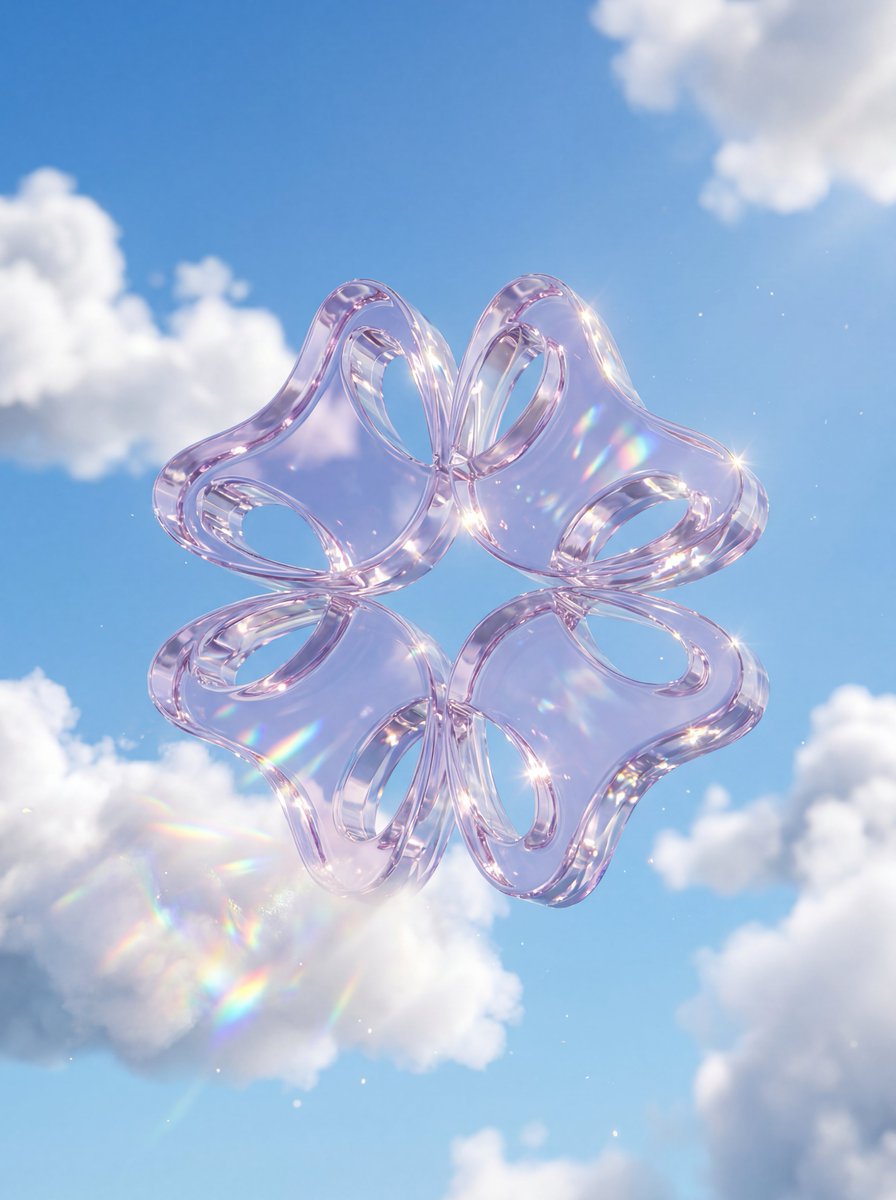
나노바나나 프로로 생성한 크리스탈 글래스 로고

크리스탈 글래스 로고

나노바나나 프로· Image
A premium 3D stylized version of attached logo, rendered as thick, translucent crystal glass with high refraction. The object is floating amidst fluffy, realistic white cumulus clouds against a bright, clear blue sky. Soft natural sunlight creates bright caustic reflections and rainbow dispersion within the glass. Ethereal, airy, and highly polished 3D aesthetic
@zazzygfx
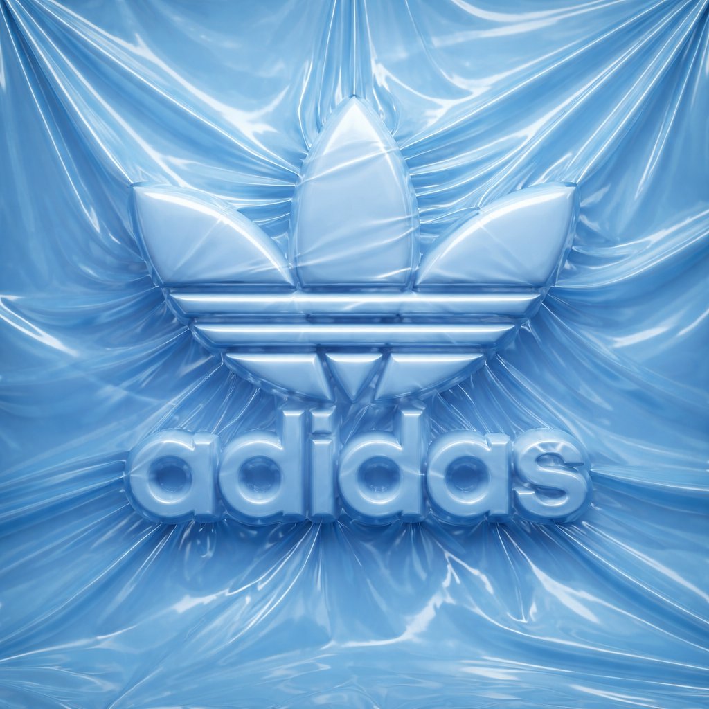
GPT 이미지 2로 생성한 슈링크랩 로고 컨셉

슈링크랩 로고 컨셉

GPT 이미지 2· Image
logo completely wrapped in a single layer of elastic plastic or shrink wrap. The shapes of the logo should be visible only through the relief under the film, the logo surfaces themselves are not visible. Brand Analysis System: Logo geometry: Determine the full visual brand identifier [ADIDAS ORIGINAL] according to the official catalog: an icon, a text element, or a combination thereof. Keep the exact spatial relationship between the icon and the text. Color system: Use one monochrome tone [ADIDAS ORIGINAL] for all elements of the scene — background, film, wrapped object. Variations are achieved only through light and shadow. The nature of the film: Based on the selected color [ADIDAS ORIGINAL], determine the behavior of the material: bright saturated colors create a dense glossy or latex film with visible tension lines; neutral — matte stretch film; dark - translucent vacuum film; light — matte food film. Stage 1: Stage and Surface The whole scene is monochromatic, the [ADIDAS ORIGINAL] color covers every surface without exception. The background is made of the same film material, which is freely assembled and crumpled around the logo. Natural tension lines are created, the folds diverge from the peaks of the relief. There are no floor lines, walls, or horizons — the stage is completely immersed in a solid plastic material. Stage 2: Applying the logo Each element of the logo is voluminous, rounded, like a balloon, with visual depth. The logo is fixed on the background and is completely covered with a single layer of film, tightly stretched over the tops of the elements, creating visible tension lines. Free folds are formed in the hollows between the letters, geometric elements of the icon and around the perimeter of the logo. The logo remains fully readable, the icon is recognizable, but not a single surface of the logo itself is visible. The physics of the film is precise: tight tension at high points, diverging stress lines, small raised areas between elements, shadows in the gaps. Stage 3: Lighting The main light source is soft, diffused, from the top left, emphasizing the relief of the film. For glossy films, there are subtle highlights along the stretched areas, for matte films, there is only diffused light. Global lighting preserves details in deep folds without smoothing out the overall relief. Technical specifications Only the [ADIDAS ORIGINAL] color, variations through light and shadow. There are no exposed logo surfaces and unnecessary text. The film is realistic: the tension, the folds, the physics of plastic, not fabric. The film grain corresponds to ISO 400. Mood: the product is packed and ready for opening, the shape is known, but not yet touched.
@Naiknelofar788
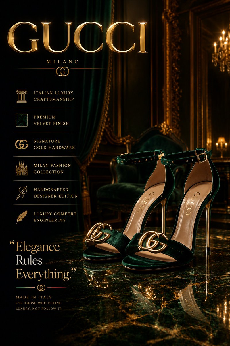
GPT 이미지 2로 생성한 디자이너 하이힐 광고 포스터

디자이너 하이힐 광고 포스터

GPT 이미지 2· Image
Create an ultra-premium luxury fashion advertisement poster for designer high heels inspired by Vogue Arabia, Paris Fashion Week, and elite luxury editorials. Feature elegant glossy heels inside a cinematic luxury studio with reflective marble flooring, dramatic spotlight lighting, soft smoke atmosphere, and photorealistic reflections. Add a modern luxury specification layout vertically on the left side with elegant typography and minimalist icons. Include a bold powerful quote and a large luxury brand logo with metallic chrome or gold reflections. Use a rich cinematic color palette of black, gold, silver, emerald green, burgundy, or monochrome tones with glossy reflections, floating particles, velvet textures, and premium editorial composition. Style should feel hyper-realistic, dark luxurious, modern, cinematic, ultra-detailed, and professionally designed like a billion-dollar fashion campaign and luxury billboard advertisement, 8K masterpiece.
@obsidian_fr1
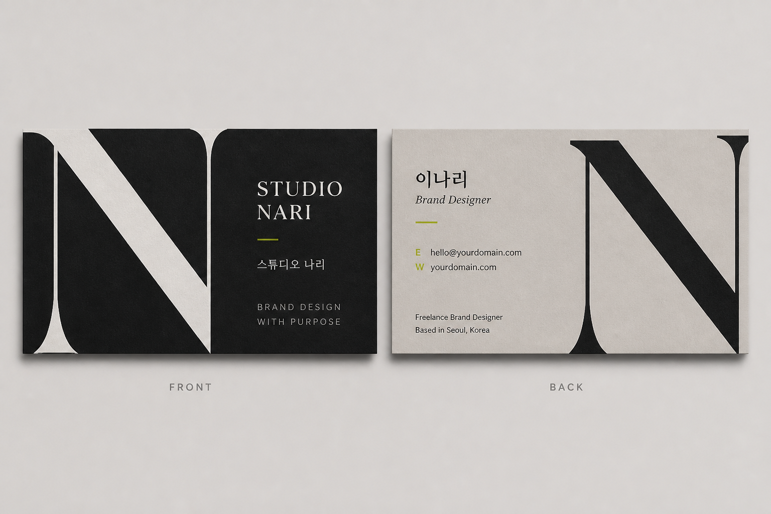
GPT 이미지 2로 생성한 프리랜서 디자이너 명함

프리랜서 디자이너 명함

GPT 이미지 2· Image
Design a creative but professional horizontal business card for a Korean freelance brand designer. Brand name: 'STUDIO NARI'. Show front and back layouts side by side. Use a strong typographic layout with one oversized letter N, black and warm gray palette, small lime accent. Korean text: '스튜디오 나리', name '이나리', role 'Brand Designer', email, portfolio URL placeholders. Editorial, modern, print-ready, not childish.
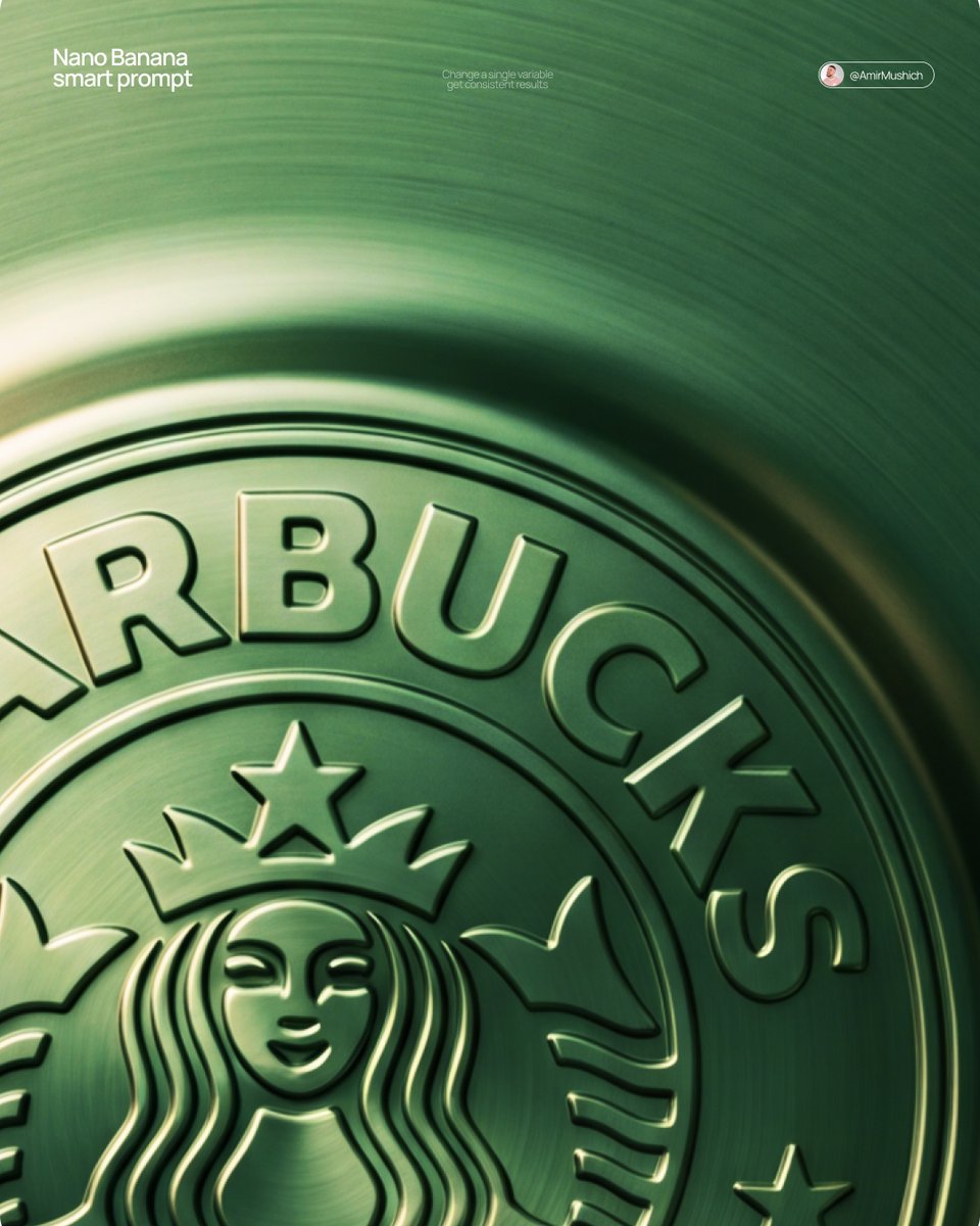
나노바나나 프로로 생성한 엠보싱 메탈 로고

엠보싱 메탈 로고

나노바나나 프로· Image
[BRAND NAME] + [METAL COLOR] Act as a Senior CGI Artist and Brand Identity Director specializing in premium logo materializations. Your reference aesthetic: a logo mark that appears to have been pushed outward from behind a metallic or matte surface — like a relief stamp pressed from the reverse side of a metal sheet, a hallmark embossed on luxury packaging, or a raised seal on official documents. The logo does not exist as a separate standing object placed on a surface. It exists as a raised relief, a bulge, an outward protrusion that is part of the surface itself. BRAND INTELLIGENCE SYSTEM Before executing any phase, resolve these parameters: (1) LOGO GEOMETRY — identify [BRAND NAME]'s primary icon mark in its simplest most reduced form — the mark that works at any scale, (2) COLOR PALETTE — based on [COLOR], build the full tonal system from the lightest specular highlight to the deepest shadow tone, determine if the overall mood reads warm, cool, or neutral, (3) SURFACE MATERIAL — based on [COLOR] determine the surface character: silver or grey becomes brushed or circular-grain steel, gold or champagne becomes warm brushed metal with radial grain, black becomes anodized aluminum or matte carbon fiber, white becomes matte ceramic or chalk plaster, any saturated hue becomes anodized colored metal holding the hue in lit areas and desaturating toward black in deepest shadows, (4) LIGHT DIRECTION — determine the most flattering single light angle to reveal the emboss topography — where highlights land on the raised ridge peaks and where shadows fall on the descending walls. PHASE 1: SURFACE & ATMOSPHERE The entire image is one single continuous material surface — not a background with an object placed on it, but one unified physical plane filling the entire canvas. This surface is made of the SURFACE MATERIAL resolved above. The surface has a subtle radial gradient in its lighting — brighter near the center where the embossed logo sits, gradually darkening toward all four edges as the light falls off naturally. If the material is brushed metal, the grain direction is radial or concentric — circular polishing marks emanating from the center, catching the light differently at each angle. Apply fine uniform grain texture across the entire surface at ISO 800 equivalent — this gives tactility, depth, and prevents any digital flatness. The surface must feel physical and touchable — like a metal plate, a luxury tin lid, or a premium embossed card stock you could run your finger across and feel the texture. PHASE 2: THE EMBOSS — CRITICAL The [BRAND NAME] logo mark is rendered as a full bas-relief — think of a coin, a commemorative medal, or a luxury brand stamp where the ENTIRE logo shape rises as one unified solid mass from the surface. Not just the outline. Not just the stroke path. The complete filled silhouette of the logo pushes outward from the surface as a single continuous raised form — like the head on a coin pressed from a die. The interior of the logo is NOT hollow or open. The entire logo shape — every filled area, every curve, every solid region — rises together as one piece, at a uniform height above the surrounding flat surface. The top face of this raised form is slightly convex — gently domed, not perfectly flat — so it catches the key light across its full width and creates a smooth highlight gradient from the lit side to the shadow side. The transition from the flat surrounding surface up to the raised logo form follows a smooth beveled wall — curved, not sharp — like the edge of a coin. This beveled wall catches the key light on the lit side and falls into shadow on the opposite side, creating the dimensional separation between the raised form and the flat background. Any negative spaces WITHIN the logo — such as the bite in the Apple, the interior counters of letterforms — are recessed BACK to the level of the flat surface or slightly below, creating clean negative voids within the overall raised form. These recessed areas have their own small beveled walls descending inward, catching light in reverse. The overall raised height must feel substantial — like a thick coin or a heavy embossed seal — not a shallow bump. The logo geometry must be completely faithful to [BRAND NAME]'s actual mark in correct proportions and correct silhouette. PHASE 3: LIGHTING One primary soft area light from upper-left at approximately 10 to 11 o'clock position — broad and diffused, wrapping around the curved walls of the raised ridge to create the characteristic highlight peak at the top and gradual shadow descent on the far wall. Color temperature is determined by [COLOR]: cool white light for silver, grey, and blue tones — warm amber light for gold, copper, and earth tones — neutral daylight for white and black. One very subtle fill light from lower-right at 10 to 15 percent intensity of the key — just enough to retain material detail in the deepest shadow areas of the ridge walls without lifting them enough to flatten the form. No hard shadows anywhere on the surface. No spotlight pools. No rim light. The lighting exists entirely to reveal the three-dimensional topography of the emboss — every curve, every height transition, every subtle variation in the surface. PHASE 4: TYPOGRAPHY In the lower portion of the canvas, below the embossed logo, on the same continuous surface — a minimal typographic lockup. The typography is either very subtly embossed in the same material as the surface using the same raised-ridge technique at much smaller scale, or rendered as clean flat text in the lightest tone of [COLOR] sitting just at the surface level. Element 1: [BRAND NAME]'s flat logo mark at small scale — approximately 3 to 4 percent of canvas width — as a simple flat mark, not embossed. Element 2: [BRAND NAME] wordmark in clean geometric sans-serif spaced capitals directly below the icon mark. Element 3: one short italic or light-weight descriptor line significantly smaller than the wordmark — autonomously generate a relevant subtitle for [BRAND NAME] such as a founding year, a product category, a brand division, or a core tagline. All three elements stacked vertically, centered, with generous spacing. No decorative elements. No lines or rules. Pure typographic restraint. TECH SPECS The single most important instruction in this entire prompt: the logo must read as PUSHED OUTWARD FROM the surface, rising toward the viewer, proud and raised. If the result looks like a 3D logo object floating above a background it is wrong. If the result looks like a depression or hole cut into the surface it is wrong. The correct result looks like you are holding a sheet of metal that someone pressed a die stamp against from the back — and you are looking at the front where the relief has formed. Ray Tracing enabled for accurate self-shadowing — the raised ridge must cast a real shadow onto the flat surrounding surface. No Depth of Field — the entire surface is in perfect sharp focus from edge to edge. Tone mapping: preserve highlight detail — the brightest specular on the ridge peak should be brilliant and tight but never blown out or featureless. Film grain applied uniformly across the full final render. No chromatic aberration. No lens distortion. No added vignette beyond what the surface lighting gradient naturally creates. Anti-aliasing maximum — the ridge edges must be perfectly clean. Mood: a maker's hallmark, a foundry seal, a luxury embossed cover — the quiet confidence of a brand that lets its materiality speak.

@AmirMushich
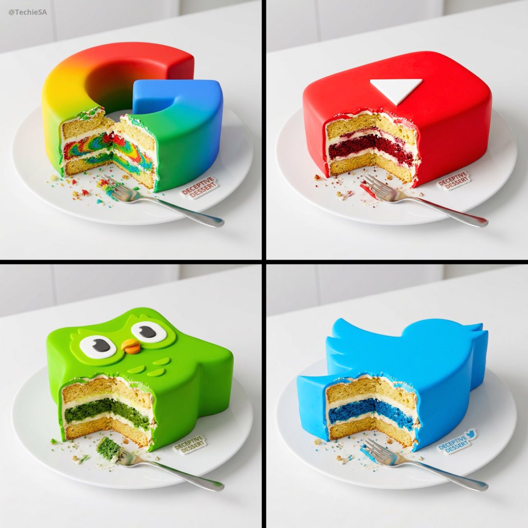
나노바나나 프로로 생성한 로고 케이크 일러스트

로고 케이크 일러스트

나노바나나 프로· Image
Generate a hyper-realistic digital illustration of a cake meticulously stylized to resemble a [LOGO] resting on a pristine white table. Show it partially bitten to reveal multiple delicious layers (sponge, frosting, crumbs) and shatter the illusion. Capture the moment of surprise with intricate details in the bite mark. Use a slightly overhead angle to emphasize the contrast between the realistic outer shell and the cake interior. Illuminate the scene with soft, diffused lighting to enhance textures and cast subtle shadows for depth. Keep the background minimal and bright to focus on the deceptive dessert. Employ a vibrant, playful palette for the cake layers against the object-mimicking exterior. Render in a photorealistic style with whimsical undertones, making the reveal both visually convincing and appetizing.
@TechieBySA
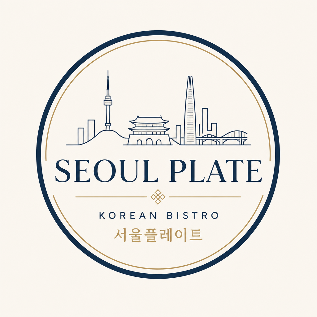
GPT 이미지 2로 생성한 레스토랑 로고

레스토랑 로고

GPT 이미지 2· Image
Create a refined Korean bistro restaurant logo named 'SEOUL PLATE'. Use a simple emblem that combines a ceramic plate circle with a subtle Seoul skyline line. Typography should be elegant but contemporary, a mix of serif title and clean sans-serif subtitle. Color palette: dark navy, warm cream, muted gold. Flat vector logo on plain background, no food photography, no mockup. Add Korean subtitle '서울플레이트' below the English name. Premium yet approachable, suitable for menu, signage, and reservation page.
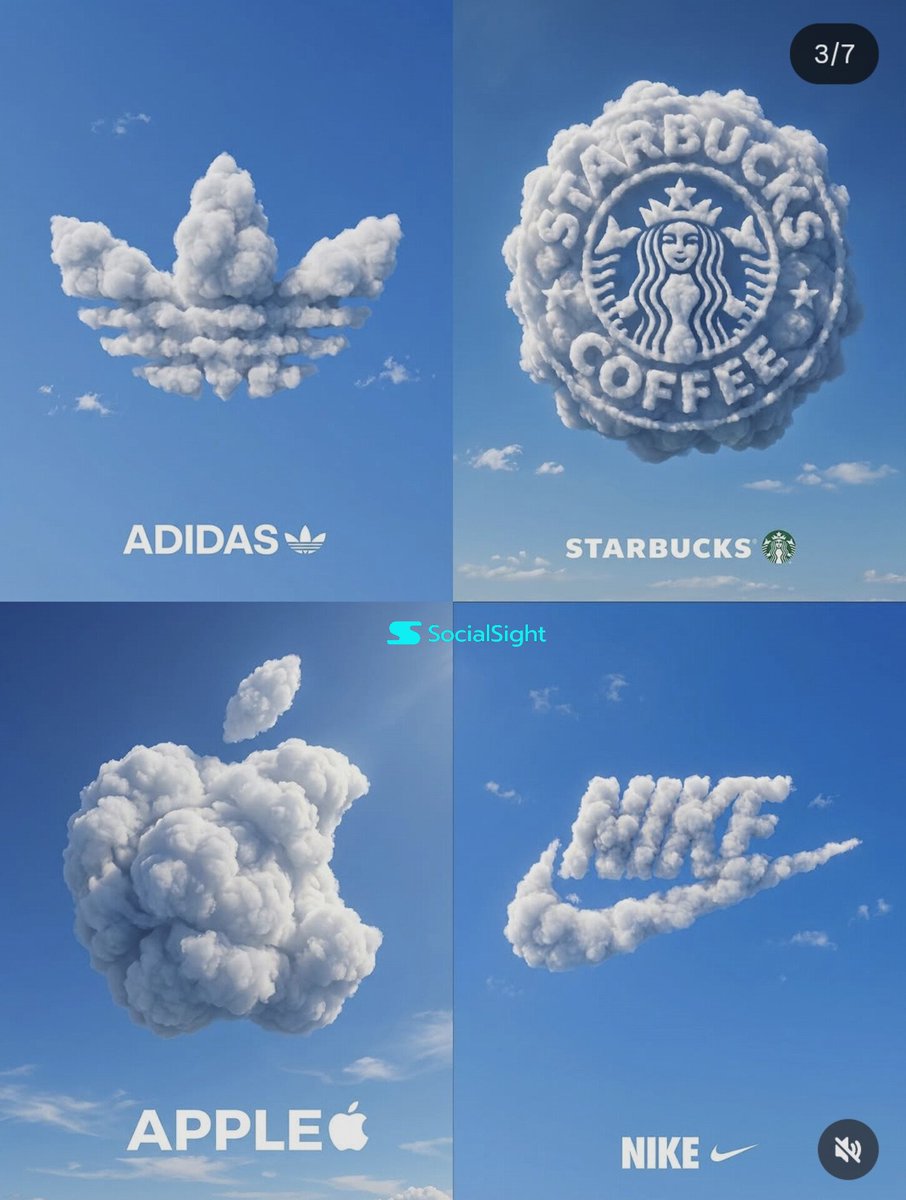
GPT 이미지 2로 생성한 구름 브랜드 로고 2x2

구름 브랜드 로고 2x2

GPT 이미지 2· Image
Create a premium 2x2 grid poster featuring four iconic brand logos sculpted entirely from realistic fluffy white clouds floating in a vibrant blue sky. Each logo is perfectly recognizable, volumetric, and formed naturally from dense cloud formations with soft shadows, sunlight highlights, and ultra-detailed textures. Minimalist advertising style, clean composition, luxury branding aesthetic, photorealistic, high contrast, cinematic daylight, subtle scattered clouds in the background. Top Left: [Brand 1] logo made from clouds Top Right: [Brand 2] logo made from clouds Bottom Left: [Brand 3] logo made from clouds Bottom Right: [Brand 4] logo made from clouds Each panel includes the brand name in bold clean typography centered at the bottom. Consistent blue-sky backdrop across all four panels. Hyper-realistic cloud sculpting, commercial advertising photography, ultra-sharp details, premium design, 8K resolution, minimalistic luxury campaign, symmetrical layout, soft atmospheric perspective, award-winning creative direction. Brand combinations you can use: McDonald's • Tesla • Disney • Amazon Mercedes • PlayStation • Pepsi • Xbox Netflix • Spotify • Airbnb • Pinterest Ferrari • Lamborghini • Porsche • Maserati Rolex • Chanel • Louis Vuitton • Gucci Coca-Cola • Red Bull • Pringles • KFC For a more artistic result add: Cloud typography masterpiece, impossible cloud formations, dreamlike realism, volumetric clouds, sky art installation, advertising campaign concept, global brand identity, clean negative space, studio-quality composition, photorealistic CGI, Octane render quality.
@AIwithSynthia
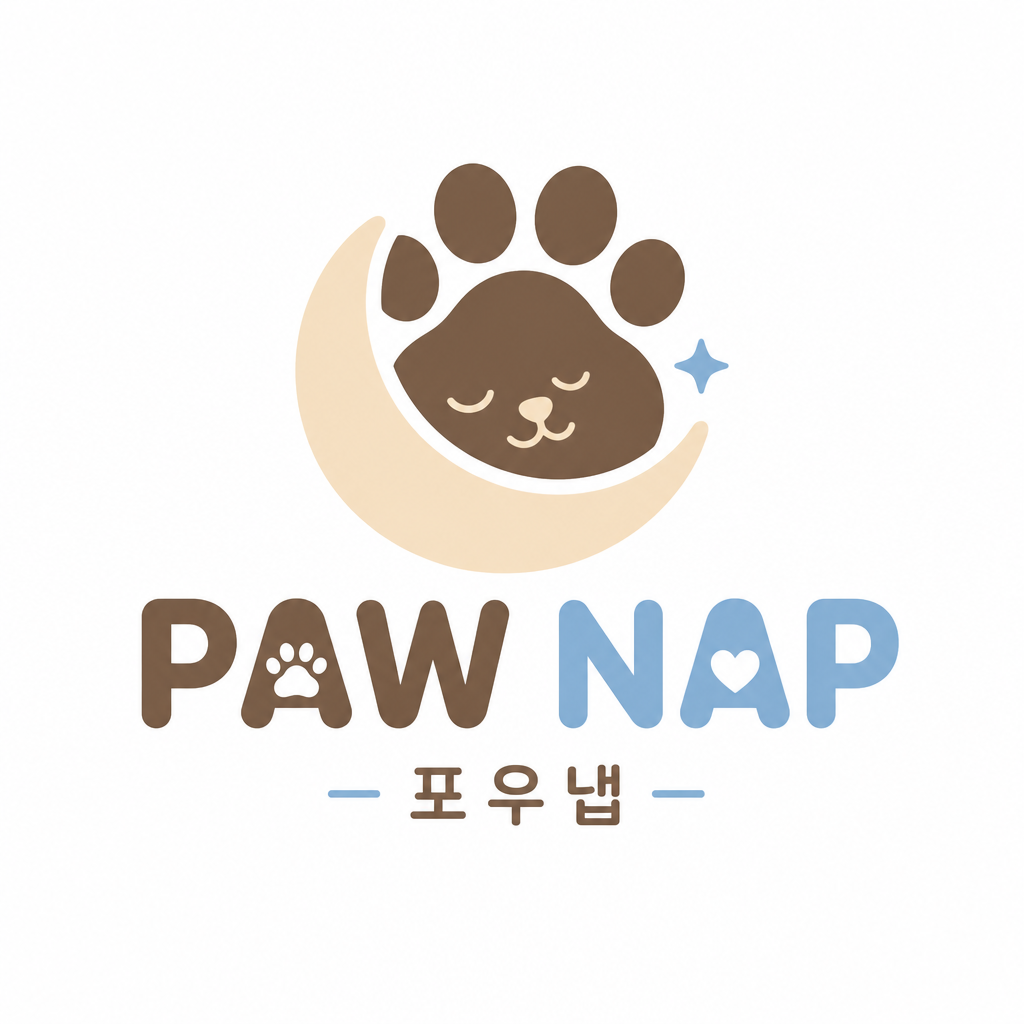
GPT 이미지 2로 생성한 반려동물 브랜드 로고

반려동물 브랜드 로고

GPT 이미지 2· Image
Create a friendly modern logo for a Korean pet lifestyle brand named 'PAW NAP'. The symbol should combine a soft paw print with a sleeping crescent moon in one simple rounded icon. Use playful but polished typography, rounded sans-serif, not childish. Color palette: cream, cocoa brown, soft sky blue. Flat vector logo on plain white background. Include a small Korean subtitle '포우냅' under the English name. Suitable for pet snacks, pet beds, and packaging. Clean, memorable, scalable.
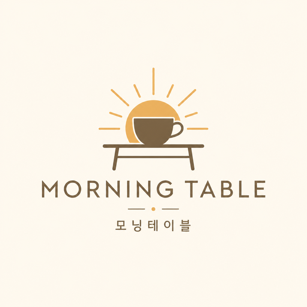
GPT 이미지 2로 생성한 감성 카페 로고

감성 카페 로고

GPT 이미지 2· Image
Create a clean professional logo design for a small Korean neighborhood cafe brand. The brand name should be 'MORNING TABLE'. Use a warm minimal emblem: a simple coffee cup silhouette combined with a rising sun and a small table line. Use refined typography with a modern sans-serif wordmark, balanced spacing, no mockup, no 3D, no realistic background. Present on a plain warm ivory background. Include a small secondary Korean line '모닝테이블' under the English name, but keep the text clean and legible. Vector logo style, premium but approachable, suitable for signage, cups, and Instagram profile.

디자이너 AI 프롬프트란?

디자이너 AI 프롬프트는 브랜드 로고, 포스터, 명함, 패키지 목업처럼 디자이너가 클라이언트 프로젝트마다 새로 만들어야 하는 결과물을 AI 이미지 모델로 빠르게 뽑아내기 위한 명령어 모음입니다. '미니멀 카페 로고'나 '3D 제품 광고 포스터' 같은 콘셉트만 정리해 프롬프트로 넣으면 완성도 높은 시안을 몇 분 안에 여러 개 받아볼 수 있습니다. 초기 시안 단계에서 여러 방향을 빠르게 비교해보고, 방향이 확정된 이후에는 벡터 툴로 다듬어 마무리할 수 있습니다.

주요 활용 장면

  • 브랜드 로고 시안, 워드마크, 심볼 디자인 아이디에이션
  • 제품 광고, 캠페인용 포스터와 배너 시안 제작
  • 프리랜서, 스타트업용 명함과 브랜드 아이덴티티 목업
  • 유리, 금속, 3D 오브젝트 질감의 로고 프레젠테이션 이미지
  • 패키지, 제품 목업에 로고를 입힌 실사 같은 프레젠테이션 컷

이 태그가 유용한 이유

디자이너는 새 프로젝트마다 로고와 포스터 시안을 여러 방향으로 만들어 클라이언트에게 제안해야 해서, 초기 아이디에이션에 상당한 시간이 듭니다. AI 프롬프트를 쓰면 컨셉과 무드만 텍스트로 정리해 다양한 스타일의 시안을 동시에 뽑아볼 수 있어, 클라이언트 미팅 전 방향성을 빠르게 좁힐 수 있습니다. 특히 유리, 금속, 3D 같은 질감 표현이 필요한 로고 프레젠테이션은 실제 목업 촬영 없이도 실사 같은 이미지를 바로 만들 수 있어 유용합니다.

프롬프트 구성 팁

  1. 브랜드의 업종과 분위기를 먼저 적으세요. '미니멀 카페 로고', '럭셔리 뷰티 브랜드'처럼 구체적일수록 방향이 정확해집니다.
  2. 재질과 스타일을 지정하세요. '크리스탈 글래스 질감', '엠보싱 메탈', '3D 카툰 스타일' 같은 표현이 원하는 완성도를 만듭니다.
  3. 로고에 들어갈 텍스트나 브랜드명을 따옴표로 정확히 적어주세요. Nano Banana Pro는 로고 타이포그래피와 재질 표현에 강합니다.
  4. 결과물 용도를 함께 적으세요. '명함 목업', '패키지 프레젠테이션', '포스터 시안'처럼 명시하면 바로 제안에 쓸 수 있는 결과물을 받을 수 있습니다.

브랜드의 업종과 원하는 재질감을 구체적으로 적을수록 프레젠테이션에 바로 쓸 만한 시안이 나옵니다. 마음에 드는 로고 스타일이 나오면 그 프롬프트를 기준으로 브랜드명과 컬러만 바꿔 다른 클라이언트 시안으로 확장해 보세요.

Frequently Asked Questions

Related Prompts

로고

로고

59 prompts

로고 디자인

로고 디자인

13 prompts

제품 광고 이미지

제품 광고 이미지

515 prompts

미니멀

미니멀

71 prompts

Carat Prompt Gallery

Create trending AI prompts instantly

Prompts

  • Logo
  • PPT Design
  • Thumbnail
  • Poster
  • Web Novel Cover
  • ID Photo
  • Caricature
  • Product Detail Page
  • Banner

Models

  • GPT Image 2
  • Seedance 2.0
  • NanoBanana Pro
  • NanoBanana 2

Carat

  • Get started
  • About
  • Blog
  • Careers
  • Contact
  • Partnership
  • Terms
  • Privacy

© 2026 Paradot.Inc All rights reserved.