Announcement Popup
Design an accessible announcement popup UI with AI prompts for hierarchy, actions, and dismissal behavior.
2026.07.16
Haz “Announcement Popup” justo como lo quieresCrea tu propio “Announcement Popup”
Pídelo en lenguaje natural: Carat genera imágenes y vídeos optimizados para ti.

Empieza ya con 100 créditos gratis al día
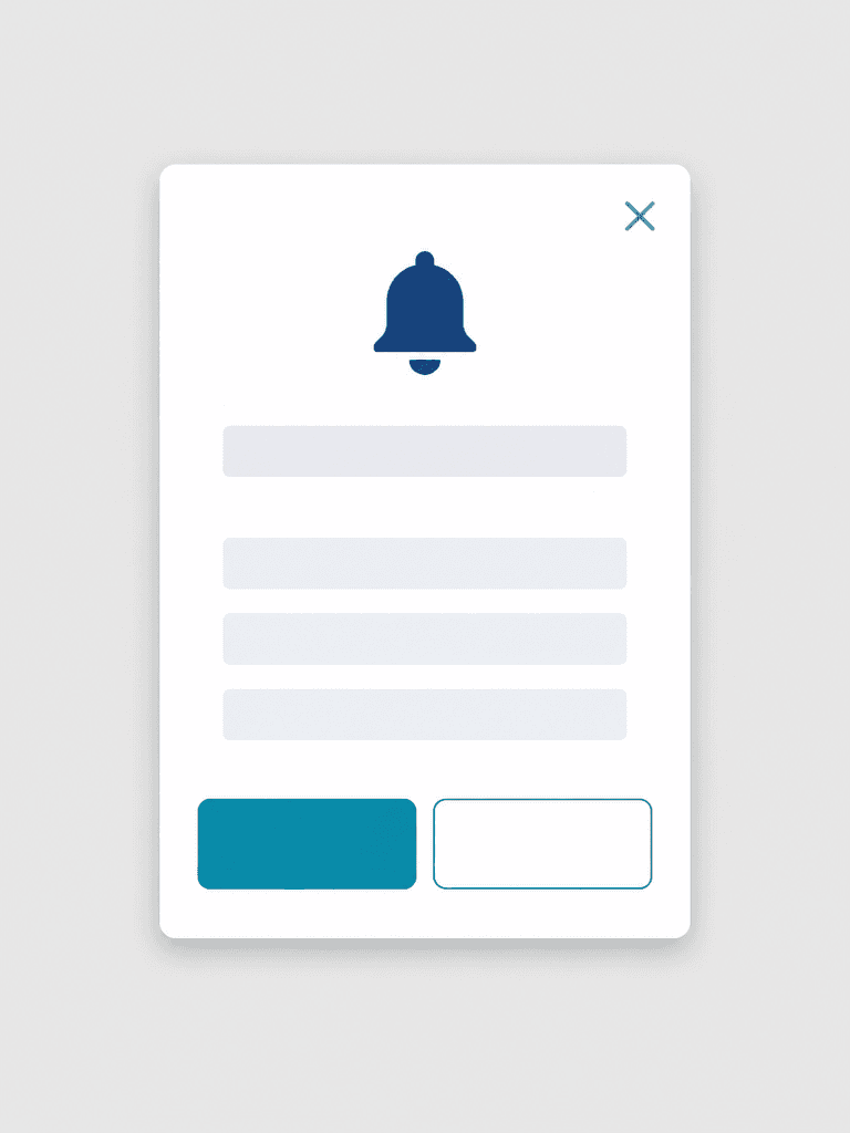
Announcement Pop-Up
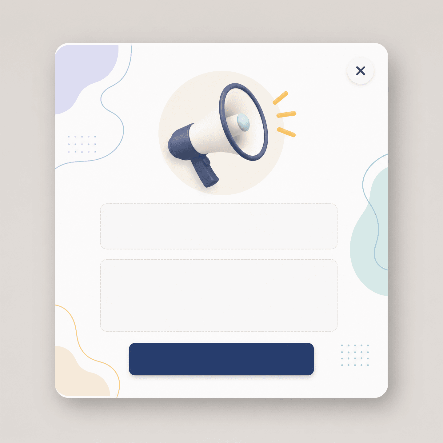
Announcement Popup
Role of an announcement popup
Announcement Popup AI prompts create a modal for maintenance notices, policy changes, feature launches, or urgent updates. Clarify the relationship among the title, concise body, primary action, secondary action, and dismiss control. Define severity, display period, and audience conditions before showing the popup repeatedly.
Clear interface hierarchy
Place a notification bell, one title line, and three body lines inside a white vertical modal. Distinguish a filled teal primary button from an outlined secondary button. The upper-right close icon needs a generous target and an accessible name for keyboard and screen-reader users.
Accessibility and responsive behavior
Maintain WCAG contrast and never communicate status through color alone. Leave horizontal margins on mobile and allow translated titles to wrap without covering actions. In implementation, trap focus inside the modal while open and return it to the invoking control after dismissal.
Functional review before launch
Inspect bell and close icon strokes, button dimensions, corner radii, spacing, and shadow consistency. After inserting real copy, verify dates, destinations, action labels, and expiration timing. Test dismissal, Escape behavior, outside-click policy, zoom, dark mode, and screen-reader output.
Related prompts
Preguntas frecuentes
Use one direct sentence that states the situation and user impact.
Fill only the primary action and use an outline for the secondary choice.
Provide a clear dismissal method unless a narrowly defined mandatory flow prevents it.
Keep safe side margins and test wrapping with longer translations.
Limit repetition using severity, acknowledgment state, and an expiration period.
Check contrast, keyboard focus, accessible names, zoom, and screen-reader output.
Test both action destinations and the screen state restored after dismissal.