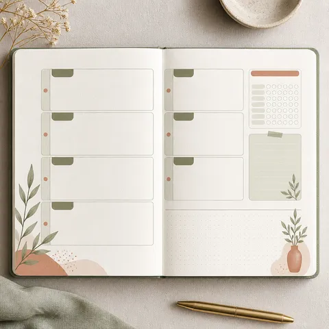
Monthly Planner
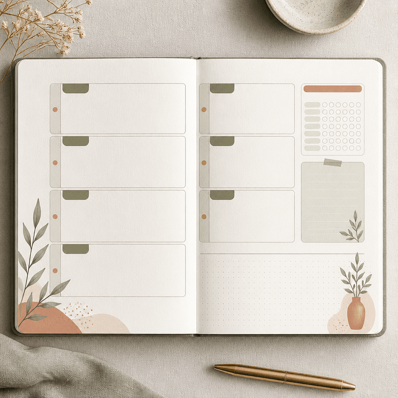
Prompts for monthly planner layouts that organize schedules, goals, notes, and visual priorities in one clear page.
2026.07.22
Haz “Monthly Planner” justo como lo quieresCrea tu propio “Monthly Planner”
Pídelo en lenguaje natural: Carat genera imágenes y vídeos optimizados para ti.

Empieza ya con 100 créditos gratis al día
Planner Inserts
What are Monthly Planner AI prompts?
Prompts for monthly planner layouts that organize schedules, goals, notes, and visual priorities in one clear page. This page focuses on practical composition rather than decoration alone: define the focal point, repeating spaces or objects, safe margins, and contrast before generating. A clear use case keeps the prompt stable and makes the result easier to review.
Practical use cases
The concept can support 월간 일정표, 목표 관리 페이지와 다이어리 속지, social posts, printed goods, diary decoration, event materials, and gift concepts. Choosing a material and mood lets one keyword expand into a clean editorial layout, a warm illustration, or a structured graphic design.
Building the composition
Choose the visual anchor first, then arrange supporting elements around it. When the repeating structure of Monthly Planner matters, specify alignment, spacing, and the beginning and end of the visual flow. Limit the palette to a base color and accents, and keep foreground-background contrast strong enough for thumbnail viewing. For print, include trim-safe margins and a comfortable border.
Prompting tips
Describe the topic, purpose, ratio, viewpoint, material, palette, and mood in that order. When exact numbers or copy matter, reserve a clean area and replace the text during editing. To compare versions efficiently, keep the layout fixed and vary one axis at a time, such as palette or decoration.
Review before publishing
Generated copy, numbers, icons, trademarks, and recognizable characters may differ from approved sources. Check resolution, ratio, cropping, color, and usage rights before print or publication. Inspect the asset at thumbnail size and confirm that fine lines and small labels remain usable in the final medium.
Preguntas frecuentes
You can plan 월간 일정표, 목표 관리 페이지와 다이어리 속지 and content visuals. Define the purpose, composition, palette, mood, and publishing medium together so the prompt describes a practical outcome.
Start with the use case and output ratio. Knowing whether the asset is for print, mobile, or social media helps control framing, hierarchy, and information density.
Short labels may work, but long Korean copy, numbers, and detailed instructions can be inconsistent. Reserve a clean area and add exact text later in an editor when accuracy matters.
Lock the palette, lighting, material, and camera viewpoint, then change only the intended variable. This keeps the collection recognizable while allowing useful variations.
Use 1:1 for square feeds, 3:4 or 9:16 for portrait posts, and the required paper ratio for print. Request safe margins so important elements remain visible near the edges.
Review trademarks, people, characters, copy, and distinctive design elements for rights and factual accuracy. Human approval is recommended before public or paid use.
Separate the subject, layout, palette, and decoration into clear instructions. Ask for fewer secondary objects and stronger focal hierarchy so the topic remains legible at thumbnail size.