
TikTok Challenge Video
Essential visual guides and high-impact prompts for designing high-retention TikTok challenge thumbnail layouts.
2026.07.22
Haz “TikTok Challenge Video” justo como lo quieresCrea tu propio “TikTok Challenge Video”
Pídelo en lenguaje natural: Carat genera imágenes y vídeos optimizados para ti.

Empieza ya con 100 créditos gratis al día
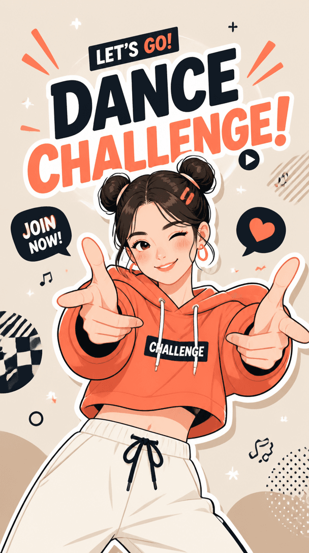
TikTok Challenge Video
Topic and intent
The main focus of a TikTok challenge video is to capture user interest and inspire them to join the trend instantly. Filling the vertical mobile screen with energetic character actions and bold text layouts is key. Your thumbnail must summarize the vibe of a short-form challenge in a single second, ensuring the visual perfectly highlights the core message.
Composition
Position your subject prominent in the center with diagonal composition that accentuates motion and rhythm. Use bold, clear backgrounds like neon glows or simple gradients rather than cluttered realist settings, ensuring the silhouette remains visible. Keep challenge title texts in highly readable bold fonts placed inside safe margins so viewers can read them without friction on busy feeds.
Prompt practice
When writing a prompt for a social video trend, combine action descriptors with clear asset specifications. Words like "dancer performing dynamic challenge" paired with technical tools like "saturated modern lighting, thick outlines, pop art styling" will create a believable online aesthetic. Always anchor your scene in vertical proportions to verify composition spacing on vertical displays.
Quality review
Inspect the design at mobile feed size and verify if its rhythm and energetic mood remain recognizable. Check that stylized joints and hands are clean and do not suffer from deep anatomical issues or awkward fusions. Eliminate accidental letter-like gibberish from background sections, and ensure that bright focal colors effectively draw attention to the main dancer.
Practical use
If you are planning a sequence of related visual assets for an event or campaign, lock down a template layout with the branding logo and signature palettes first. Generate a clean set of poses and trend-oriented backdrops from the tool, and then place the final logo or official text overlays in post-production. This flow establishes an optimized, top-tier look with minimal friction.
Preguntas frecuentes
모바일 뷰어의 형태에 밀착되는 세로형(9:16) 비율이 숏폼 챌린지의 피드 현장감을 가장 생생하게 살릴 수 있어 적합합니다.
움직임 자체뿐 아니라 인물의 머리카락 흩날림, 리듬을 타는 자세, 휘날리는 불꽃이나 불빛 선 같은 운동감 단서를 강조하면 좋습니다.
프롬프트에 복잡한 표어를 다 넣지 마시고 'DANCE'나 'JOIN'처럼 핵심 단어 하나만 큰 따옴표 안에 넣어 디자인된 글자로 출력을 유도합니다.
볼륨 넘치는 네온 컬러, 일그러진 글리치 스타일 효과, 또는 밝은 대비를 활용하면 화면이 작아도 팝 일러스트의 매력이 깊어집니다.
자세를 정면의 간결한 주먹이나 뻗은 손으로 비교적 심플하게 정의하고 상체 위주 구도로 묘사 범위를 줄여 안정성을 올립니다.
가장자리 여백 규칙, 캐릭터의 채도 강도, 그리고 단일한 폰트 테두리 선 속성을 고정하고 동작 묘사만 바꾸는 방식을 씁니다.
유저들이 0.5초 이내에 스와이프 여부를 결정하므로 핵심 정보를 담은 볼드한 텍스트 배치가 앱 내 조회율에 직접 영향을 미칩니다.


