Aesthetic Poster
Create a practical aesthetic poster with clear layout, color, copy hierarchy, and production checks using AI prompts.
2026.07.16
Fais « Aesthetic Poster » exactement comme tu veuxCrée ton propre « Aesthetic Poster »
Demande-le simplement — Carat génère pour toi des images et des vidéos optimisées.

Commence maintenant avec 100 crédits gratuits par jour
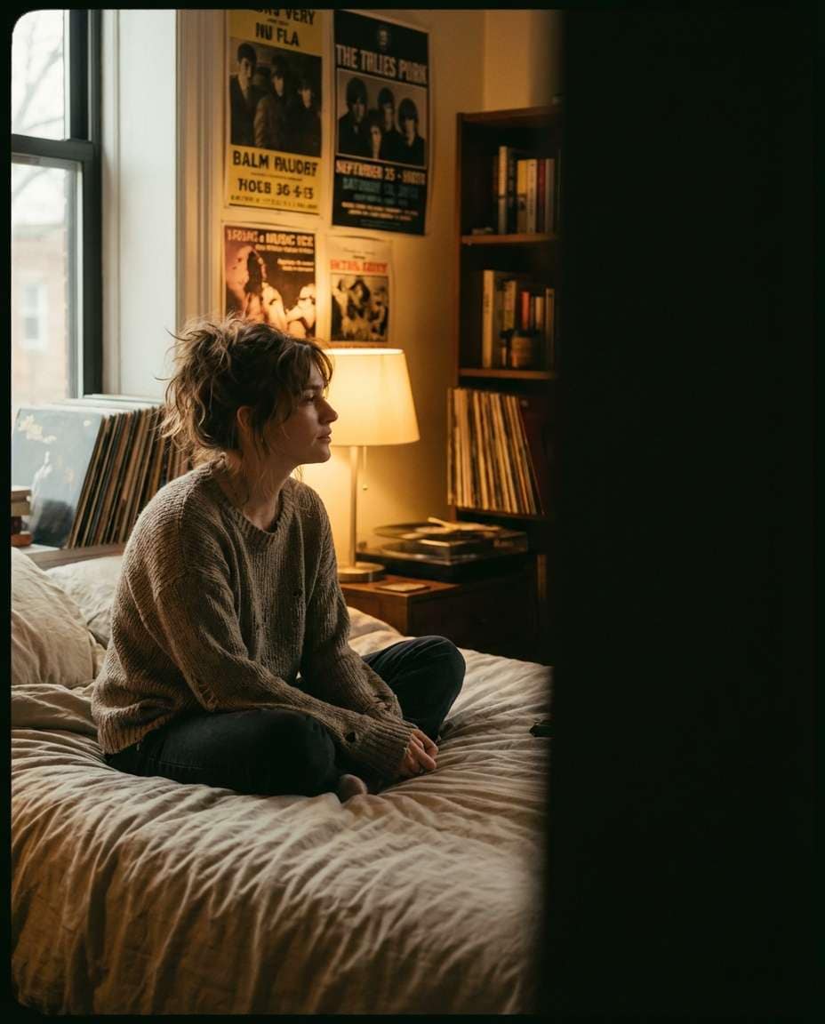
Indie Bedroom Glow
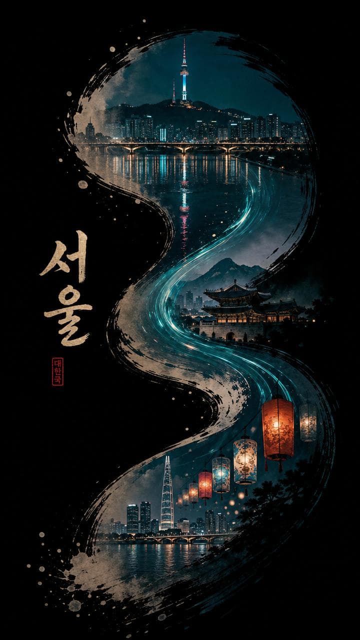
Pure Deep BLack Background
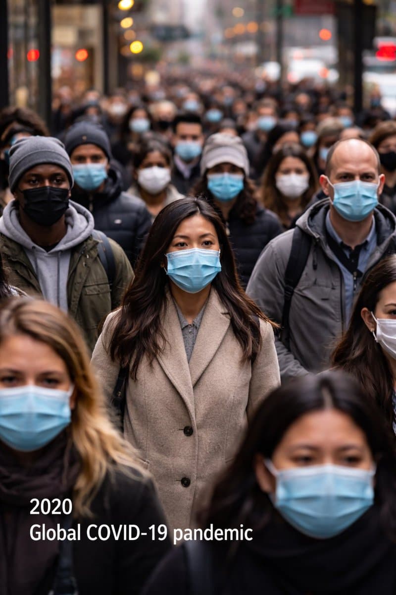
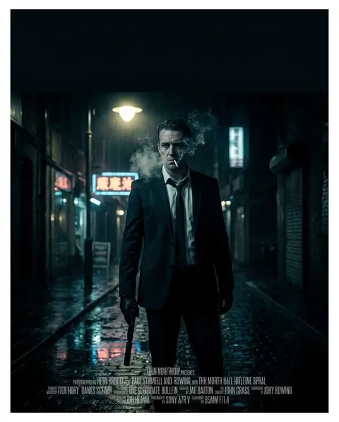
Image 1: a Chinese Odyssey Poster Redesigned in 90s Hong Kong Film Style
Purpose and viewing context
A Aesthetic Poster is designed for posters that combine restrained color, negative space, tactile texture, and short copy to create a deliberate mood. Begin by defining who will see it, where it will appear, and how many seconds the viewer has. Common uses include cafe walls, pop-up exhibitions, room decor, music events, and social announcements, and each setting changes viewing distance and information density. Screen previews and printed output also require separate checks for resolution, safe margins, and contrast even when the ratio looks identical.
Observable prompt ingredients
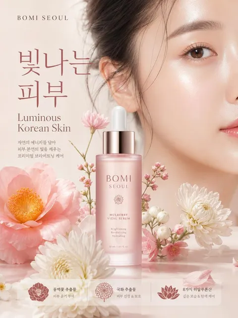
Build the prompt around a muted palette, film grain, paper texture, asymmetric negative space, and a serif or handwritten headline. Describe the subject, layout, limited palette, headline position, material, and print or lighting texture in observable terms. Replace vague requests such as “make it beautiful” with spatial instructions: reserve the top twenty percent for a headline, place one hero in the center, and keep a clean information block below. Lock one art direction before asking for variations.
Hierarchy and readability
Make the primary title readable at a glance, then reduce size and weight for supporting details. If the background is complex, protect copy with a quiet field or generous negative space and keep essential details away from trim edges. Review the complete layout on a phone, but inspect small type and thin rules at actual print size. For Korean copy, generating a short heading and adding detailed information later is usually more reliable.
Common failures and focused revisions
The main risk is stacking too many effects until the copy disappears, or preserving atmosphere while losing information hierarchy. Revise one variable at a time, such as palette, headline scale, or background complexity, instead of regenerating every decision. When contrast fails, lower background saturation or simplify the copy zone rather than stacking heavy shadows. Names, dates, classifications, and institutional wording must be checked against an authoritative source after generation.
Production and preflight checklist
Verify spelling, event details, logo orientation, resolution, and trim allowance in that order. Do not force one master design through automatic crops for portrait, landscape, and square outputs; rebalance the focal point for every ratio. Explore retro-poster, vintage-poster, and pinterest-aesthetic for adjacent visual directions. Finish with both a distant thumbnail review and an actual-size detail proof before publishing or printing.
Questions fréquentes
Limit the system to one dominant color, one support color, and a small accent. Pairings such as beige with charcoal or misty blue with cream preserve mood while keeping readable contrast.
Yes. Negative space, paper texture, thin rules, and restrained typography can carry the design. Specify headline placement, tracking, and scale so the composition remains intentional.
Reserve a clean copy area during generation or request only a very short heading. Add final Korean event details in a layout editor after the visual has been approved.
A3 and A2 commonly use the 1:1.414 portrait ratio. Choose the frame or print specification first, then generate and crop to that exact proportion.
Vintage recreates the print marks and palette of a recognizable period. Aesthetic is broader and organizes any style around a chosen emotion or atmosphere.
Yes, but the menu name, price, and promotion period must outrank decorative texture. Reserve a separate information block near the lower edge.
Lock the palette, type character, margin ratio, and texture intensity. Reuse the same grid language while changing only the central image or message.