
Business Hours Sign
Aesthetic storefront signage layouts and high-contrast typography templates to communicate open hours on shop glass entryways.
2026.07.22
Fais « Business Hours Sign » exactement comme tu veuxCrée ton propre « Business Hours Sign »
Demande-le simplement — Carat génère pour toi des images et des vidéos optimisées.

Commence maintenant avec 100 crédits gratuits par jour
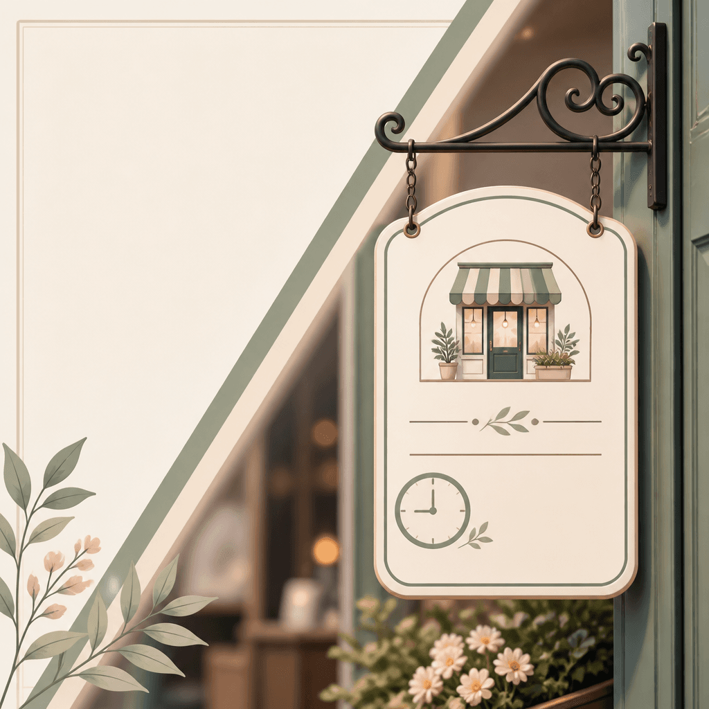
Hours of Operation Sign
Topic and intent
A business hours sign informs pedestrians and direct clients about opening and closing times, building customer trust and maximizing walk-in traffic. High-contrast typography is critical to ensure legibility from a busy curb. Weaving shop window reflections, metallic finishes, or soft warm ambient lighting into your prompt creates a professional backdrop for busy shopping avenues.
Composition
Use framing that simulates the sign hanging directly on a glass shop door or wooden entryway. Position bold 'OPEN & CLOSE' headers prominently near the top center, list time rows clearly below, and balance the lower safety margin with minimal contact icons like phone numbers. Anchor your canvas in a wide landscape 16:9 format to evaluate composition spacing with plenty of peripheral breathing space.
Prompt practice
Write your prompt utilizing formatting concepts like 'editorial poster design' to establish visual order between typography structures and illustration details. Include terms like 'storefront operating hours sign, wood grain door trim, matte paint finish' alongside 'balanced print-ready borders, pastel coloring' to capture a professional commercial agency level presentation asset.
Quality review
Check the layout at small sizes and verify that numbers and signs are legible without warping. Confirm that structural support elements, such as dangling strings, ropes, or door mounts, are logically attached and don't end in strange physical voids. Inspect the outer borders of the graphic to ensure that text lines stay fully centered inside safe interior margin rules.
Practical use
Store owners looking to elevate their physical cafe entryway can print this generated high-quality design on heavy-duty stock board. Alternatively, provide the visual files to local fabrication workshops specializing in engraved wooden signboards or matte brass plaques. This template minimizes layout design costs and ensures your custom order is delivered swiftly and accurately.
Questions fréquentes
배경과 텍스트의 대비를 확실히 분리하기 위해 다크 우드나 매트 블랙 메인 보드에 밝은 웜 화이트나 골드 옐로우 텍스트를 배치하는 것이 압도적으로 훌륭합니다.
중심 필드를 2단으로 접어 위쪽에는 평일 개폐 시간(MON-FRI)을, 아래쪽에는 주말/공휴일 특이 시간(SAT-SUN)을 격자 정렬하는 템플릿이 대단히 명료합니다.
유동인구의 시선 중심 높이인 지상 1.5미터 부근 유리문 중앙에 거는 것이 행인들의 스캔 동선 내에 가장 자연스레 안착해 권장됩니다.
영어 단어 'OPEN'과 'CLOSED'를 크고 볼드하며 살짝 다른 대비를 준 프레임(예: 녹색과 적색, 혹은 하이라이트 박스)으로 묶는 기법이 가독성이 높습니다.
너무 복잡한 실사 명암 대신 굵고 또렷한 2D 플랫 백 표면 일러스트로 생성하면 기계 레이저 각인 가공용 경로 설정 시 왜곡이 없어 성공률이 매우 높습니다.
로고 플레이스홀더로 둥근 원(circle logo container) 구도만 프롬프트로 미리 정돈하고, 실제 상호는 나중에 일러스트레이터 툴에서 병합해야 온전히 마무리됩니다.
주요 안내판에 'BUSINESS HOURS', 'WE ARE OPEN', 'WEEKEND REST' 등의 깔끔한 텍스트로 레이아웃을 감아 가치를 확보하면 유용합니다.


