Church Poster
Elegant organic vector elements and tranquil dawn gradients to organize modern sunday assembly and bible camp announcements.
2026.07.22
Fais « Church Poster » exactement comme tu veuxCrée ton propre « Church Poster »
Demande-le simplement — Carat génère pour toi des images et des vidéos optimisées.

Commence maintenant avec 100 crédits gratuits par jour
Church Poster
Topic and intent
A church poster acts as a welcoming visual touchpoint and communication tool representing modern spiritual events, yearly youth retreats, biblical study seminars, or weekly Sunday assemblies. Introducing contemporary design philosophies like organic lines and soft color blocks is critical to bypass old dry designs and foster an authentic atmosphere of serene peace. This ensures the public feels a warm, gentle sense of trust and connection.
Composition
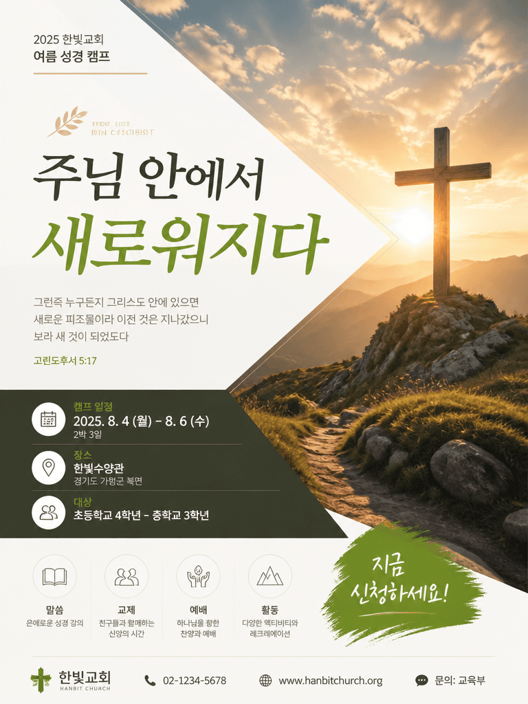
Utilize a vertical layout format like a portrait 4:3 ratio to organize information with perfect visual balance. Establish a calm, artistic header area featuring clean sunrise horizons, a minimalist line-art cross, or gentle forest contours. Dedicate the middle section to clean event headers like 'Summer Camp' or 'Vesper Service' wrapped in comfortable typography plates, and lock the bottom 30% area for event dates, retreat locations, registration guidelines, and contact lines.
Prompt practice
Construct your design system prompt incorporating keywords like 'editorial poster design' and 'subtle organic shapes'. Use descriptors such as 'serene cross silhouette, soft mountain range outlines, dawn light ray overlays, comforting muted palette with a single focus color' to yield tranquil vector canvases. Specify 'portrait_4_3' to prevent awkward horizontal cropping and preserve vertical graphic layouts.
Quality review
Perform detailed quality assurance checklines on the central structural lines of the cross illustration and guarantee they stay perfectly perpendicular without warping. Verify that background scenery gradients (sky color shifts, radiating dawn lines) are rendered smoothly without digital noise patches or blocky steps. Ensure text sections stay neatly arranged inside boundaries without flowing into random decorative margins.
Practical use
Church office designers and media team coordinators can swiftly customize this professional background asset using layout software. Wipe the placeholder text strings, and typeset the native congregation names, retreat times, seminary agendas, and contact links using highly legible, sleek modern fonts. Print the finalized layout on matte artistic sheets to pins on main building boards, or crop as high-resolution headers for the community's mobile newsletters.
Questions fréquentes
청년 집회는 성장과 비전을 상징하는 한색 계열의 틸 그린이나 스카이 블루를, 장년층 모임은 명상과 위로의 느낌이 강한 웜 브릭 브라운이나 차분한 플레인 미색 톤이 주효합니다.
두꺼운 입체 3D 십자가 대신 선묘로 얇게 드로잉된 가느다란 미니멀 골드 십자가나, 겹쳐진 반투명 기하학 원형의 모서리에 겹친 십자 실루엣을 배치하면 세련미가 배가됩니다.
큰 캠프 제목은 힘차면서도 현대적인 '나눔스퀘어 볼드'나 '에스코어드림'을 쓰고, 아래 세부 일시 장소는 획이 정돈되어 가독성이 만점인 '노토 산스'의 미디움 굵기를 어우릅니다.
주요 벽보에는 계좌번호처럼 복잡한 텍스트를 크게 노출하지 말고, 신도들이 스마트폰 카메라로 간편히 타고 넘어가 모바일 서식을 기입할 수 있는 단정한 QR 코드를 하나 심어 결합하는 방식을 극력 추천합니다.
실외는 직사광선과 비바람 습기에 자주 접하므로 일반 전단은 뒤틀리기 십상입니다. 이에 물방울 방울짐을 차단하는 펫(PET) 실사 용지에 친환경 솔벤트 무광 출력을 진행해 비치하는 것이 으뜸입니다.
신청자들의 불규칙한 원본 사진들은 채도를 모노톤(gray)으로 통일한 뒤 이미지 편집상에서 파스텔 레이어로 살짝 오버레이 혼합해주면 기성 포스터와 디자인 결이 튀지 않고 안착합니다.
상단에 'WELCOME TO ALL', '함께하는 예배', '이곳에서 쉼을 찾으세요'와 같은 평안 수식 키를 삽입해 주면 누구나 쉽게 발걸음을 매장과 교회 안으로 이끌어 유도합니다.