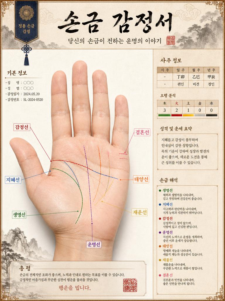
Diagram Design
Professional AI prompts for flowcharts, timelines, and information visualization designs.
2026.07.04
Make “Diagram Design” exactly the way you wantCreate your own “Diagram Design”
Just ask in plain language — Carat generates optimized images and videos for you.

Start now with 100 free credits daily
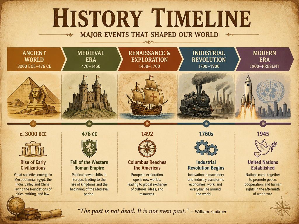
역사 타임라인 인포그래픽
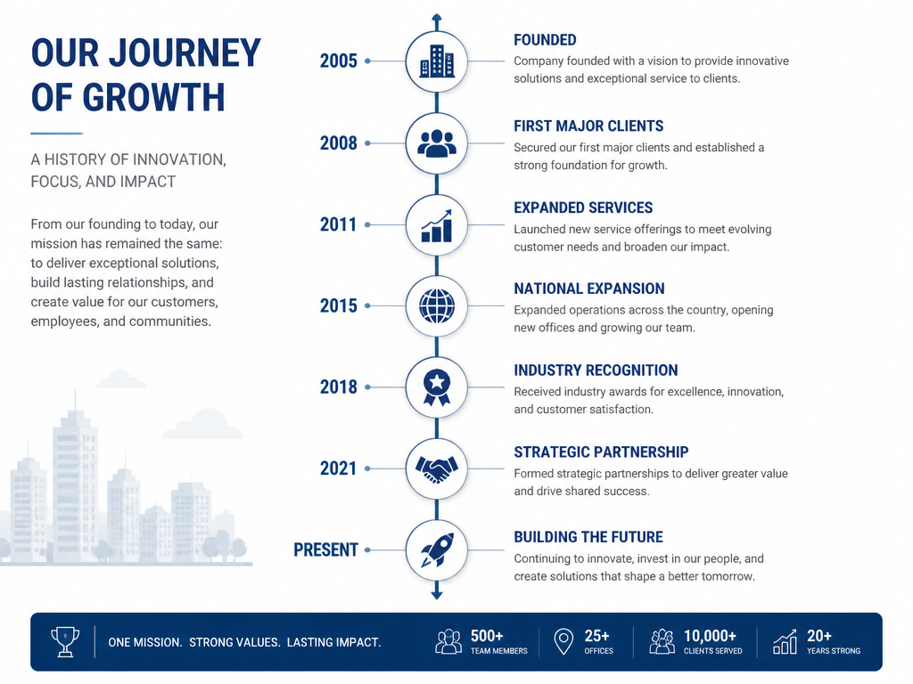
회사 연혁 타임라인
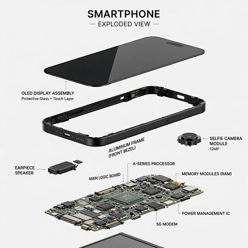
Smartphone Exploded View Diagram
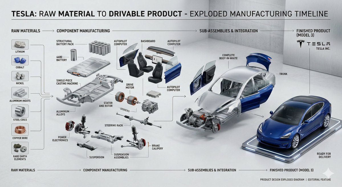
Product Cross-Section Cutaway Design
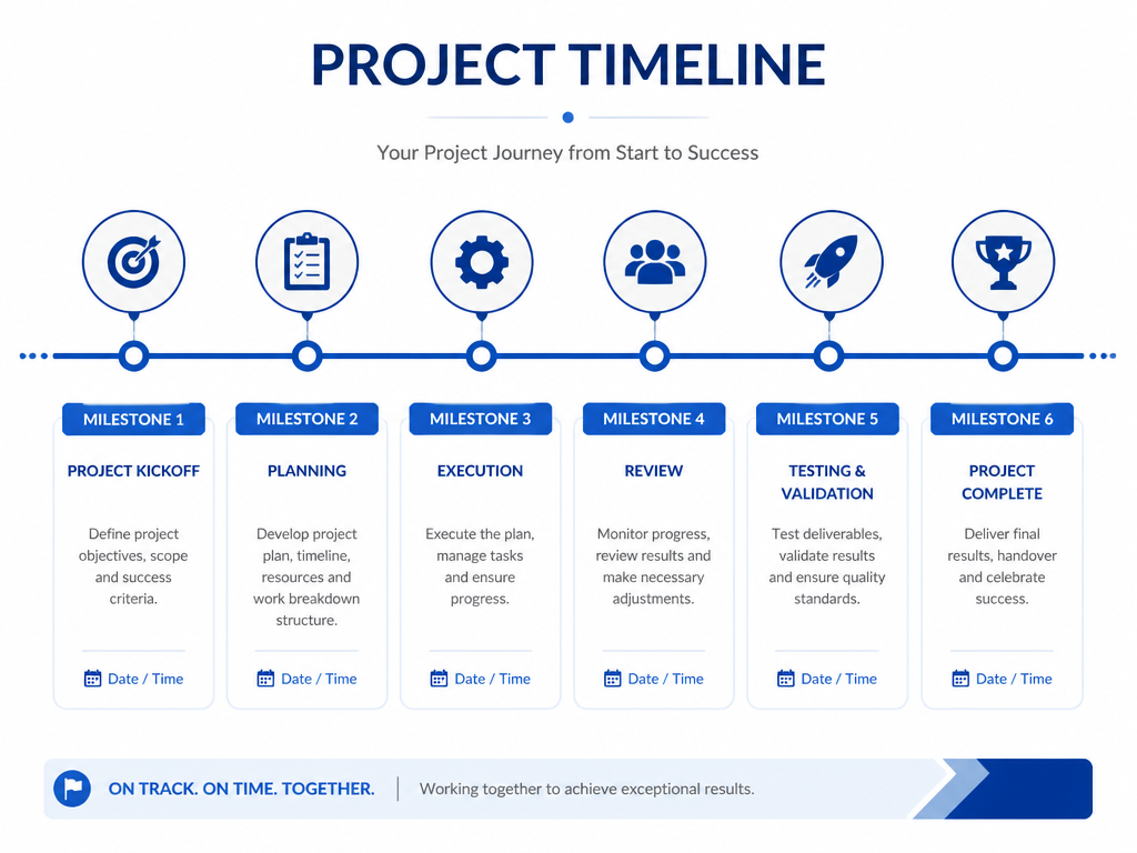
프로젝트 타임라인

Product Diagram Template
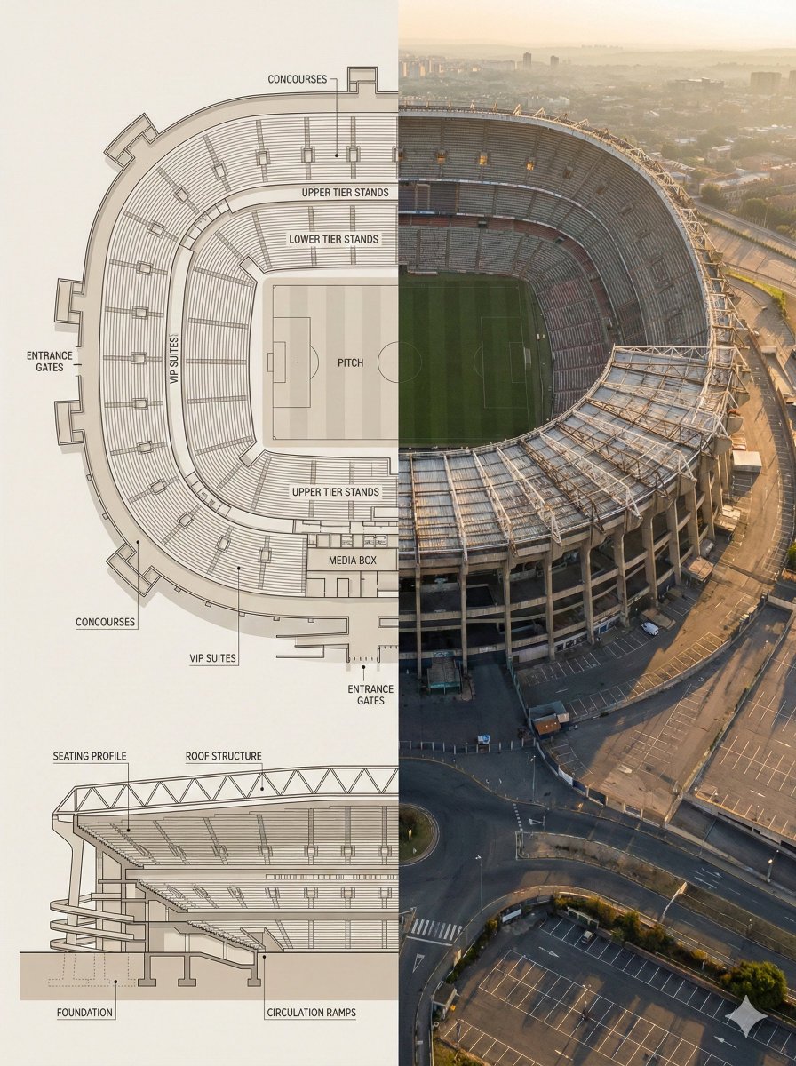
Landmark Floor Plan Cross-Section Infographic
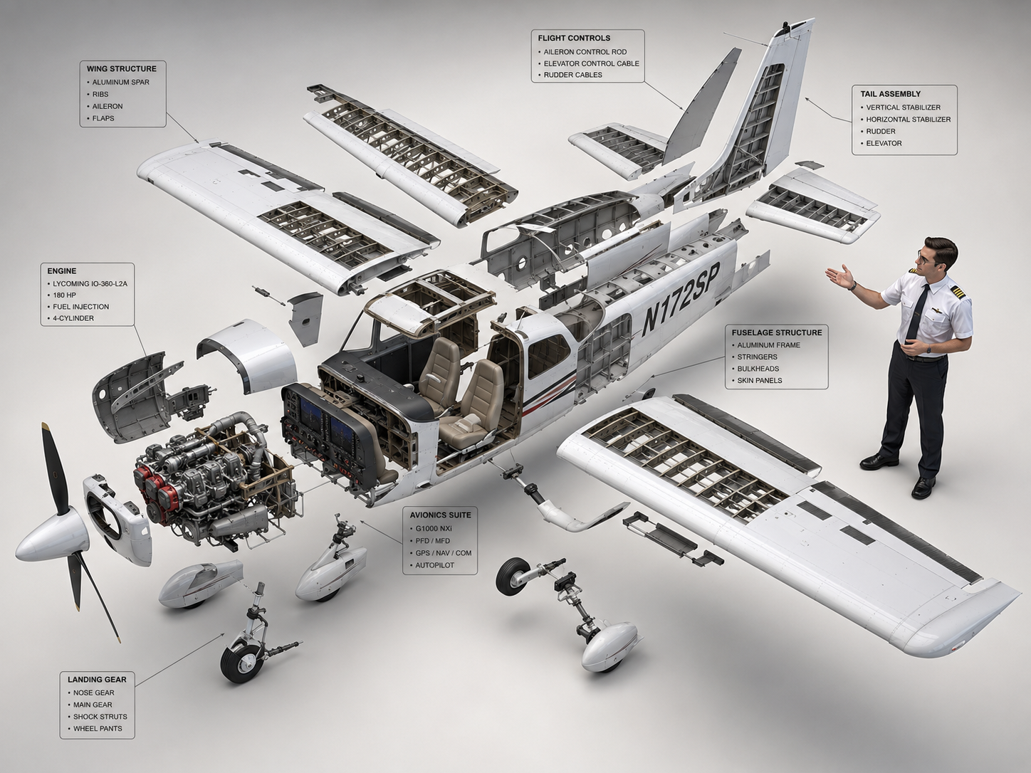
Cessna 172 Exploded View Diagram
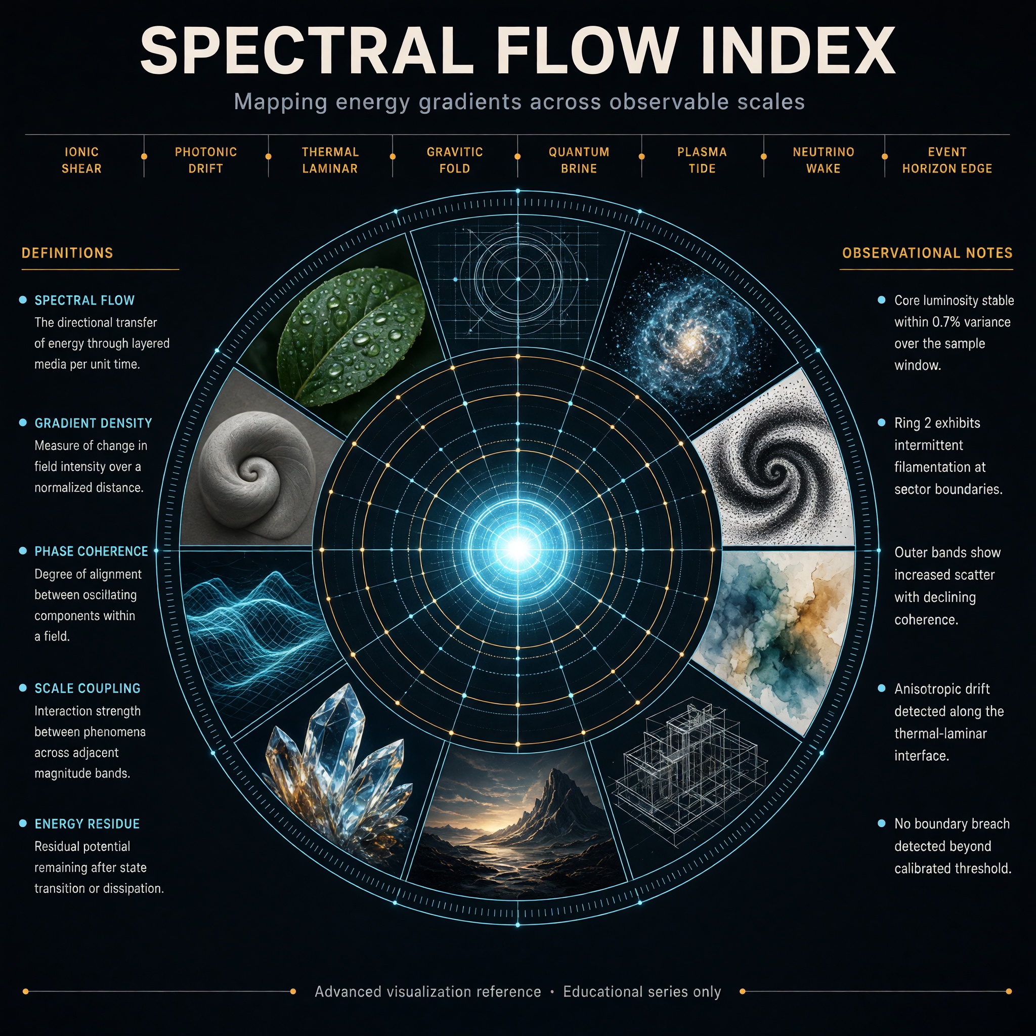
Concentric Ring Data Infographic
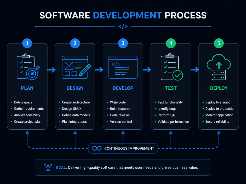
소프트웨어 개발 플로우
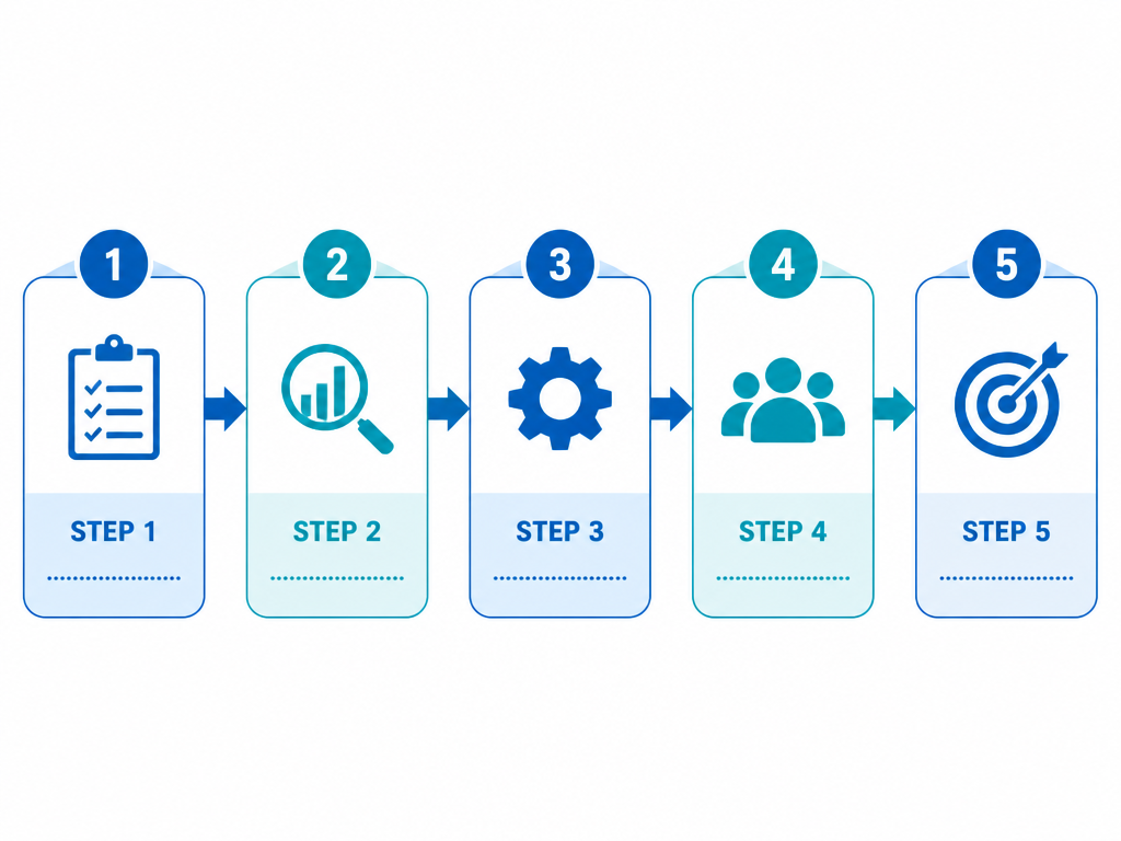
업무 프로세스 플로우
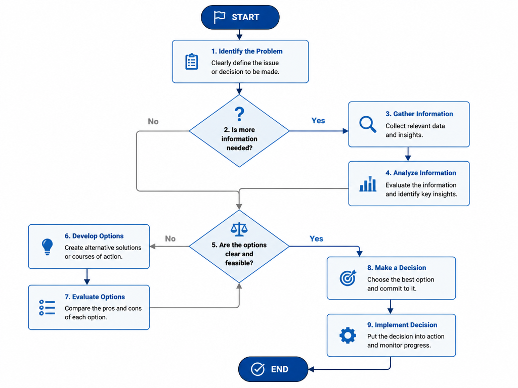
의사결정 플로우차트
What Are Diagram Design AI Prompts?
Diagram design AI prompts are specialized sets of instructions crafted to guide generative artificial intelligence in creating structured, logical, and visually aesthetic representations of information. Unlike generic artistic prompts, these are focused on the geometry of information-prioritizing flow, hierarchy, and connection. They are engineered to produce various types of visual aids, including flowcharts, process maps, organizational charts, and complex technical diagrams. By using these prompts on Carat, professionals can quickly generate high-quality visual frameworks that help explain intricate systems, business models, or data relationships. The goal of these prompts is to transform abstract data into a concrete visual language that is easy to understand at a glance. They act as a bridge between complex thought processes and clear visual communication, providing a professional-grade starting point for any information design project.
Best Use Cases
The utility of diagram design prompts spans across numerous professional and academic fields. In corporate environments, they are essential for creating "process flowcharts" that outline operational steps or software architecture for technical teams. Project managers use them to visualize "Gantt charts" or "project timelines" to communicate milestones to stakeholders. In education, these prompts help teachers create "mind maps" or "historical timelines" that make learning more engaging and visual. Designers often use them as a "wireframing" tool to explore different layout possibilities for user interfaces or infographics. Another powerful use case is in marketing, where "funnel diagrams" or "customer journey maps" are needed to illustrate strategic concepts. They are also perfect for technical manuals, where "cutaway diagrams" or "exploded views" of products are required to show internal components. By utilizing AI-generated diagrams, you can ensure that your presentations and documents have a consistent, modern, and professional aesthetic that enhances comprehension.
Why This Tag Works
The "Diagram Design" tag on Carat is effective because it solves the inherent difficulty of starting a complex visual layout from scratch. It works by providing a structured "design system" that the AI follows-ensuring that the output remains clean, organized, and professional. One of the key strengths of this tag is its ability to handle different visual styles, from "minimalist flat vectors" to "high-tech 3D isometric designs." This versatility allows users to match the diagram's style perfectly with their existing brand or document theme. Furthermore, these prompts are optimized for "readability" and "clarity," emphasizing clean lines and balanced spacing. By using this tag, users save hours of tedious manual alignment and icon searching, allowing them to focus on the actual content and logic of the information being presented. It democratizes professional information design, making it accessible to anyone with a need to communicate complex ideas visually.
Explore Related Prompts
Broaden your visual communication toolkit by exploring these specialized diagram and infographic categories:
- Flowchart Design
- Timeline Diagram
- Process Diagram
- Cutaway Diagram
- Infographic
- Card News Template
- UI Mockup
Prompt Building Tips
To generate high-quality, clear diagrams, you need to provide the AI with structural and stylistic constraints. First, identify the "type" of diagram; use specific terms like "circular process map," "hierarchical tree diagram," or "horizontal timeline." Second, specify the "dimensionality"-choose between "2D flat vector" for a modern clean look or "3D isometric" for a more dynamic, high-end feel. Third, define the "color scheme" using professional combinations like "monochromatic blue shades," "high-contrast corporate colors," or "soft pastel gradients." Fourth, mention the "background" to ensure it's easy to integrate into your slides; "solid white background" or "transparent-style background" are often the best choices. Fifth, include technical quality keywords such as "clean vector graphics," "precise geometry," and "high resolution." Sixth, to avoid clutter, add negative prompts or instructions like "no text," "clean nodes," and "minimalist style." Finally, describe the "nodes" and "connectors"-mentioning "rounded rectangles" or "dotted arrows" can significantly refine the final output. By layering these specific details, you can produce professional-grade diagrams tailored to your exact needs.