Infographic Example
Create clean infographic examples with process flows, charts, and data visualization layouts.
2026.07.07
Make “Infographic Example” exactly the way you wantCreate your own “Infographic Example”
Just ask in plain language — Carat generates optimized images and videos for you.

Start now with 100 free credits daily
인포그래픽 예시
What Is an Infographic Example Prompt?
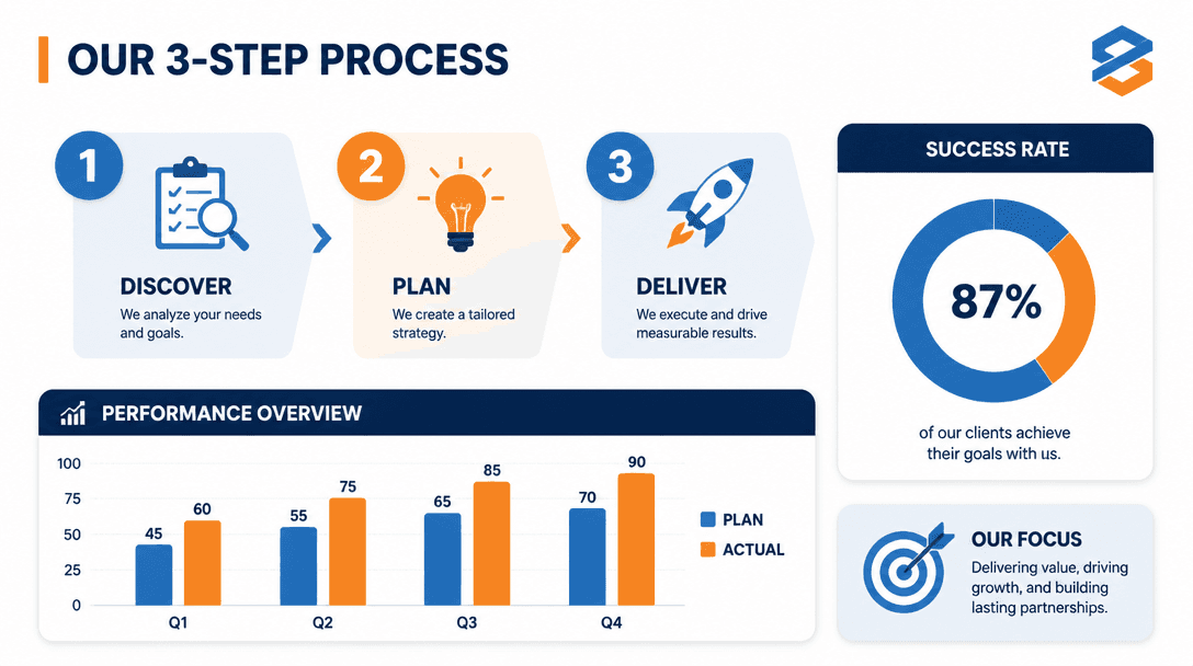
An infographic example prompt generates a composed infographic image that combines numbered icons, bar charts, donut charts, and process flows into a single layout. It is used for report summaries, social media information posts, educational materials, and blog thumbnails where complex information needs to be presented visually. Rather than building a layout from scratch in PowerPoint or Canva, you can generate a complete structure with AI and then replace the details with your actual data.
Common Use Cases
- Executive report summaries and weekly briefing visuals
- Instagram and blog card news with step-by-step guides
- Educational materials and onboarding documents with process flows
- Product landing pages with feature comparisons or statistics
- Conference presentation slides with data highlights
Why This Prompt Is Useful
Infographics are highly effective for information delivery, but planning the structure and arranging elements takes significant time. This prompt generates a clean layout with a three-step process flow, bar chart segment, and donut chart in a single image. The cohesive blue and orange color scheme gives a professional feel, and the flat vector style works for both print and digital. Using the generated image as a reference, you can swap in real data in Canva or Figma to cut production time dramatically.
Customization Tips
The key to adapting this prompt is changing the components, color scheme, and aspect ratio. You can switch from a three-step process to a five-step flow, a timeline structure, or a comparison table layout. Replacing the bar chart with a line graph or the donut chart with a radial chart tailors the visualization to your data type. Colors can be matched to brand guidelines, and the aspect ratio can be set to 1:1 for Instagram, 16:9 for YouTube, or 4:3 for print. Choosing between line, filled, or three-dimensional icon styles shifts the overall mood.