
은퇴설계 인포그래픽
GPT Image 2· Imagem
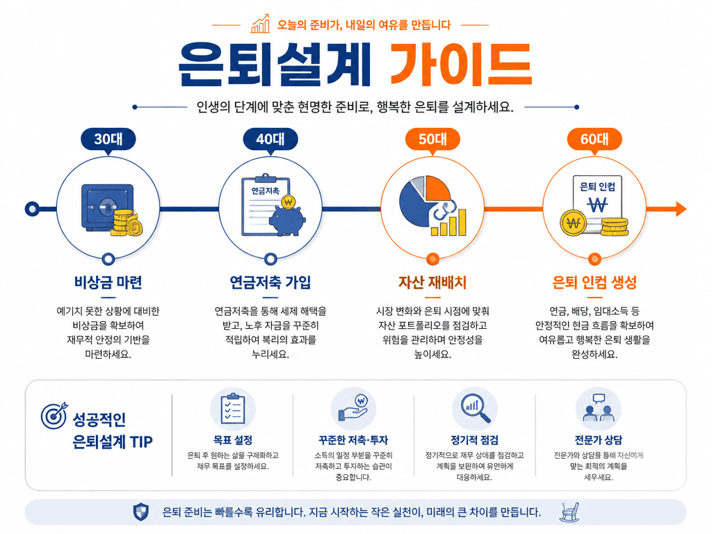
A retirement planning infographic design. Clean white background with warm orange and blue accent colors. Title text '은퇴설계 가이드' in Korean. Show a timeline from 30s to 60s with milestones: 30대 (비상금 마련), 40대 (연금저축 가입), 50대 (자산 재배치), 60대 (은퇴 인컴 생성). Each milestone has a simple icon and brief description. Professional financial infographic with clean timeline visualization.
Prompts relacionados
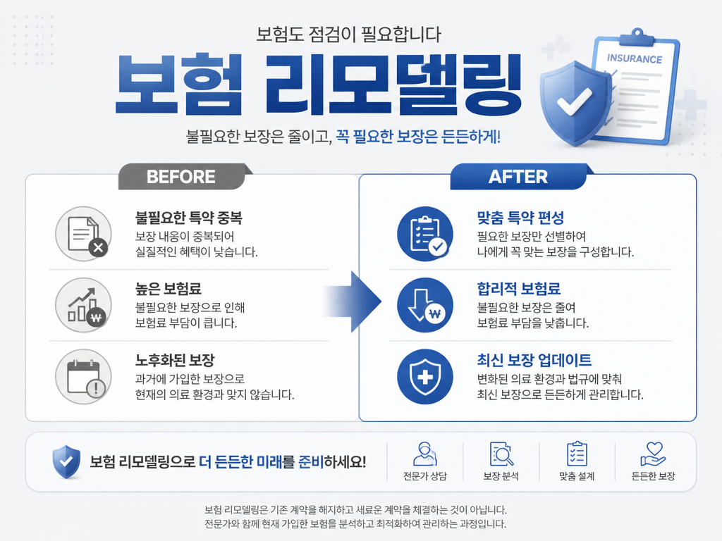
보험 리모델링 안내 이미지
GPT Image 2· Imagem
An insurance remodeling guide promotional image. Clean light gray background with blue accent. Title text '보험 리모델링' in Korean. Show a before/after comparison layout: BEFORE (불필요한 특약 중복, 높은 보험료, 노후화된 보장) vs AFTER (맞춤 특약 편성, 합리적 보험료, 최신 보장 업데이트). Professional financial advisory aesthetic with clean comparison diagram style.

보험 상담 안내 이미지
GPT Image 2· Imagem
A professional insurance consultation promotional image. Clean white background with navy blue gradient. Title text '보험 무료 상담' in Korean. Show a friendly financial consultant character in professional attire with a tablet, sitting at a clean desk with a plant. A speech bubble with checklist icons: 맞춤 설계, 보험료 비교, 기존 보험 진단. Trustworthy and approachable style, professional financial service aesthetic.
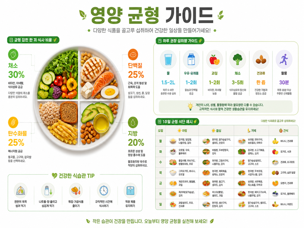
영양 균형 가이드 인포그래픽
GPT Image 2· Imagem
A nutrition balance infographic design. Clean white background with green and orange accent colors. Title text '영양 균형 가이드' in Korean. Show a balanced plate diagram divided into food groups (채소 30%, 단백질 25%, 탄수화물 25%, 지방 20%), daily intake recommendation icons, and a simple weekly meal chart. Modern health infographic with clean flat icons and organized data layout.
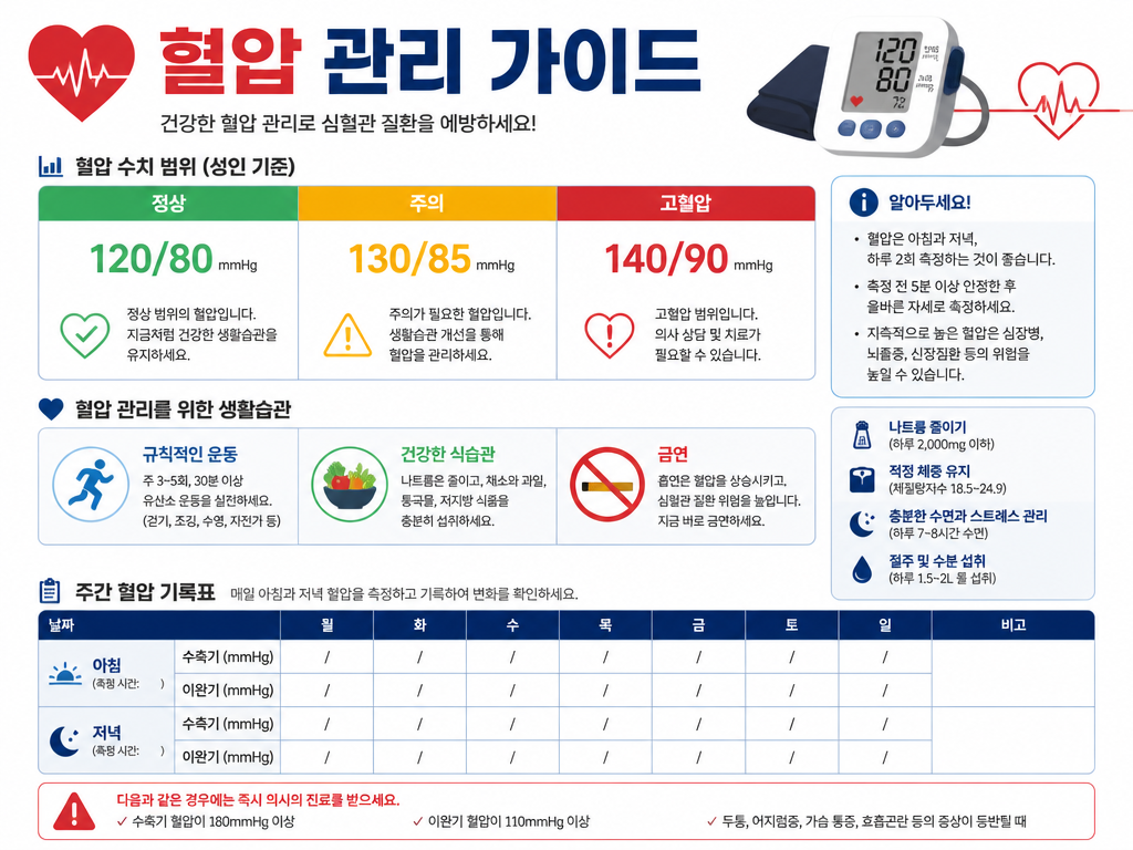
혈압 관리 가이드 인포그래픽
GPT Image 2· Imagem
A clean health infographic about blood pressure management. White background with red and blue accent colors. Title text '혈압 관리 가이드' in Korean. Show a blood pressure range chart with color-coded zones (정상 120/80, 주의 130/85, 고혈압 140/90), a lifestyle tips section with simple icons for exercise, diet, and no smoking, and a weekly tracking table template. Modern infographic design with clear data visualization and medical aesthetic.
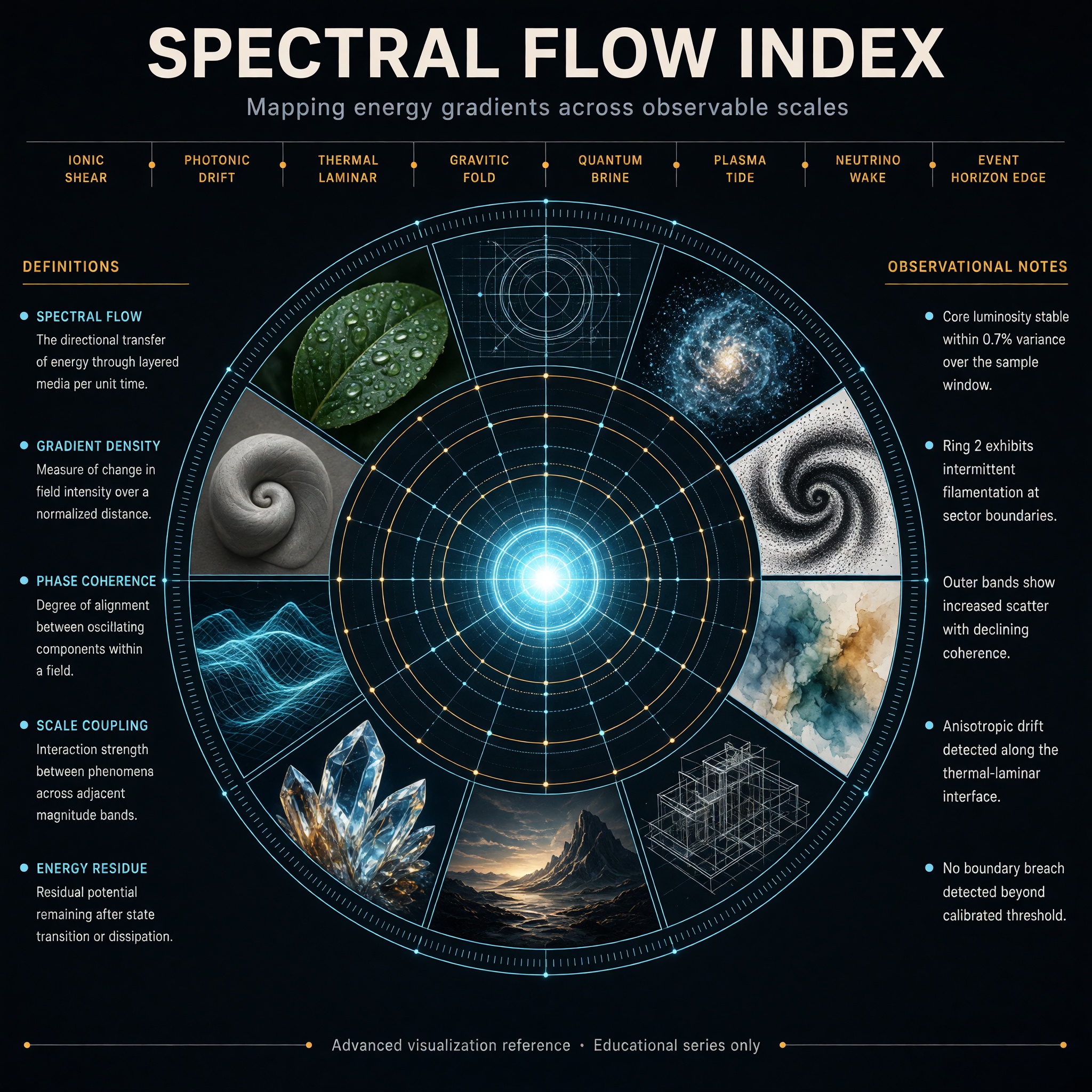
Concentric Ring Data Infographic
Grok Imagine Image 2.0· Imagem
Create a high-end hero infographic titled “SPECTRAL FLOW INDEX”.
Design it as a large circular radial diagram with a bright central glowing core, surrounded by five clean concentric rings expanding outward like a precision instrument dial. Each ring is divided into evenly spaced segments containing miniature visual studies rendered in distinctly different styles: photorealism, blueprint linework, volumetric particle render, ink stipple, soft watercolor, isometric technical drawing, cinematic still, macroscopic crystal close-up, luminous wireframe, and matte clay sculpture.
The overall atmosphere is electric, refined, and extremely polished — deep charcoal background, subtle luminous cyan and soft amber accents, thin glowing guide lines, and perfect geometric alignment.
Typography is dense, hierarchical, and perfectly legible with sharp edges and straight baselines:
Large precise bold sans-serif title centered at the very top
Medium-weight subtitle directly beneath it: “Mapping energy gradients across observable scales”
A clean horizontal band of eight short, evenly spaced labels in sharp small caps across the upper third, naming invented measurement zones
Two tall vertical columns of text, one on the far left and one on the far right, each containing five tightly spaced entries in clear body text (definitions on the left, observational notes on the right)
A single thin full-width footer line at the very bottom in micro but still razor-sharp text: “Advanced visualization reference · Educational series only”
All text sits on straight horizontal or vertical axes. No curved or circular text. Consistent spacing, strong visual hierarchy, and absolute clarity at every scale.
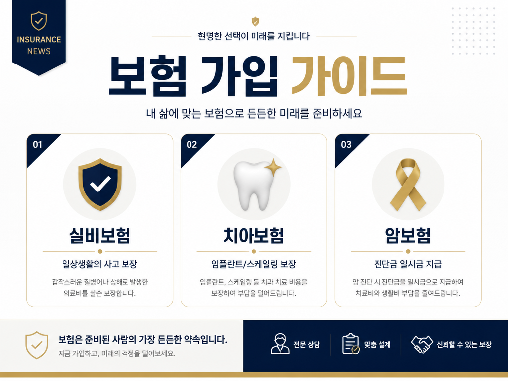
보험 가입 가이드 카드뉴스
GPT Image 2· Imagem
A professional insurance guide card news design. Clean white background with navy blue and gold accent colors. Title text '보험 가입 가이드' in Korean. Three card sections: 실비보험 (일상생활의 사고 보장), 치아보험 (임플란트/스케일링 보장), 암보험 (진단금 일시금 지급). Each section has a simple icon (shield, tooth, ribbon). Professional financial card news design with trustworthy navy and gold color scheme.
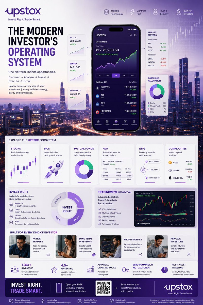
Fintech Investing Infographic Poster
GPT Image 2· Imagem
TOPIC: UPSTOX
Create an ultra-premium vertical SMM infographic poster for Upstox, designed as a next-generation fintech editorial infographic focused on high-performance investing, intelligent execution, and modern wealth creation.
The final design should feel like a fusion of:
- Apple Pro Display aesthetics
- TradingView interface design
- Bloomberg editorial systems
- Formula 1 telemetry dashboards
- modern Indian investing culture
- premium startup branding
The design should visually communicate:
"INVEST RIGHT. TRADE SMART."
CORE CONCEPT:
"THE MODERN INVESTOR'S OPERATING SYSTEM"
The entire composition should visualize Upstox as the central financial platform powering every stage of investing.
The visual narrative should show:
DISCOVERY
→ ANALYSIS
→ INVESTMENT
→ EXECUTION
→ GROWTH
Instead of showing random charts and holograms,
show a highly structured financial workflow.
Everything should feel:
- fast
- clean
- capable
- intelligent
- efficient
- trustworthy
NOT chaotic.
LAYOUT STYLE:
Create a premium modular fintech editorial layout.
Use:
- floating investment modules
- elegant information architecture
- structured dashboard systems
- large whitespace
- asymmetrical composition
- premium visual hierarchy
The layout should resemble:
a luxury financial operating system expanded into a collectible infographic poster.
HERO VISUAL:
Large central Upstox mobile ecosystem.
NOT just a phone mockup.
Instead:
Create a layered financial command center.
At center:
large Upstox mobile interface
surrounded by:
- portfolio systems
- investment cards
- watchlists
- market movers
- growth indicators
Everything connected through:
clean directional pathways
representing:
the investing journey.
BACKGROUND ENVIRONMENT:
Beautiful Mumbai financial district atmosphere.
Blue-hour cityscape.
Subtle references to:
- BKC
- NSE energy
- Indian capital markets
Use:
soft financial grid overlays
thin trajectory lines
minimal market architecture
NO hologram overload.
UPSTOX ECOSYSTEM MODULES:
Create premium information cards:
STOCKS
Real-time investing
Visual:
clean chart interface
IPOs
Invest in India's next growth stories
Visual:
launch trajectory card
MUTUAL FUNDS
Long-term wealth building
Visual:
circular diversified portfolio system
F&O
Advanced trading
Visual:
structured options matrix
ETFs
Smart passive investing
Visual:
connected allocation system
COMMODITIES
Gold, energy, multi-asset exposure
Visual:
minimal commodity dashboard
THE INVEST RIGHT SYSTEM
Large premium section:
INVEST RIGHT
Visualize:
- research
- education
- decision-making
- portfolio building
Show:
investment clarity
NOT gambling energy.
TRADINGVIEW POWER MODULE
Premium feature card:
TradingView Integration
Visual:
- advanced charting
- indicators
- drawing tools
- market analysis
Use sophisticated chart aesthetics.
MODERN INVESTOR SECTION
Show:
young Indian professionals
builders
creators
investors
market participants
Use:
realistic premium lifestyle photography
NOT smiling stock-photo energy.
The people should feel:
ambitious,
focused,
future-oriented.
QUICK STATS SYSTEM
Elegant floating metric cards:
1.3Cr+ Investors
4.5+ App Rating
Advanced Charting Tools
Zero Commission Mutual Funds
Multi-Asset Investing
Present as:
Apple-style information modules
NOT corporate blocks.
VISUAL KNOWLEDGE ELEMENTS
Include:
- portfolio allocation wheels
- watchlists
- market heatmaps
- clean candlestick systems
- growth trajectories
- SIP growth curves
- investment timelines
- execution indicators
Everything should feel:
premium,
minimal,
professional.
TYPOGRAPHY SYSTEM
Use:
large editorial sans-serif
strong hierarchy
minimal labels
clean spacing
Typography should resemble:
Apple
TradingView
Stripe
Bloomberg Weekend
Avoid:
techno fonts
startup clichés
crypto aesthetics
COLOR SYSTEM
Use actual Upstox-inspired identity:
Primary:
Deep Upstox Purple
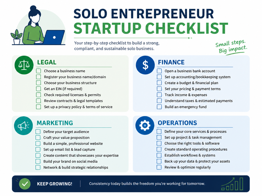
1인 창업 체크리스트
GPT Image 2· Imagem
A checklist infographic for solo entrepreneurs. Categories: legal, finance, marketing, operations with checkbox icons. Clean modern design, green and blue color scheme. Professional 1-person startup checklist infographic.
건강보험 필요성 카드뉴스
GPT Image 2· Imagem
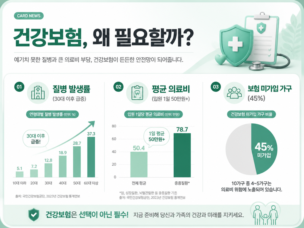
A health insurance necessity card news design. Soft mint green and white background. Title text '건강보험, 왜 필요할까?' in Korean. Three sections with icons: 질병 발생률 (30대 이후 급증), 평균 의료비 (입원 1일 50만원+), 보험 미가입 가구 (45%). Each section uses simple bar chart or pie chart visual elements. Professional healthcare insurance card news with clean data visualization style.
보험료 비교 카드뉴스
GPT Image 2· Imagem
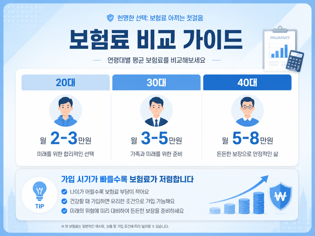
An insurance premium comparison card news design. Light blue gradient background. Title text '보험료 비교 가이드' in Korean. Show a comparison table layout with three columns: 20대 (월 2-3만원), 30대 (월 3-5만원), 40대 (월 5-8만원) with simple person icons. Bottom section with tips: '가입 시기가 빠를수록 보험료가 저렴합니다'. Clean infographic-style card news with professional financial aesthetic.
Fintech Dashboard UI
GPT Image 2· Imagem
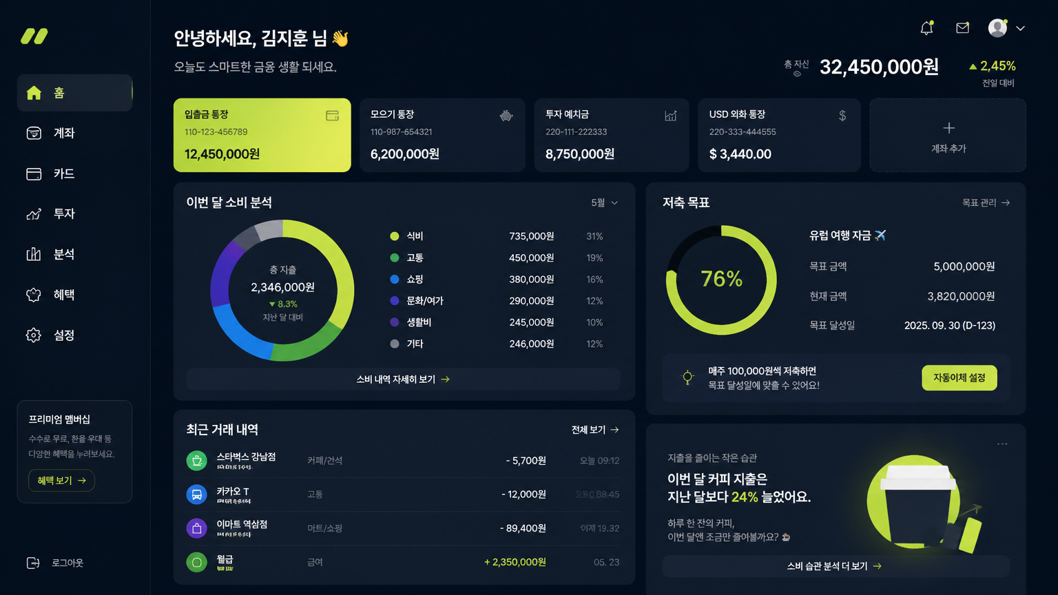
Create a modern fintech dashboard UI screen, spending chart, account cards, savings goal module, transaction list, dark navy and lime accents, premium Korean finance app style, no real bank logos.
fal:75268
Glassmorphism Gold Price Chart
Seedream 5.0 Lite· Imagem
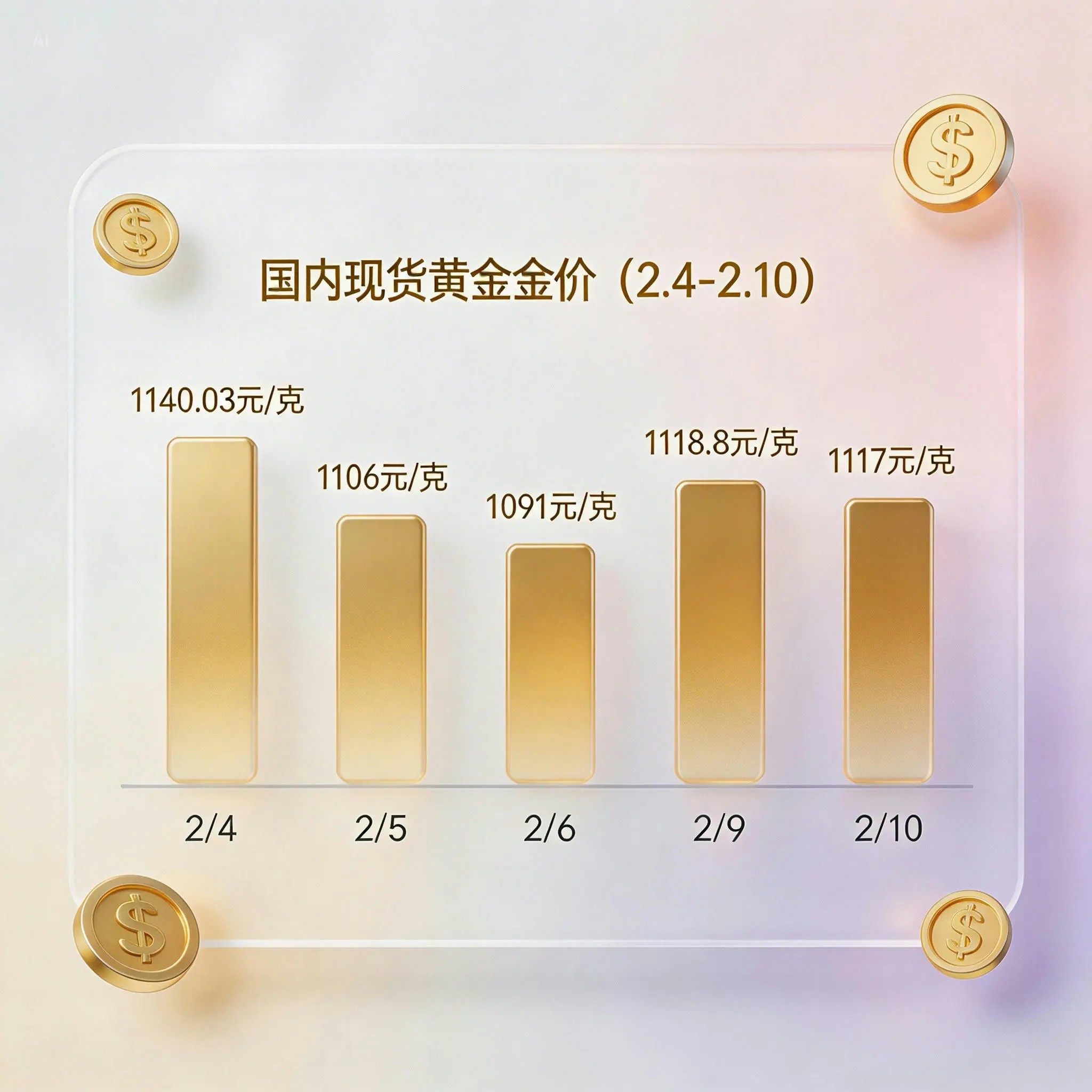
Generate a gold price trend chart for the past 7 days (priced in domestic spot gold, displaying specific values and timestamps), presented in a glassmorphism UI card style.