Data Infographic
Create data infographics, statistical visualizations, and informational images with AI. Retirement planning, nutrition guides, blood pressure management, and more.
2026.07.01
Faça “Data Infographic” exatamente do jeito que você querCrie o seu próprio “Data Infographic”
É só pedir com suas palavras — a Carat gera imagens e vídeos otimizados para você.

Comece agora com 100 créditos grátis por dia
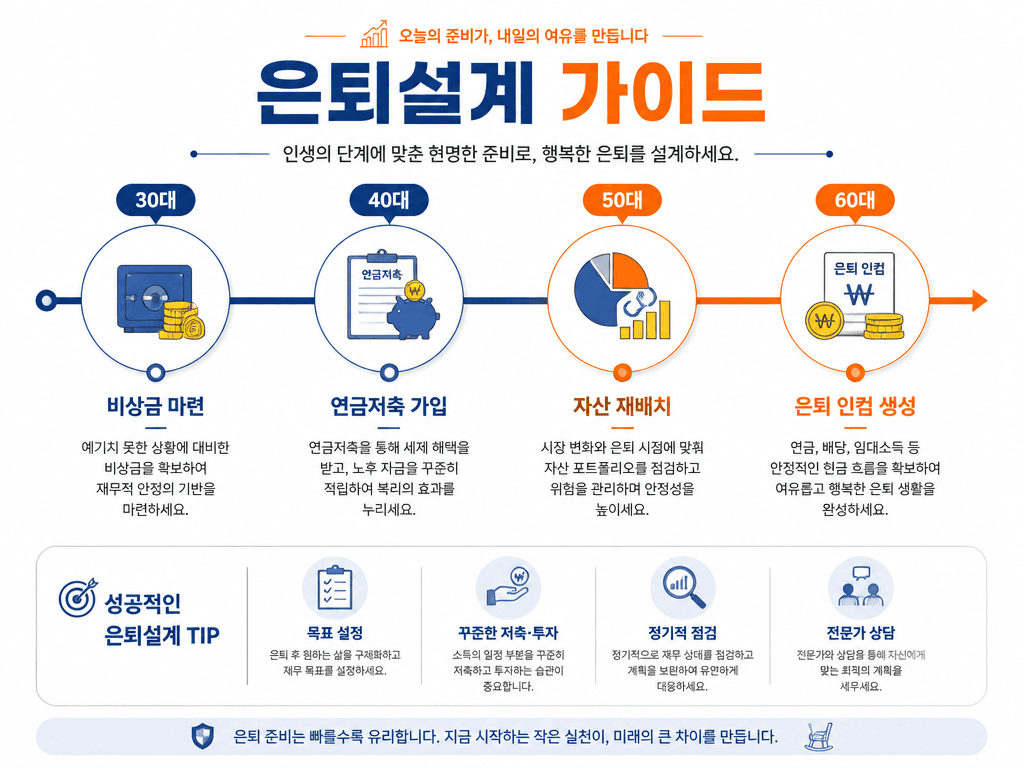
은퇴설계 인포그래픽
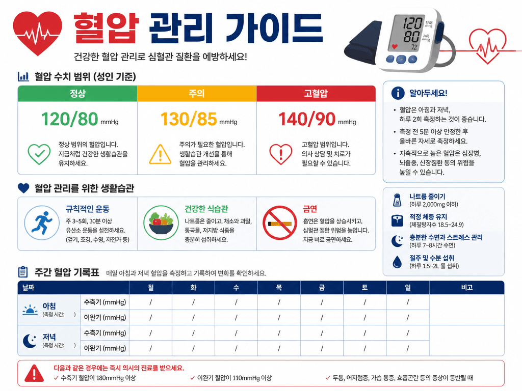
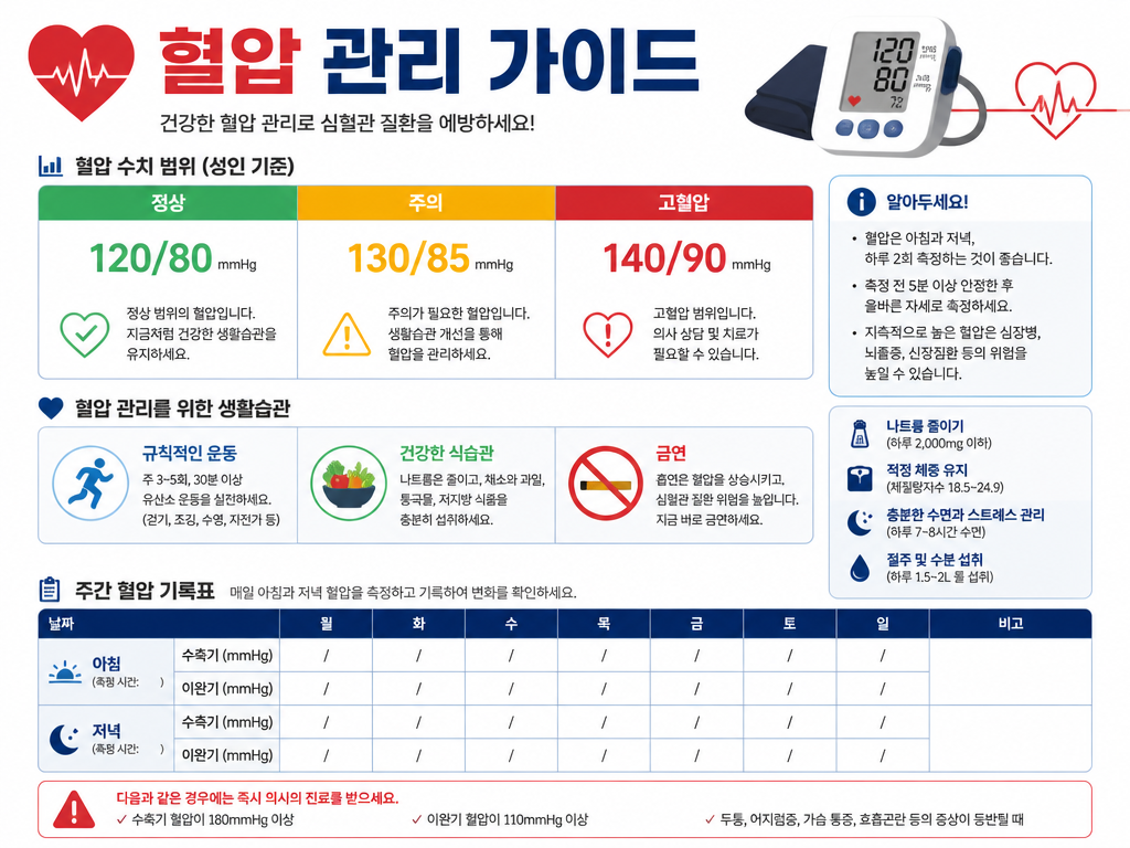
혈압 관리 가이드 인포그래픽
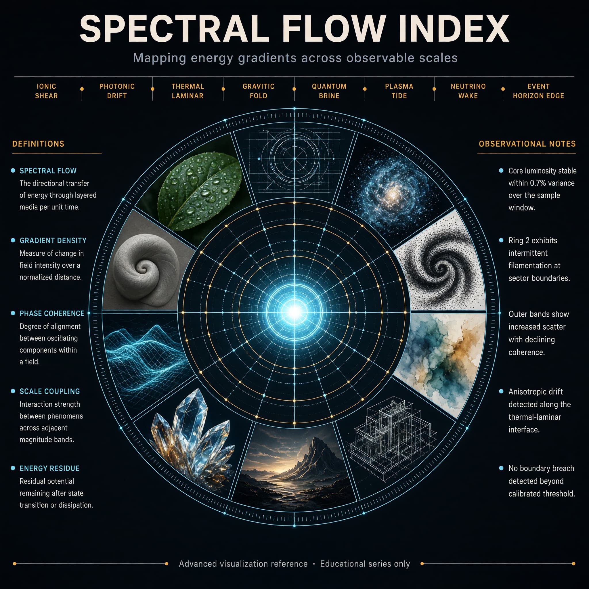
Concentric Ring Data Infographic
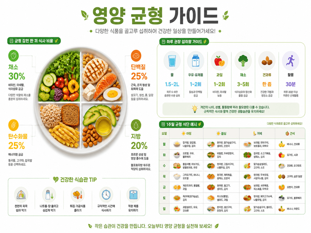
영양 균형 가이드 인포그래픽
Data Infographics — Visualize Information with AI
Data infographics are key tools for conveying complex information intuitively. Carat's AI data infographic generator creates retirement planning timelines, nutrition balance guides, and blood pressure management infographics.
Key Data Infographic Types
- Health/Medical: Blood pressure management, nutrition balance, exercise guides
- Finance: Retirement planning, investment comparison, financial diagnosis
- Technology: Product structure, tech principles, comparison analysis
- Statistics: Demographics, market research, industry trends
Data Infographic Tips
Specify topic, data values, and target audience. Try: 'Blood pressure management infographic, normal/caution/high values, icons and charts, teal and white tones.'