브랜드 이미지
브랜드 이미지, 무드보드, 브랜드 가이드라인 보드를 AI로 제작하세요. 브랜드 컬러, 타이포그래피, 로고 방향성, 비주얼 시스템을 시각화한 브랜드 디자인 자산을 생성합니다.
2026.07.01
·

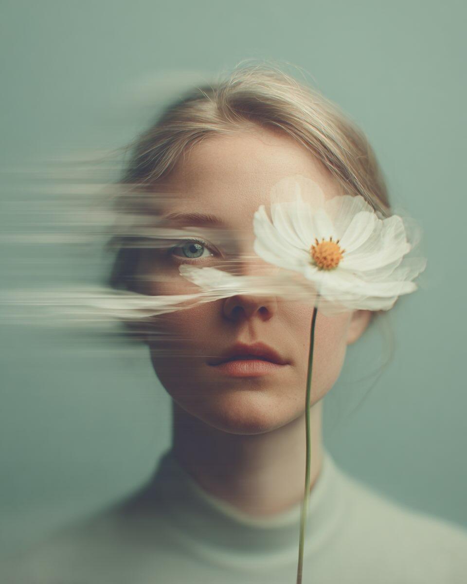
브랜드 무드보드 2×2 그리드
GPT 이미지 2· 이미지
[BRAND NAME]
Act as a Senior Brand Art Director and Editorial Designer creating a 2×2 grid brand moodboard — four distinct editorial cards unified by [BRAND NAME]'s visual identity system. References: Ivy Park campaign editorial, Supreme lookbook layouts, Palace Skateboards zine design, Off-White editorial grids, Highsnobiety brand feature spreads.
---
PHASE 0: BRAND INTELLIGENCE — AUTONOMOUS RESEARCH
Before generating any visual, perform a complete brand decode of [BRAND NAME] from training data. Extract and apply all of the following autonomously:
Color system: identify the exact primary and secondary brand colors — their specific hex values, how they are used in hierarchy (dominant background color, accent color, text color). These colors drive every card in the grid.
Typography DNA: identify the exact typeface or typeface category [BRAND NAME] uses — serif, sans-serif, condensed, extended, grotesque, slab. Identify the weight hierarchy: what weight is used for headlines, what for body text, what for labels. Apply this typography system throughout all four cards.
Brand language: identify the tone of voice, key phrases, campaign slogans, product categories, founding year, key collaborators, cultural positioning. Extract real factual information about [BRAND NAME] that can be used as text content across the four cards — real product names, real campaign titles, real dates, real locations, real brand statements.
Visual codes: identify the photographic style associated with [BRAND NAME] — editorial fashion, sport, street, luxury, industrial. Identify compositional patterns the brand uses — full bleed photography, text-dominant layouts, graphic-only compositions, collage.
All text content across all four cards must be real information about [BRAND NAME] — not placeholder text, not generic copy. Real brand slogans, real product lines, real campaign names, real founding information.
---
PHASE 1: GRID SYSTEM
The output is a single image composed of four equal rectangular cards arranged in a 2×2 grid. Total image dimensions: square or slightly landscape — 1:1 or 4:3 ratio. Each card is identical in size — exactly one quarter of the total image area. A thin gap of 4 to 6px between cards — neutral dark or light depending on brand palette. The four cards form a unified editorial system — they share the same color palette and typography but each has a distinct layout typology. Together they tell the brand story.
---
PHASE 2: CARD 1 — HERO EDITORIAL (top left)
Layout typology: large bold typography layered over or integrated with photography. Dominant background color: [BRAND NAME]'s primary brand color at full saturation — fills the entire card. Photography: a fashion or lifestyle image relevant to [BRAND NAME]'s visual world — model, product, or environment. The photo is either full-bleed behind the text or cropped into a specific zone of the card with text occupying the remaining space. Photo treatment: slight blend mode integration with the background color — the photo and background feel like one unified surface. Typography: the most recognizable [BRAND NAME] headline or slogan in the largest type size on the card — bold condensed, uppercase, white or brand secondary color. The text is large enough to partially overlap the photo. Secondary small text: brand name, location, date — set in small caps or tracking-heavy small type in a corner. The overall feeling: a magazine cover or campaign poster.
---
PHASE 3: CARD 2 — EDITORIAL TEXT LAYOUT (top right)
Layout typology: text-dominant editorial layout with a small photo inset. Background: [BRAND NAME]'s secondary brand color or a dark neutral consistent with the brand palette. Large headline: a real [BRAND NAME] campaign title or brand statement broken across multiple lines — each line a different size or weight, creating a typographic staircase effect. The largest line is very large, the smallest is medium, they are left-aligned creating a ragged right edge. Small body text column: a real paragraph of brand information — founding story, product description, or campaign context — set in small regular weight type, positioned in the upper right or lower right of the card. Photo inset: a small rectangular photo — 20 to 30% of card area — positioned where it interrupts or overlaps the headline text, creating editorial tension. The photo has a colored border or frame in the brand primary color.
---
PHASE 4: CARD 3 — FASHION EDITORIAL (bottom left)
Layout typology: photography-forward with typography as structural background element. Photography: a strong fashion or product image — model wearing [BRAND NAME] product, or a key product hero shot. The photo is positioned in the left 50 to 60% of the card, cropped tightly. Photo treatment: slightly desaturated or high contrast — editorial black and white or brand-tinted. Background typography: behind and around the photo, a very large single word or letterform from [BRAND NAME]'s identity — set at 200 to 300% of the card height, in the brand primary or secondary color, acting as graphic wallpaper behind the photo. This background type is partially obscured by the photo. Body text: a column of real [BRAND NAME] editorial copy — 3 to 5 short paragraphs, small regular weight, positioned to the right of the photo. Pull quote: one sentence extracted from the body copy, set larger and in brand accent color, positioned between the photo and the body text.
---
PHASE 5: CARD 4 — CLEAN BRAND STATEMENT (bottom right)
Layout typology: minimal, graphic, brand identity statement. Background: white, off-white, or the lightest tone in [BRAND NAME]'s palette — maximum contrast with the other three cards. Primary element: [BRAND NAME]'s wordmark or brand name set in massive type — ultra-bold, condensed or extended depending on the brand's typographic DNA. The wordmark is broken across 2 to 3 lines, each line flush left, occupying 70 to 80% of the card width. Type color: black or the darkest brand color — maximum contrast on the light background. Secondary element: a model or product image positioned at the right edge of the card, slightly cropped — human presence that grounds the graphic layout. The model/product is not the focus — the typography is. Accent element: a year, a number, a collection identifier, or a brand slogan set small in the brand primary color — positioned as a superscript or footnote near the main wordmark, adding a handwritten or stamped quality.
---
PHASE 6: UNIFIED VISUAL SYSTEM
Typography consistency across all four cards: all type is set in typefaces consistent with [BRAND NAME]'s identity. Headline type: one typeface, one weight — the boldest, most brand-representative option. Body type: one typeface, regular weight — legible at small sizes. No decorative or unrelated typefaces. Color consistency: only the colors identified in PHASE 0 appear across all four cards — primary brand color, secondary brand color, neutral (white or black), and one accent. No colors outside this palette. No gradients. No drop shadows. No textures on type. Information consistency: all text is real [BRAND NAME] information. No lorem ipsum. No generic placeholder text. Every word on every card is either the brand name, a real product name, a real campaign title, a real date, a real location, or a real brand statement. Grid alignment: elements across cards share implied alignment axes — a headline that starts at a certain x-position in card 1 aligns with an element in card 3 at the same x-position. This creates visual cohesion across the 2×2 grid when viewed as a whole.
---
PHASE 7: TECH SPECS
Output: a single flat image of the complete 2×2 grid. No separate files. Aspect ratio: 1:1 square or 4:3 landscape. Total resolution feel: high enough to read all body text clearly. Typography rendering: all type anti-aliased and crisp — no blurry text. Photography: editorial quality, not stock photography aesthetic. Color accuracy: brand colors exactly as identified in PHASE 0 — not approximated. No film grain unless it is a brand-authentic texture. No vignettes. No lens flare. Clean, precise, editorial. Output feel: this moodboard could be published on Hypebeast, Highsnobiety, or used as an internal brand presentation deck slide.

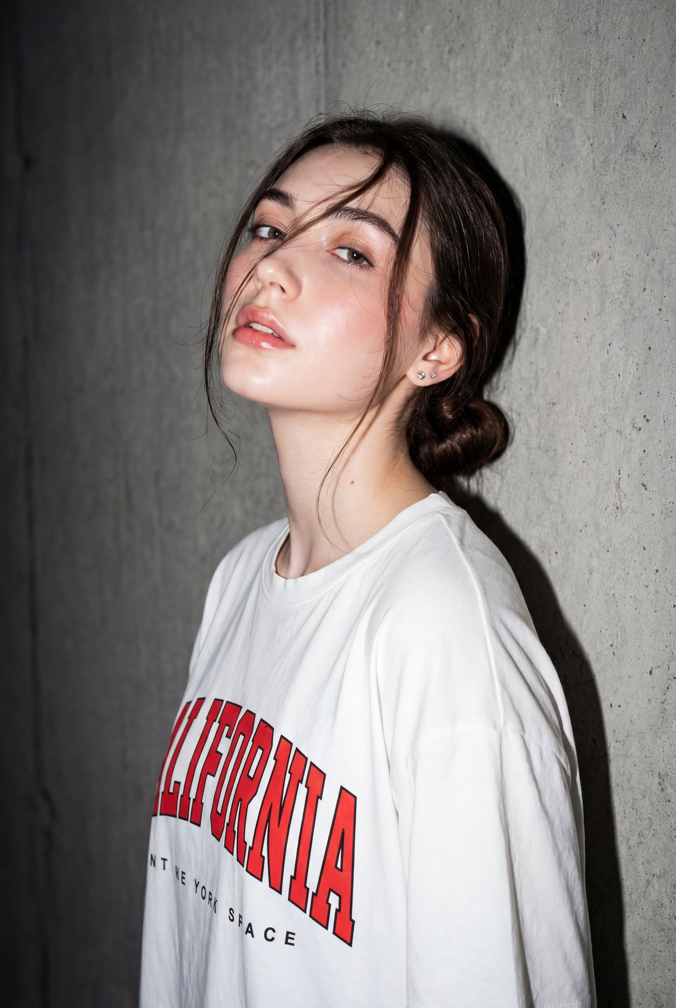
글로시에 브랜드 무드보드
나노 바나나 프로· 이미지
You are a world class creative director, brand strategist, editorial art director, and visual identity designer specializing in high impact campaign systems for global brands.
Your task is to create a bold, visually explosive, highly curated editorial moodboard collage composition that feels like a modern brand identity system.
This should feel like a brand world captured in one frame, not a clean layout, slightly chaotic, layered, and expressive.
BRAND INPUTS:
BRAND NAME: GLOSSIER
INDUSTRY / PRODUCT TYPE: beauty / skincare
PRIMARY BRAND COLOR: soft pink
SECONDARY BRAND COLOR: white
ACCENT COLOR (optional): translucent gloss
BRAND PERSONALITY: fresh, minimal, youthful, clean
OPTIONAL SLOGAN / TEXT: SKIN FIRST
VISUAL STYLE:
Create a dense, layered moodboard-style composition combining:
• real product photography or lifestyle shots
• packaging elements (bags, boxes, labels, tags)
• typography snippets and brand phrases
• illustrated graphics and doodles
• icons, symbols, and stickers
• abstract graphic shapes and patterns
• UI-like elements (menus, cards, labels)
• editorial cutouts and overlapping assets
The composition should feel:
• slightly messy but intentionally designed
• layered with depth and overlaps
• like a Pinterest board meets high-end campaign
• expressive, youthful, and brand-heavy
• visually rich and scroll-stopping
ART DIRECTION:
Include a mix of elements such as:
• product packaging mockups (bags, boxes, labels, stickers)
• lifestyle shot (person interacting with product or brand)
• bold typography blocks with brand phrases
• illustrated objects interacting with real elements
• menu-style or UI-style panels
• abstract shapes, blobs, squiggles, starbursts
• brand-related icons or symbols
• badge / stamp graphics
• textile or merch items (t-shirt, cap, tote bag, etc.)
• playful graphic overlays
COMPOSITION RULES:
• asymmetrical layout (NOT grid-based)
• elements scattered but balanced
• overlapping layers with depth
• mix of large hero elements + small details
• combine clean areas with dense clusters
• include cutout-style compositions
• avoid too much empty space
COLOR & DESIGN LANGUAGE:
• strictly follow brand color palette
• strong use of PRIMARY COLOR across elements
• secondary color used for contrast and layering
• minimal additional colors (keep it brand-consistent)
• high contrast, bold visual identity
TYPOGRAPHY:
• modern editorial typography
• mix of serif / sans-serif if relevant
• bold headlines + small UI text
• include brand name and/or slogan naturally in layout
• typography should feel integrated, not separate
VISUAL CHARACTERISTICS:
• premium campaign look
• modern brand identity system
• editorial + commercial hybrid aesthetic
• highly shareable social media visual
• playful but intentional chaos
• cohesive even in randomness
IMPORTANT:
This should feel like:
• a brand world explosion in one frame
• a creative direction board for a global campaign
• a visual identity snapshot of the brand
NOT a clean layout
NOT a grid
NOT minimal
It must feel alive, layered, and expressive.
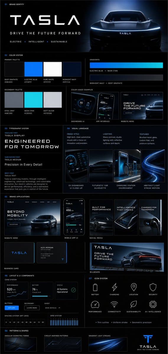
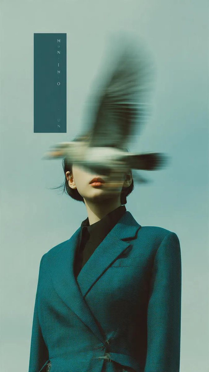
브랜드 가이드라인 보드
GPT 이미지 2· 이미지
{
"prompt": {
"title": "Premium Vertical Brand Guideline Board",
"aspect_ratio": "4:5",
"brand_inputs": {
"brand_name": "[BRAND NAME]",
"industry": "[INDUSTRY / NICHE]",
"target_audience": "[AUDIENCE TYPE]",
"brand_personality": "[3–5 TRAITS]",
"core_emotion": "[FEELING YOU WANT TO EVOKE]"
},
"layout": {
"type": "structured_modular_grid",
"columns": "3–4",
"style": "high-end agency presentation",
"rules": [
"precise spacing",
"clean alignment",
"strong visual hierarchy",
"no collage appearance"
]
},
"core_rules": [
"All elements must be derived from brand inputs",
"Color palette must reflect personality and industry",
"Typography must match tone",
"Shapes and visuals must be consistent",
"No randomness",
"No generic defaults"
],
"sections": {
"header": {
"elements": [
"Brand name (dominant headline)",
"Tagline (max 6 words)",
"3 brand descriptors"
],
"style": "clean, confident, visually anchored"
},
"color_system": {
"primary_colors": "3–5",
"secondary_colors": "2–4",
"display": [
"Large swatches",
"HEX codes",
"Color labels"
],
"extras": [
"2 gradient styles",
"2–3 real pairing examples (UI or branding usage)"
],
"requirement": "intentional and cohesive palette"
},
"typography_system": {
"hierarchy": {
"headline": "strong, expressive",
"subheading": "structured",
"body": "high readability"
},
"samples": [
"Large title",
"Medium subheading",
"Short paragraph"
],
"requirement": "aligned with brand tone"
},
"visual_language": {
"definitions": [
"Image style",
"Lighting direction",
"Texture/material inspiration"
],
"assets": "3–4 moodboard tiles",
"requirement": "clearly reflect brand world"
},
"brand_applications": {
"mockups": [
"Website hero section",
"Mobile app UI",
"2–3 social media creatives",
"Business card",
"Poster or billboard"
],
"requirement": "strict adherence to system"
},
"layout_ui_components": {
"elements": [
"Card layout system",
"Buttons",
"Spacing rules",
"Grid alignment"
],
"style": "functional, minimal, consistent"
},
"icon_system": {
"count": "6–8",
"style": "consistent (outline or solid)",
"rules": [
"uniform stroke weight",
"geometry aligned with brand personality"
]
},
"patterns_shapes": {
"elements": [
"Geometric forms",
"Repeating motifs",
"Background textures"
],
"requirement": "supportive, not dominant"
}
},
"rendering": {
"composition": "ultra-clean",
"structure": "clear section separation",
"hierarchy": "strong",
"aesthetic": "editorial or tech premium",
"effects": [
"soft shadows",
"depth",
"premium lighting"
]
},
"output_requirement": "Must resemble a professional brand guideline board used in real client presentations, not AI-generated clutter"
}
}"
브랜드 이미지, AI로 브랜드 아이덴티티를 시각화해요
브랜드 이미지는 브랜드 아이덴티티를 시각적으로 표현하는 핵심 자산입니다. 캐럿의 AI 브랜드 이미지 생성기는 브랜드 가이드라인 보드, 무드보드, 브랜드 패키지 디자인까지 브랜드 디자인에 필요한 비주얼을 제작합니다.
브랜드 이미지 종류
- 브랜드 가이드라인 보드: 컬러 팔레트, 타이포그래피, 로고 변형, 비주얼 시스템
- 브랜드 무드보드: 분위기, 텍스처, 컬러, 레퍼런스 이미지 그리드
- 브랜드 패키지 디자인: 제품 패키지, 라벨, 박스 디자인
- 브랜드 캠페인 포스터: 브랜드 메시지를 담은 광고 비주얼
브랜드 이미지 제작 팁
브랜드 무드(럭셔리/미니멀/친환경/빈티지)와 주요 컬러를 프롬프트에 지정하세요. '브랜드 가이드라인 보드, 럭셔리 코스메틱, 골드와 화이트, 미니멀, 컬러 팔레트와 타이포그래피 포함'처럼 작성하면 됩니다.