carat

Prompt Gallery

/

포스터

Login
Sign Up

포스터

공연·행사·영화·브랜드 포스터에 바로 쓸 수 있는 포스터 AI 프롬프트. 콘서트·전시·홍보 키비주얼을 세로 레이아웃으로 빠르게 만들 수 있습니다.

2026.08.11

·
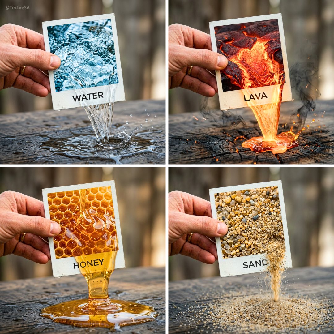
나노바나나 프로로 생성한 폴라로이드에서 나오는 ELEMENT

폴라로이드에서 나오는 ELEMENT

나노바나나 프로· Image
A hyper-realistic 3D photo concept showing a hand holding a square polaroid photo labeled “ELEMENT”. Inside the photo, there’s a close-up of [ELEMENT], and it flows seamlessly out of the photo frame into the real world, naturally interacting with the surface below. The text “ELEMENT” appears printed cleanly on the white border of the photo. Realistic cinematic lighting, ultra-detailed textures, artistic composition, 1080x1080 square format.
@TechieBySA
GPT 이미지 2로 생성한 애니 스트리트웨어 잠금화면 일러스트

애니 스트리트웨어 잠금화면 일러스트

GPT 이미지 2· Image
Use the uploaded image as the character identity and fashion reference. Reimagine the uploaded character as a premium Japanese streetwear anime lock screen wallpaper while preserving the character’s recognizable face, hairstyle, facial proportions, silhouette, personality, expression, clothing identity, and overall visual DNA. IMPORTANT WALLPAPER COMPOSITION: Create the artwork specifically for an iPhone lock screen wallpaper (1290×2796 vertical composition). Design around the lock screen UI. Leave the upper 25–30% of the image intentionally clean with minimal visual detail to provide negative space for the clock, date, widgets, and notifications. Do not place the character’s face, eyes, typography, weapons, logos, or important design elements behind the clock area. Position the character lower in the composition, occupying the lower two-thirds of the canvas. The character should remain the focal point while naturally framing the lock screen interface above. IMPORTANT CHARACTER DIRECTION: The character should maintain direct eye contact with the viewer and face forward. Preserve the recognizable facial identity while reconstructing the face into a front-facing fashion-editorial pose. The expression should feel calm, confident, stylish, and slightly intimidating. POSE: Low crouching Japanese streetwear pose. Strong silhouette. Relaxed confidence. Fashion-editorial body language. If the original character has a weapon, redesign and preserve the weapon. The weapon should help frame the composition without blocking the character’s face. STYLE: Minimalist Japanese graphic design poster, Nogi-inspired streetwear artwork, ultra-clean anime illustration, bold black ink linework, crisp vector-inspired shapes, graphic novel aesthetics, luxury streetwear fashion illustration, collectible designer poster art, strong silhouette readability, premium graphic design composition. COLOR PALETTE: The image should remain overwhelmingly black, white, and grayscale. Extract the brightest accent color from the uploaded character and use it as the only accent color throughout the artwork. The accent color should occupy less than 10% of the image and be reserved for subtle highlights, clothing details, weapon accents, jewelry, symbols, typography, and reflections. BACKGROUND: Large vertical Japanese katakana typography integrated into the design. The typography should sit behind the character and extend beyond the canvas edges. Keep the upper clock-safe area significantly cleaner than the rest of the composition. Use strong negative space and premium poster design principles. LOCK SCREEN OPTIMIZATION: The character’s head should sit just below the clock area. Important facial features must remain unobstructed by lock screen UI. The overall wallpaper should feel intentionally designed around Apple’s lock screen layout rather than simply cropped from a poster. Premium wallpaper quality, balanced composition, elegant spacing, and strong visual hierarchy.
@mdmadeit
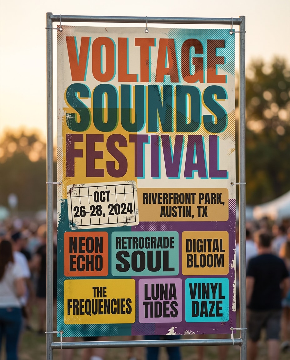
나노바나나 2로 생성한 AI 이미지 Music Festival Lineup

AI 이미지 Music Festival Lineup

나노바나나 2· Image
Music festival banner with bold typographic hierarchy, colorful halftone textures, layered stickers aesthetic, lineup grid, date and location blocks, retro-modern color palette, high visual rhythm, crisp vector poster vibe, no watermark, 85mm lens, shallow depth of field, soft cinematic lighting --ar 4:5
music-festival-lineup
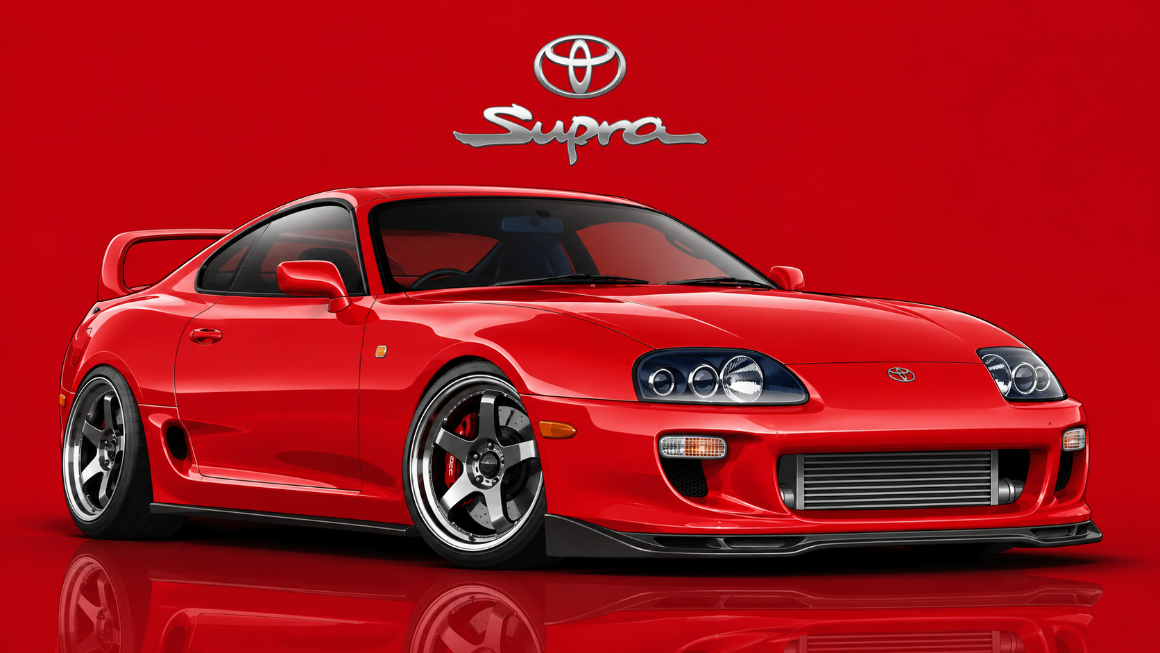
GPT 이미지 2으로 생성한 영화 자동차 벡터 일러스트

영화 자동차 벡터 일러스트

GPT 이미지 2· Image
[Car full description and movie-accurate details], three-quarter view, vector art style, clean bold lines with subtle gradients, lowered aggressive stance, detailed wheels and lights. Background solid [main car color] with soft glossy reflection on ground. Top center: [Brand] logo. Below logo: "[Model Name]" sleek modern font. Main car scaled huge dominating the frame, 16:9 aspect ratio, dynamic composition
67dfd4ed81b359a567dede03c49fa4f8
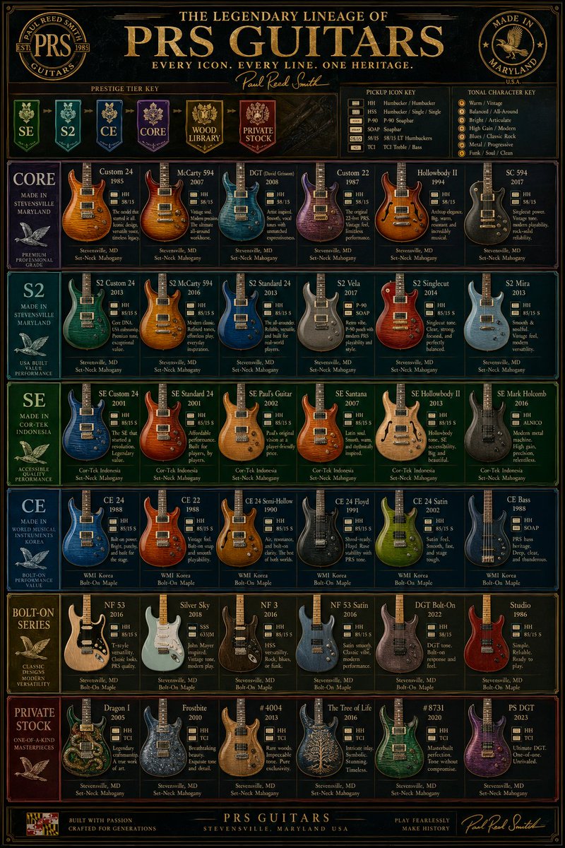
GPT 이미지 2로 생성한 빈티지 PRS 기타 계보 포스터

빈티지 PRS 기타 계보 포스터

GPT 이미지 2· Image
{"type":"luxury vintage guitar comparison infographic poster","subject":"a highly detailed, vertically oriented PRS electric guitar lineup chart designed like a premium museum poster or collector's reference board","style":"ornate, dark, glossy, high-contrast, gold-foil typography, elegant wood-and-metal textures, symmetrical grid layout, premium catalog aesthetic, subtle vintage patina, ultra sharp graphic design","branding":{"main headline":"THE LEGENDARY LINEAGE OF {argument name="brand name" default="PRS GUITARS"}","subheadline":"EVERY ICON. EVERY LINE. ONE HERITAGE.","signature":"Paul Reed Smith","left seal":"PAUL REED SMITH GUITARS","right seal":"MADE IN MARYLAND U.S.A."},"palette":{"background":"black and deep charcoal with dark figured wood accents","primary":"antique gold","secondary":"cream","accent colors":["deep green","teal","royal blue","purple","gold","burgundy"]},"layout":{"format":"single-page vertical poster","header":{"position":"top","elements":["large central title","small tagline below","script signature","2 circular emblems in upper left and upper right","3 horizontal legend boxes under the title"]},"sections":[{"title":"PRESTIGE TIER KEY","position":"upper left below title","count":6,"labels":["SE","S2","CE","CORE","WOOD LIBRARY","PRIVATE STOCK"]},{"title":"PICKUP ICON KEY","position":"upper center-right below title","count":7,"labels":["HH","HSH","P-90","SOAP","58/15","TCI","Bass"]},{"title":"TONAL CHARACTER KEY","position":"upper right below title","count":7,"labels":["Warm / Vintage","Balanced / All-around","Bright / Articulate","High Gain / Modern","Blues / Classic Rock","Metal / Progressive","Funk / Soul / Clean"]},{"title":"CORE","position":"first main row left label","count":7,"labels":["Custom 24","McCarty 594","DGT (David Grissom)","Custom 22","Hollowbody II","SC 594","row category panel"]},{"title":"S2","position":"second main row left label","count":6,"labels":["S2 Custom 24","S2 McCarty 594","S2 Standard 24","S2 Vela","S2 Singlecut","S2 Mira"]},{"title":"SE","position":"third main row left label","count":6,"labels":["SE Custom 24","SE Standard 24","SE Paul's Guitar","SE Santana","SE Hollowbody II","SE Mark Holcomb"]},{"title":"CE","position":"fourth main row left label","count":6,"labels":["CE 24","CE 22","CE 24 Semi-Hollow","CE 24 Floyd","CE 24 Satin","CE Bass"]},{"title":"BOLT-ON SERIES","position":"fifth main row left label","count":6,"labels":["NF 53","Silver Sky","NF 3","NF 53 Satin","DGT Bolt-On","Studio"]},{"title":"PRIVATE STOCK","position":"sixth main row left label","count":6,"labels":["Dragon I","Frostbite","#4004","The Tree of Life","#8731","PS DGT"]}],"footer":{"position":"bottom","elements":["small badge at lower left","centered company line","right-side script signature"]}},"content grid":{"total guitar models shown":37,"card design":"each product card contains a guitar render, model name, year, small pickup icons, a short descriptive blurb, and origin/wood specs at the bottom","row side panels":6},"visual details":{"guitars":"front-facing electric guitars with varied body shapes and highly polished figured maple tops, metallic and transparent finishes, some solid colors, some natural wood","typography":"all caps serif headlines, small serif body text, script signature accents","borders":"thin decorative gold rules around every panel and the full poster","lighting":"studio-lit instruments against dark panel backgrounds","render quality":"clean infographic precision with realistic product renders"},"camera":"straight-on flat poster view, no perspective distortion, centered composition","quality":"ultra detailed, print-ready, high-resolution editorial infographic, luxury brand poster"}
@GlennHasABeard
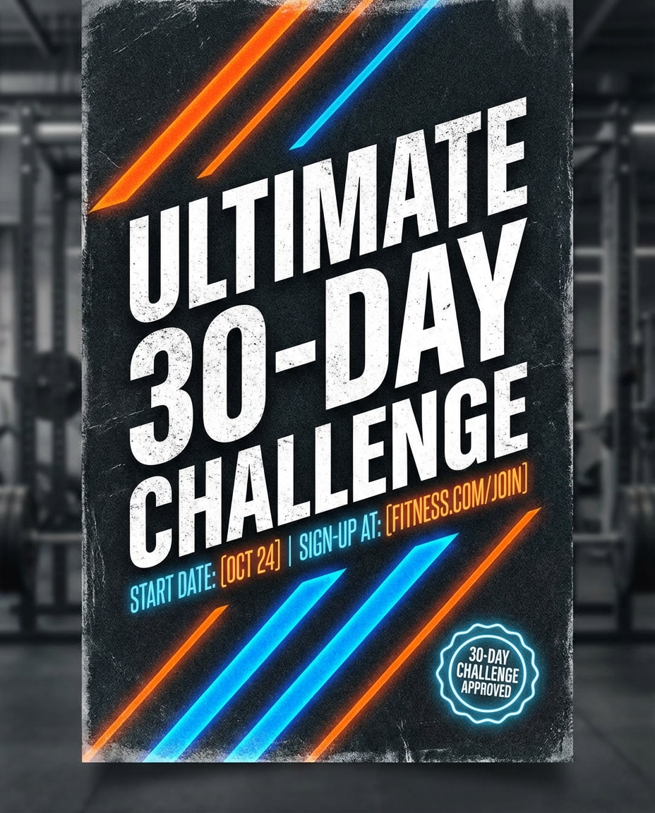
나노바나나 2로 생성한 AI 이미지 Fitness Challenge

AI 이미지 Fitness Challenge

나노바나나 2· Image
High-energy fitness challenge banner with gritty texture overlay, bold condensed typography, diagonal stripes, neon accent highlights, badge for 30-day challenge, space for start date and sign-up link, athletic brand vibe, strong contrast and hierarchy, crisp poster design, no watermark, 85mm lens, shallow depth of field --ar 4:5
fitness-challenge
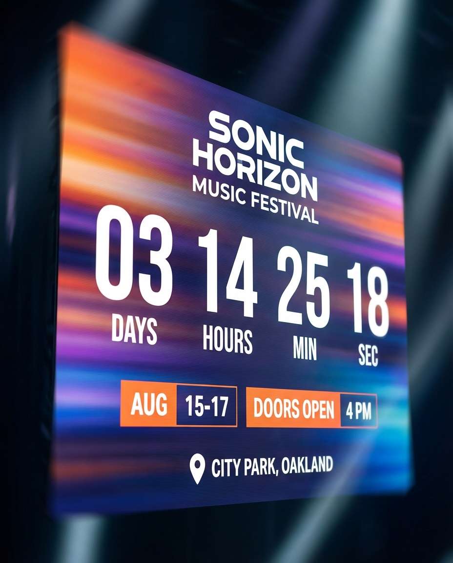
나노바나나 2로 생성한 포스터 디자인

포스터 디자인

나노바나나 2· Image
Event countdown banner with big numeric countdown area, energetic gradient background, subtle motion blur streaks, headline space for event name, date and time blocks, location pin icon, modern festival typography, strong contrast, crisp vector finish, no watermark, 85mm lens, shallow depth of field, soft cinematic lighting --ar 4:5
event-countdown-poster
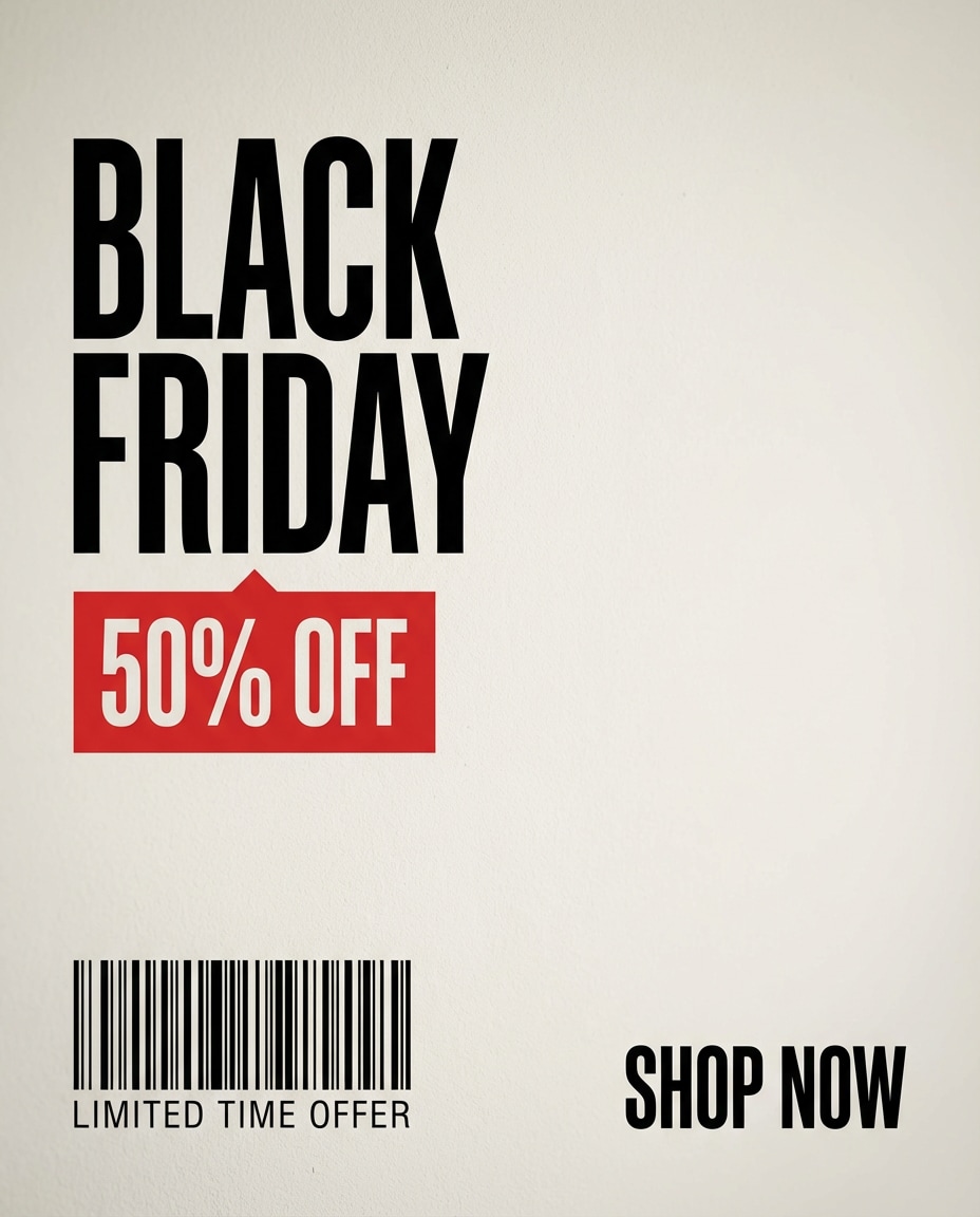
나노바나나 2로 생성한 AI 이미지 Minimal Black Friday

AI 이미지 Minimal Black Friday

나노바나나 2· Image
High-impact Black Friday sale banner in minimal Swiss design style, stark black and off-white palette with one accent red, oversized typography with tight tracking, price tag block, barcode-style lines, strong hierarchy, lots of negative space, clean vector poster finish, sharp and legible, no watermark, 85mm lens, shallow depth of field, soft cinematic lighting --ar 4:5
minimal-black-friday
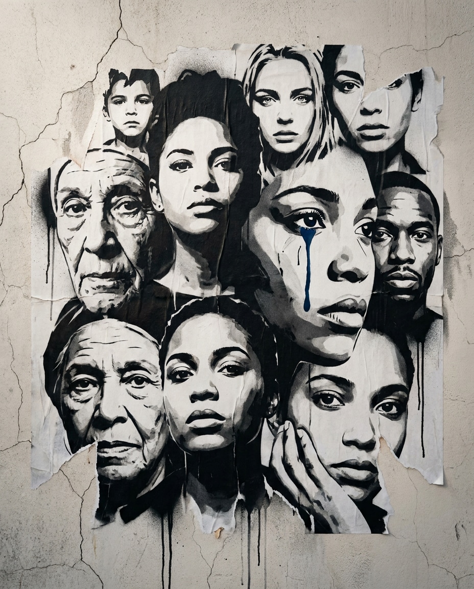
나노바나나 2로 생성한 AI 인물 이미지

AI 인물 이미지

나노바나나 2· Image
Street-art stencil graffiti style illustration of a collage mural of diverse faces in overlapping stencil layers, bold black-and-white shapes, one deep blue accent tear on one face only, cracked plaster wall with torn wheatpaste poster edges, subtle spray drips, powerful empathetic mood, clean vertical composition like a gallery poster, 85mm lens, shallow depth of field, soft cinematic lighting --ar 4:5
blue-tear-portrait-wall
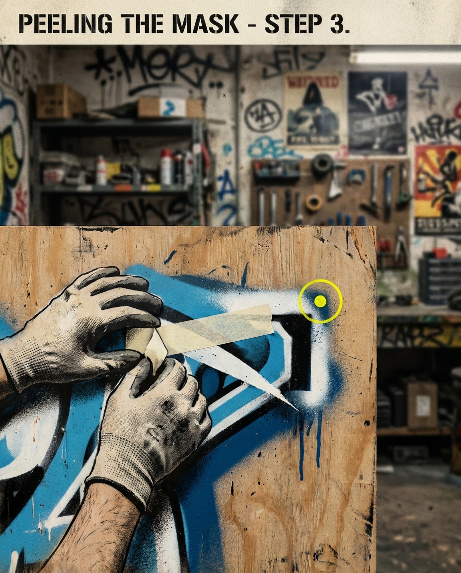
나노바나나 2로 생성한 AI 이미지 Layered Stencil Process

AI 이미지 Layered Stencil Process

나노바나나 2· Image
Street-art stencil graffiti style illustration of hands peeling masking tape from a multi-layer stencil on plywood, crisp cutout edges and slight stencil bleed, one yellow accent on a single alignment marker, gritty workshop wall background, aerosol overspray and drip marks, instructional yet artistic poster composition, 85mm lens, shallow depth of field --ar 4:5
layered-stencil-process
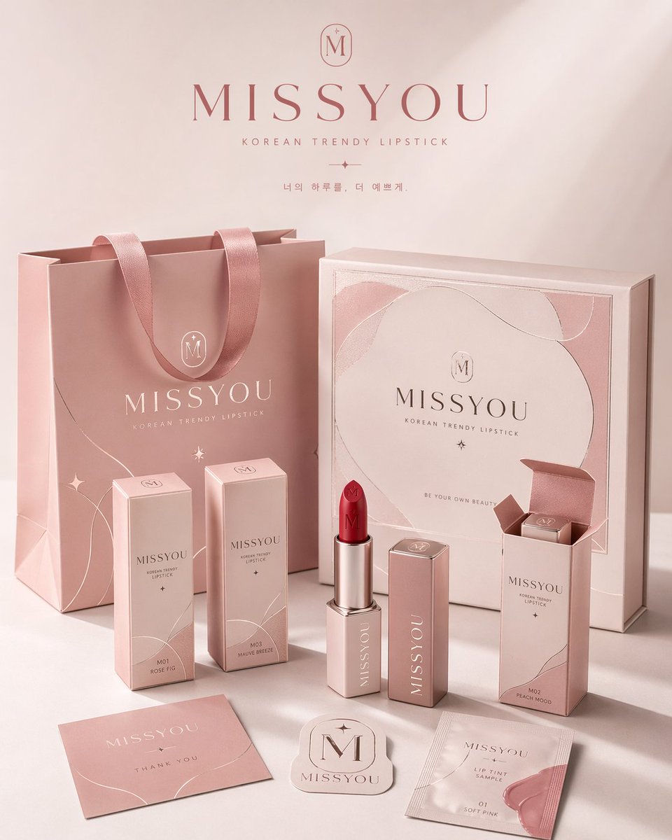
여러 패키지 형태에 일관된 브랜드 비주얼 시스템을 적용한 4:5 세로형 패키지 패밀리 전시 포스터

브랜드 패키지 시스템 전시 포스터

GPT 이미지 2· Image
请为品牌[品牌名称]、类目为[品牌类目]创作一张高审美、高完成度的「品牌包装系统展示图」。这不是普通电商白底图,也不是单一产品图,而是一张具有品牌提案感、视觉识别系统感和商业摄影质感的包装家族陈列效果图。画面需要体现“同一品牌在多个包装载体上的统一落地”,呈现一个成熟消费品牌的完整包装系统。 【画幅要求】整体必须为固定 4:5 的竖版海报构图,画面方向明确为纵向,禁止生成横版构图、宽幅桌面陈列或过于分散的横向展示。整体构图需符合海报阅读逻辑:上方保留呼吸感,中部为品牌包装系统的主要视觉焦点,下方安排辅助包装、标签和产品本体,整体重心集中,适合直接作为品牌展示海报发布。 【核心要求】根据【类目】自动匹配最合理、最自然的包装组合与产品形态,并围绕【品牌名字】建立统一的品牌视觉系统。画面中应选择少量但有代表性的包装形式,组成一组完整而精炼的品牌包装系统,不追求堆砌数量,而强调主次层级、品牌统一性与陈列美感。可根据类目合理选择以下包装类型中的一部分:手提袋 / 购物袋、纸盒 / 礼盒 / 外包装盒、长条盒 / 单品盒 / 套装盒、包装袋 / 封套 / 小样袋 / 软袋、杯子 / 瓶子 / 罐子 / 管状容器 / 喷雾瓶 / 泵头瓶、标签 / 贴纸 / 封签 / 吊牌 / 小卡片,以及与类目对应的真实产品本体。 【类目适配逻辑】包装形式与产品形态需要根据【类目】自动匹配,但不局限于单一方向。可参考以下适配逻辑自由发散:若类目为食品 / 烘焙 / 零食 / 饮品,则以纸袋、纸盒、包装袋、杯子、食品容器、贴纸、封签及真实产品本体为主;若类目为茶饮 / 咖啡 / 饮料,则以杯子、瓶子、罐装包装、提袋、杯套、封口贴、礼盒等为主;若类目为美妆 / 护肤 / 彩妆 / 香水,则以瓶、罐、管、盒、礼盒、手提袋、小样包装等为主;若类目为香氛 / 家居 / 生活方式,则以香薰瓶、蜡烛杯、包装盒、礼盒、提袋、吊卡、标签卡等为主;若类目为服饰 / 饰品 / 潮玩 / 文创,则以包装盒、抽屉盒、防尘袋、手提袋、贴纸、吊牌、配件包装等为主;若类目为数码配件 / 工具 / 小型消费品,则以硬盒、外包装盒、收纳袋、说明卡、贴纸、封套、标签等为主。整体必须体现“类目合理、品牌统一、包装成体系”的效果。 【数量与密度控制】请控制画面中的物件数量,不要过多堆砌,也不要把所有可能包装形式全部展示出来。整体应呈现“少而精、完整但不拥挤”的品牌包装系统效果。建议选择最具代表性的包装载体进行展示:大件包装 1~2 个,中型包装 2~3 个,小型包装或辅助物件 2~4 个,真实产品本体 1~3 个,总可见元素建议控制在 6~10 个之间。包装种类应体现层次变化与系统感,但不宜重复过多同类物件。画面需要有足够留白与呼吸感,确保每个包装都清晰可见、主次明确、摆放舒展,宁可少而精,也不要为了“完整”而过度塞满。 【品牌视觉系统要求】所有包装必须属于同一个品牌系统,统一使用【品牌名字】作为核心品牌识别元素。整体应具备一致的 logo / 标志呈现、字体风格、图形语言、插画语言或纹样系统、排版逻辑、配色体系、材质与印刷质感。品牌调性、色彩方向、图案元素、辅助图形和视觉氛围,请根据【类目】自动匹配并合理发散,不局限于任何固定风格。整体风格应统一、协调、具有品牌识别度,可以是简约高级、自然有机、时尚现代、轻奢精致、年轻清新、艺术感、潮流个性或经典优雅,但必须符合【类目】特征,并呈现成熟品牌的设计完成度。 【配色机制要求】整体配色不要固化为某一种固定组合,也不要连续多次出现高度相似的主色系统。每次生成时应根据【类目】与品牌气质,主动形成不同的主色方案与配色关系,采用“受控发散”的方式进行色彩演绎。色彩可以是低饱和自然色、现代中性色、轻复古色、明快清新色、轻奢深色系或艺术感综合色系,但必须保持高级、统一、克制、有品牌感。允许每次生成时呈现不同的视觉气质,例如奶油白与焦糖棕、雾灰蓝与暖白、橄榄绿与亚麻米、酒红与奶霜白、可可棕与象牙白、炭灰与麦秆金、雾粉灰与米白、海军蓝与暖灰等,仅作为参考方向而非固定模板。不要荧光色,不要廉价高饱和,不要杂乱失控的多色拼贴。 【画面构图与陈列要求】画面采用品牌包装家族陈列逻辑,而不是杂乱堆放。整体为商业摄影棚场景,使用 3/4 轻俯视角或略带透视的正面陈列角度,形成有层次、有秩序、有主次的包装展示画面。构图参考以下逻辑:后景摆放 1~2 个较大的包装作为视觉支撑,如手提袋、大礼盒、大外盒;中景安排品牌核心包装或主力单品包装,作为主要视觉焦点;前景摆放较小包装形成有层次、有秩序、有主次的包装展示画面。构图参考以下逻辑:后景摆放 1~2 个较大的包装作为视觉支撑,如手提袋、大礼盒、大外盒;中景安排品牌核心包装或主力单品包装,作为主要视觉焦点;前景摆放较小包装、辅助包装、标签、贴纸及真实产品本体;至少有一个真实产品与包装产生自然互动,如产品半露出、摆放在包装前方、与包装组合展示;整体形成平衡而有设计感的三角式或错落式构图。画面干净、有留白、不拥挤,内容丰富但克制,以有限而精准的包装组合体现完整的品牌包装生态。 【视觉风格要求】整体呈现高端商业摄影质感与品牌提案感,背景为干净的摄影棚环境,可为白色、暖白色、浅灰色,或根据品牌调性自动匹配的极简背景。画面应强调真实的包装材质表现、清晰的纸张折痕、盒型结构、瓶罐轮廓、标签细节、印刷质感、压纹 / 烫金 / 哑光 / 棉纸纹理 / 牛皮纸纹理等材质细节,以及统一而高级的配色搭配、精致现代干净的品牌视觉语言和强烈的“这是一整套品牌包装系统”的完整感。 【光影要求】采用真实商业摄影级光影,可为柔和棚拍光,也可带有轻微方向性的自然侧光。需要有清晰但克制的阴影,以增强立体感、空间感与高级感。整体光线通透、明亮、干净,不要阴暗,不要廉价感,不要杂乱背景。 【最终效果要求】最终画面应像一个成熟品牌的包装系统展示海报、包装家族提案图或品牌视觉落地效果图,而不是零散商品拼图。重点突出:固定 4:5 竖版海报感、品牌统一性、包装家族完整性、商业摄影感、设计提案感、类目适配性,以及高级审美与视觉完成度。
2047253028462317674
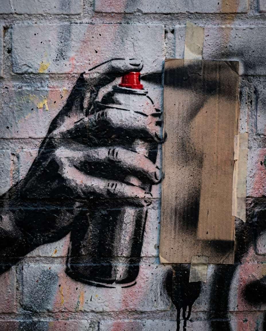
나노바나나 2로 생성한 AI 이미지 Spray Can in Hand

AI 이미지 Spray Can in Hand

나노바나나 2· Image
Street-art stencil graffiti style illustration of close-up hands holding a spray can beside a freshly cut stencil sheet, high-contrast black silhouettes, one red accent on the nozzle cap, brick wall texture with overspray mist, visible drips, tactile DIY street mural vibe, tight vertical framing focused on the hands, 85mm lens, shallow depth of field, soft cinematic lighting --ar 4:5
spray-can-in-hand

포스터 AI 프롬프트란?

포스터 AI 프롬프트는 공연·행사·영화·브랜드 메시지를 한 장에 담는 포스터 비주얼을 텍스트 설명만으로 만드는 프롬프트입니다. 템플릿 편집기와 달리 주제·분위기·색·카피 위치를 직접 지정해 같은 톤의 시안을 여러 장 뽑을 수 있고, 콘서트·페스티벌·전시 같은 세부 용도까지 한 흐름으로 만들 수 있습니다. 캐럿에서는 GPT Image 2나 Nano Banana Pro로 생성한 뒤, 비율 변경·배경 제거·한글 카피 수정으로 이어서 다듬습니다.

주요 활용 장면

  • 콘서트·페스티벌·공연 포스터
  • 영화·전시·행사 홍보 포스터
  • 브랜드 캠페인 키비주얼
  • 학교·학술 행사 및 채용 공고 포스터
  • 매장 프로모션·SNS 홍보 포스터

이 태그가 유용한 이유

포스터는 강한 주제 비주얼과 정보 배치를 동시에 잡아야 합니다. 상위 포스터 생성 도구들은 대부분 템플릿을 고른 뒤 채우는 방식이지만, 캐럿 갤러리는 검증된 프롬프트 예시 225개를 바로 복붙해 원하는 분위기부터 시작할 수 있습니다. 처음이라면 이렇게 만들어 보세요. (1) 만들 포스터 종류(콘서트·전시·영화 등)와 쓸 채널(인쇄·SNS)을 정합니다. (2) 비슷한 예시 프롬프트를 골라 주제·색·카피만 내 행사에 맞게 바꿉니다. (3) 9:16 세로 등 채널 비율을 지정해 생성합니다. (4) Nano Banana Pro로 한글 제목·날짜·장소 카피를 정확히 얹고, 캐럿에서 비율·배경을 이어서 다듬습니다. 한글 타이포가 잘 들어가는 모델을 쓰면 별도 디자인 툴 없이 인쇄·게시 가능한 완성도까지 갈 수 있습니다.

관련 프롬프트 더 보기

K-드라마 포스터, 애니 포스터, 여행 포스터, 웹소설 표지, 로고, 초대장, 제품 광고 이미지 같은 주제도 함께 살펴보세요.

포스터 규격과 저장 형식 정하기

AI로 만든 포스터는 쓰임에 따라 규격과 저장 형식을 맞춰야 합니다.

  • 인쇄용 표준 규격: A2(420×594mm) 대형, A3(297×420mm) 게시판·매장, A4(210×297mm) 소형 배포. 미국식 표준은 11×17인치입니다.
  • 온라인용 규격: 인스타그램 피드 1080×1080px(1:1), 스토리·릴스 1080×1920px(9:16), 유튜브 썸네일 1280×720px(16:9).
  • 저장 형식: 인쇄를 맡길 땐 PDF(글자·여백이 밀리지 않음), 웹 게시·SNS는 PNG(글자 선명), 파일 용량을 줄여야 하면 JPG.

원하는 규격을 프롬프트에 함께 적으면(예: 9:16 세로 비율) 처음부터 그 비율로 만들 수 있어, 나중에 잘리거나 여백이 어색해지는 문제를 줄입니다.

포스터 검색어 연동을 의도 중심으로 정리해 클릭을 끌어올린다. 핵심 검색어 '포스터 프롬프트'는 노출은 높은 편이지만 노출어와 실제 제작 용도가 뒤섞여 보여 클릭 선택이 약해질 수 있습니다. 메타 설명과 첫 문단에서 '행사 포스터', '브랜드 캠페인', 'SNS 홍보 포스터'처럼 사용 상황을 분리해 써서 쿼리 일치도를 높입니다.

빠른 보완 포인트

검색 흐름에서 '포스터 프롬프트'와 실제 제작 의도가 분기되지 않아 클릭이 분산됩니다. 상단에 '행사 포스터', '브랜드 포스터', 'SNS 홍보 포스터'를 용도별로 나누고, 각 용도에 출력 비율 1개와 예시 한 줄을 추가해 바로 실행 동선을 만든다.

프롬프트 구성 팁

  1. 세로·가로와 쓰일 채널(인쇄·SNS)을 먼저 정합니다.
  2. 핵심 주제·배경·분위기와 행사 성격(공연·전시·축제)을 구체적으로 적습니다.
  3. 제목·날짜·장소 카피 자리와 여백을 함께 지정합니다.
  4. 브랜드 색과 인쇄 질감, 한글 폰트 느낌을 요청합니다.

생성 후 글자 오타와 로고 정확도를 확인하고, 한글 카피가 어긋나면 Nano Banana Pro로 텍스트를 다시 얹은 뒤 캐럿에서 비율·배경을 이어서 다듬으세요.
Frequently Asked Questions

Related Prompts

일러스트

일러스트

774 prompts

제품 광고 이미지

제품 광고 이미지

515 prompts

목업

목업

396 prompts

3D 카툰

382 prompts

Carat Prompt Gallery

Create trending AI prompts instantly

Prompts

  • Logo
  • PPT Design
  • Thumbnail
  • Poster
  • Web Novel Cover
  • ID Photo
  • Caricature
  • Product Detail Page
  • Banner

Models

  • GPT Image 2
  • Seedance 2.0
  • NanoBanana Pro
  • NanoBanana 2

Carat

  • Get started
  • About
  • Blog
  • Careers
  • Contact
  • Partnership
  • Terms
  • Privacy

© 2026 Paradot.Inc All rights reserved.