로고
카페·뷰티·스타트업·반려동물 브랜드 로고 시안을 바로 만드는 AI 로고 디자인 프롬프트. 업종·심볼·색을 지정해 단색까지 고려한 로고 콘셉트를 빠르게 잡고 다듬으세요.
2026.07.13
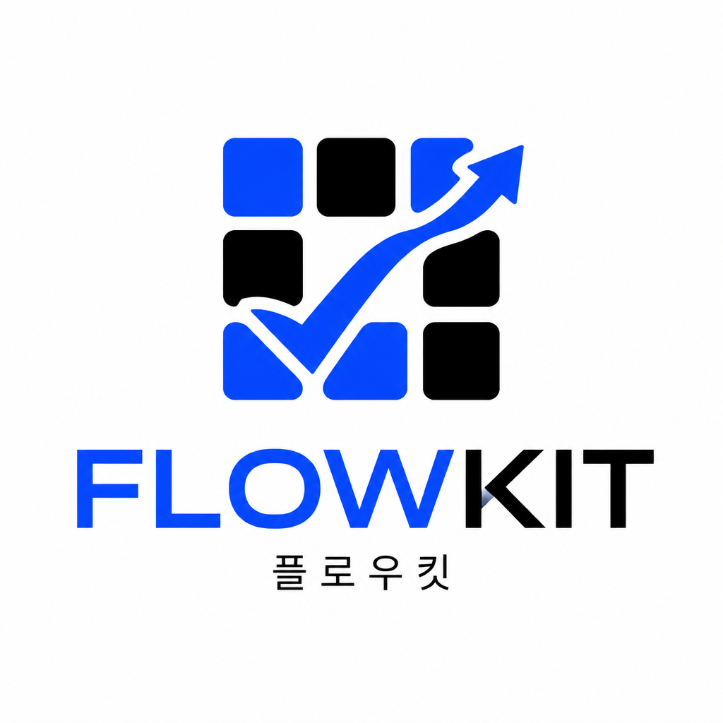
스타트업 로고
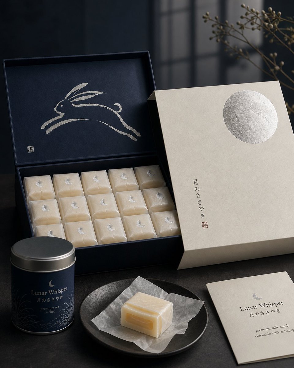
일본 과자 패키지 디자인

앱 브랜딩 그라데이션 일러스트
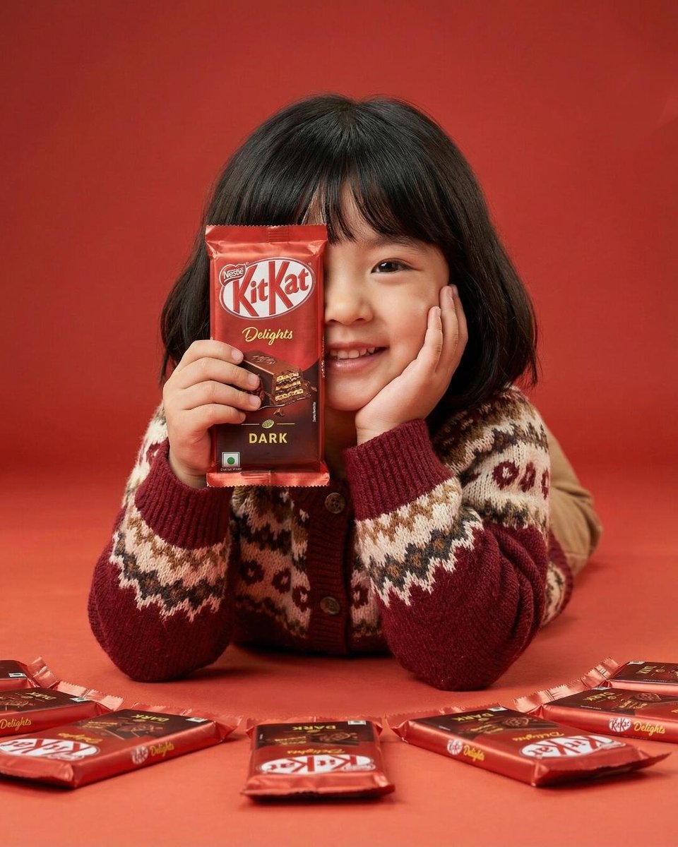
킷캣 푸드 광고
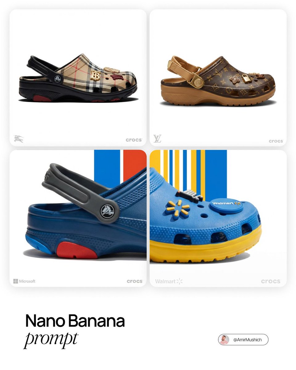
LV x 크록스 콜라보 컨셉
제품 다이어그램 템플릿
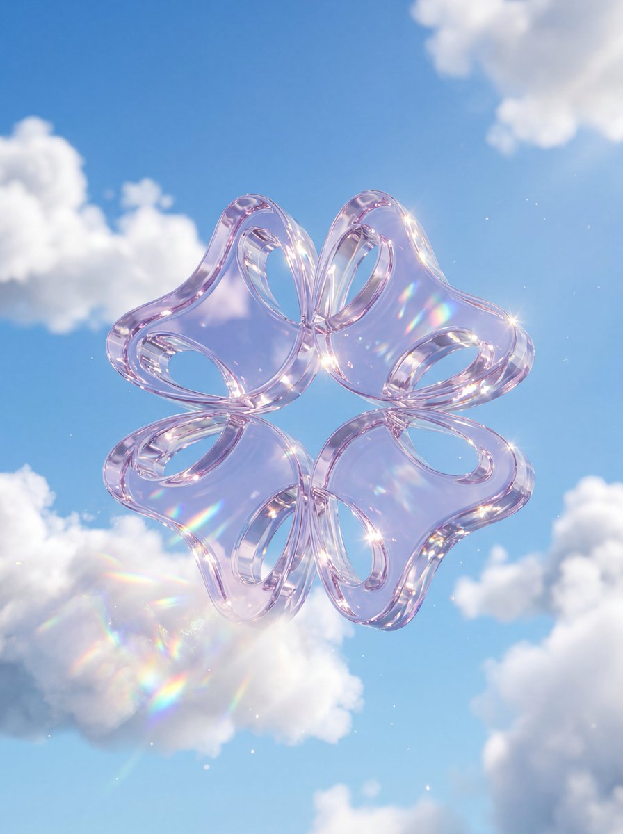
크리스탈 글래스 로고
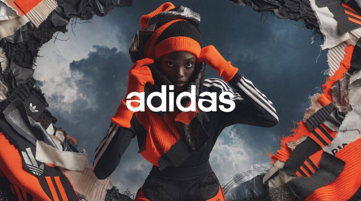
하이패션 캠페인 포스터
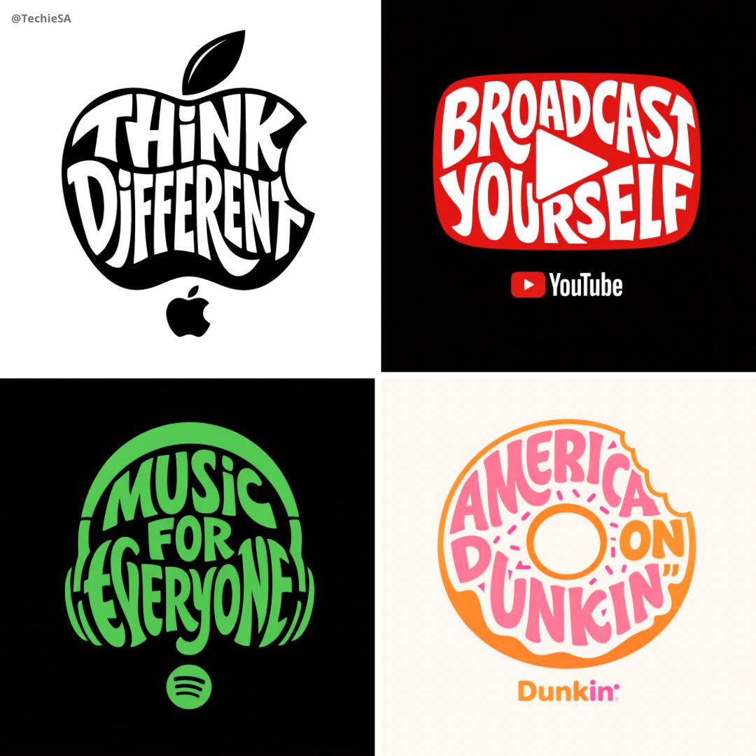
타이포그래픽 브랜드 일러스트
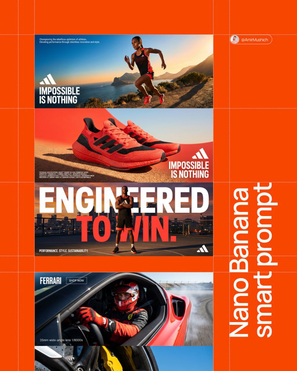
3패널 브랜드 매니페스토
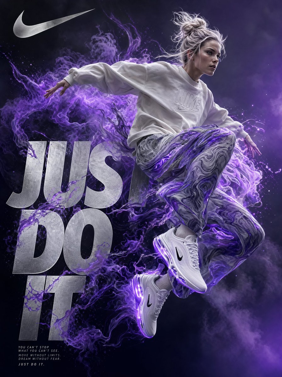
나이키 Just Do It 광고 포스터
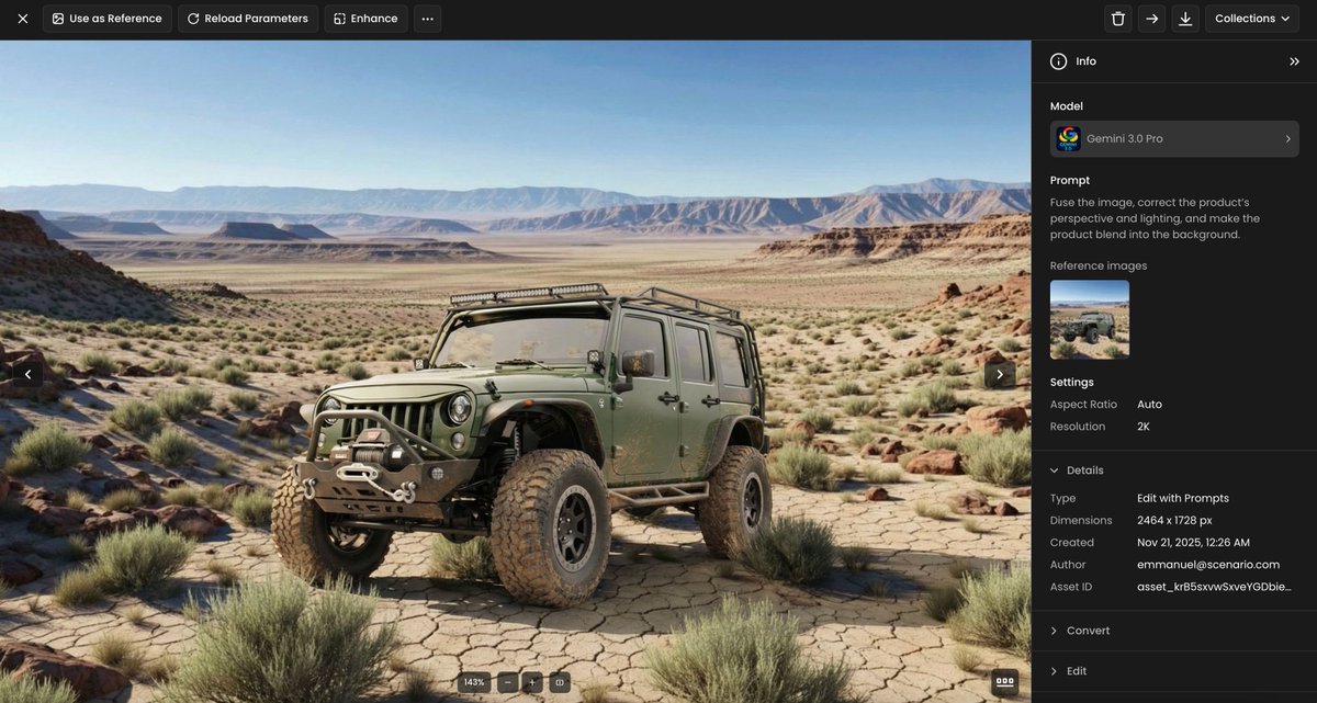
제품 합성·조명 보정 템플릿
로고 AI 프롬프트란?
로고 프롬프트는 브랜드의 첫인상을 잡는 로고 시안·콘셉트를 빠르게 만드는 AI 프롬프트입니다. 원클릭 로고 메이커와 달리 업종·심볼 방향·타이포를 직접 지정해 다양한 시안을 뽑아볼 수 있어, 디자이너에게 맡기기 전 방향을 잡거나 1인 브랜드가 시안을 자체 제작할 때 유용합니다. 캐럿에서는 GPT Image 2·Nano Banana Pro 같은 모델로 생성한 뒤, 배경 제거·비율 변경으로 이어서 다듬을 수 있습니다. 이 페이지의 프롬프트는 그대로 복사해 바로 생성해 볼 수 있고, 단어만 바꿔 내 브랜드에 맞게 응용하면 됩니다.
주요 활용 장면
- 카페·레스토랑 로고 (감성 카페, 베이커리, 다이닝)
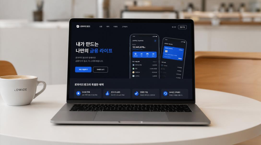
- 스타트업·서비스·앱 로고
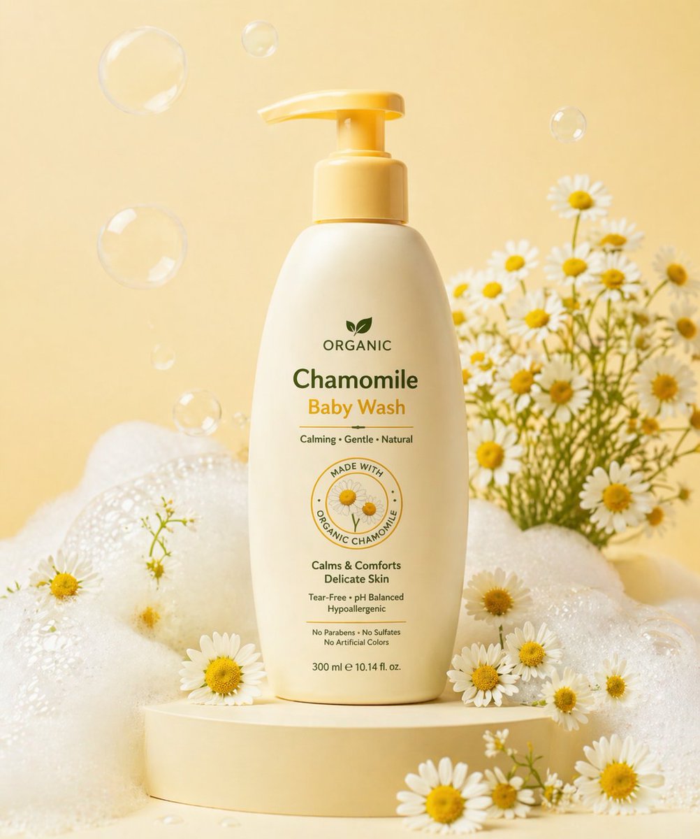
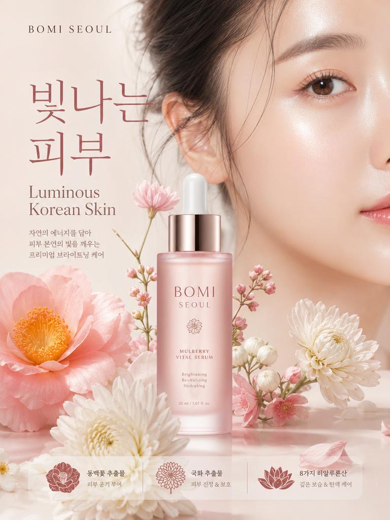
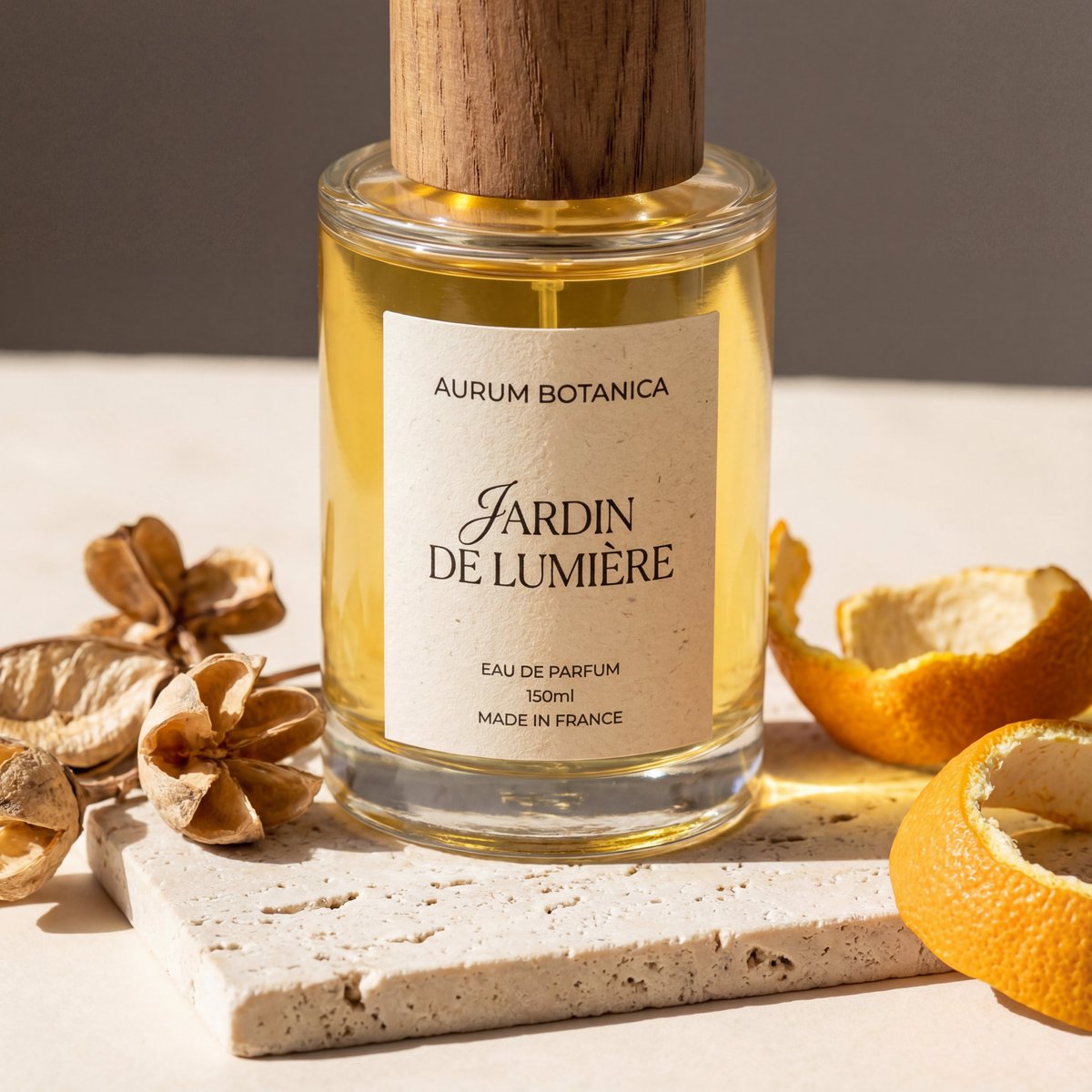
- 뷰티·코스메틱 브랜드 로고와 패키지 로고
- 반려동물 브랜드 심볼
- 유튜브·SNS 채널 로고와 명함·목업 적용
이 태그가 유용한 이유
로고는 장식보다 인식성이 중요합니다. 좋은 로고 프롬프트는 보통 업종 + 타깃 + 브랜드 톤 + 차별점 + 색상을 한 문장에 담습니다. AI 로고를 처음 만든다면 다음 순서로 적어 보세요. ① 형태를 정합니다 — 심볼형, 글자로만 된 워드마크, 테두리로 감싼 엠블럼 중 무엇인지 고릅니다. ② 인상을 지정합니다 — 미니멀·친근·럭셔리처럼 전달할 느낌을 한 단어로 적습니다. ③ 색 1~2개와 복잡도(간결할지 디테일할지)를 고릅니다. ④ 단색(흑백)에서도 읽히는지까지 요청합니다. 이 흐름대로 적으면 실제 브랜드 작업에 가까운 시안이 나오고, 같은 설정을 고정한 채 심볼·색만 바꿔 여러 방향을 비교할 수 있습니다. 글자가 핵심인 워드마크는 GPT Image 2가 비교적 정확하고, 입체·질감이 살아야 하는 심볼은 Nano Banana Pro가 잘 맞습니다. (벡터화·상표 등록은 별도 단계입니다.)
관련 프롬프트 더 보기
명함, 포스터, 패키지 디자인, 목업, 제품 광고 이미지, 에디토리얼 같은 주제도 함께 살펴보세요.
원하는 로고 스타일 지정하기
- 워드마크(글자형), 심볼+글자 조합형, 엠블럼, 레터마크처럼 로고 유형을 프롬프트에 먼저 정하면 방향이 잡힙니다.
- 미니멀 라인 아이콘, 플랫 벡터(단색·입체감 없음), 그라데이션 중 어떤 느낌인지 명시하세요.
- 업종·브랜드 키워드와 컬러 2~3개(예: "딥블루와 화이트"), 톤(신뢰감/프리미엄/발랄)을 함께 넣으면 정체성이 반영됩니다.
- "단순하게, 여백 넉넉히, 흰 배경"을 넣으면 실제 로고로 쓰기 좋은 깔끔한 결과가 나옵니다.
- 한 방향으로 여러 변형을 뽑아 본 뒤 가장 강한 것을 골라 세부를 다듬는 흐름을 추천합니다.
프롬프트 구성 팁
- 업종과 브랜드명, 전달할 인상(예: 미니멀·친근·럭셔리)을 먼저 적습니다.
- 심볼형·워드마크·엠블럼 중 형태와 복잡도(간결할지 디테일할지)를 지정합니다.
- 색 1~2개를 정하고 단색(흑백)에서도 읽히는지 함께 요청합니다.
- 글자가 중요한 워드마크는 GPT Image 2가, 입체·질감 심볼은 Nano Banana Pro가 잘 맞으니 목적에 따라 모델을 고릅니다.
생성 후 글자 정확도와 단색 가독성을 확인하고, 캐럿에서 배경 제거·비율 변경으로 다듬으세요. 마음에 드는 방향이 나오면 명함·목업에 얹어 실제 적용 느낌까지 미리 볼 수 있습니다.