carat

Галерея промптов

/

Data Infographic

Вход
Регистрация

Data Infographic

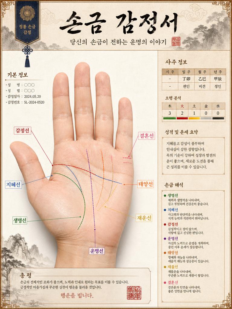
Create data infographics, statistical visualizations, and informational images with AI. Retirement planning, nutrition guides, blood pressure management, and more.

2026.07.01

Сделайте «Data Infographic» именно так, как хотитеСоздайте свой «Data Infographic»

Просто попросите своими словами — Carat создаст для вас подходящие изображения и видео.

Начните сейчас со 100 бесплатных кредитов в день
·
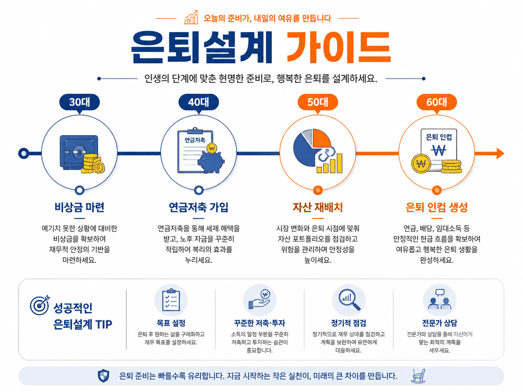
GPT 이미지 2로 생성한 은퇴설계 인포그래픽

은퇴설계 인포그래픽

GPT Image 2· Изображение
A retirement planning infographic design. Clean white background with warm orange and blue accent colors. Title text '은퇴설계 가이드' in Korean. Show a timeline from 30s to 60s with milestones: 30대 (비상금 마련), 40대 (연금저축 가입), 50대 (자산 재배치), 60대 (은퇴 인컴 생성). Each milestone has a simple icon and brief description. Professional financial infographic with clean timeline visualization.
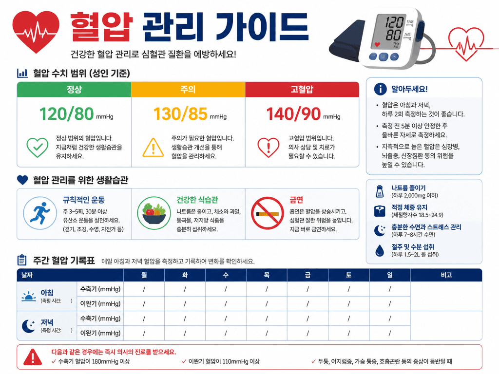
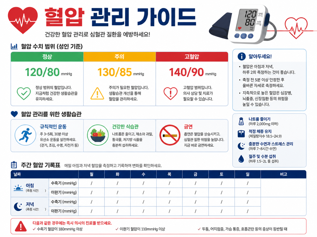
GPT 이미지 2로 생성한 혈압 관리 가이드 인포그래픽

혈압 관리 가이드 인포그래픽

GPT Image 2· Изображение
A clean health infographic about blood pressure management. White background with red and blue accent colors. Title text '혈압 관리 가이드' in Korean. Show a blood pressure range chart with color-coded zones (정상 120/80, 주의 130/85, 고혈압 140/90), a lifestyle tips section with simple icons for exercise, diet, and no smoking, and a weekly tracking table template. Modern infographic design with clear data visualization and medical aesthetic.
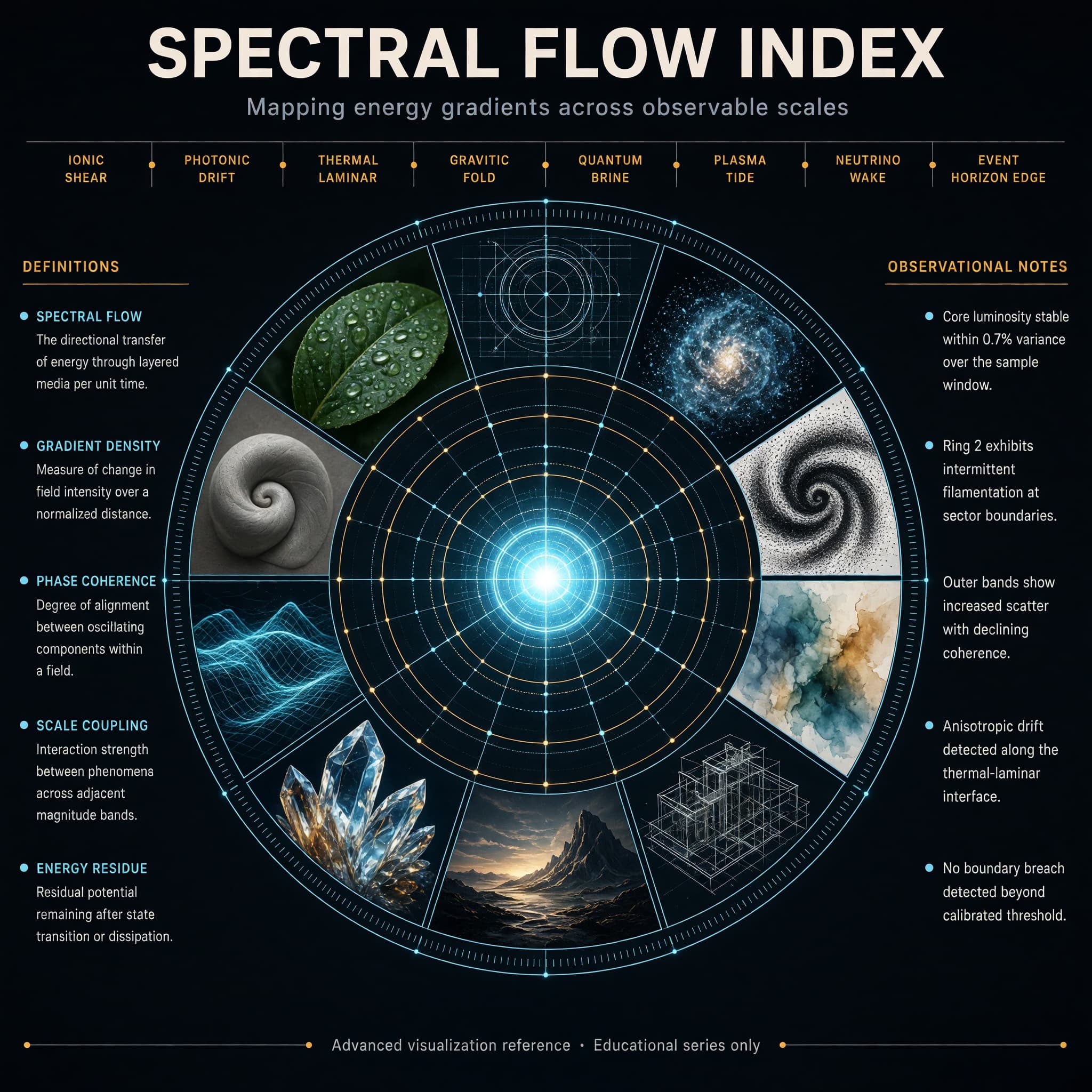
AI-generated Concentric Ring Data Infographic made with Grok Imagine Image 2.0

Concentric Ring Data Infographic

Grok Imagine Image 2.0· Изображение
Create a high-end hero infographic titled “SPECTRAL FLOW INDEX”. Design it as a large circular radial diagram with a bright central glowing core, surrounded by five clean concentric rings expanding outward like a precision instrument dial. Each ring is divided into evenly spaced segments containing miniature visual studies rendered in distinctly different styles: photorealism, blueprint linework, volumetric particle render, ink stipple, soft watercolor, isometric technical drawing, cinematic still, macroscopic crystal close-up, luminous wireframe, and matte clay sculpture. The overall atmosphere is electric, refined, and extremely polished — deep charcoal background, subtle luminous cyan and soft amber accents, thin glowing guide lines, and perfect geometric alignment. Typography is dense, hierarchical, and perfectly legible with sharp edges and straight baselines: Large precise bold sans-serif title centered at the very top Medium-weight subtitle directly beneath it: “Mapping energy gradients across observable scales” A clean horizontal band of eight short, evenly spaced labels in sharp small caps across the upper third, naming invented measurement zones Two tall vertical columns of text, one on the far left and one on the far right, each containing five tightly spaced entries in clear body text (definitions on the left, observational notes on the right) A single thin full-width footer line at the very bottom in micro but still razor-sharp text: “Advanced visualization reference · Educational series only” All text sits on straight horizontal or vertical axes. No curved or circular text. Consistent spacing, strong visual hierarchy, and absolute clarity at every scale.
@fal.ai
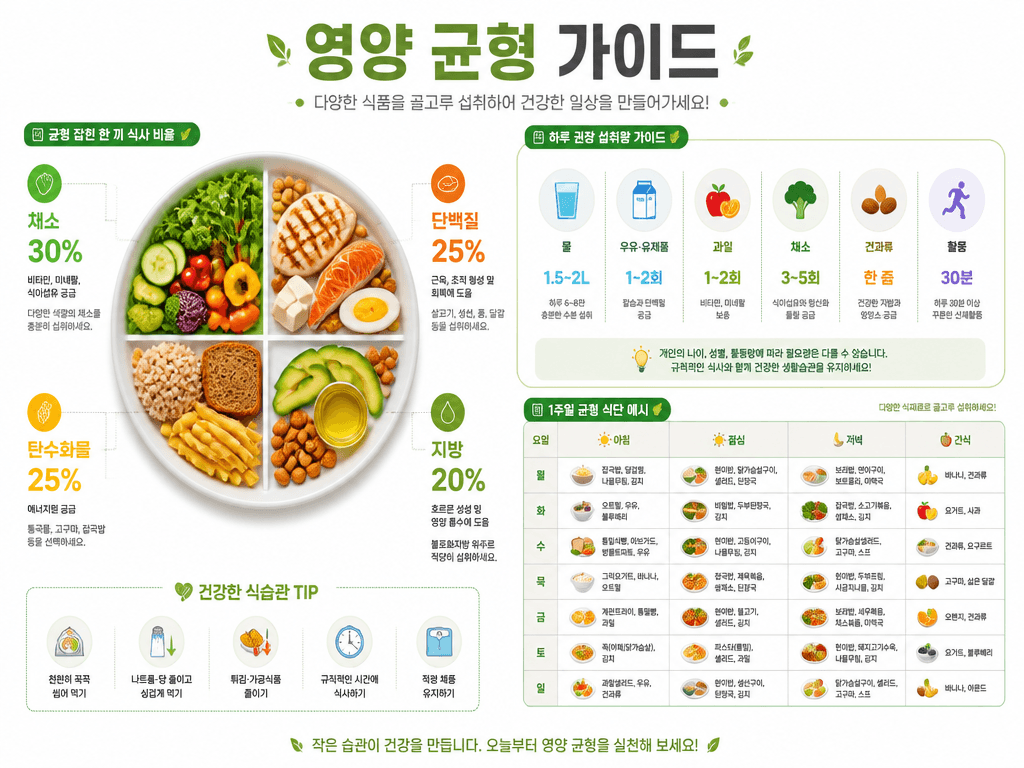
GPT 이미지 2로 생성한 영양 균형 가이드 인포그래픽

영양 균형 가이드 인포그래픽

GPT Image 2· Изображение
A nutrition balance infographic design. Clean white background with green and orange accent colors. Title text '영양 균형 가이드' in Korean. Show a balanced plate diagram divided into food groups (채소 30%, 단백질 25%, 탄수화물 25%, 지방 20%), daily intake recommendation icons, and a simple weekly meal chart. Modern health infographic with clean flat icons and organized data layout.

Data Infographics — Visualize Information with AI

Data infographics are key tools for conveying complex information intuitively. Carat's AI data infographic generator creates retirement planning timelines, nutrition balance guides, and blood pressure management infographics.

Key Data Infographic Types

  • Health/Medical: Blood pressure management, nutrition balance, exercise guides
  • Finance: Retirement planning, investment comparison, financial diagnosis
  • Technology: Product structure, tech principles, comparison analysis
  • Statistics: Demographics, market research, industry trends

Data Infographic Tips

Specify topic, data values, and target audience. Try: 'Blood pressure management infographic, normal/caution/high values, icons and charts, teal and white tones.'
Related Tags

  • Presentation Image
  • Health Infographic
  • Brand Image

Частые вопросы

Похожие промпты

Infographic

Infographic

Промптов: 70

Health Infographic

Health Infographic

Промптов: 7

Insurance Consultation Image

Insurance Consultation Image

Промптов: 6

Health Design

Health Design

Промптов: 13

Галерея промптов Carat

Создавайте популярные ИИ-промпты мгновенно

Промпты

  • Логотип
  • Дизайн презентации
  • Обложка
  • Постер
  • Обложка веб-новеллы
  • Фото на документы
  • Карикатура
  • Карточка товара
  • Баннер

Модели

  • GPT Image 2
  • Seedance 2.0
  • Nano Banana Pro
  • Nano Banana 2

Carat

  • Начать
  • О нас
  • Блог
  • Вакансии
  • Контакты
  • Партнёрство
  • Условия
  • Конфиденциальность

© 2026 Paradot.Inc All rights reserved.