carat

Prompt Gallery

/

패키지 디자인

Login
Sign Up

패키지 디자인

브랜드 제품의 패키지와 라벨 시안 제작에 바로 쓸 수 있는 패키지 디자인 AI 프롬프트. 화장품 패키지, 식품 라벨, 굿즈 박스 디자인을 빠르게 만들 수 있습니다.

2026.05.22

·
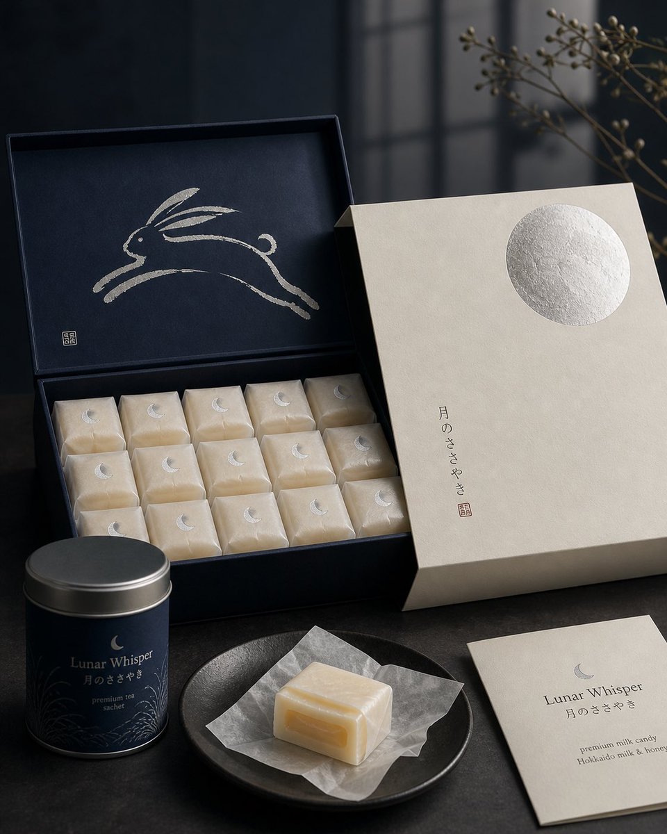
GPT 이미지 2로 생성한 일본 과자 패키지 디자인

일본 과자 패키지 디자인

GPT 이미지 2· Image
Premium Japanese confectionery packaging concept, “Lunar Whisper” / 月のささやき, inspired by moon rabbit folklore and refined milk candy nostalgia, rigid uncoated cream paper outer sleeve with smooth eggshell texture, minimal negative space, single cool silver embossed full moon in upper-right corner, small vertical Japanese sumi ink typography, sleeve sliding open to reveal deep matte midnight indigo inner box, inside lid printed with elegant single brushstroke leaping rabbit in shimmering pearl ink, sumi-e style, abstract folkloric rabbit, rows of individually wrapped milk candies in translucent washi-style paper, tiny silver crescent moon stickers, pale ivory candies glowing softly through paper, one candy partially unwrapped showing silky nama caramel like milk core with delicate edible rice paper film, Hokkaido cream and honey feeling, quiet ceremonial unboxing, reusable keepsake tea sachet container, Japanese minimalism, luxury packaging design, tactile paper materials, pearl ink, silver foil embossing, soft diffused moonlight, editorial product photography, refined negative space, calm nocturnal atmosphere, award winning packaging render, high end boutique confectionery brand presentation.
@IamEmily2050
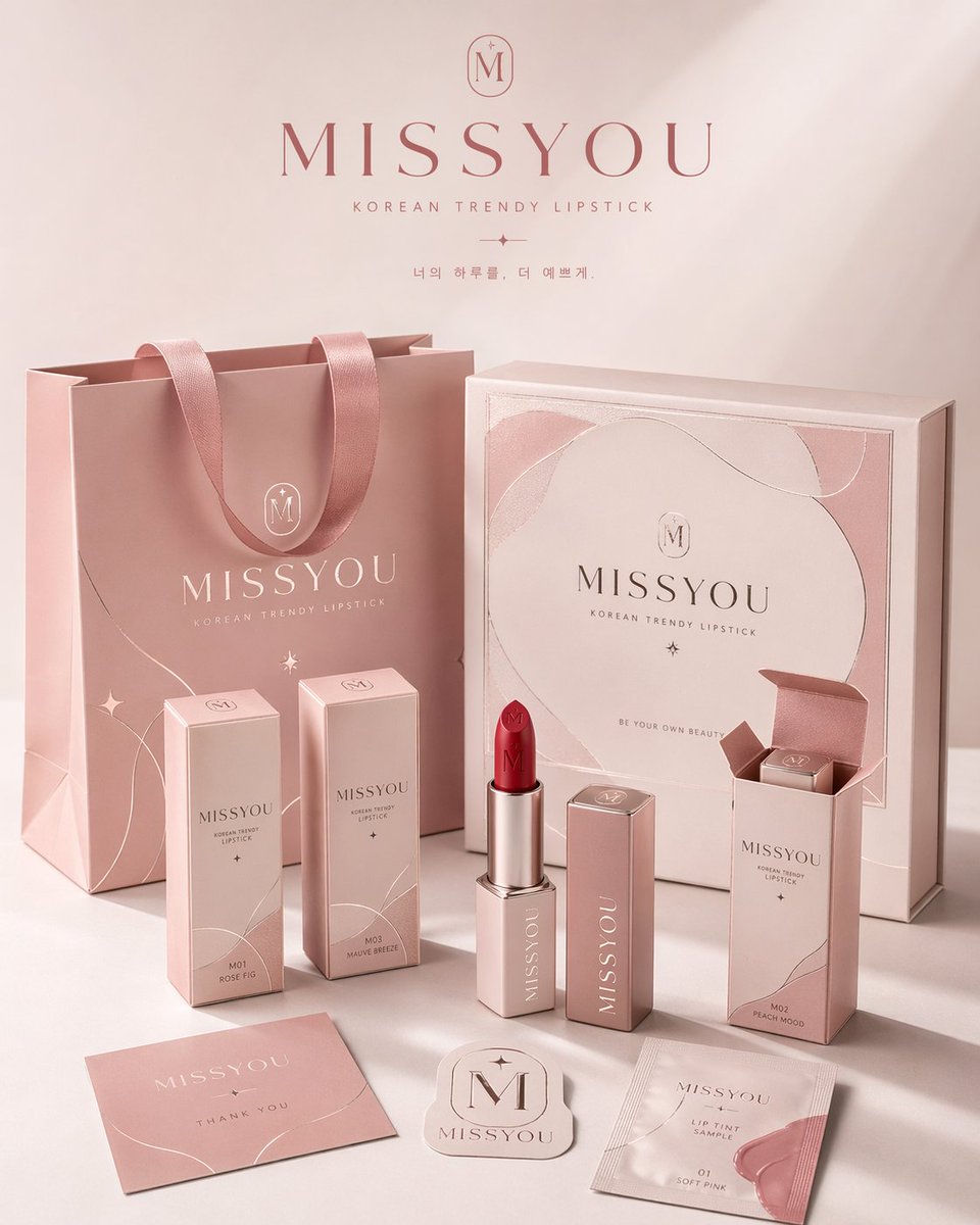
여러 패키지 형태에 일관된 브랜드 비주얼 시스템을 적용한 4:5 세로형 패키지 패밀리 전시 포스터

브랜드 패키지 시스템 전시 포스터

GPT 이미지 2· Image
请为品牌[品牌名称]、类目为[品牌类目]创作一张高审美、高完成度的「品牌包装系统展示图」。这不是普通电商白底图,也不是单一产品图,而是一张具有品牌提案感、视觉识别系统感和商业摄影质感的包装家族陈列效果图。画面需要体现“同一品牌在多个包装载体上的统一落地”,呈现一个成熟消费品牌的完整包装系统。 【画幅要求】整体必须为固定 4:5 的竖版海报构图,画面方向明确为纵向,禁止生成横版构图、宽幅桌面陈列或过于分散的横向展示。整体构图需符合海报阅读逻辑:上方保留呼吸感,中部为品牌包装系统的主要视觉焦点,下方安排辅助包装、标签和产品本体,整体重心集中,适合直接作为品牌展示海报发布。 【核心要求】根据【类目】自动匹配最合理、最自然的包装组合与产品形态,并围绕【品牌名字】建立统一的品牌视觉系统。画面中应选择少量但有代表性的包装形式,组成一组完整而精炼的品牌包装系统,不追求堆砌数量,而强调主次层级、品牌统一性与陈列美感。可根据类目合理选择以下包装类型中的一部分:手提袋 / 购物袋、纸盒 / 礼盒 / 外包装盒、长条盒 / 单品盒 / 套装盒、包装袋 / 封套 / 小样袋 / 软袋、杯子 / 瓶子 / 罐子 / 管状容器 / 喷雾瓶 / 泵头瓶、标签 / 贴纸 / 封签 / 吊牌 / 小卡片,以及与类目对应的真实产品本体。 【类目适配逻辑】包装形式与产品形态需要根据【类目】自动匹配,但不局限于单一方向。可参考以下适配逻辑自由发散:若类目为食品 / 烘焙 / 零食 / 饮品,则以纸袋、纸盒、包装袋、杯子、食品容器、贴纸、封签及真实产品本体为主;若类目为茶饮 / 咖啡 / 饮料,则以杯子、瓶子、罐装包装、提袋、杯套、封口贴、礼盒等为主;若类目为美妆 / 护肤 / 彩妆 / 香水,则以瓶、罐、管、盒、礼盒、手提袋、小样包装等为主;若类目为香氛 / 家居 / 生活方式,则以香薰瓶、蜡烛杯、包装盒、礼盒、提袋、吊卡、标签卡等为主;若类目为服饰 / 饰品 / 潮玩 / 文创,则以包装盒、抽屉盒、防尘袋、手提袋、贴纸、吊牌、配件包装等为主;若类目为数码配件 / 工具 / 小型消费品,则以硬盒、外包装盒、收纳袋、说明卡、贴纸、封套、标签等为主。整体必须体现“类目合理、品牌统一、包装成体系”的效果。 【数量与密度控制】请控制画面中的物件数量,不要过多堆砌,也不要把所有可能包装形式全部展示出来。整体应呈现“少而精、完整但不拥挤”的品牌包装系统效果。建议选择最具代表性的包装载体进行展示:大件包装 1~2 个,中型包装 2~3 个,小型包装或辅助物件 2~4 个,真实产品本体 1~3 个,总可见元素建议控制在 6~10 个之间。包装种类应体现层次变化与系统感,但不宜重复过多同类物件。画面需要有足够留白与呼吸感,确保每个包装都清晰可见、主次明确、摆放舒展,宁可少而精,也不要为了“完整”而过度塞满。 【品牌视觉系统要求】所有包装必须属于同一个品牌系统,统一使用【品牌名字】作为核心品牌识别元素。整体应具备一致的 logo / 标志呈现、字体风格、图形语言、插画语言或纹样系统、排版逻辑、配色体系、材质与印刷质感。品牌调性、色彩方向、图案元素、辅助图形和视觉氛围,请根据【类目】自动匹配并合理发散,不局限于任何固定风格。整体风格应统一、协调、具有品牌识别度,可以是简约高级、自然有机、时尚现代、轻奢精致、年轻清新、艺术感、潮流个性或经典优雅,但必须符合【类目】特征,并呈现成熟品牌的设计完成度。 【配色机制要求】整体配色不要固化为某一种固定组合,也不要连续多次出现高度相似的主色系统。每次生成时应根据【类目】与品牌气质,主动形成不同的主色方案与配色关系,采用“受控发散”的方式进行色彩演绎。色彩可以是低饱和自然色、现代中性色、轻复古色、明快清新色、轻奢深色系或艺术感综合色系,但必须保持高级、统一、克制、有品牌感。允许每次生成时呈现不同的视觉气质,例如奶油白与焦糖棕、雾灰蓝与暖白、橄榄绿与亚麻米、酒红与奶霜白、可可棕与象牙白、炭灰与麦秆金、雾粉灰与米白、海军蓝与暖灰等,仅作为参考方向而非固定模板。不要荧光色,不要廉价高饱和,不要杂乱失控的多色拼贴。 【画面构图与陈列要求】画面采用品牌包装家族陈列逻辑,而不是杂乱堆放。整体为商业摄影棚场景,使用 3/4 轻俯视角或略带透视的正面陈列角度,形成有层次、有秩序、有主次的包装展示画面。构图参考以下逻辑:后景摆放 1~2 个较大的包装作为视觉支撑,如手提袋、大礼盒、大外盒;中景安排品牌核心包装或主力单品包装,作为主要视觉焦点;前景摆放较小包装形成有层次、有秩序、有主次的包装展示画面。构图参考以下逻辑:后景摆放 1~2 个较大的包装作为视觉支撑,如手提袋、大礼盒、大外盒;中景安排品牌核心包装或主力单品包装,作为主要视觉焦点;前景摆放较小包装、辅助包装、标签、贴纸及真实产品本体;至少有一个真实产品与包装产生自然互动,如产品半露出、摆放在包装前方、与包装组合展示;整体形成平衡而有设计感的三角式或错落式构图。画面干净、有留白、不拥挤,内容丰富但克制,以有限而精准的包装组合体现完整的品牌包装生态。 【视觉风格要求】整体呈现高端商业摄影质感与品牌提案感,背景为干净的摄影棚环境,可为白色、暖白色、浅灰色,或根据品牌调性自动匹配的极简背景。画面应强调真实的包装材质表现、清晰的纸张折痕、盒型结构、瓶罐轮廓、标签细节、印刷质感、压纹 / 烫金 / 哑光 / 棉纸纹理 / 牛皮纸纹理等材质细节,以及统一而高级的配色搭配、精致现代干净的品牌视觉语言和强烈的“这是一整套品牌包装系统”的完整感。 【光影要求】采用真实商业摄影级光影,可为柔和棚拍光,也可带有轻微方向性的自然侧光。需要有清晰但克制的阴影,以增强立体感、空间感与高级感。整体光线通透、明亮、干净,不要阴暗,不要廉价感,不要杂乱背景。 【最终效果要求】最终画面应像一个成熟品牌的包装系统展示海报、包装家族提案图或品牌视觉落地效果图,而不是零散商品拼图。重点突出:固定 4:5 竖版海报感、品牌统一性、包装家族完整性、商业摄影感、设计提案感、类目适配性,以及高级审美与视觉完成度。
2047253028462317674
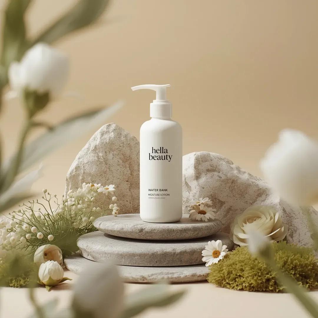
나노바나나 프로로 생성한 헬라뷰티 스킨케어 제품컷

헬라뷰티 스킨케어 제품컷

나노바나나 프로· Image
Ultra-high-end photorealistic commercial skincare product photography featuring a matte white plastic pump bottle centered and upright, labeled “hella beauty” in clean black minimalist typography with smaller text reading “water bank moisture lotion” and subtle product details beneath, the bottle placed on a layered natural stone surface surrounded by carefully arranged organic props including smooth gray river stones, pale beige textured rock formations, soft green moss clusters,delicate white pom-pom flowers, cream-colored daisy-like blossoms, light green fern leaves, and a muted sage rose, all arranged in a balanced symmetrical composition, background a soft warm beige studio backdrop with gentle gradient and no visible edges, foreground partially framed by softly blurred out-of-focus white flowers creating depth, lighting soft diffused daylight-style studio lighting from upper left producing gentle shadows, natural highlights on the bottle and petals, and a calm airymood, color palette dominated by warm neutrals, soft whites, sage greens, and muted earth tones, textures highly detailed including matte plastic, porous stone, velvety petals, and moist moss, shallow depth of field with sharp focus on the product label and midground elements and smooth bokeh in foreground and background, premium botanical skincare advertising aesthetic, clean minimal luxury composition, cinematic realism, ultra-detailed 8K, studio-grade hyperrealism, no extra text, no borders, no stylization beyond natural photorealism.
@ChillaiKalan__
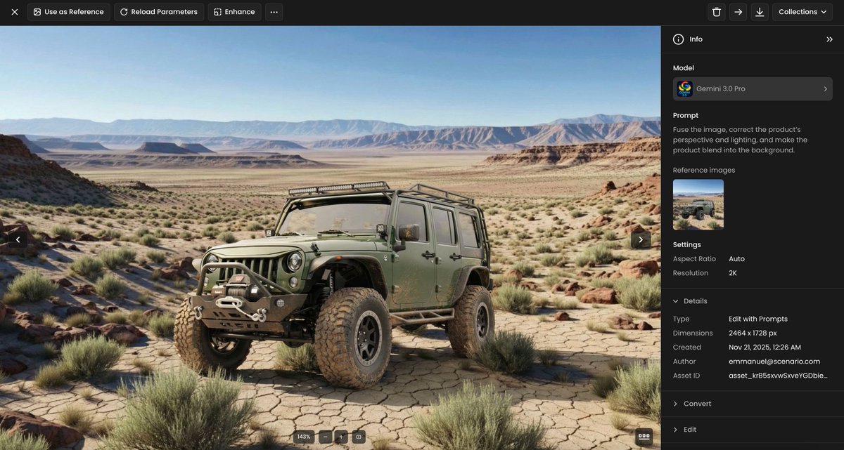
나노바나나 프로로 생성한 제품 합성·조명 보정 템플릿 예시 이미지

제품 합성·조명 보정 템플릿

나노바나나 프로· Image
Fuse the image, correct the product’s perspective and lighting, and make the product blend into the background.
@emmanuel_2m
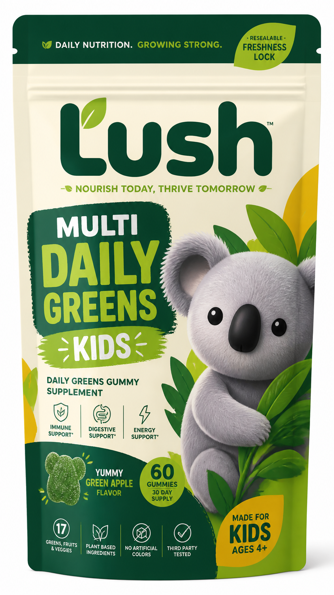
코알라 마스코트를 적용한 키즈 데일리 그린 구미 영양제 파우치 패키지 콘셉트 이미지

키즈 영양제 파우치 패키지

GPT 이미지 2· Image
Create a distinctive packaging concept for a kids daily greens gummy supplement line designed primarily for online sales through D2C, Amazon, and TikTok Shop. The product should be packaged in a stand-up resealable supplement pouch and must feel highly recognizable, premium, and eye-catching in crowded digital marketplaces, particularly when viewed as a small thumbnail. The brand identity should balance health, convenience, trust, and playful personality, while remaining modern and commercially viable. The packaging should clearly communicate that the product is a daily greens gummy supplement, with strong visual hierarchy and memorable shelf presence. Include a prominent brand mascot on the front of the pouch. I have been exploring a koala as the mascot, so use this as the initial direction. The koala should feel friendly, distinctive, and brandable, but not overly childish. Importantly, the mascot must not have a mouth, keeping its facial expression neutral, calm, and versatile across future products and marketing applications. The final design should feel suitable for a scalable wellness brand: bold enough with vibrant colours to stand out on Amazon and TikTok, while still appearing trustworthy, clean, and premium for a D2C audience. For the interim logo and brand name, please use “Lush.” Ensure the packaging also clearly identifies the product as “Multi Daily Greens” and for "Kids".
MeiGen Creator
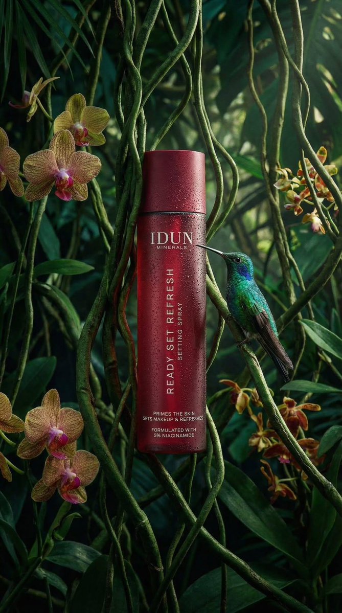
나노바나나 프로로 생성한 코스메틱 스프레이 제품컷

코스메틱 스프레이 제품컷

나노바나나 프로· Image
{ "subject": { "primary": "Cosmetic spray bottle", "secondary": "Hummingbird", "brand": "IDUN MINERALS", "product_name": "READY SET REFRESH" }, "packaging": { "form_factor": "Cylindrical bottle", "component_parts": [ "Main body", "Cap (flush with body)" ], "material_appearance": "Matte finish, likely plastic or coated metal", "condition": "Pristine, new", "reflections": "Vertical highlight on the left side, mirrored reflection in water below" }, "label_design": { "type": "Direct print onto bottle", "layout_orientation": "Mixed (Horizontal brand/details, Vertical product name)", "typography": { "font_family": "Sans-serif", "casing": "All uppercase", "style": "Clean, minimalist", "alignment": "Left aligned relative to the vertical axis for product name, centered horizontally for brand" } }, "text_visible": { "brand_header": [ "IDUN", "MINERALS" ], "body_vertical": [ "READY SET REFRESH", "SETTING SPRAY" ], "footer_details": [ "PRIMES THE SKIN", "SETS MAKEUP & REFRESHES", "FORMULATED WITH", "3% NIACINAMIDE" ], "reflection_text": "Inverted mirror image of all text visible on the water surface" }, "colors": { "packaging_base": "Deep red / Burgundy", "text": "White", "foliage": [ "Deep emerald green", "Forest green", "Moss green" ], "hummingbird": [ "Iridescent green (head/back)", "Dark grey/brown (wings)", "Reddish/pink (tail feathers)", "Black (beak)" ], "water": "Dark, almost black with reflections" }, "materials": { "bottle": "Matte rigid material", "environment": [ "Liquid water", "Moss", "Fern leaves", "Palm-like leaves" ], "biological": "Feathers (bird)" }, "human_elements": { "visible": false }, "environment": { "setting": "Simulated rainforest or jungle floor", "foreground": "Still water surface", "midground": "Mossy bank, bottle placement", "background": "Dense tropical foliage" }, "lighting": { "quality": "Soft, moody, atmospheric", "direction": "Side lighting from left (creating highlight on bottle)", "shadows": "Soft shadows in the foliage, dark water providing high contrast reflection", "highlights": "specular highlight on hummingbird head, diffuse highlight on bottle curve" }, "camera": { "angle": "Eye-level with water surface", "framing": "Vertical portrait", "focus": "Sharp focus on bottle and hummingbird", "depth_of_field": "Shallow (background leaves are blurred/bokeh)", "composition": "Rule of thirds (bottle on left third line, bird entering from right)" }, "style": { "category": "Product photography", "theme": "Nature, Organic, Eco-luxury", "mood": "Serene, fresh, premium" } }
@oggii_0
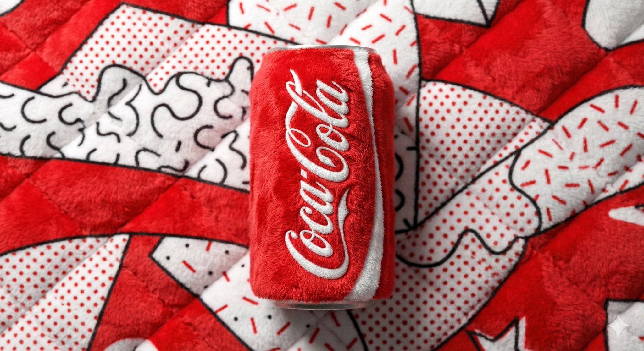
나노바나나 프로로 생성한 플러시 음료캔 팝아트

플러시 음료캔 팝아트

나노바나나 프로· Image
A beverage can branded [BRAND NAME], entirely made from vibrant, fluffy plush fabric, positioned centrally against a soft, plush background in the signature colors of [BRAND NAME]. Bold Pop Art and Memphis design style, playful yet premium aesthetic. Bright, clean studio lighting that strongly emphasizes the plush texture, visible fibers, softness, and tactile depth. Sharp focus, high color saturation, smooth shadows, modern commercial product shot, minimal composition, ultra-high resolution.
@aleenaamiir
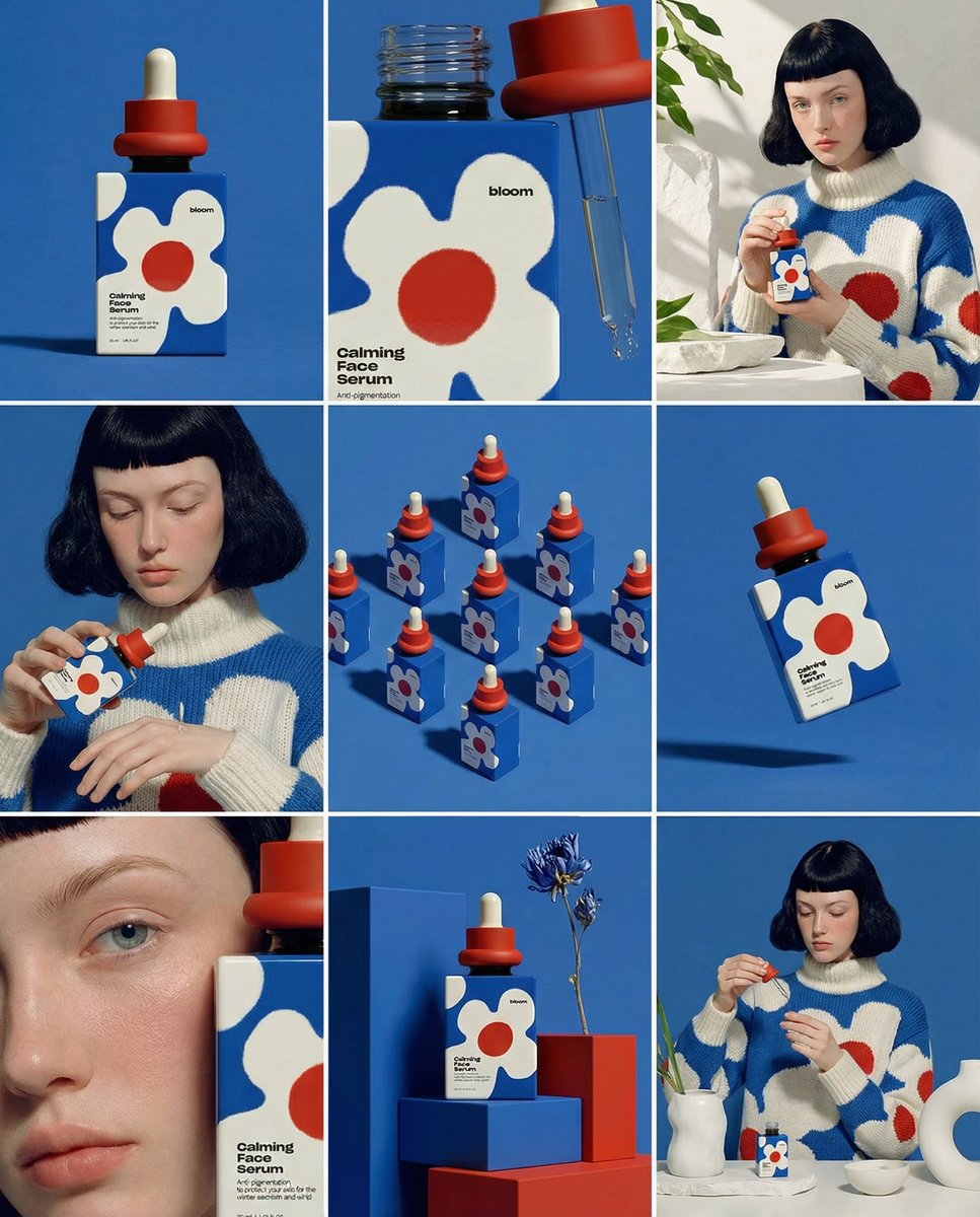
나노바나나 프로로 생성한 3x3 제품 스토리보드 목업

3x3 제품 스토리보드 목업

나노바나나 프로· Image
Create ONE final image. A clean 3×3 [ratio] storyboard grid with nine equal [ratio] sized panels on [4:5] ratio. Use the reference image as the base product reference. Keep the same product, packaging design, branding, materials, colors, proportions and overall identity across all nine panels exactly as the reference. The product must remain clearly recognizable in every frame. The label, logo and proportions must stay exactly the same. This storyboard is a high-end designer mockup presentation for a branding portfolio. The focus is on form, composition, materiality and visual rhythm rather than realism or lifestyle narrative. The overall look should feel curated, editorial and design-driven. FRAME 1: Front-facing hero shot of the product in a clean studio setup. Neutral background, balanced composition, calm and confident presentation of the product. FRAME 2: Close-up shot with the focus centered on the middle of the product. Focusing on surface texture, materials and print details. FRAME 3: Shows the reference product placed in an environment that naturally fits the brand and product category. Studio setting inspired by the product design elements and colours. FRAME 4: Product shown in use or interaction on a neutral studio background. Hands and interaction elements are minimal and restrained, the look matches the style of the package. FRAME 5: Isometric composition showing multiple products arranged in a precise geometric order from the top isometric angle. All products are placed at the same isometric top angle, evenly spaced, clean, structured and graphic. FRAME 6: Product levitating slightly tilted on a neutral background that matches the reference image color palette. Floating position is angled and intentional, the product is floating naturally in space. FRAME 7: is an extreme close-up focusing on a specific detail of the label, edge, texture or material behavior. FRAME 8: The product in an unexpected yet aesthetically strong setting that feels bold, editorial and visually striking. Unexpected but highly stylized setting. Studio-based, and designer-driven. Bold composition that elevates the brand. FRAME 9: Wide composition showing the product in use, placed within a refined designer setup. Clean props, controlled styling, cohesive with the rest of the series. CAMERA & STYLE: Ultra high-quality studio imagery with a real camera look. Different camera angles and framings across frames. Controlled depth of field, precise lighting, accurate materials and reflections. Lighting logic, color palette, mood and visual language must remain consistent across all nine panels as one cohesive series. OUTPUT: A clean 3×3 grid with no borders, no text, no captions and no watermarks.17
@Dari_Designs
나노바나나 프로로 생성한 음료 보틀 라이프스타일 광고

음료 보틀 라이프스타일 광고

나노바나나 프로· Image
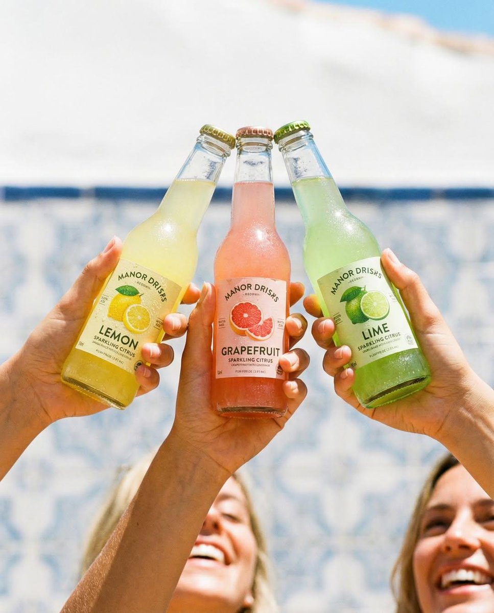
Nano Banana pro on Gemini app. Prompt: Three hands holding colorful glass soda bottles (lemon, grapefruit, lime) clinking together, bright sunny outdoor setting, soft beach/pool background blur, natural light, condensation on bottles, lifestyle photography, vibrant colors, shallow depth of field, candid joyful mood, commercial beverage ad, ultra-realistic, 8K. IMAGE 2 Three hands holding minimalist glass bottles labeled almond milk, pistachio milk, chocolate oat milk, clean neutral background, soft studio lighting, modern branding, centered composition, smooth shadows, aesthetic product photography, high detail, muted tones, premium look, 8K. IMAGE 3 Three hands holding iced coffee bottles (latte, mocha, oat milk), warm golden hour sunlight, cafe interior background, soft shadows of leaves on wall, cozy atmosphere, realistic reflections, lifestyle product shot, cinematic warm tones, shallow depth of field, 8K. IMAGE 4 Three hands holding glowing sports drink bottles stacked vertically, neon blue and red lighting, futuristic tunnel background, motion blur streaks, cyberpunk aesthetic, dramatic lighting, high contrast, dynamic composition, glossy bottles, ultra-realistic, 8K.
@Taaruk_
나노바나나 프로로 생성한 스파 바디워시 제품컷

스파 바디워시 제품컷

나노바나나 프로· Image
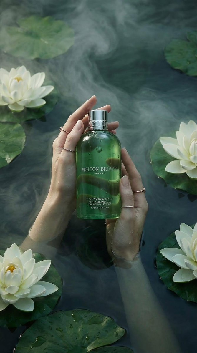
Luxury product photography of a green translucent bath and shower gel bottle held gently by two feminine hands submerged in calm water. The bottle is centered, glossy, with water droplets on the surface, silver metallic cap, elegant minimal label design. The water is deep teal-green with soft mist swirling across the surface. White lotus flowers and large green lily pads float around the hands. The hands wear delicate thin gold rings. Soft, diffused natural lighting, moody spa atmosphere, high-end skincare advertisement style, ultra-realistic, cinematic composition, shallow depth of field, 85mm lens, high resolution, editorial beauty shot, serene and calming aesthetic.
@oggii_0
나노바나나 프로로 생성한 진공포장 제품 패키지

진공포장 제품 패키지

나노바나나 프로· Image
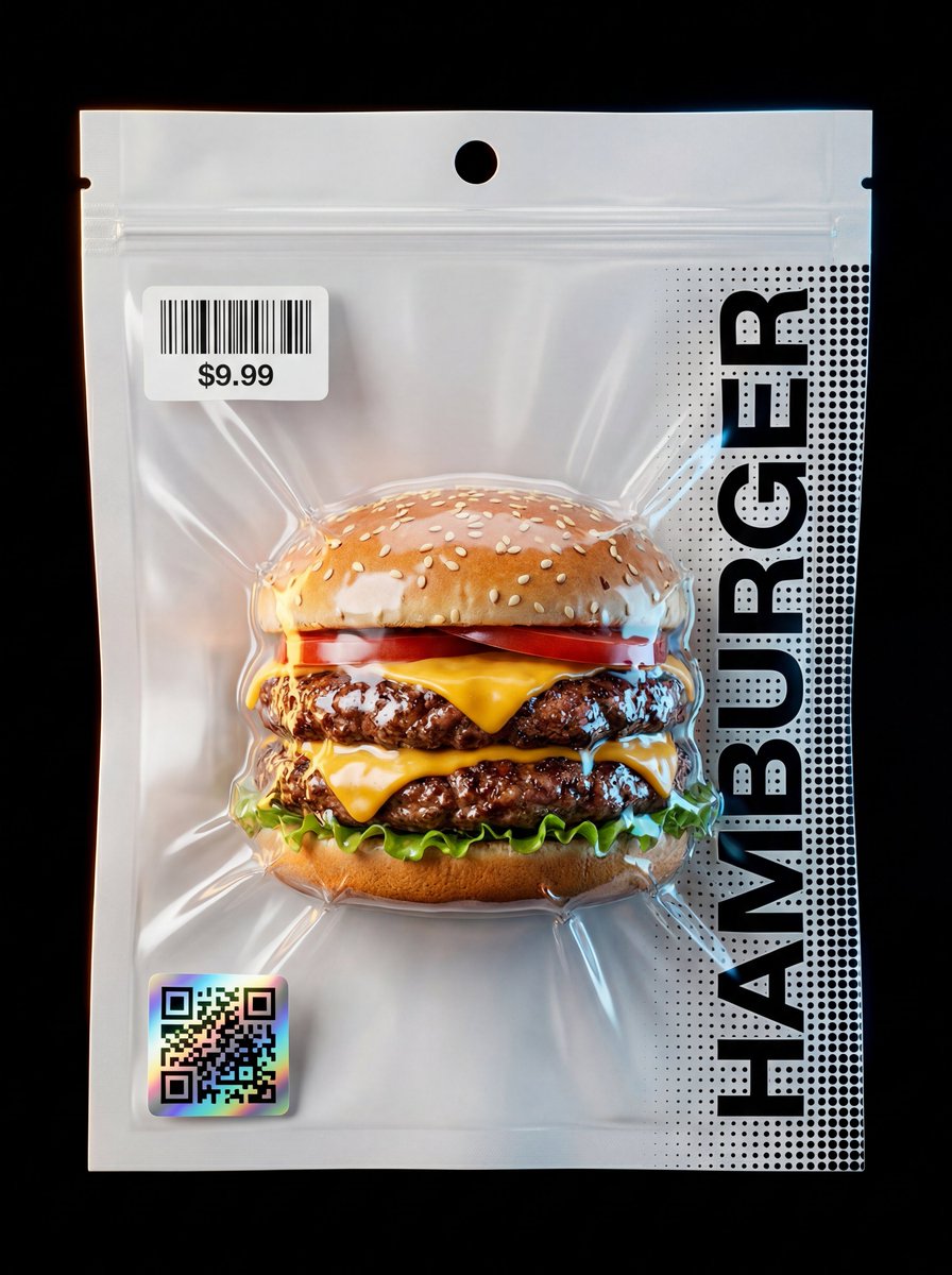
Composition & Subject: A professional front-facing studio shot of a hyper-realistic [INSERT OBJECT] standing vertical. The object features intense textural details like [DESCRIBE OBJECT TEXTURES]. Pouch Structure (Dual Material): The vacuum-sealed pouch is composed of two distinct layers. The back layer is a solid, opaque, industrial matte-white material (providing a high-contrast backdrop). The front layer is crystal-clear, high-gloss transparent plastic, allowing the object to be seen with perfect clarity and sharp detail. Vacuum Physics & Compression: The packaging demonstrates extreme vacuum-contoured compression. The plastic is sucked inward like a second skin, clinging tightly to the [DESCRIBE KEY PROTRUDING PARTS] of the object. This creates aggressive, sharp tension micro-folds and deep sculptural wrinkles that radiate from the object's silhouette. The pouch edges feature a crisp, industrial micro-dotted heat-seal pattern. Packaging Detail: The top features a circular punch-hole for hanging display, located above a realistic zip-lock seal track. The vacuum effect is powerful, with the clear front plastic sucked tightly against the contours, creating sharp, ray-traced reflections and deep tension folds. Graphics & Strategic Placement: Upper Label: A crisp white thermal rectangular sticker with a barcode and price tag of "$[INSERT PRICE]" is placed at the top-left, positioned precisely below the zip-lock seal line. Lower QR: A premium square holographic QR-code with prismatic iridescent reflections is located at the bottom-left corner. Typography & Extended Pattern: The word "[INSERT OBJECT NAME IN CAPS]" is printed vertically in a bold black Swiss font along the right side, layered over a black halftone dot-matrix pattern that extends fully to the mid-point of the pouch and then gradually fades/dissolves from there towards the center, creating a sophisticated transition. Lighting & Background: Set against a pitch-black minimalist background. Cinematic Amber and Electric Blue rim lighting outlines the silhouette, highlighting the contrast between the white back and the clear front plastic, ensuring a zero-flatness, 3D pop. Technical Specs: Commercial product photography, 8k, Unreal Engine 5.4 render style, macro-detail, zero-flatness, ultra-high contrast, focus on extreme transparency of the front layer.
@Arminn_Ai
GPT 이미지 2로 생성한 티 브랜드 패키지 디자인

티 브랜드 패키지 디자인

GPT 이미지 2· Image
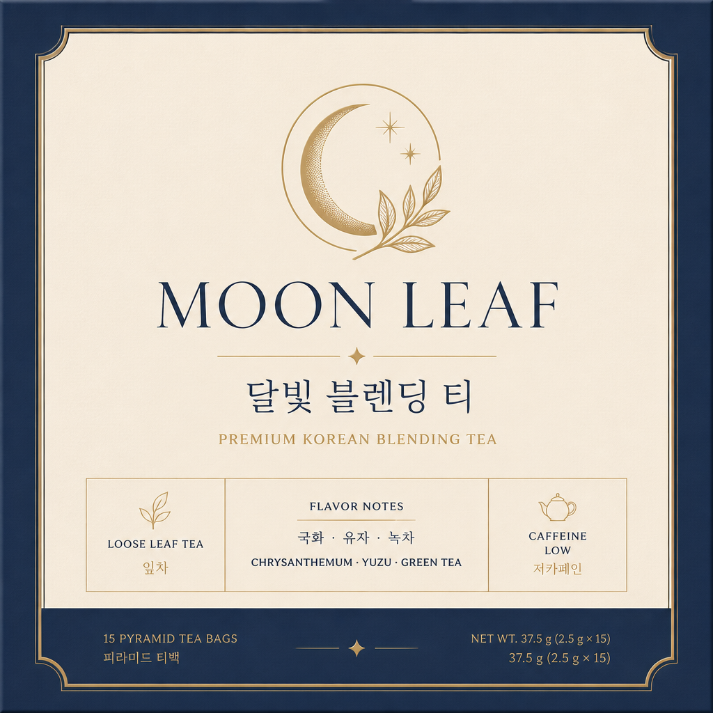
Design an elegant tea box package for a Korean premium tea brand named 'MOON LEAF'. Show the front packaging panel as a clean flat design. Include Korean text '달빛 블렌딩 티', subtle moon and tea leaf emblem, thin gold line detail, deep navy and warm cream palette. Minimal luxury packaging, refined serif typography, clear product information blocks, print-ready.

패키지 디자인 AI 프롬프트란?

패키지 디자인 프롬프트는 브랜드 제품의 패키지와 라벨 시안 제작을 빠르게 구체화하기 위한 AI 프롬프트입니다. 캐럿에서는 GPT Image 2 같은 생성 모델로 이미지나 영상을 만들고, 결과물을 다시 수정하거나 비율 변경, 배경 제거, 화질 개선, 영상 변환 같은 후속 작업까지 이어갈 수 있습니다.

주요 활용 장면

  • 화장품 패키지 시안
  • 식품·음료 라벨 디자인
  • 건강기능식품 패키지
  • 반려동물 제품 패키지
  • 브랜드 리뉴얼 목업

이 태그가 유용한 이유

패키지 디자인 작업은 단순히 보기 좋은 결과물을 만드는 것보다 사용 목적이 중요합니다. 패키지 디자인은 예쁜 표면보다 매대에서의 인상, 브랜드 톤, 제품 정보 배치가 중요합니다. 소재, 용기 형태, 라벨 구조, 촬영 각도를 함께 지정하면 실제 상품 시안처럼 보입니다. 프롬프트를 고를 때는 피사체, 구도, 스타일, 텍스트 배치, 활용 채널이 함께 드러나는 예시를 우선 확인하는 것이 좋습니다.

프롬프트 구성 팁

  1. 결과물이 쓰일 채널과 비율을 먼저 정하세요.
  2. 핵심 피사체, 배경, 조명, 카메라 구도를 구체적으로 적으세요.
  3. 필요한 경우 브랜드명, 제품명, 인물 특징, 색상 팔레트를 분리해서 지정하세요.
  4. 생성 후에는 텍스트 오류, 로고 정확도, 인물권·저작권 요소를 검수하세요.

캐럿에서는 프롬프트를 실행한 뒤 마음에 드는 결과물을 기준으로 다시 수정하거나, 이미지 비율 변경·배경 제거·화질 개선·영상 변환 같은 후속 작업을 이어갈 수 있습니다.

Frequently Asked Questions

Related Prompts

제품 광고 이미지

제품 광고 이미지

515 prompts

목업

목업

396 prompts

실사 사진

실사 사진

521 prompts

포스터

포스터

575 prompts

Carat Prompt Gallery

Create trending AI prompts instantly

Prompts

  • Logo
  • PPT Design
  • Thumbnail
  • Poster
  • Web Novel Cover
  • ID Photo
  • Caricature
  • Product Detail Page
  • Banner

Models

  • GPT Image 2
  • Seedance 2.0
  • NanoBanana Pro
  • NanoBanana 2

Carat

  • Get started
  • About
  • Blog
  • Careers
  • Contact
  • Partnership
  • Terms
  • Privacy

© 2026 Paradot.Inc All rights reserved.