Create a practical annual general meeting banner with clear layout, color, copy hierarchy, and production checks using AI prompts.
2026.07.16
Make “Annual General Meeting Banner” exactly the way you wantCreate your own “Annual General Meeting Banner”
Just ask in plain language — Carat generates optimized images and videos for you.

Start now with 100 free credits daily
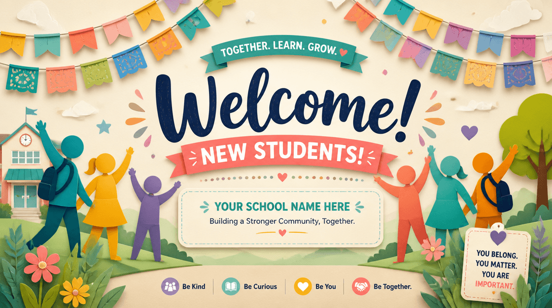
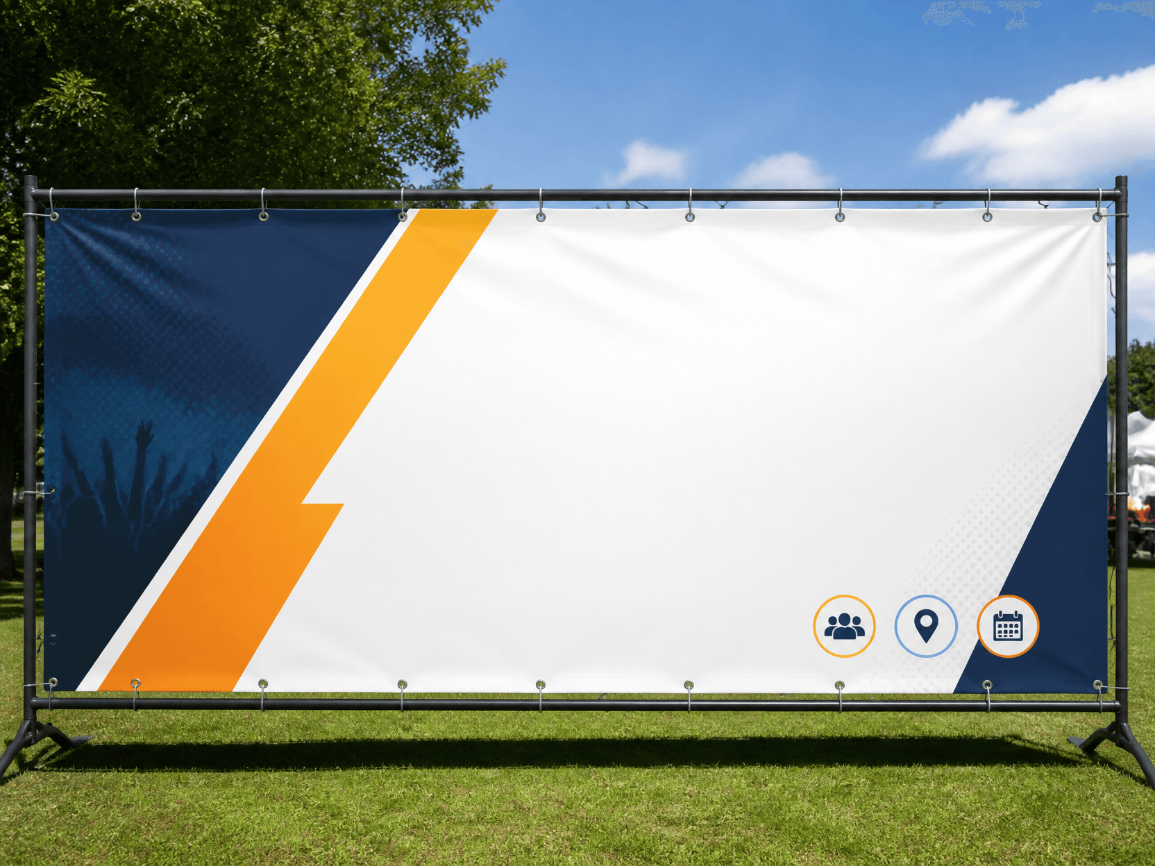
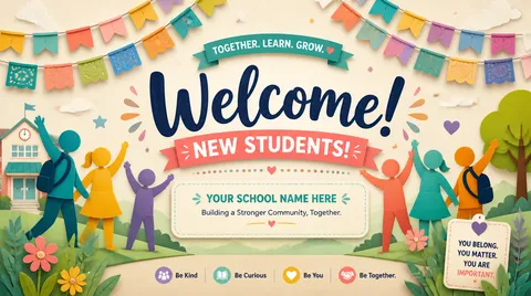
A Annual General Meeting Banner is designed for formal event banners that let associations, cooperatives, companies, and alumni groups display the meeting name, session number, date, and venue from a distance. Begin by defining who will see it, where it will appear, and how many seconds the viewer has. Common uses include shareholder meetings, association assemblies, cooperative delegate meetings, alumni assemblies, and nonprofit annual meetings, and each setting changes viewing distance and information density. Screen previews and printed output also require separate checks for resolution, safe margins, and contrast even when the ratio looks identical.
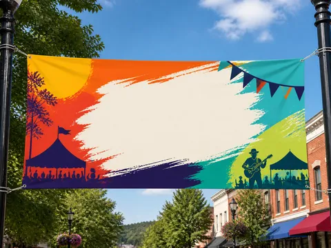
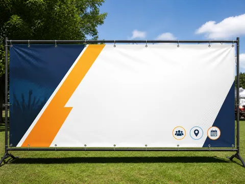
Build the prompt around a wide horizontal ratio, centered meeting title, prominent session number, restrained organizational colors, and safe logo margins. Describe the subject, layout, limited palette, headline position, material, and print or lighting texture in observable terms. Replace vague requests such as “make it beautiful” with spatial instructions: reserve the top twenty percent for a headline, place one hero in the center, and keep a clean information block below. Lock one art direction before asking for variations.
Make the primary title readable at a glance, then reduce size and weight for supporting details. If the background is complex, protect copy with a quiet field or generous negative space and keep essential details away from trim edges. Review the complete layout on a phone, but inspect small type and thin rules at actual print size. For Korean copy, generating a short heading and adding detailed information later is usually more reliable.
The main risk is forcing a long title into one tiny line, burying date and venue under decoration, or placing logos inside the trim risk area. Revise one variable at a time, such as palette, headline scale, or background complexity, instead of regenerating every decision. When contrast fails, lower background saturation or simplify the copy zone rather than stacking heavy shadows. Names, dates, classifications, and institutional wording must be checked against an authoritative source after generation.
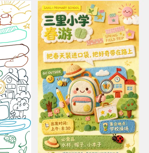
Verify spelling, event details, logo orientation, resolution, and trim allowance in that order. Do not force one master design through automatic crops for portrait, landscape, and square outputs; rebalance the focal point for every ratio. Explore banner-design, 야유회-현수막, and x-banner-design for adjacent visual directions. Finish with both a distant thumbnail review and an actual-size detail proof before publishing or printing.