Leaflet Mockup
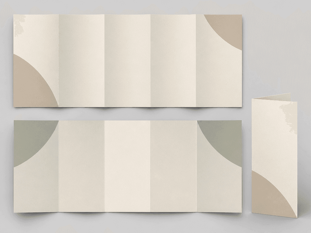
Preview a tri-fold leaflet across cover, inside spread, and folded views in a realistic paper mockup.
2026.07.15
Make “Leaflet Mockup” exactly the way you wantCreate your own “Leaflet Mockup”
Just ask in plain language — Carat generates optimized images and videos for you.

Start now with 100 free credits daily
리플렛 목업
What Is a Leaflet Mockup AI Prompt?
Preview a tri-fold leaflet across cover, inside spread, and folded views in a realistic paper mockup. A useful prompt defines the main silhouette, expression or material, spacing, and background instead of naming the subject alone. These instructions give the image model a stable visual target and produce an asset that is easier to reuse.
Designing the Visual Language
Multiple views of the same design reveal fold order and panel continuity problems before production. Sticker-style assets benefit from one focal subject, clean edges, restrained color, and enough negative space. Check the result at thumbnail size because fine details that look attractive at full resolution may disappear in chat or mobile interfaces.
Practical Uses
This format works for store introductions, service guides, exhibition handouts, print proposals. Keep the core proportions and rendering rules fixed when building a set, then vary expression, accent color, or surface treatment. This method creates variety without losing visual consistency across channels.
Prompt Construction Tips
Separate trim and fold guides, then match inner-panel width and safe margins to printer specifications. Describe lighting direction, surface texture, viewing angle, and background color with concrete terms. Avoid mixing conflicting art styles. After the first generation, lock the successful geometry and adjust only one variable at a time so you can identify what improved the result.
Related Prompt Ideas
Use neighboring themes to plan a coordinated asset family while keeping this topic visually distinct. Review the final image at its actual display size, confirm that the silhouette and focal detail survive reduction, and regenerate with wider padding or softer reflections if edges or highlights become distracting.