Kinetic Typography
Practical prompt and composition guidance for 키네틱 타이포.
2026.07.22
Fais « Kinetic Typography » exactement comme tu veuxCrée ton propre « Kinetic Typography »
Demande-le simplement — Carat génère pour toi des images et des vidéos optimisées.

Commence maintenant avec 100 crédits gratuits par jour
Kinetic type self-portrait
Kinetic type showreel · @itsuki_dev
Kinetic type and particle showreel
Type, form, space showreel
Bold typographic motion showreel
Kinetic type motion showreel
Speech built as architecture
Kinetic type showreel · @zheke
Motion techniques showreel
Bold kinetic type showreel
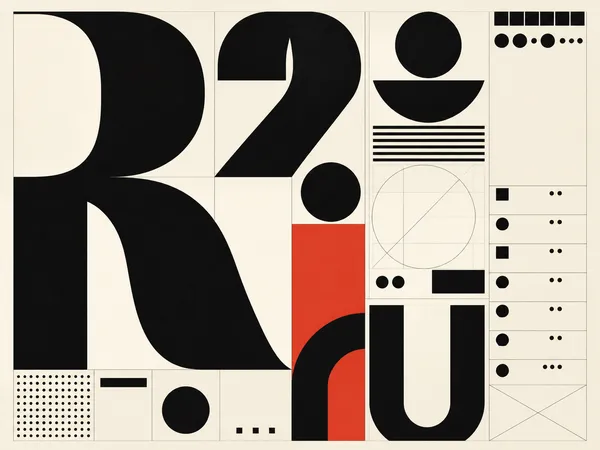
Typography Design Example 1
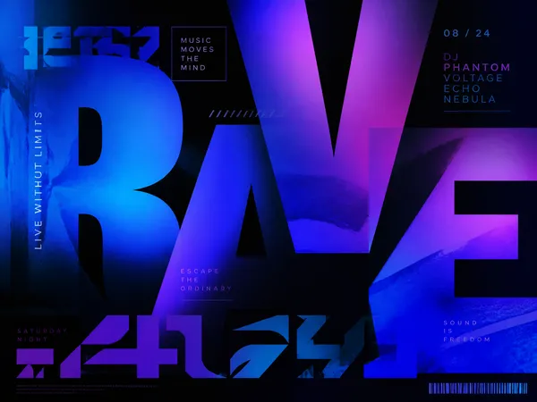
Typography Design Example 2
Topic and intent
When planning Kinetic Typography, define the scene purpose and the information the viewer should understand first. The thumbnail should reveal the main subject immediately, while the full visual should guide attention toward the next piece of information. This page structures prompts around subject, aspect ratio, focal point, spacing, color, and texture.
Composition
Place one clear message in the opening frame and use supporting elements only to establish hierarchy. Separating the focal subject from the explanatory area keeps the meaning readable on a small mobile screen. Keep people, shapes, boards, and icons from colliding, and leave a visual direction that can continue into the next shot.
Prompt practice
Before generating, write the purpose, audience, mood, aspect ratio, and exclusions in plain language. If the result misses the target, change only one variable at a time: composition, color, or information density. Creating variations with the same core constraints makes comparison easier and gives you a stable base for expanding the series.
Quality review
Reduce the image to thumbnail size and check whether the topic remains recognizable. Look for accidental text-like marks, cropped edge elements, and unnatural joins in people, hands, or geometric forms. A clear brightness difference between the subject and background helps the image remain legible in a busy feed.
Practical use
For recurring work such as educational content, branded channels, short-form covers, and campaign series, establish a shared palette and spacing system before producing variations. Review the image in its real publishing context and make sure the title and description match the visual promise. Comparing related prompts can quickly establish a repeatable production standard.
Questions fréquentes
글자의 모양과 위치가 리듬에 맞춰 변하며 메시지를 전달하는 구조입니다. 정적인 포스터도 움직임을 상상할 수 있는 방향성과 대비를 담을 수 있습니다.
시청 거리와 화면 비율을 기준으로 핵심 단어를 가장 크게 두고 보조 문구는 충분한 간격을 둡니다.
배경, 주 글자, 강조 글자의 역할을 나누고 제한된 팔레트 안에서 대비를 만드는 편이 안정적입니다.
명도 차이와 외곽 여백을 먼저 확보한 뒤 그림자나 단순한 면을 보조적으로 사용하세요.
등장, 확대, 이동, 분할, 반복처럼 관찰 가능한 변화를 순서대로 적으면 장면의 리듬을 구체화할 수 있습니다.
포스터는 한 화면의 정지된 계층이 중요하고 영상은 시간에 따른 변화, 전환 방향, 읽는 순서를 함께 설계해야 합니다.
실제 문구를 정확히 기대하기보다 텍스트 영역, 글자 덩어리, 읽기 순서를 설계하고 최종 문구는 후편집에서 넣는 방식이 안전합니다.