Typography Video
Typography video prompts for planning letter scale, rhythm, color, motion, transitions, and readable text areas.
2026.07.21
Fais « Typography Video » exactement comme tu veuxCrée ton propre « Typography Video »
Demande-le simplement — Carat génère pour toi des images et des vidéos optimisées.

Commence maintenant avec 100 crédits gratuits par jour
Synced lyrics motion video
Kinetic type self-portrait
Kinetic type showreel · @itsuki_dev
Kinetic type and particle showreel
Bold typographic motion showreel
Kinetic type motion showreel
Speech built as architecture
Kinetic type showreel · @zheke
History of AI timeline
Talking-head clip edit
Engraving-style Claude ad
What are typography video AI prompts?
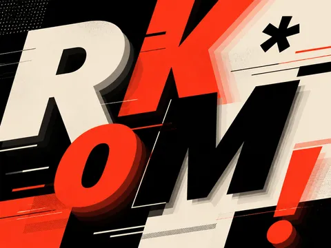
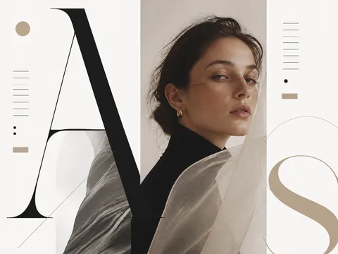
Typography video AI prompts treat letters as the main visual subject rather than as ordinary subtitles. Define sentence length, letter scale and weight, reveal order, negative space, rhythm, and transition speed to plan a lyric video, brand opener, event teaser, or motion graphic. Typography examples in the Carat gallery can help you study contrast, layout, and color systems before adapting the structure to your own message.
Practical use cases
- Lyrics and album teaser videos
- Key-message openers for brand campaigns
- Teasers for talks, concerts, and exhibitions
- Strong opening moments for short-form content
- Motion graphics for product features and statistics
Connecting type and motion
Choose the one sentence viewers should read first. Make it large, then place supporting copy at a smaller scale so the hierarchy is obvious. A phrase that pops in, builds one letter at a time, or travels across the screen creates a different mood. Keep the background simple enough that movement remains readable, and use one or two accent colors to emphasize the most important words.
Prompting tips
List the message, type character, aspect ratio, background texture, reveal behavior, transition pace, and reserved copy area. If exact Korean or English wording matters, ask for short placeholder text or a clean text zone and add final lettering in an editor because generated text can be inaccurate. For music-led edits, define timing rules such as one word per beat or a scale increase at the chorus.
Review before publishing
Check lyrics, quotations, logos, and font permissions, then compare visible lettering with the approved copy. Inspect the video on a mobile screen to ensure fast transitions do not hide the message and that text remains inside the safe area. Verify every number and date against the source material, and obtain final approval for brand colors and restricted wording before release.
Questions fréquentes
They can plan lyric videos, album teasers, brand openers, event promos, short-form hooks, and statistic-driven motion graphics.
Long text can be unreliable. Request short copy or an empty text area and add the final lettering in an editor for better control.
Choose one rule such as building letter by letter, enlarging each word, or traveling across the frame so the rhythm supports the message.
It can, but readability comes first. Reduce texture and decoration around the main words and preserve strong contrast and negative space.
Yes. Define timing rules such as one word per beat or a scale increase at the chorus in both the prompt and editing plan.
No. Confirm commercial usage rights and apply an approved font file during editing when a brand or event requires a specific typeface.
You can copy and adapt the gallery prompts. Actual image or video generation may involve separate terms or costs depending on the model and account.