carat

Prompt Gallery

/

Announcement Popup

Login
Sign Up

Announcement Popup

Design an accessible announcement popup UI with AI prompts for hierarchy, actions, and dismissal behavior.

2026.07.16

Make “Announcement Popup” exactly the way you wantCreate your own “Announcement Popup”

Just ask in plain language — Carat generates optimized images and videos for you.

Start now with 100 free credits daily
·
GPT 이미지 2로 생성한 공지 팝업

공지 팝업

GPT Image 2· Image
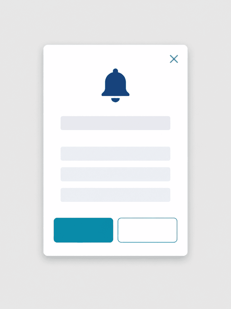
웹사이트와 앱에 쓰는 공지 팝업 UI 템플릿. 밝은 회색 화면 중앙에 흰색 세로 모달 카드 하나, 상단에 남색 알림 종 아이콘, 그 아래 제목용 빈 줄 하나와 본문용 빈 줄 세 개, 하단에는 크기가 같은 청록색 기본 버튼과 흰색 보조 버튼. 우측 상단에 단순한 X 닫기 아이콘. 8픽셀 그리드, 일관된 모서리 반경과 그림자, WCAG 대비, 정면 UI 목업. 생성 문자, 로고, 사진, 워터마크, 왜곡된 아이콘 없음. flat brand symbol design, clean silhouette, restrained palette, no mockup background. three-quarter view with clear silhouette and subtle depth.
GPT 이미지 2로 생성한 공지 팝업

공지 팝업

GPT Image 2· Image
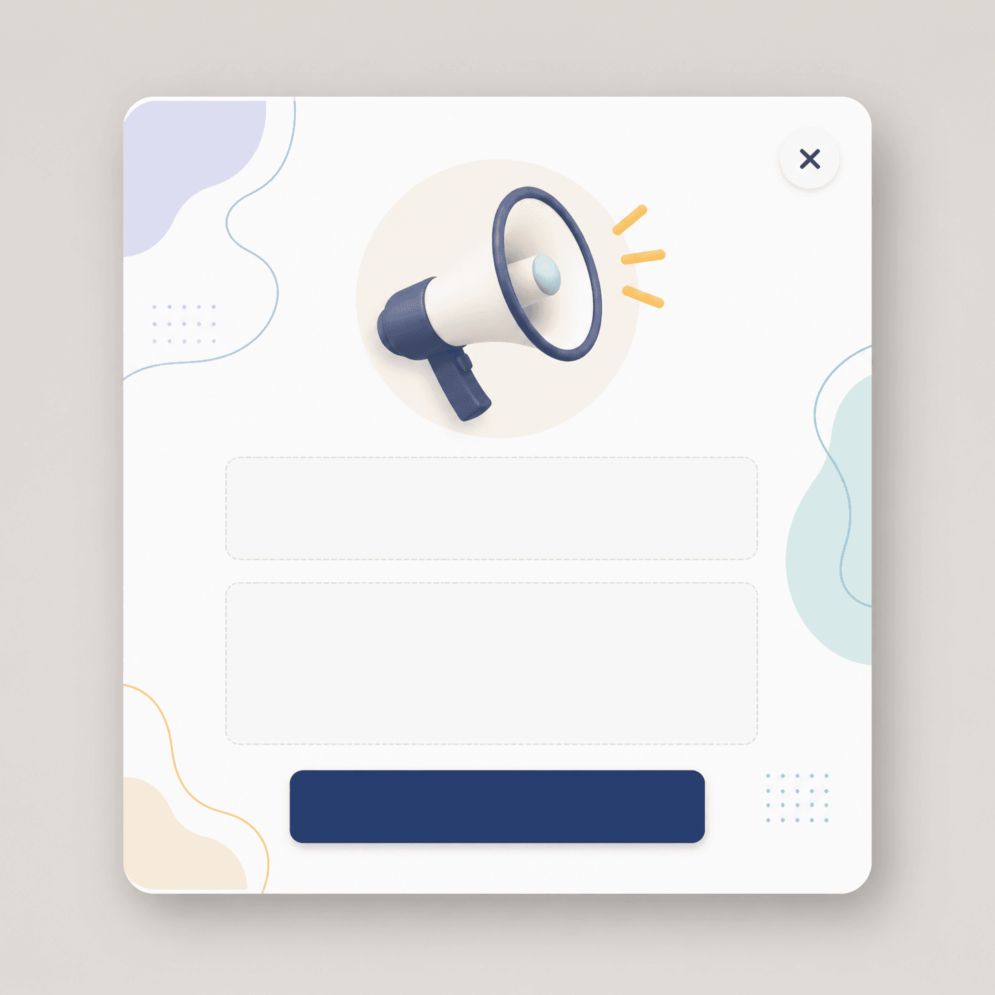
Clean modern website announcement popup UI mockup centered on a soft neutral background, rounded white card with abstract decorative shapes and clearly empty text areas reserved for later copy, polished product design presentation, accessible high contrast layout, square image, no actual words, no watermark

Role of an announcement popup

Announcement Popup AI prompts create a modal for maintenance notices, policy changes, feature launches, or urgent updates. Clarify the relationship among the title, concise body, primary action, secondary action, and dismiss control. Define severity, display period, and audience conditions before showing the popup repeatedly.

Clear interface hierarchy

Place a notification bell, one title line, and three body lines inside a white vertical modal. Distinguish a filled teal primary button from an outlined secondary button. The upper-right close icon needs a generous target and an accessible name for keyboard and screen-reader users.

Accessibility and responsive behavior

Maintain WCAG contrast and never communicate status through color alone. Leave horizontal margins on mobile and allow translated titles to wrap without covering actions. In implementation, trap focus inside the modal while open and return it to the invoking control after dismissal.

Functional review before launch

Inspect bell and close icon strokes, button dimensions, corner radii, spacing, and shadow consistency. After inserting real copy, verify dates, destinations, action labels, and expiration timing. Test dismissal, Escape behavior, outside-click policy, zoom, dark mode, and screen-reader output.

Related prompts

Frequently Asked Questions

Related Prompts

100-Day Celebration

100-Day Celebration

4 prompts

16-Panel Grid

16-Panel Grid

0 prompts

2D Anime

133 prompts

2D Character Design

2D Character Design

4 prompts

Carat Prompt Gallery

Create trending AI prompts instantly

Prompts

  • Logo
  • PPT Design
  • Thumbnail
  • Poster
  • Web Novel Cover
  • ID Photo
  • Caricature
  • Product Detail Page
  • Banner

Models

  • GPT Image 2
  • Seedance 2.0
  • NanoBanana Pro
  • NanoBanana 2

Carat

  • Get started
  • About
  • Blog
  • Careers
  • Contact
  • Partnership
  • Terms
  • Privacy

© 2026 Paradot.Inc All rights reserved.