
Orphism Circular Color Abstraction
Nano Banana 2· Imagem
Este prompt precisa de uma foto. Anexe uma pelo botão + à esquerda do campo de texto.
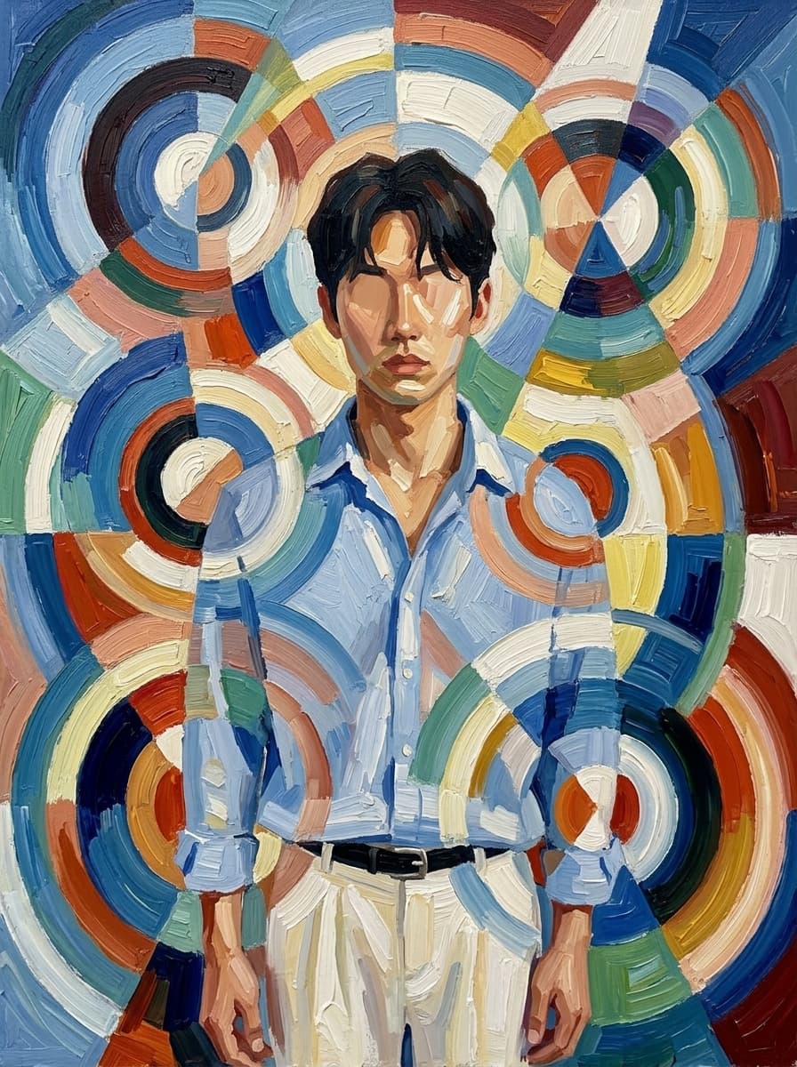
Robert Delaunay Orphism style oil painting.
Completely dissolve this figure into an explosion of overlapping
concentric circles, rotating arcs, and radial geometric color planes —
no face, no body, no recognizable human form remains.
Multiple simultaneous viewpoints expressed as layered rotating
disc fragments.
Critically: derive the entire color palette exclusively from the
colors present in this person's portrait — their skin tone, hair color,
and clothing — and translate those exact colors into the cubist
composition.
The result should feel like this specific person's colors have been
set in motion and spun into pure geometric rhythm.
Thick impasto oil paint, visible brushstrokes, painterly and beautiful.
Museum quality.
Prompts relacionados
Warm Geometric Cubist Figure
Nano Banana 2· Imagem
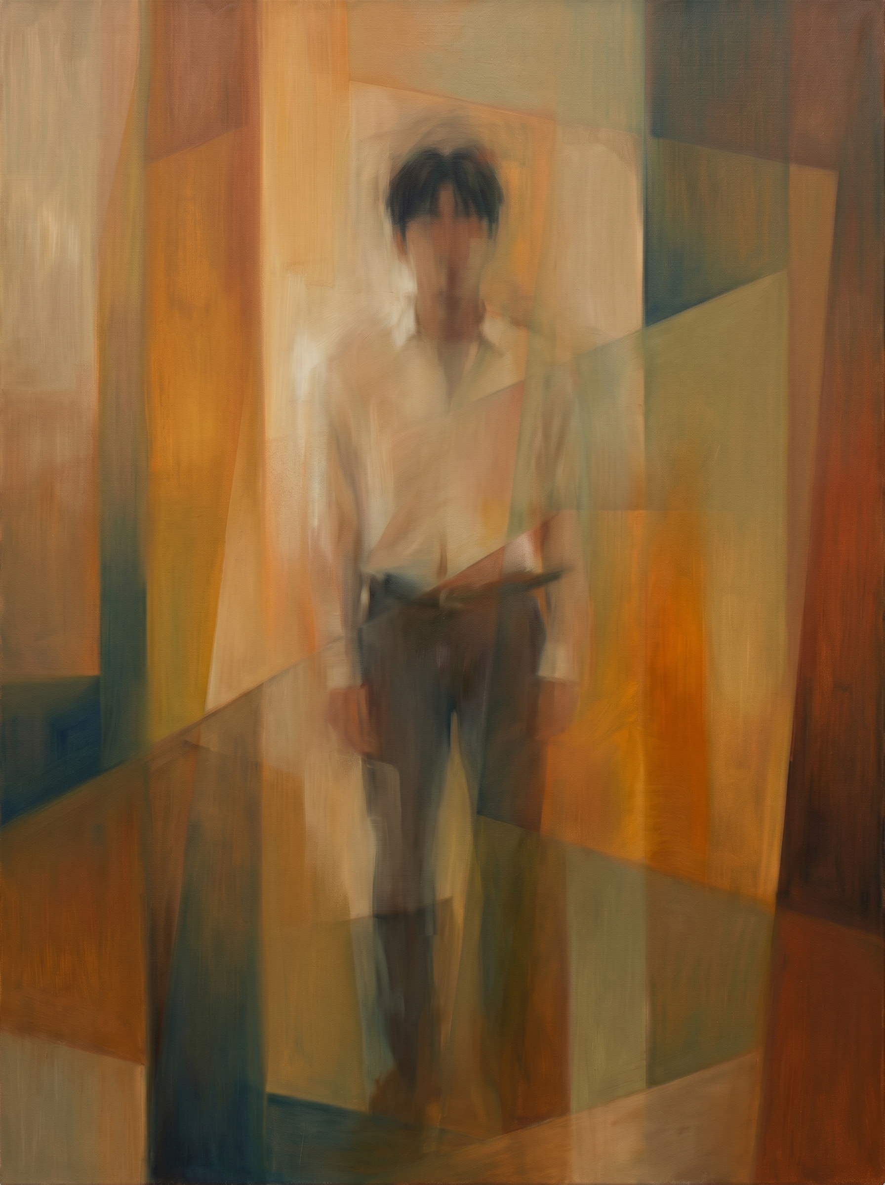
The subject : a standing portrait photograph of a person. Use the rough posture, hair mass, clothing color relationships, and main silhouette only as faint residues. The reference is the fixed painting-style reference and must dominate. Reconstruct the subject in that style: the human form itself should be blurry and indistinct, dissolving into warm overlapping geometric color fields. Do not keep a clear portrait, readable face, or sharp silhouette. Preserve only faint cues: vertical standing weight, key clothing color residues, a soft diagonal or linear accessory trace if present, and dark hair absorbed into muted planes. Use warm ochre, burnt sienna, raw umber, muted olive, beige, restrained blue-green shadows, translucent color layers, hazy plane intersections, smeared oil transitions, softened vertical bands, trapezoids, and overlapping color planes. The figure should feel like a memory inside color and plane. The final image should be the artwork itself, filling the entire frame edge to edge. No crisp contours, no pencil sketch, no stone texture, no photorealism, no realistic anatomy, no ghostly mood, no canvas object, no frame, no gallery wall, no border.
Braque-Inspired Analytical Cubist Figure
Nano Banana 2· Imagem
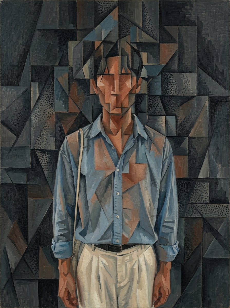
Georges Braque analytical cubism oil painting 1913. Deconstruct this person into a dense field of interlocking geometric planes. The figure should leave only a faint ghost-like impression within the geometric structure — like a presence felt rather than seen. A viewer who looks carefully might sense a human was here, but the form is buried so deep within the geometry that it is never certain. No clear face, no readable eyes or nose, no defined silhouette — only the vaguest concentration of certain tones hinting at where a person once stood. Figure and background are fully fused into one continuous geometric fabric. Use this portrait as a color source: extract dominant tones from skin, hair, and clothing and translate into the palette. Canvas filled with interlocking planes — densest in center, simpler toward edges. Dominant deep charcoal grey and black. One region of warm burnt sienna and terracotta. Accents of dusty blue and cream. Strict horizontal, vertical, and diagonal straight lines. Some areas with stippled pointillist texture. Museum quality oil on canvas. No signature, no text, no artist name, no watermark, no inscription of any kind.
Picasso-Inspired Cubist Portrait
Nano Banana 2· Imagem
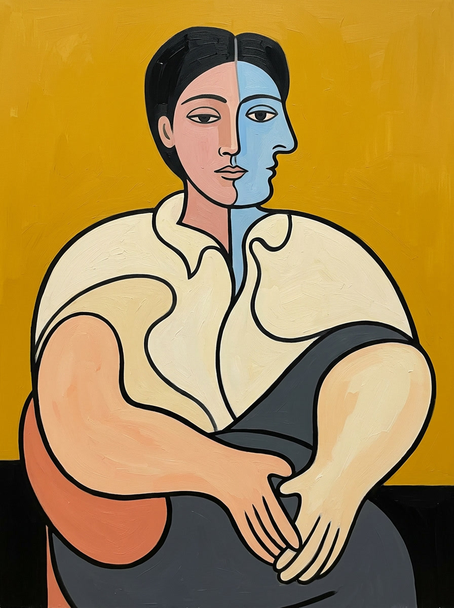
Pablo Picasso oil painting in the style of Le Rêve (1932). Render this person with Picasso's signature face distortion: simultaneously show the face from frontal and profile viewpoints merged into one — the nose curves sideways while the eyes face forward, the face is split by a vertical line into two color zones. Organic rounded curves for the body and limbs, not angular. Bold thick black outlines defining every shape. Flat color planes with no shading. Background in a strong contrasting solid color. The figure is recognizable as a person but beautifully distorted in Picasso's dreamlike manner. Derive the entire color palette from this person's portrait — skin tone, hair, clothing — then translate into Picasso's bold flat color blocks: enrich and contrast them. Painterly oil texture. Museum quality. No signature, no text, no artist name, no watermark, no inscription of any kind.
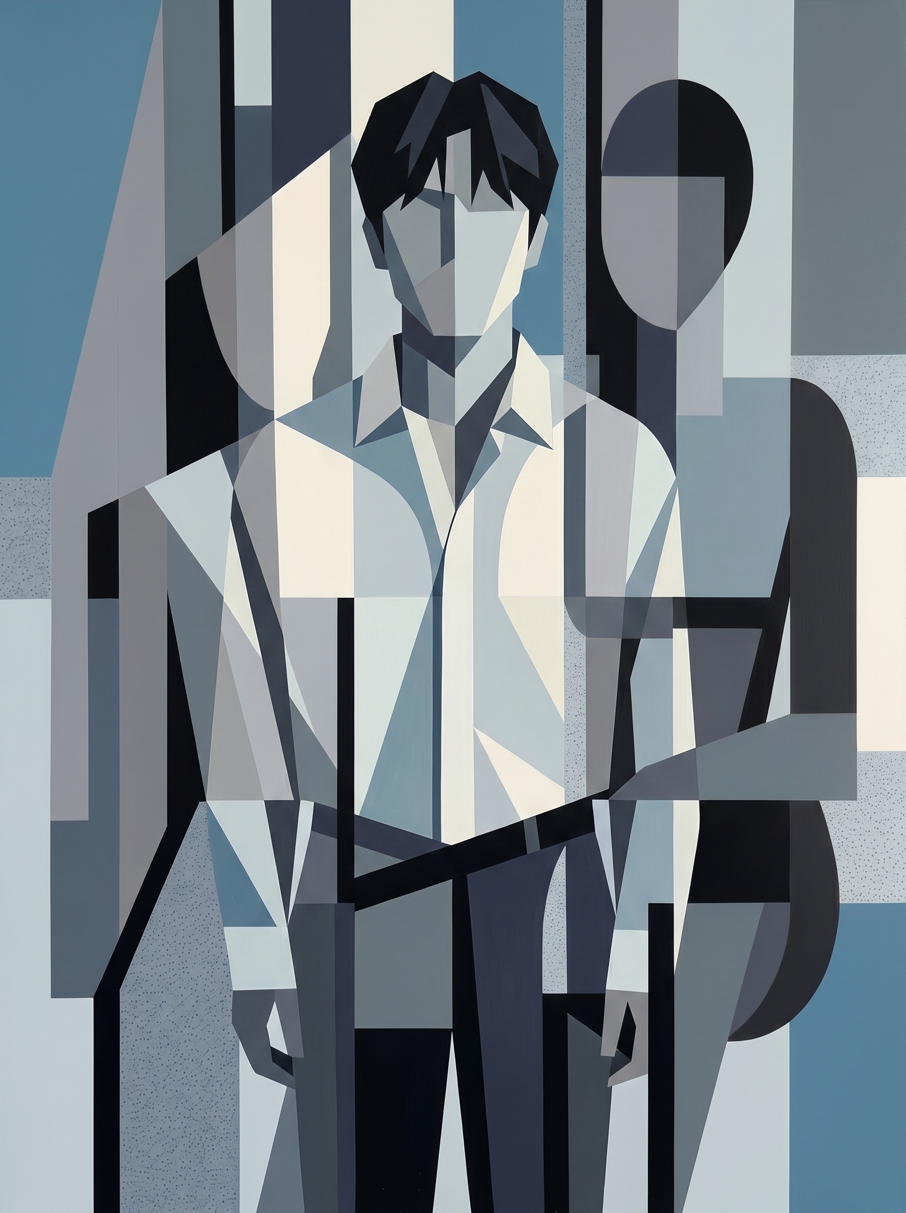
Cool-Toned Graphic Cubist Figure
Nano Banana 2· Imagem
Image 1 is the subject reference: new male subject from the first attached image, standing portrait photograph, use pose, hair, clothing, and accessories only as raw material for geometric reconstruction. Image 2 is the fixed painting-style reference and must dominate. Rebuild the subject through orderly low-saturation synthetic cubist geometry. Likeness is not important. Convert hair, clothing, limbs, accessories, and body structure into clean flat planes, vertical and diagonal partitions, rectangles, wedges, arcs, bars, and cropped figure fragments. Use muted cerulean, smoky navy, charcoal black, cool gray, off-white, pale blue-gray. Emphasize flat overlap, screen division, crisp hard edges, and extreme shadow contrast: black shadow blocks against pale planes. Accessories or straps become diagonal graphic divisions. No realistic face or anatomy. Architectural, balanced, graphic, matte painted collage feeling.
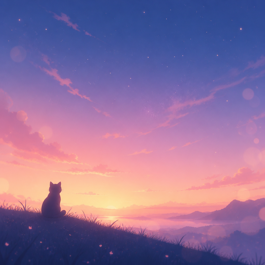
감성 맥북 배경화면
GPT Image 2· Imagem
감성적인 맥북 데스크탑 배경화면, 파스텔 그라데이션 하늘과 잔별, 미니멀한 일러스트, 부드러운 보케, 아늑하고 꿈결 같은 무드, 와이드 16:10 비율, 깔끔한 여백, 고해상도 디지털 아트
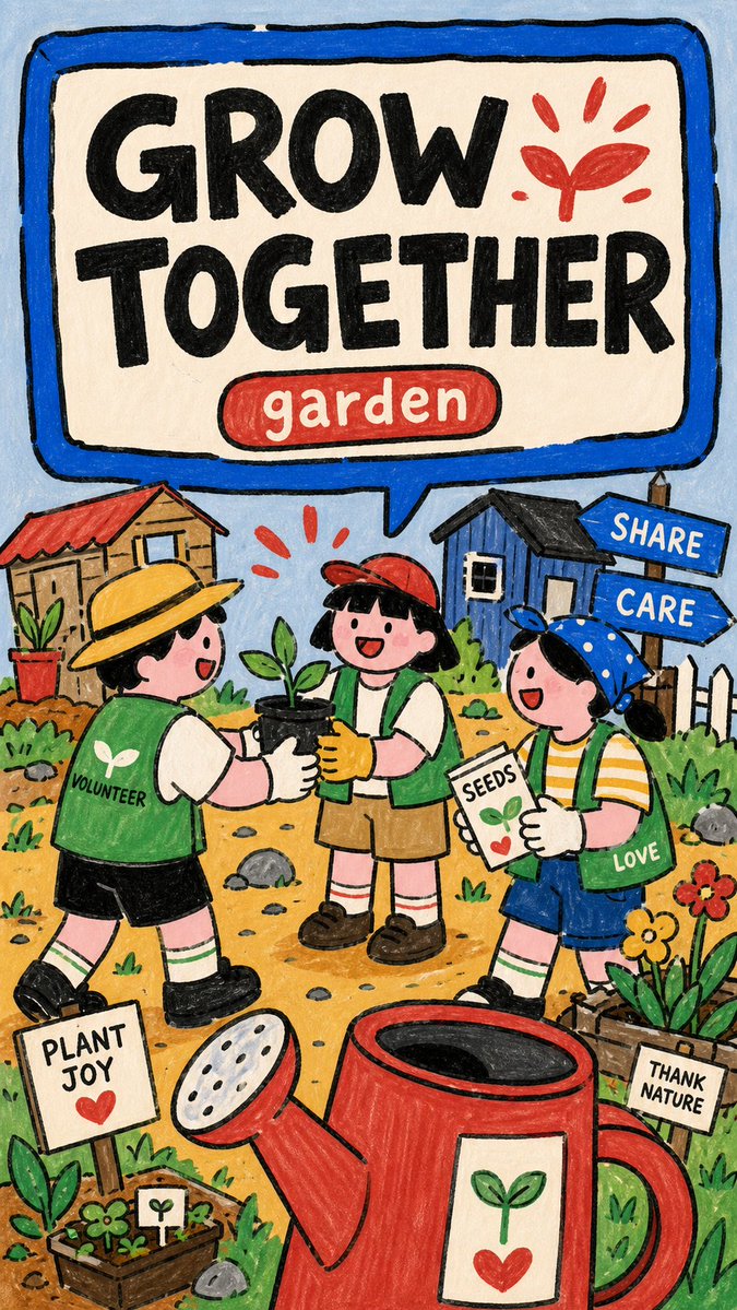
Naive Marker PSA Poster
GPT Image 2· Imagem
Create an image in naive-marker-psa-poster-style.
Aspect ratio: 9:16.
Scene: [SUBJECT] [SUBJECT_ACTION], featuring [PRODUCT_OR_PROP], in [LOCATION]. Include [BACKGROUND_ELEMENTS]. Style the characters with [WARDROBE_STYLE].
Illustration: make a finished raster poster, not a photo, SVG, UI mockup, or clean vector icon set. Use thick uneven black marker outlines, flat hand-colored fills, rounded stroke ends, subtle paper grain, marker scuffs, imperfect edges, and low-polish scanned-poster softness.
Layout: reserve the upper half or upper band for a huge rounded speech-panel sign with a thick marker-blue border and off-white interior. Put "[MAIN_TEXT]" inside the sign as massive rough black block letters. Add "[SECONDARY_TEXT]" as a small rounded red or blue capsule label near the headline.
Characters and setting: place one or more simplified cartoon people in the lower half with playful scale distortion, oversized hands, signs, or props, and intentionally naive proportions. Build the environment from flat doodled public-scene icons: tiny buildings, signs, cones, grass tufts, arrows, rocks, labels, alert marks, and simple yellow ground patches.
Color and mood: use pale blue background, cream panel, marker blue frame, coral red accents, warm yellow ground, soft skin pink, grass green, chalk gray, and deep black ink. Keep the poster friendly, instructional, childlike, approachable, and lightly comedic. Include [ACCENT_SYMBOL] as a simple graphic accent.--- VARIABLES ---
[ACCENT_SYMBOL] — lightning bolt, exclamation mark, hand sign, arrow, triangle warning icon, circular arrow, sprout burst, or comic burst
[BACKGROUND_ELEMENTS] — flat tiny buildings, signs, arrows, grass tufts, cones, paper labels, small rocks, alert marks, bottle icons, paper scraps, and doodle symbols
[LOCATION] — simple public setting, school area, street corner, library, garden, transit stop, clinic, market, lab booth, recycling station, or community space
[MAIN_TEXT] — short bold public-service headline inside the speech-panel sign, maximum three to five words
[PRODUCT_OR_PROP] — oversized object, book, tool, sign, device, food item, toy, bin, clipboard, safety item, or public prop
[SECONDARY_TEXT] — small label in a rounded red or blue capsule
[SUBJECT] — main simplified cartoon subject, group, students, volunteers, workers, neighbors, mascot, or public-service character
[SUBJECT_ACTION] — main public-service action or frozen gesture, such as raising a hand, pointing at a sign, sorting objects, passing supplies, checking a list, or holding an oversized prop
[WARDROBE_STYLE] — simple school, community, worker, volunteer, lab, neighbor, or everyday cartoon outfit with flat marker-color blocks
--- NEGATIVE PROMPT ---
watermark, username, creator ID, platform logo, QR code, app UI, signature, copied reference text, copied reference characters, red telephone, legal theme, date range, no-access sign, exact layout, brand logo, licensed character, recognizable person, photorealism, 3D render, glossy vector art, clean corporate icon set, gradient lighting, airbrush shading, thin elegant line art, realistic anatomy, correct architectural perspective, long paragraphs, dense fine print, dark cinematic mood
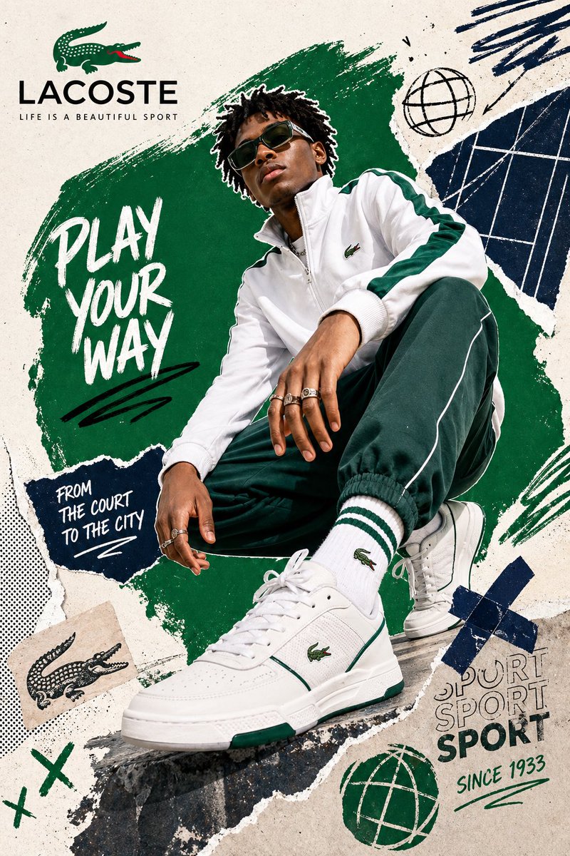
Digital Collage Brand Ad
GPT Image 2· Imagem
[BRAND NAME = CHANGE TO YOUR BRAND].
Act as a Social Media Art Director and Digital Collage Artist specializing in bold, youth-oriented brand content for Instagram and digital campaigns. PHASE 1: CONCEPTUAL FRAMEWORK Create a dynamic digital collage that merges fashion photography with graphic design chaos. This is controlled rebellion – a composition that feels spontaneous and energetic while maintaining brand coherence. The aesthetic is anti-polished: torn edges, layered textures, hand-drawn elements, and bold color blocking that screams confidence and movement. PHASE 2: MODEL & PHOTOGRAPHY - Subject: One model (diverse casting, age 18-30) in a dynamic, confident pose - Pose Energy: 80% attitude, 20% natural – sitting, jumping, mid-motion, or power stance (avoid static standing) - Outfit: Street style/athleisure that aligns with [BRAND NAME] aesthetic – casual but styled - Hero Product: Feature 1 signature [BRAND NAME] product prominently (sneakers, bag, apparel) – this is the visual anchor - Photography Style: Editorial fashion cutout – model extracted from background with clean edges - Camera Angle: Slight low angle to empower subject (hero perspective) - Crop: Full body or 3/4 body showing hero product clearly - Background Removal: Model cut out cleanly for layering over collage elements PHASE 3: COLOR BLOCKING FOUNDATION - Primary Color Blob: Large organic shape (40-60% of composition) in bold, saturated brand color behind/around model - Shape Style: Irregular, hand-painted aesthetic – think Photoshop brush strokes or torn paper texture (NOT perfect geometric shapes) - Color Selection (Autonomous): Choose 1 hero color from [BRAND NAME] palette: - Texture: Visible brush strokes, grain, or subtle noise (15-25% opacity) – avoid flat digital fills - Placement: Blob positioned to frame model without obscuring key product details PHASE 4: GRAPHIC ELEMENTS LAYER Add 3-5 abstract graphic elements scattered across composition: - Element Types: - Color Palette: Use 2-3 accent colors total (main blob color + 1-2 contrasting tones from brand palette) - Placement: Asymmetric scatter – top-left and bottom-right zones primarily (avoid center crowding) - Scale: Mix small (5% of canvas) and medium (15% of canvas) elements – nothing overpowering - Aesthetic: Analog/handmade feel – imperfect circles, rough edges, visible texture PHASE 5: TYPOGRAPHY INTEGRATION - Brand Logo: Clean [BRAND NAME] logo placed in upper-left or upper-right quadrant (10-15% of width) - Slogan/Tagline: If [BRAND NAME] has an iconic slogan, integrate it using: - Supporting Copy: Optional 1-line descriptor (e.g., "A MOMENT OF YOUR STYLE") in smaller uppercase sans-serif - Type Treatment: Mix of aligned and slightly rotated text (2-5° angles) for dynamic energy - Hierarchy: Logo largest → Slogan medium → Copy smallest PHASE 6: TEXTURE & BACKGROUND - Base Layer: Off-white or light gray textured background (NOT pure white) - Texture Options (Autonomous selection): - Color: RGB 245-250 (near-white with warmth) – maintains brightness while adding depth - Treatment: Texture should be felt, not seen – enhances tactility without competing with foreground PHASE 7: COMPOSITION RULES - Layout: Asymmetric balance – model off-center, graphic elements counter-balance - Breathing Room: 15-20% negative space (textured background visible) to prevent claustrophobia - Layering Order: Background texture → Color blob → Graphic elements → Model (cutout) → Typography top layer - Focal Point: Model + hero product = primary focus (60% visual weight), graphics support (40%) - Movement: Diagonal lines and angled elements create directional flow (top-left to bottom-right or vice versa) PHASE 8: BRAND INTELLIGENCE (AUTONOMOUS) Autonomously adapt composition based on [BRAND NAME] personality: - Streetwear/Sportswear (Nike, Adidas, Supreme): - Luxury Streetwear (Balenciaga, Off-White, Gucci): - Beauty/Lifestyle (Glossier, Fenty, Skims): - Tech/Modern (Apple, Tesla, Beats): PHASE 9: SOCIAL MEDIA FOOTER (OPTIONAL) - Bottom Strip: Clean white or light gray bar at bottom 8-10% of frame - Content: Social media handles (Instagram, Facebook, Twitter) in small sans-serif - Layout: Three-column grid with platform icons or text handles - Aesthetic: Minimal and professional – contrast with chaotic collage above TECHNICAL SPECS: - Aspect Ratio: 4:5 (Instagram feed) or 1:1 (square social post) - Resolution: 2400x3000px minimum (high-quality for zoom and detail) - Color Mode: sRGB, vibrant saturation (Instagram-optimized) - File Aesthetic: Digital collage that mimics analog craft (Photoshop + hand-drawn hybrid) - Model Photography: 85mm lens, f/2.8, shallow depth of field on original shoot (before cutout) - Style Reference: Nike social campaigns, Spotify wrapped graphics, Gen Z Instagram aesthetics, Hypebeast x streetwear collabs - Mood: Confident, energetic, youthful, authentic chaos, anti-corporate polish
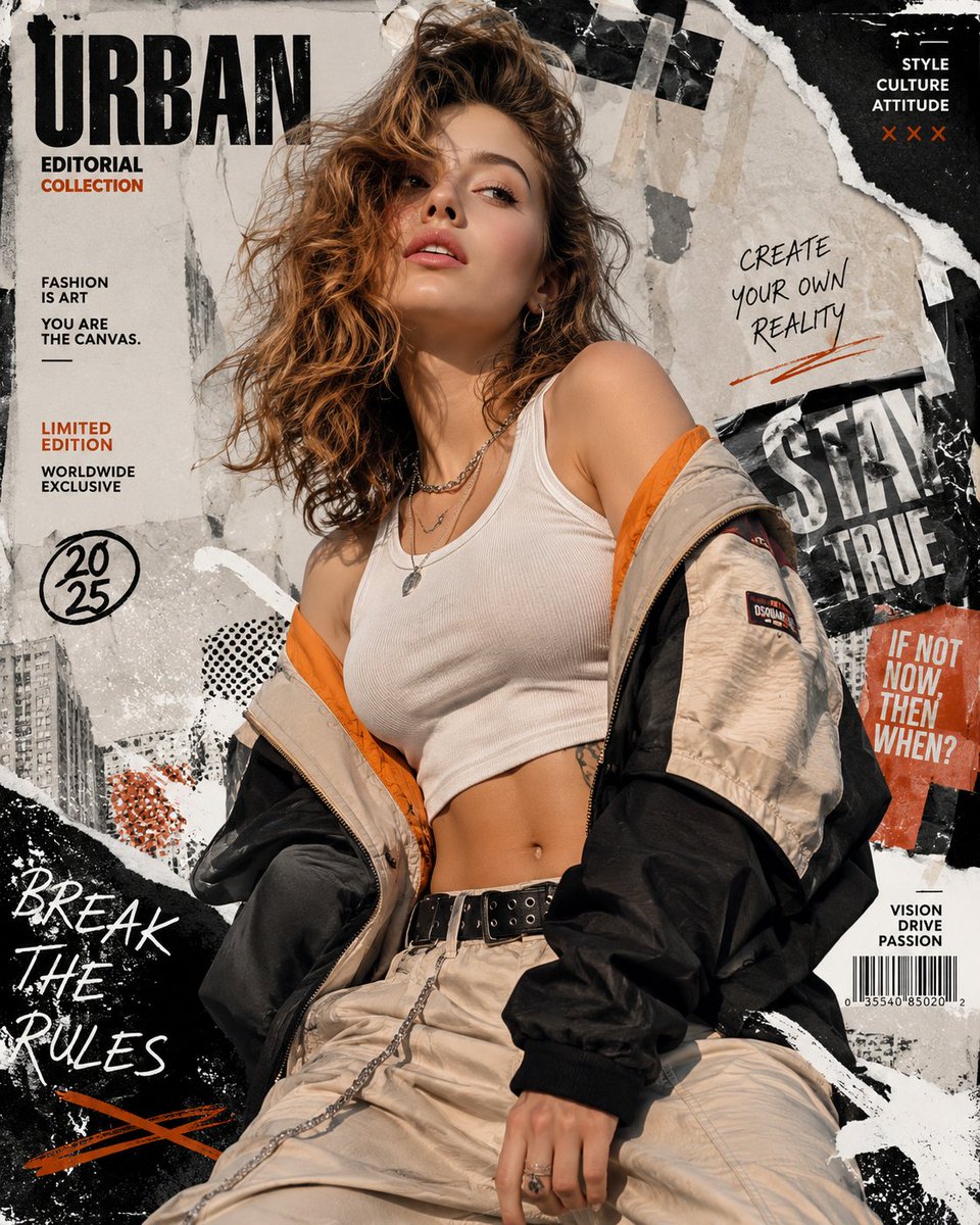
Urban Fashion Collage Poster
GPT Image 2· Imagem
Create a high-resolution 8K portrait poster in an Urban Fashion Editorial Collage style, blending contemporary street-fashion aesthetics with premium editorial magazine design. The overall composition should feel bold, stylish, modern, and visually layered, combining elements of luxury fashion campaigns, urban culture, and artistic collage experimentation. Incorporate dynamic poster ornaments and decorative elements that strongly reflect the Urban Fashion Editorial Collage aesthetic, such as ripped paper textures, layered magazine cutouts, abstract geometric accents, expressive brush strokes, typography fragments, street-style graphic overlays, halftone textures, tape effects, paint splashes, handwritten scribbles, and fashionable editorial layout compositions. Every decorative element should feel intentional, stylish, and visually balanced rather than overcrowded. Humanity really looked at torn paper and graffiti textures and decided, “yes, this is luxury now.” Somehow it works.
The subject’s pose must not resemble the reference photo. Create a completely different body posture and facial expression with a more natural, expressive, and emotionally alive presence. Avoid stiff, awkward, flat, or overly symmetrical posing. The subject should radiate the confident elegance of an international fashion model, with fluid body language, subtle movement, and a cinematic editorial attitude. The expression should feel charismatic, effortless, fashionable, and modern, as if captured during a high-end streetwear magazine photoshoot rather than a static studio portrait. Add slight motion energy through posture, clothing movement, hand placement, camera angle, or gaze direction to make the composition feel more alive and dynamic.
The outfit must feature modern casual fashion with a stylish and trendy urban aesthetic. Avoid monotonous clothing design, colors, or materials. Combine fashionable layers, contemporary cuts, unique textures, stylish accessories, and varied color palettes that complement the poster composition. The clothing should feel premium, youthful, and fashion-forward, inspired by global streetwear and luxury casual editorial styling. Mix different fabric materials, patterns, and tones naturally to create visual richness without making the outfit look chaotic or overly exaggerated.
Use dramatic editorial lighting with strong contrast and depth to enhance the fashion atmosphere. The background should integrate seamlessly with the collage elements, creating a visually immersive poster composition filled with layered urban energy and modern fashion identity. Maintain a clean balance between subject visibility and decorative complexity so the poster still feels premium and professionally art-directed. The final result should look like a sophisticated international fashion campaign poster with a strong urban editorial character, ultra-detailed textures, crisp focus, cinematic color grading, and highly polished visual quality in ultra-detailed 8K resolution.
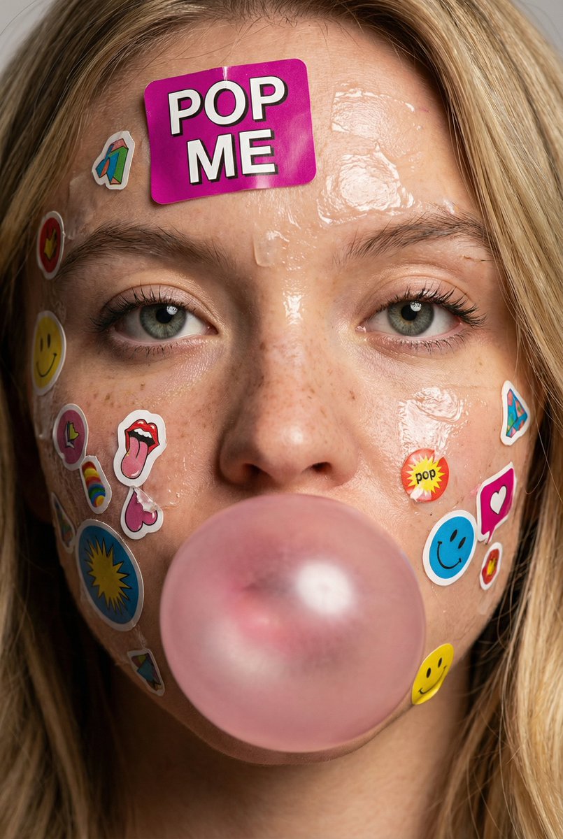
Sticker Bubblegum Close-Up
Nano Banana Pro· Imagem
{
"meta": {
"image_quality": "High",
"image_type": "Photo"
},
"global_context": {
"scene_description": "Close-up portrait of a young person's face covered with colorful paper stickers and glossy adhesive residue. Central focus on eyes, nose, lips; subject blowing a pink bubblegum bubble. Stickers vary in size, text, icons and layered overlap; hair strands frame face at edges. Skin shows freckles, pores, and sheen from adhesive or moisture.",
"time_of_day": "Neutral/studio lighting",
"weather_atmosphere": "Indoors/controlled",
"lighting": {
"source": "Artificial",
"direction": "Frontal with slight top",
"quality": "Soft",
"color_temp": "Neutral"
}
},
"color_palette": {
"dominant_hex_estimates": ["#E7B1B6", "#F6C0D0", "#C9A38C"],
"accent_colors": ["Pink","Magenta"],
"contrast_level": "Medium"
},
"composition": {
"camera_angle": "Eye-level",
"framing": "Extreme close-up (face fills frame)",
"depth_of_field": "Shallow (background indistinct)",
"focal_point": "Eyes and central bubble"
},
"objects": [
{
"id": "obj_001",
"label": "Face",
"category": "Person (head)",
"location": "Center",
"prominence": "Foreground",
"visual_attributes": {
"color": "Light beige skin with pink undertones and freckles",
"texture": "Smooth with visible pores, glossy adhesive patches",
"material": "Skin",
"state": "Sticker-covered, slightly wet/glossy",
"dimensions_relative": "Large relative to frame"
},
"micro_details": [
"Freckles concentrated on nose and cheeks",
"Shiny adhesive residue streaks on forehead and cheeks",
"Fine vellus hairs visible",
"Pores visible on nose and cheeks"
],
"pose_or_orientation": "Frontal",
"text_content": null
},
{
"id": "obj_002",
"label": "Eyes (pair)",
"category": "Facial feature",
"location": "Upper-center",
"prominence": "Foreground",
"visual_attributes": {
"color": "Gray-green irises with dark limbal ring",
"texture": "Wet/glossy cornea, visible eyelashes",
"material": "Biological",
"state": "Open, neutral expression",
"dimensions_relative": "Medium"
},
"micro_details": [
"Tiny specular highlights on each cornea",
"Sparse lower lashes, fuller upper lashes",
"Slight shadow under lower lids"
],
"pose_or_orientation": "Facing camera",
"text_content": null
},
{
"id": "obj_003",
"label": "Pink bubble",
"category": "Object (gum)",
"location": "Lower-center",
"prominence": "Foreground",
"visual_attributes": {
"color": "Pastel pink",
"texture": "Smooth, slightly translucent",
"material": "Gum",
"state": "Inflated/intact",
"dimensions_relative": "Large relative to mouth"
},
"micro_details": [
"Two bright specular reflections on sphere",
"Seamless edge against lips"
],
"pose_or_orientation": "Centered over mouth",
"text_content": null
},
{
"id": "obj_004",
"label": "Stickers (assorted)",
"category": "Adhesive stickers",
"location": "Entire face and neck, concentrated forehead and cheeks",
"prominence": "Foreground",
"visual_attributes": {
"color": "Multicolor: magenta, yellow, blue, white",
"texture": "Paper/plastic with glossy varnish, torn edges",
"material": "Paper/plastic adhesive",
"state": "Layered, partially torn, some wrinkled",
"dimensions_relative": "Varied small-to-medium"
},
"micro_details": [
"Large 'POP ME' magenta sticker on forehead",
"Partial torn sticker fragments near nasolabial fold",
"Small rectangular stickers with tiny printed text",
"Edges lifting, adhesive shine around perimeters"
],
"pose_or_orientation": "Affixed flat or slightly peeled",
"text_content": "Multiple small logos and words (e.g., 'POP ME')"
},
{
"id": "obj_005",
"label": "Hair strands",
"category": "Hair",
"location": "Left and right edges framing face",
"prominence": "Background/foreground overlap",
"visual_attributes": {
"color": "Light brown",
"texture": "Fine, slightly wet",
"material": "Hair",
"state": "Loose strands",
"dimensions_relative": "Thin relative to face"
},
"micro_details": [
"Individual strands crossing forehead edges",
"Slight adhesive sheen on some strands"
],
"pose_or_orientation": "Hanging down"
}
],
"text_ocr": {
"present": true,
"content": [
{
"text": "POP ME",
"location": "Forehead",
"font_style": "Bold/Decorative",
"legibility": "Clear"
}
]
},
"semantic_relationships": [
"Stickers are affixed to Face",
"Bubble covers mouth, partially obscuring lips",
"Adhesive residue creates glossy highlights on skin",
"Hair strands frame and partly overlay stickers"
]
}
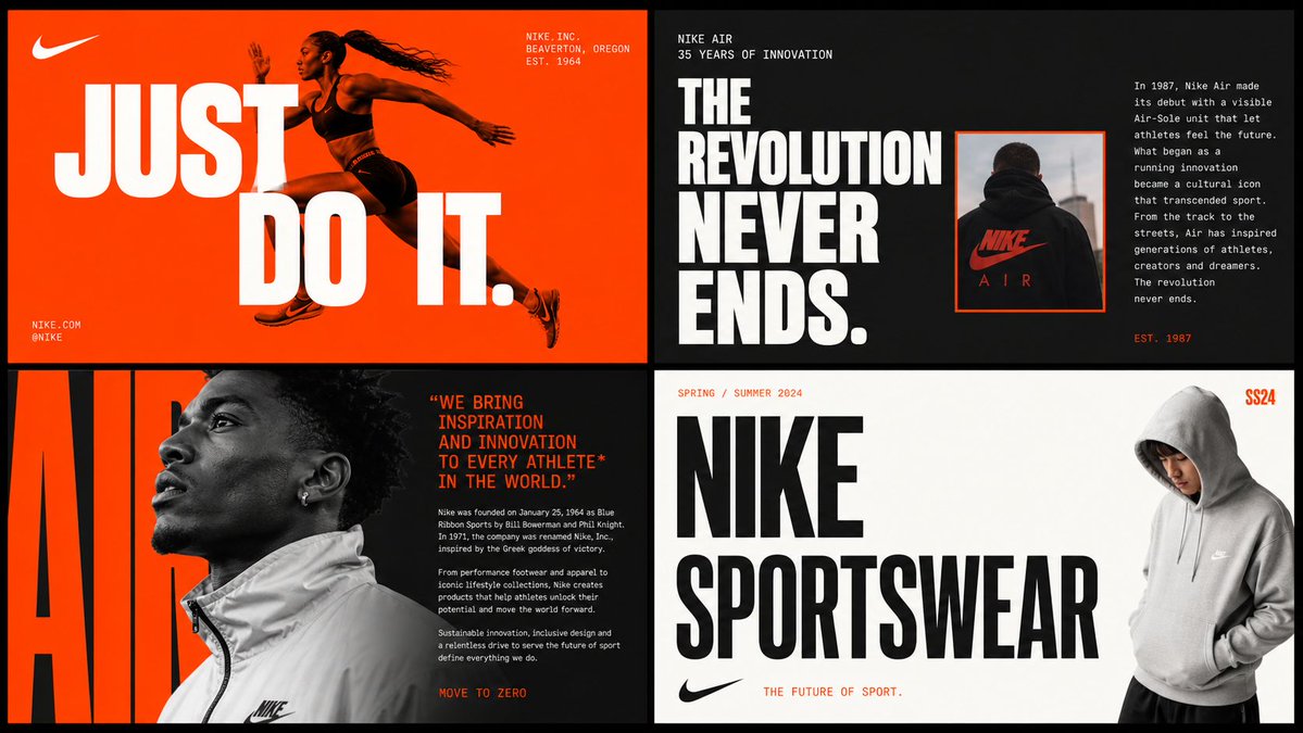
2x2 Brand Moodboard Grid
GPT Image 2· Imagem
[BRAND NAME]
Act as a Senior Brand Art Director and Editorial Designer creating a 2×2 grid brand moodboard — four distinct editorial cards unified by [BRAND NAME]'s visual identity system. References: Ivy Park campaign editorial, Supreme lookbook layouts, Palace Skateboards zine design, Off-White editorial grids, Highsnobiety brand feature spreads.
---
PHASE 0: BRAND INTELLIGENCE — AUTONOMOUS RESEARCH
Before generating any visual, perform a complete brand decode of [BRAND NAME] from training data. Extract and apply all of the following autonomously:
Color system: identify the exact primary and secondary brand colors — their specific hex values, how they are used in hierarchy (dominant background color, accent color, text color). These colors drive every card in the grid.
Typography DNA: identify the exact typeface or typeface category [BRAND NAME] uses — serif, sans-serif, condensed, extended, grotesque, slab. Identify the weight hierarchy: what weight is used for headlines, what for body text, what for labels. Apply this typography system throughout all four cards.
Brand language: identify the tone of voice, key phrases, campaign slogans, product categories, founding year, key collaborators, cultural positioning. Extract real factual information about [BRAND NAME] that can be used as text content across the four cards — real product names, real campaign titles, real dates, real locations, real brand statements.
Visual codes: identify the photographic style associated with [BRAND NAME] — editorial fashion, sport, street, luxury, industrial. Identify compositional patterns the brand uses — full bleed photography, text-dominant layouts, graphic-only compositions, collage.
All text content across all four cards must be real information about [BRAND NAME] — not placeholder text, not generic copy. Real brand slogans, real product lines, real campaign names, real founding information.
---
PHASE 1: GRID SYSTEM
The output is a single image composed of four equal rectangular cards arranged in a 2×2 grid. Total image dimensions: square or slightly landscape — 1:1 or 4:3 ratio. Each card is identical in size — exactly one quarter of the total image area. A thin gap of 4 to 6px between cards — neutral dark or light depending on brand palette. The four cards form a unified editorial system — they share the same color palette and typography but each has a distinct layout typology. Together they tell the brand story.
---
PHASE 2: CARD 1 — HERO EDITORIAL (top left)
Layout typology: large bold typography layered over or integrated with photography. Dominant background color: [BRAND NAME]'s primary brand color at full saturation — fills the entire card. Photography: a fashion or lifestyle image relevant to [BRAND NAME]'s visual world — model, product, or environment. The photo is either full-bleed behind the text or cropped into a specific zone of the card with text occupying the remaining space. Photo treatment: slight blend mode integration with the background color — the photo and background feel like one unified surface. Typography: the most recognizable [BRAND NAME] headline or slogan in the largest type size on the card — bold condensed, uppercase, white or brand secondary color. The text is large enough to partially overlap the photo. Secondary small text: brand name, location, date — set in small caps or tracking-heavy small type in a corner. The overall feeling: a magazine cover or campaign poster.
---
PHASE 3: CARD 2 — EDITORIAL TEXT LAYOUT (top right)
Layout typology: text-dominant editorial layout with a small photo inset. Background: [BRAND NAME]'s secondary brand color or a dark neutral consistent with the brand palette. Large headline: a real [BRAND NAME] campaign title or brand statement broken across multiple lines — each line a different size or weight, creating a typographic staircase effect. The largest line is very large, the smallest is medium, they are left-aligned creating a ragged right edge. Small body text column: a real paragraph of brand information — founding story, product description, or campaign context — set in small regular weight type, positioned in the upper right or lower right of the card. Photo inset: a small rectangular photo — 20 to 30% of card area — positioned where it interrupts or overlaps the headline text, creating editorial tension. The photo has a colored border or frame in the brand primary color.
---
PHASE 4: CARD 3 — FASHION EDITORIAL (bottom left)
Layout typology: photography-forward with typography as structural background element. Photography: a strong fashion or product image — model wearing [BRAND NAME] product, or a key product hero shot. The photo is positioned in the left 50 to 60% of the card, cropped tightly. Photo treatment: slightly desaturated or high contrast — editorial black and white or brand-tinted. Background typography: behind and around the photo, a very large single word or letterform from [BRAND NAME]'s identity — set at 200 to 300% of the card height, in the brand primary or secondary color, acting as graphic wallpaper behind the photo. This background type is partially obscured by the photo. Body text: a column of real [BRAND NAME] editorial copy — 3 to 5 short paragraphs, small regular weight, positioned to the right of the photo. Pull quote: one sentence extracted from the body copy, set larger and in brand accent color, positioned between the photo and the body text.
---
PHASE 5: CARD 4 — CLEAN BRAND STATEMENT (bottom right)
Layout typology: minimal, graphic, brand identity statement. Background: white, off-white, or the lightest tone in [BRAND NAME]'s palette — maximum contrast with the other three cards. Primary element: [BRAND NAME]'s wordmark or brand name set in massive type — ultra-bold, condensed or extended depending on the brand's typographic DNA. The wordmark is broken across 2 to 3 lines, each line flush left, occupying 70 to 80% of the card width. Type color: black or the darkest brand color — maximum contrast on the light background. Secondary element: a model or product image positioned at the right edge of the card, slightly cropped — human presence that grounds the graphic layout. The model/product is not the focus — the typography is. Accent element: a year, a number, a collection identifier, or a brand slogan set small in the brand primary color — positioned as a superscript or footnote near the main wordmark, adding a handwritten or stamped quality.
---
PHASE 6: UNIFIED VISUAL SYSTEM
Typography consistency across all four cards: all type is set in typefaces consistent with [BRAND NAME]'s identity. Headline type: one typeface, one weight — the boldest, most brand-representative option. Body type: one typeface, regular weight — legible at small sizes. No decorative or unrelated typefaces. Color consistency: only the colors identified in PHASE 0 appear across all four cards — primary brand color, secondary brand color, neutral (white or black), and one accent. No colors outside this palette. No gradients. No drop shadows. No textures on type. Information consistency: all text is real [BRAND NAME] information. No lorem ipsum. No generic placeholder text. Every word on every card is either the brand name, a real product name, a real campaign title, a real date, a real location, or a real brand statement. Grid alignment: elements across cards share implied alignment axes — a headline that starts at a certain x-position in card 1 aligns with an element in card 3 at the same x-position. This creates visual cohesion across the 2×2 grid when viewed as a whole.
---
PHASE 7: TECH SPECS
Output: a single flat image of the complete 2×2 grid. No separate files. Aspect ratio: 1:1 square or 4:3 landscape. Total resolution feel: high enough to read all body text clearly. Typography rendering: all type anti-aliased and crisp — no blurry text. Photography: editorial quality, not stock photography aesthetic. Color accuracy: brand colors exactly as identified in PHASE 0 — not approximated. No film grain unless it is a brand-authentic texture. No vignettes. No lens flare. Clean, precise, editorial. Output feel: this moodboard could be published on Hypebeast, Highsnobiety, or used as an internal brand presentation deck slide.
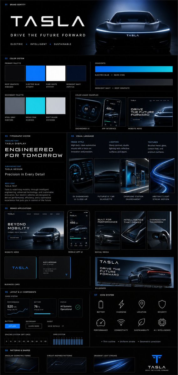
Brand Guideline Board
GPT Image 2· Imagem
{
"prompt": {
"title": "Premium Vertical Brand Guideline Board",
"aspect_ratio": "4:5",
"brand_inputs": {
"brand_name": "[BRAND NAME]",
"industry": "[INDUSTRY / NICHE]",
"target_audience": "[AUDIENCE TYPE]",
"brand_personality": "[3–5 TRAITS]",
"core_emotion": "[FEELING YOU WANT TO EVOKE]"
},
"layout": {
"type": "structured_modular_grid",
"columns": "3–4",
"style": "high-end agency presentation",
"rules": [
"precise spacing",
"clean alignment",
"strong visual hierarchy",
"no collage appearance"
]
},
"core_rules": [
"All elements must be derived from brand inputs",
"Color palette must reflect personality and industry",
"Typography must match tone",
"Shapes and visuals must be consistent",
"No randomness",
"No generic defaults"
],
"sections": {
"header": {
"elements": [
"Brand name (dominant headline)",
"Tagline (max 6 words)",
"3 brand descriptors"
],
"style": "clean, confident, visually anchored"
},
"color_system": {
"primary_colors": "3–5",
"secondary_colors": "2–4",
"display": [
"Large swatches",
"HEX codes",
"Color labels"
],
"extras": [
"2 gradient styles",
"2–3 real pairing examples (UI or branding usage)"
],
"requirement": "intentional and cohesive palette"
},
"typography_system": {
"hierarchy": {
"headline": "strong, expressive",
"subheading": "structured",
"body": "high readability"
},
"samples": [
"Large title",
"Medium subheading",
"Short paragraph"
],
"requirement": "aligned with brand tone"
},
"visual_language": {
"definitions": [
"Image style",
"Lighting direction",
"Texture/material inspiration"
],
"assets": "3–4 moodboard tiles",
"requirement": "clearly reflect brand world"
},
"brand_applications": {
"mockups": [
"Website hero section",
"Mobile app UI",
"2–3 social media creatives",
"Business card",
"Poster or billboard"
],
"requirement": "strict adherence to system"
},
"layout_ui_components": {
"elements": [
"Card layout system",
"Buttons",
"Spacing rules",
"Grid alignment"
],
"style": "functional, minimal, consistent"
},
"icon_system": {
"count": "6–8",
"style": "consistent (outline or solid)",
"rules": [
"uniform stroke weight",
"geometry aligned with brand personality"
]
},
"patterns_shapes": {
"elements": [
"Geometric forms",
"Repeating motifs",
"Background textures"
],
"requirement": "supportive, not dominant"
}
},
"rendering": {
"composition": "ultra-clean",
"structure": "clear section separation",
"hierarchy": "strong",
"aesthetic": "editorial or tech premium",
"effects": [
"soft shadows",
"depth",
"premium lighting"
]
},
"output_requirement": "Must resemble a professional brand guideline board used in real client presentations, not AI-generated clutter"
}
}"
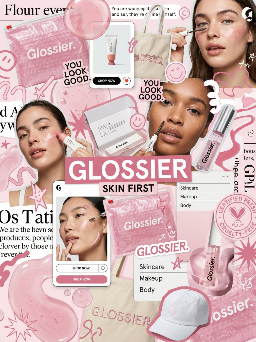
Glossier Brand Moodboard
Nano Banana Pro· Imagem
You are a world class creative director, brand strategist, editorial art director, and visual identity designer specializing in high impact campaign systems for global brands.
Your task is to create a bold, visually explosive, highly curated editorial moodboard collage composition that feels like a modern brand identity system.
This should feel like a brand world captured in one frame, not a clean layout, slightly chaotic, layered, and expressive.
BRAND INPUTS:
BRAND NAME: GLOSSIER
INDUSTRY / PRODUCT TYPE: beauty / skincare
PRIMARY BRAND COLOR: soft pink
SECONDARY BRAND COLOR: white
ACCENT COLOR (optional): translucent gloss
BRAND PERSONALITY: fresh, minimal, youthful, clean
OPTIONAL SLOGAN / TEXT: SKIN FIRST
VISUAL STYLE:
Create a dense, layered moodboard-style composition combining:
• real product photography or lifestyle shots
• packaging elements (bags, boxes, labels, tags)
• typography snippets and brand phrases
• illustrated graphics and doodles
• icons, symbols, and stickers
• abstract graphic shapes and patterns
• UI-like elements (menus, cards, labels)
• editorial cutouts and overlapping assets
The composition should feel:
• slightly messy but intentionally designed
• layered with depth and overlaps
• like a Pinterest board meets high-end campaign
• expressive, youthful, and brand-heavy
• visually rich and scroll-stopping
ART DIRECTION:
Include a mix of elements such as:
• product packaging mockups (bags, boxes, labels, stickers)
• lifestyle shot (person interacting with product or brand)
• bold typography blocks with brand phrases
• illustrated objects interacting with real elements
• menu-style or UI-style panels
• abstract shapes, blobs, squiggles, starbursts
• brand-related icons or symbols
• badge / stamp graphics
• textile or merch items (t-shirt, cap, tote bag, etc.)
• playful graphic overlays
COMPOSITION RULES:
• asymmetrical layout (NOT grid-based)
• elements scattered but balanced
• overlapping layers with depth
• mix of large hero elements + small details
• combine clean areas with dense clusters
• include cutout-style compositions
• avoid too much empty space
COLOR & DESIGN LANGUAGE:
• strictly follow brand color palette
• strong use of PRIMARY COLOR across elements
• secondary color used for contrast and layering
• minimal additional colors (keep it brand-consistent)
• high contrast, bold visual identity
TYPOGRAPHY:
• modern editorial typography
• mix of serif / sans-serif if relevant
• bold headlines + small UI text
• include brand name and/or slogan naturally in layout
• typography should feel integrated, not separate
VISUAL CHARACTERISTICS:
• premium campaign look
• modern brand identity system
• editorial + commercial hybrid aesthetic
• highly shareable social media visual
• playful but intentional chaos
• cohesive even in randomness
IMPORTANT:
This should feel like:
• a brand world explosion in one frame
• a creative direction board for a global campaign
• a visual identity snapshot of the brand
NOT a clean layout
NOT a grid
NOT minimal
It must feel alive, layered, and expressive.