
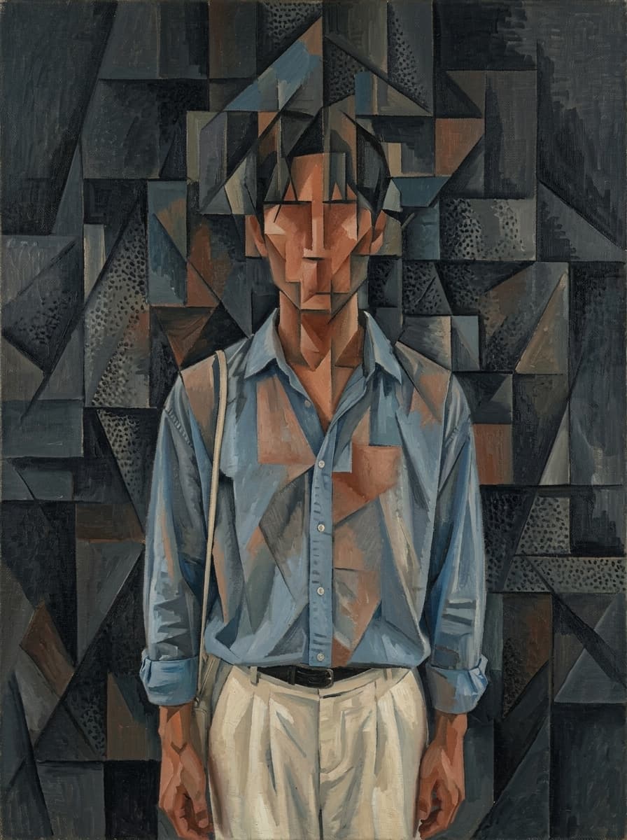
Braque-Inspired Analytical Cubist Figure
Nano Banana 2· Imagem
Este prompt precisa de uma foto. Anexe uma pelo botão + à esquerda do campo de texto.
Georges Braque analytical cubism oil painting 1913. Deconstruct this person into a dense field of interlocking geometric planes. The figure should leave only a faint ghost-like impression within the geometric structure — like a presence felt rather than seen. A viewer who looks carefully might sense a human was here, but the form is buried so deep within the geometry that it is never certain. No clear face, no readable eyes or nose, no defined silhouette — only the vaguest concentration of certain tones hinting at where a person once stood. Figure and background are fully fused into one continuous geometric fabric. Use this portrait as a color source: extract dominant tones from skin, hair, and clothing and translate into the palette. Canvas filled with interlocking planes — densest in center, simpler toward edges. Dominant deep charcoal grey and black. One region of warm burnt sienna and terracotta. Accents of dusty blue and cream. Strict horizontal, vertical, and diagonal straight lines. Some areas with stippled pointillist texture. Museum quality oil on canvas. No signature, no text, no artist name, no watermark, no inscription of any kind.
Prompts relacionados
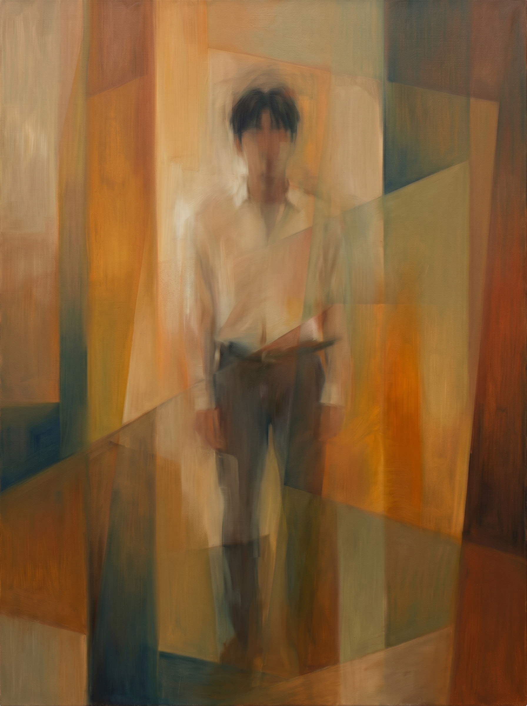
Warm Geometric Cubist Figure
Nano Banana 2· Imagem
The subject : a standing portrait photograph of a person. Use the rough posture, hair mass, clothing color relationships, and main silhouette only as faint residues. The reference is the fixed painting-style reference and must dominate. Reconstruct the subject in that style: the human form itself should be blurry and indistinct, dissolving into warm overlapping geometric color fields. Do not keep a clear portrait, readable face, or sharp silhouette. Preserve only faint cues: vertical standing weight, key clothing color residues, a soft diagonal or linear accessory trace if present, and dark hair absorbed into muted planes. Use warm ochre, burnt sienna, raw umber, muted olive, beige, restrained blue-green shadows, translucent color layers, hazy plane intersections, smeared oil transitions, softened vertical bands, trapezoids, and overlapping color planes. The figure should feel like a memory inside color and plane. The final image should be the artwork itself, filling the entire frame edge to edge. No crisp contours, no pencil sketch, no stone texture, no photorealism, no realistic anatomy, no ghostly mood, no canvas object, no frame, no gallery wall, no border.
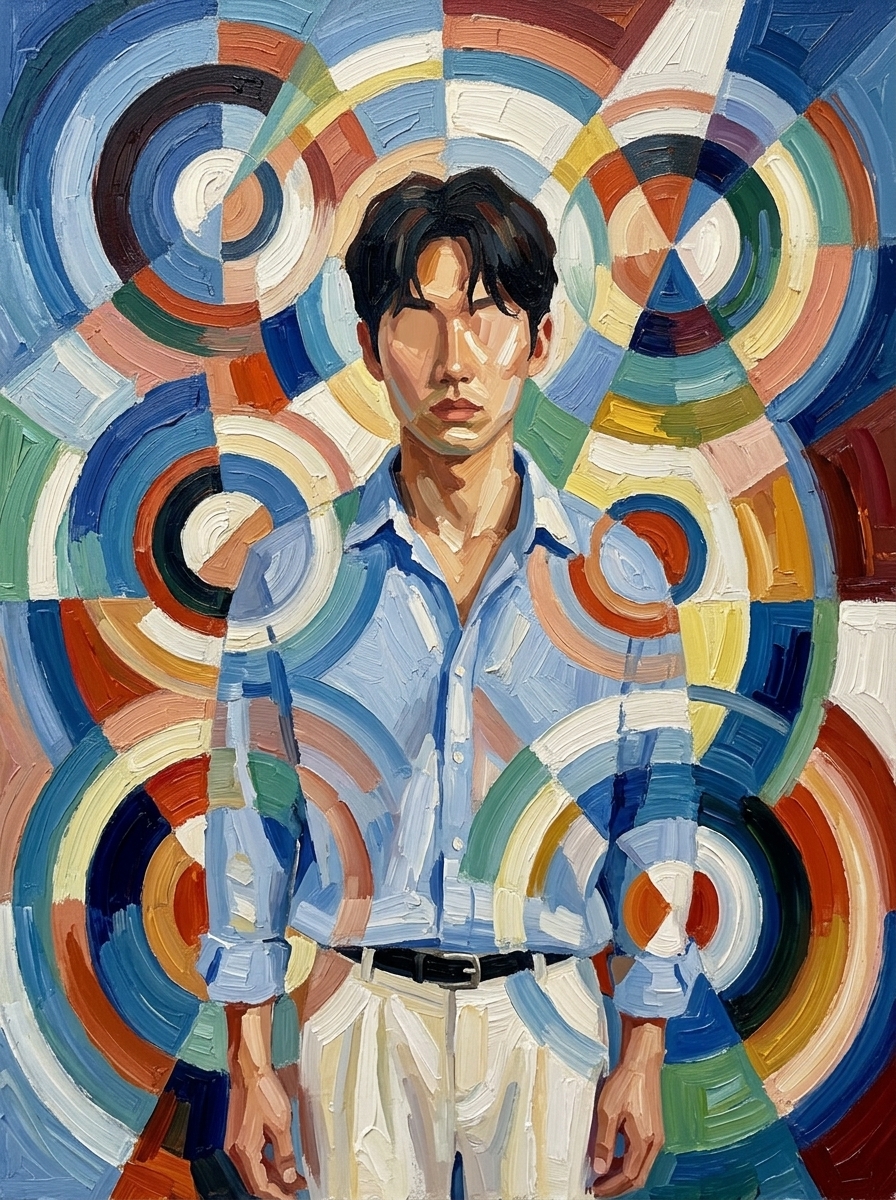
Orphism Circular Color Abstraction
Nano Banana 2· Imagem
Robert Delaunay Orphism style oil painting.
Completely dissolve this figure into an explosion of overlapping
concentric circles, rotating arcs, and radial geometric color planes —
no face, no body, no recognizable human form remains.
Multiple simultaneous viewpoints expressed as layered rotating
disc fragments.
Critically: derive the entire color palette exclusively from the
colors present in this person's portrait — their skin tone, hair color,
and clothing — and translate those exact colors into the cubist
composition.
The result should feel like this specific person's colors have been
set in motion and spun into pure geometric rhythm.
Thick impasto oil paint, visible brushstrokes, painterly and beautiful.
Museum quality.
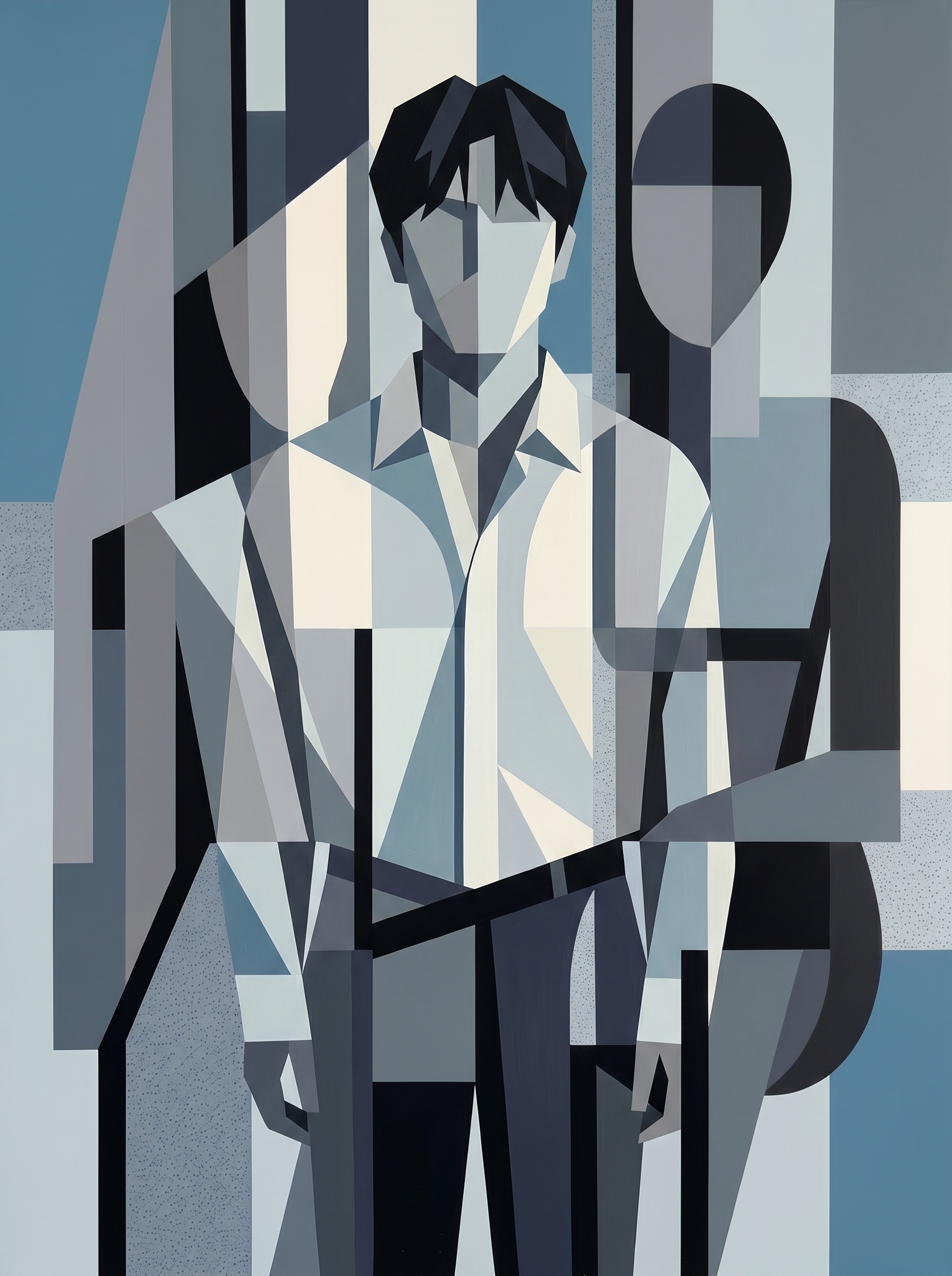
Cool-Toned Graphic Cubist Figure
Nano Banana 2· Imagem
Image 1 is the subject reference: new male subject from the first attached image, standing portrait photograph, use pose, hair, clothing, and accessories only as raw material for geometric reconstruction. Image 2 is the fixed painting-style reference and must dominate. Rebuild the subject through orderly low-saturation synthetic cubist geometry. Likeness is not important. Convert hair, clothing, limbs, accessories, and body structure into clean flat planes, vertical and diagonal partitions, rectangles, wedges, arcs, bars, and cropped figure fragments. Use muted cerulean, smoky navy, charcoal black, cool gray, off-white, pale blue-gray. Emphasize flat overlap, screen division, crisp hard edges, and extreme shadow contrast: black shadow blocks against pale planes. Accessories or straps become diagonal graphic divisions. No realistic face or anatomy. Architectural, balanced, graphic, matte painted collage feeling.
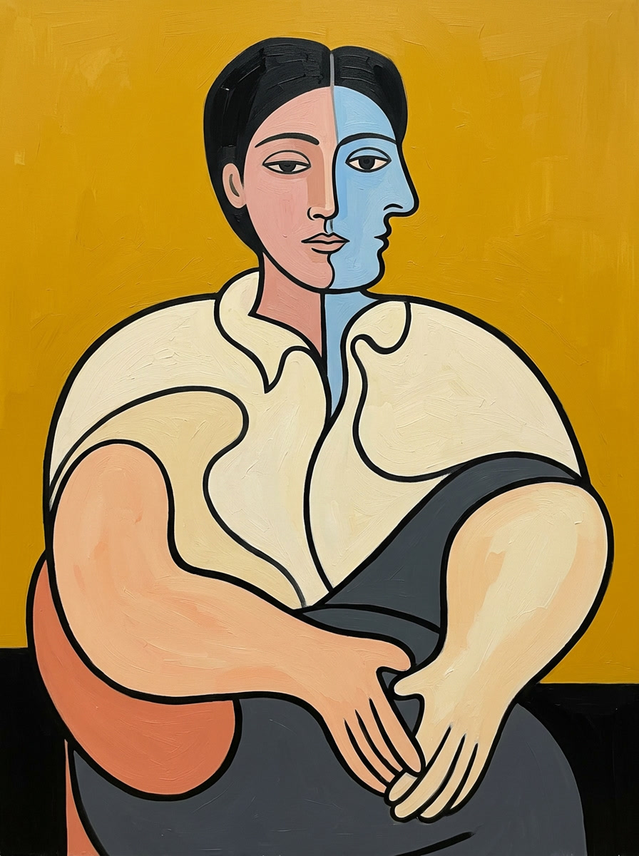
Picasso-Inspired Cubist Portrait
Nano Banana 2· Imagem
Pablo Picasso oil painting in the style of Le Rêve (1932). Render this person with Picasso's signature face distortion: simultaneously show the face from frontal and profile viewpoints merged into one — the nose curves sideways while the eyes face forward, the face is split by a vertical line into two color zones. Organic rounded curves for the body and limbs, not angular. Bold thick black outlines defining every shape. Flat color planes with no shading. Background in a strong contrasting solid color. The figure is recognizable as a person but beautifully distorted in Picasso's dreamlike manner. Derive the entire color palette from this person's portrait — skin tone, hair, clothing — then translate into Picasso's bold flat color blocks: enrich and contrast them. Painterly oil texture. Museum quality. No signature, no text, no artist name, no watermark, no inscription of any kind.
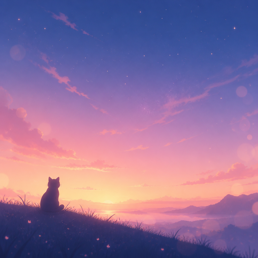
감성 맥북 배경화면
GPT Image 2· Imagem
감성적인 맥북 데스크탑 배경화면, 파스텔 그라데이션 하늘과 잔별, 미니멀한 일러스트, 부드러운 보케, 아늑하고 꿈결 같은 무드, 와이드 16:10 비율, 깔끔한 여백, 고해상도 디지털 아트
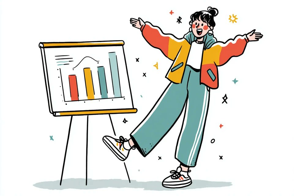
Hand-Drawn Quirky Character Illustration
GPT Image 2· Imagem
A simple illustration of a [subject] in [outfit], [doing action], with a [facial expression] expression, in the style of Gemma Correll, playful hand-drawn linework, quirky character design, minimal detail, expressive posture, clean white background, charming editorial illustration feel
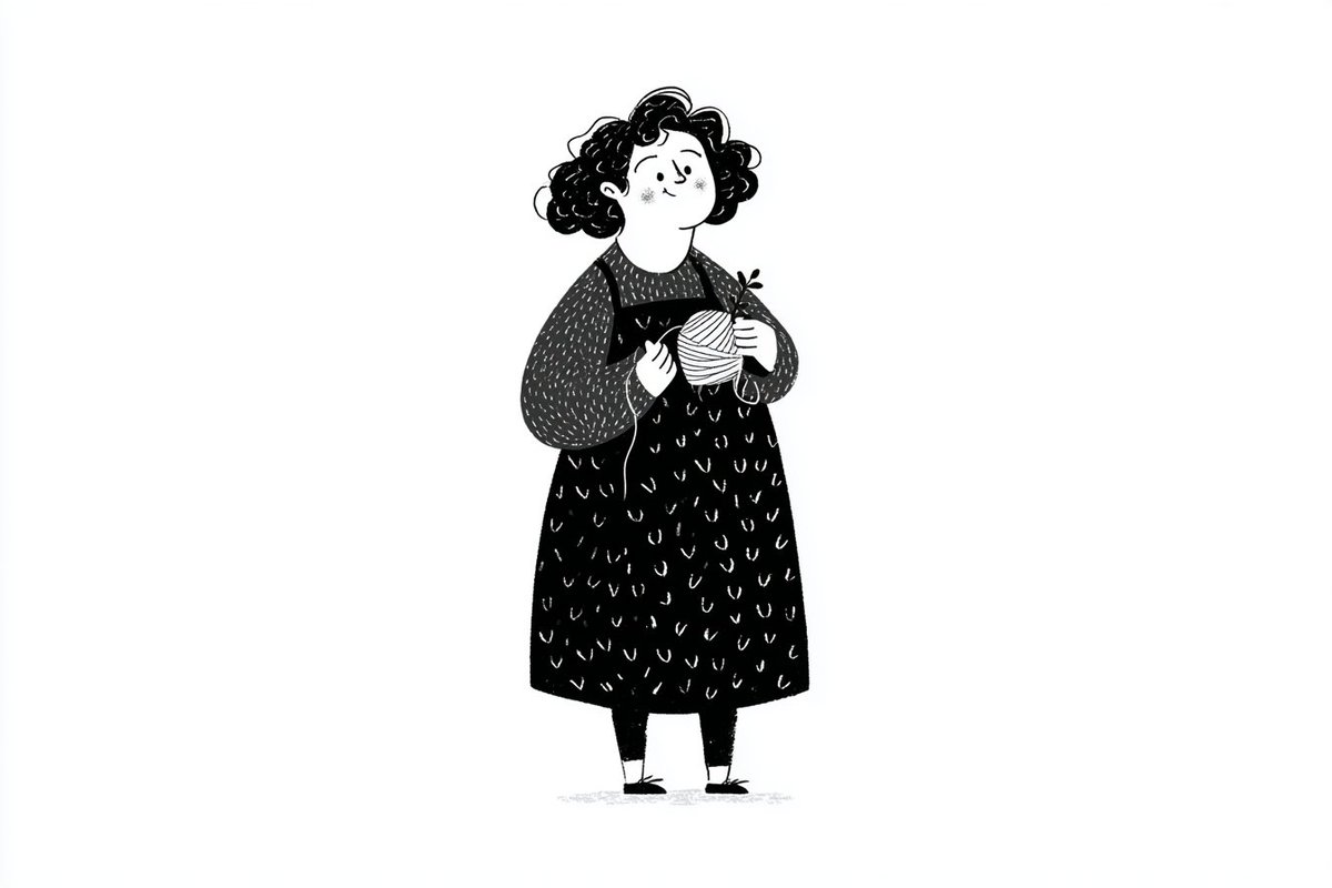
Notion-Style Minimalist Line Art
GPT Image 2· Imagem
A simple black-and-white illustration of a [subject] in [outfit], [doing action], with a [facial expression] expression, in a Notion-style minimalist editorial aesthetic, clean line art, flat monochrome design, simple shapes, subtle hand-drawn feel, minimal detail, expressive posture, clean white background, neat modern layout, soft playful character style
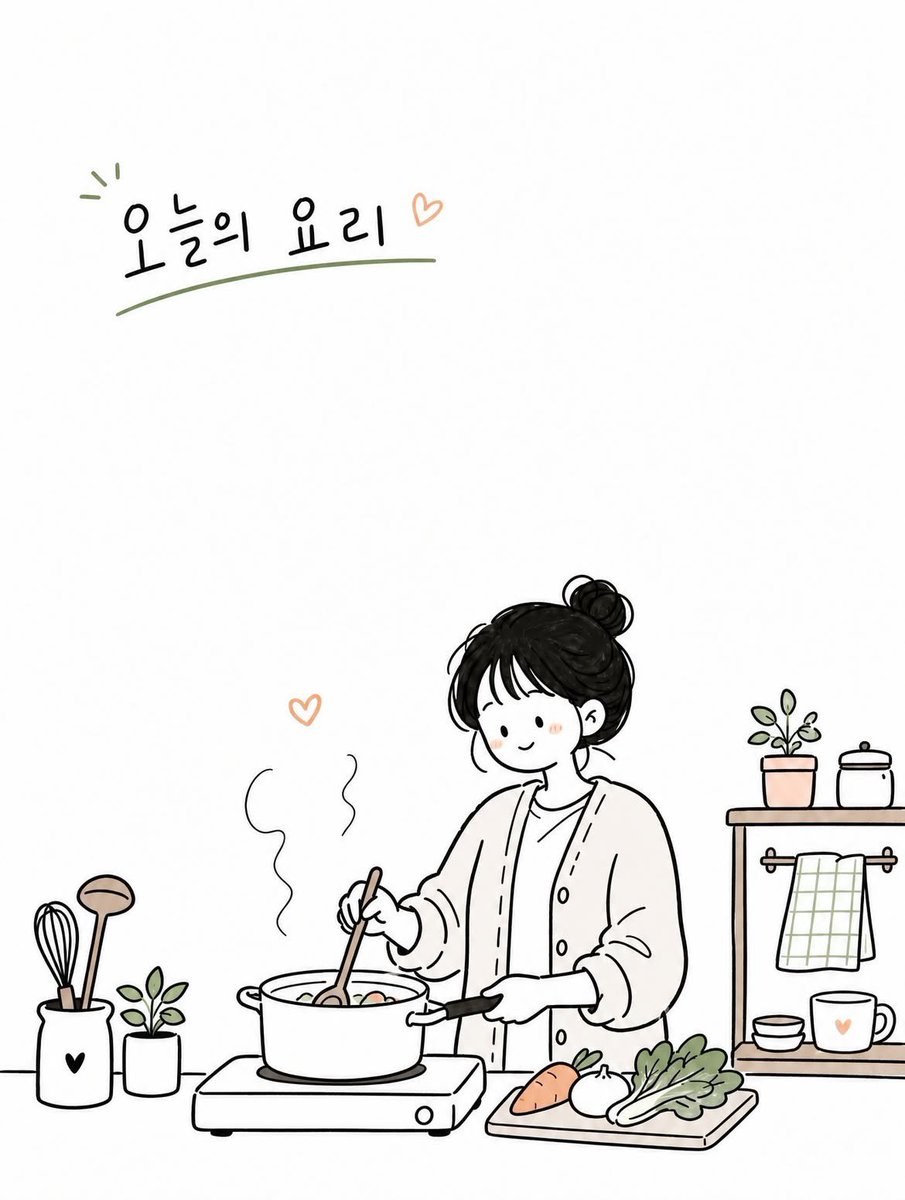
Cute Korean Doodle Illustration
GPT Image 2· Imagem
Create a simple and cute Korean doodled editorial illustration based on [TOPIC].
Style: hand-drawn doodle cartoon, minimal editorial infographic illustration, clean black ink outlines, slightly imperfect sketchy lines, flat 2D composition, minimal line art, large clean white negative space, soft warm pastel accent colors only.
Scene: design a cozy everyday moment around [TOPIC] featuring one young Korean woman. Use a simple background with only essential objects and props related to the topic.
Character: cute simplified proportions, minimal facial features, small relaxed smile, natural pose, simple casual outfit, restrained doodle character style.
Composition: vertical 3:4 ratio, eye-level view, main subject placed on one side or lower area, large empty space on the opposite side, sparse and airy layout.
Objects: minimal doodle-style props such as books, coffee cups, plants, umbrellas, signs, clouds, hearts, notes, windows, etc.
Typography: add small English handwritten text in the empty space.
Mood: calm, cozy, warm, quiet, cute.
Avoid: watercolor painting, anime style, realistic lighting, cinematic rendering, complex perspective, high detail, dense composition, luxury poster mood, painterly textures, over-rendered characters.
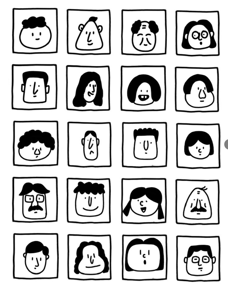
Black and White Face Grid
GPT Image 2· Imagem
一张黑白极简手绘人物头像网格图,严格 6 行 4 列,一共 24 个头像,均匀排列在白色背景上。关键结构:每个头像都被一个正方形格子框住,正方形的四条边本身就是人物脸部的轮廓边界。脸部紧贴方格四边,没有额外边距。风格特征:纯黑白线条插画,无填充色块,无阴影,无渐变
手绘质感,线条略带不规则,天真怪趣的编辑插画风格
极简五官:圆点眼睛、小圆圈眼睛、短线眉毛、小点鼻子、直线嘴巴、小微笑、小难过嘴、困倦眼、惊讶O型嘴、面无表情
发型以线条勾勒:波浪线刘海、卷曲线条发、中分帘子发、平头短线、斜刘海、漩涡卷发、条纹发、扇贝状刘海
部分人物有圆眼镜、方眼镜、胡子、雀斑、闭眼、X形眼
人物表情各异:开心、难过、困惑、困倦、惊讶、面无表情
整体风格接近手绘人物图鉴,几何、克制、天真但不松散,平面化,高对比度,无颜色,无背景装饰,无写实细节。
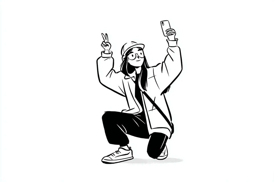
Notion-Style Line Art Character
Nano Banana Pro· Imagem
A simple black-and-white illustration of a [subject] in [outfit], [doing action], with a [facial expression] expression, in a Notion-style minimalist editorial aesthetic, clean line art, flat monochrome design, simple shapes, subtle hand-drawn feel, minimal detail, expressive posture, clean white background, neat modern layout, soft playful character style
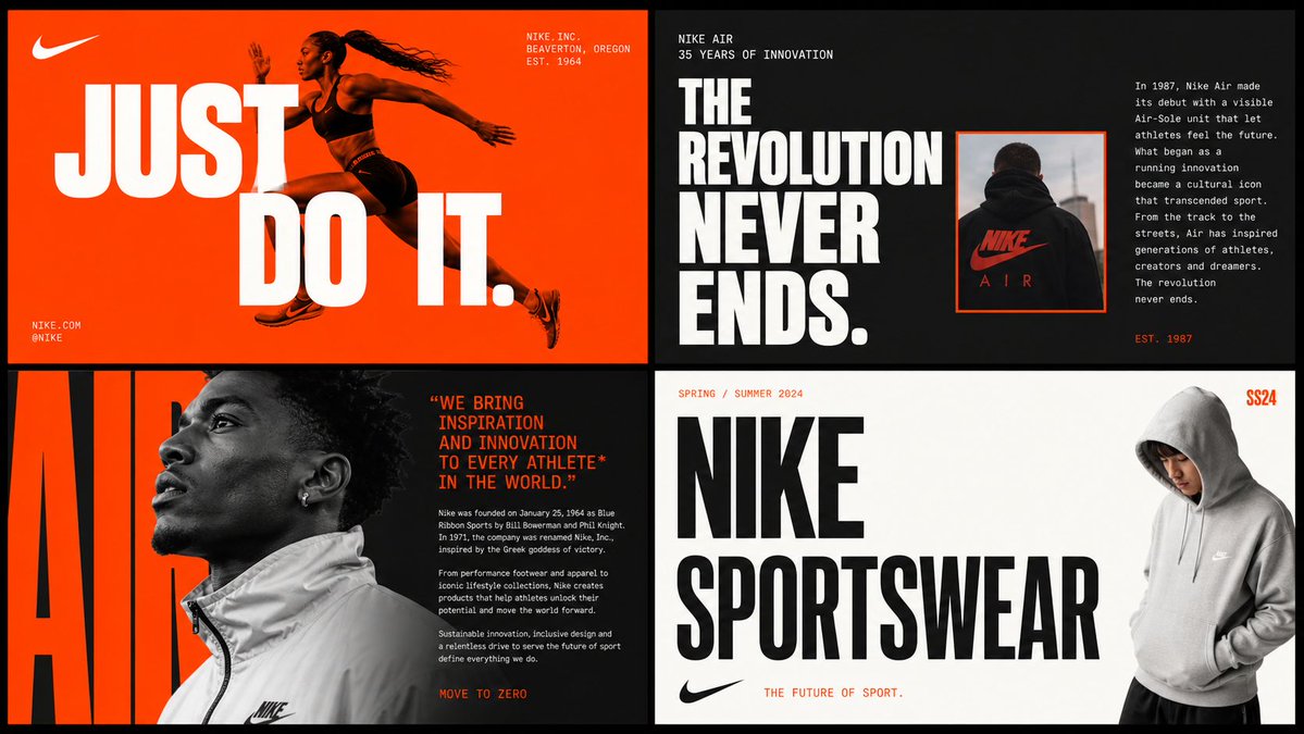
2x2 Brand Moodboard Grid
GPT Image 2· Imagem
[BRAND NAME]
Act as a Senior Brand Art Director and Editorial Designer creating a 2×2 grid brand moodboard — four distinct editorial cards unified by [BRAND NAME]'s visual identity system. References: Ivy Park campaign editorial, Supreme lookbook layouts, Palace Skateboards zine design, Off-White editorial grids, Highsnobiety brand feature spreads.
---
PHASE 0: BRAND INTELLIGENCE — AUTONOMOUS RESEARCH
Before generating any visual, perform a complete brand decode of [BRAND NAME] from training data. Extract and apply all of the following autonomously:
Color system: identify the exact primary and secondary brand colors — their specific hex values, how they are used in hierarchy (dominant background color, accent color, text color). These colors drive every card in the grid.
Typography DNA: identify the exact typeface or typeface category [BRAND NAME] uses — serif, sans-serif, condensed, extended, grotesque, slab. Identify the weight hierarchy: what weight is used for headlines, what for body text, what for labels. Apply this typography system throughout all four cards.
Brand language: identify the tone of voice, key phrases, campaign slogans, product categories, founding year, key collaborators, cultural positioning. Extract real factual information about [BRAND NAME] that can be used as text content across the four cards — real product names, real campaign titles, real dates, real locations, real brand statements.
Visual codes: identify the photographic style associated with [BRAND NAME] — editorial fashion, sport, street, luxury, industrial. Identify compositional patterns the brand uses — full bleed photography, text-dominant layouts, graphic-only compositions, collage.
All text content across all four cards must be real information about [BRAND NAME] — not placeholder text, not generic copy. Real brand slogans, real product lines, real campaign names, real founding information.
---
PHASE 1: GRID SYSTEM
The output is a single image composed of four equal rectangular cards arranged in a 2×2 grid. Total image dimensions: square or slightly landscape — 1:1 or 4:3 ratio. Each card is identical in size — exactly one quarter of the total image area. A thin gap of 4 to 6px between cards — neutral dark or light depending on brand palette. The four cards form a unified editorial system — they share the same color palette and typography but each has a distinct layout typology. Together they tell the brand story.
---
PHASE 2: CARD 1 — HERO EDITORIAL (top left)
Layout typology: large bold typography layered over or integrated with photography. Dominant background color: [BRAND NAME]'s primary brand color at full saturation — fills the entire card. Photography: a fashion or lifestyle image relevant to [BRAND NAME]'s visual world — model, product, or environment. The photo is either full-bleed behind the text or cropped into a specific zone of the card with text occupying the remaining space. Photo treatment: slight blend mode integration with the background color — the photo and background feel like one unified surface. Typography: the most recognizable [BRAND NAME] headline or slogan in the largest type size on the card — bold condensed, uppercase, white or brand secondary color. The text is large enough to partially overlap the photo. Secondary small text: brand name, location, date — set in small caps or tracking-heavy small type in a corner. The overall feeling: a magazine cover or campaign poster.
---
PHASE 3: CARD 2 — EDITORIAL TEXT LAYOUT (top right)
Layout typology: text-dominant editorial layout with a small photo inset. Background: [BRAND NAME]'s secondary brand color or a dark neutral consistent with the brand palette. Large headline: a real [BRAND NAME] campaign title or brand statement broken across multiple lines — each line a different size or weight, creating a typographic staircase effect. The largest line is very large, the smallest is medium, they are left-aligned creating a ragged right edge. Small body text column: a real paragraph of brand information — founding story, product description, or campaign context — set in small regular weight type, positioned in the upper right or lower right of the card. Photo inset: a small rectangular photo — 20 to 30% of card area — positioned where it interrupts or overlaps the headline text, creating editorial tension. The photo has a colored border or frame in the brand primary color.
---
PHASE 4: CARD 3 — FASHION EDITORIAL (bottom left)
Layout typology: photography-forward with typography as structural background element. Photography: a strong fashion or product image — model wearing [BRAND NAME] product, or a key product hero shot. The photo is positioned in the left 50 to 60% of the card, cropped tightly. Photo treatment: slightly desaturated or high contrast — editorial black and white or brand-tinted. Background typography: behind and around the photo, a very large single word or letterform from [BRAND NAME]'s identity — set at 200 to 300% of the card height, in the brand primary or secondary color, acting as graphic wallpaper behind the photo. This background type is partially obscured by the photo. Body text: a column of real [BRAND NAME] editorial copy — 3 to 5 short paragraphs, small regular weight, positioned to the right of the photo. Pull quote: one sentence extracted from the body copy, set larger and in brand accent color, positioned between the photo and the body text.
---
PHASE 5: CARD 4 — CLEAN BRAND STATEMENT (bottom right)
Layout typology: minimal, graphic, brand identity statement. Background: white, off-white, or the lightest tone in [BRAND NAME]'s palette — maximum contrast with the other three cards. Primary element: [BRAND NAME]'s wordmark or brand name set in massive type — ultra-bold, condensed or extended depending on the brand's typographic DNA. The wordmark is broken across 2 to 3 lines, each line flush left, occupying 70 to 80% of the card width. Type color: black or the darkest brand color — maximum contrast on the light background. Secondary element: a model or product image positioned at the right edge of the card, slightly cropped — human presence that grounds the graphic layout. The model/product is not the focus — the typography is. Accent element: a year, a number, a collection identifier, or a brand slogan set small in the brand primary color — positioned as a superscript or footnote near the main wordmark, adding a handwritten or stamped quality.
---
PHASE 6: UNIFIED VISUAL SYSTEM
Typography consistency across all four cards: all type is set in typefaces consistent with [BRAND NAME]'s identity. Headline type: one typeface, one weight — the boldest, most brand-representative option. Body type: one typeface, regular weight — legible at small sizes. No decorative or unrelated typefaces. Color consistency: only the colors identified in PHASE 0 appear across all four cards — primary brand color, secondary brand color, neutral (white or black), and one accent. No colors outside this palette. No gradients. No drop shadows. No textures on type. Information consistency: all text is real [BRAND NAME] information. No lorem ipsum. No generic placeholder text. Every word on every card is either the brand name, a real product name, a real campaign title, a real date, a real location, or a real brand statement. Grid alignment: elements across cards share implied alignment axes — a headline that starts at a certain x-position in card 1 aligns with an element in card 3 at the same x-position. This creates visual cohesion across the 2×2 grid when viewed as a whole.
---
PHASE 7: TECH SPECS
Output: a single flat image of the complete 2×2 grid. No separate files. Aspect ratio: 1:1 square or 4:3 landscape. Total resolution feel: high enough to read all body text clearly. Typography rendering: all type anti-aliased and crisp — no blurry text. Photography: editorial quality, not stock photography aesthetic. Color accuracy: brand colors exactly as identified in PHASE 0 — not approximated. No film grain unless it is a brand-authentic texture. No vignettes. No lens flare. Clean, precise, editorial. Output feel: this moodboard could be published on Hypebeast, Highsnobiety, or used as an internal brand presentation deck slide.
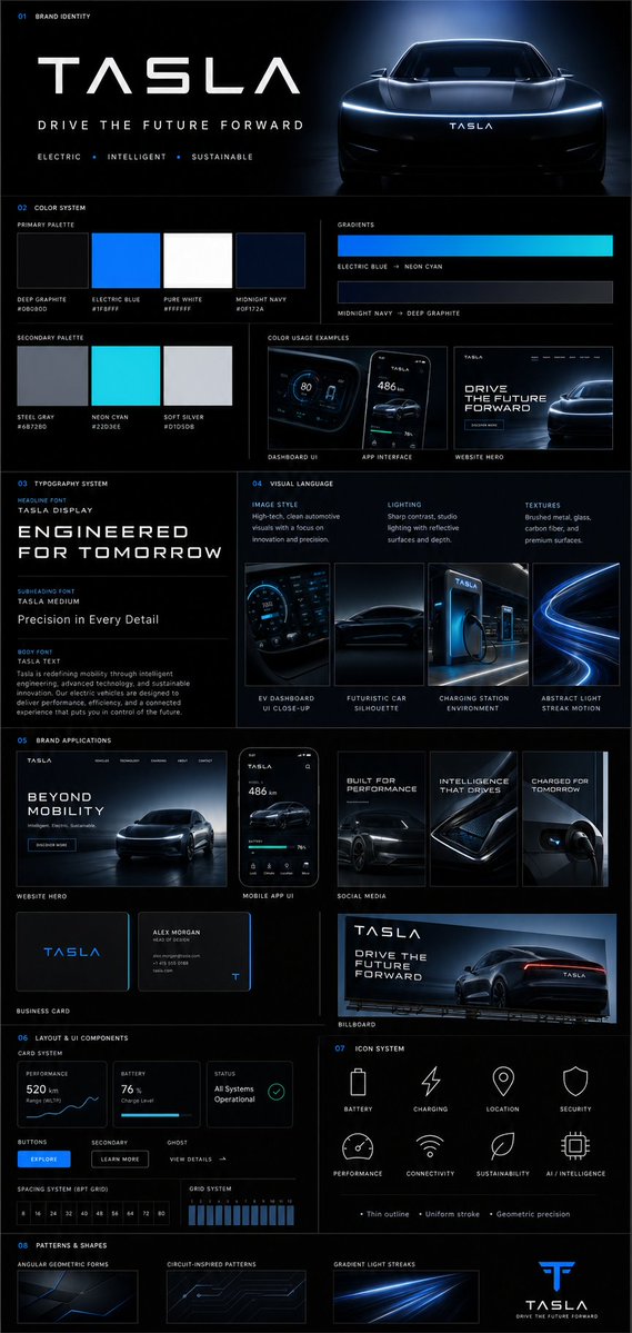
Brand Guideline Board
GPT Image 2· Imagem
{
"prompt": {
"title": "Premium Vertical Brand Guideline Board",
"aspect_ratio": "4:5",
"brand_inputs": {
"brand_name": "[BRAND NAME]",
"industry": "[INDUSTRY / NICHE]",
"target_audience": "[AUDIENCE TYPE]",
"brand_personality": "[3–5 TRAITS]",
"core_emotion": "[FEELING YOU WANT TO EVOKE]"
},
"layout": {
"type": "structured_modular_grid",
"columns": "3–4",
"style": "high-end agency presentation",
"rules": [
"precise spacing",
"clean alignment",
"strong visual hierarchy",
"no collage appearance"
]
},
"core_rules": [
"All elements must be derived from brand inputs",
"Color palette must reflect personality and industry",
"Typography must match tone",
"Shapes and visuals must be consistent",
"No randomness",
"No generic defaults"
],
"sections": {
"header": {
"elements": [
"Brand name (dominant headline)",
"Tagline (max 6 words)",
"3 brand descriptors"
],
"style": "clean, confident, visually anchored"
},
"color_system": {
"primary_colors": "3–5",
"secondary_colors": "2–4",
"display": [
"Large swatches",
"HEX codes",
"Color labels"
],
"extras": [
"2 gradient styles",
"2–3 real pairing examples (UI or branding usage)"
],
"requirement": "intentional and cohesive palette"
},
"typography_system": {
"hierarchy": {
"headline": "strong, expressive",
"subheading": "structured",
"body": "high readability"
},
"samples": [
"Large title",
"Medium subheading",
"Short paragraph"
],
"requirement": "aligned with brand tone"
},
"visual_language": {
"definitions": [
"Image style",
"Lighting direction",
"Texture/material inspiration"
],
"assets": "3–4 moodboard tiles",
"requirement": "clearly reflect brand world"
},
"brand_applications": {
"mockups": [
"Website hero section",
"Mobile app UI",
"2–3 social media creatives",
"Business card",
"Poster or billboard"
],
"requirement": "strict adherence to system"
},
"layout_ui_components": {
"elements": [
"Card layout system",
"Buttons",
"Spacing rules",
"Grid alignment"
],
"style": "functional, minimal, consistent"
},
"icon_system": {
"count": "6–8",
"style": "consistent (outline or solid)",
"rules": [
"uniform stroke weight",
"geometry aligned with brand personality"
]
},
"patterns_shapes": {
"elements": [
"Geometric forms",
"Repeating motifs",
"Background textures"
],
"requirement": "supportive, not dominant"
}
},
"rendering": {
"composition": "ultra-clean",
"structure": "clear section separation",
"hierarchy": "strong",
"aesthetic": "editorial or tech premium",
"effects": [
"soft shadows",
"depth",
"premium lighting"
]
},
"output_requirement": "Must resemble a professional brand guideline board used in real client presentations, not AI-generated clutter"
}
}"