carat

Prompt Gallery

/

트위터 헤더

Login
Sign Up

트위터 헤더

트위터 헤더 프롬프트로 X(Twitter) 프로필 배너, 헤더 이미지, 커버 이미지를 AI로 생성하세요. 개인 브랜딩, 기업 계정, SNS 마케팅에 활용 가능합니다.

2026.08.17

·
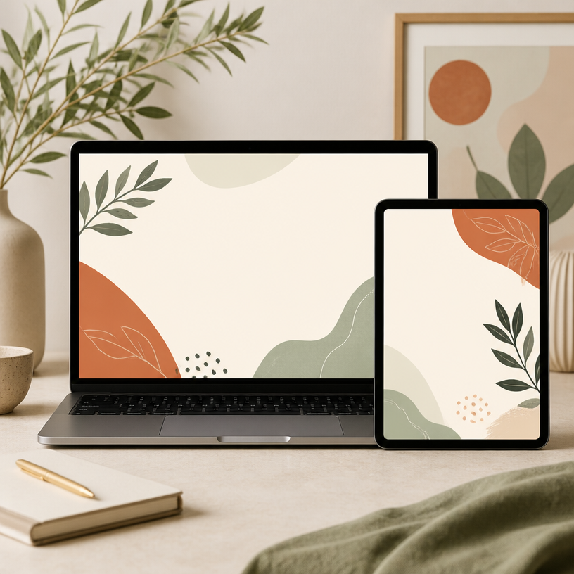
GPT 이미지 2로 생성한 앱 브랜딩 그라데이션 일러스트

앱 브랜딩 그라데이션 일러스트

GPT 이미지 2· Image
Soft gradient illustration of [SUBJECT], smooth geometric forms, muted color palette, white minimal background, modern app branding style, premium digital art aesthetic.
@aleenaamiir
GPT 이미지 2로 생성한 네이버 GFA 배너

네이버 GFA 배너

GPT 이미지 2· Image
Square digital advertising banner mockup for a Korean mobile display ad campaign, polished blue and white layout with a fictional lifestyle product, clear visual hierarchy, decorative placeholder shapes instead of readable text, modern commercial graphic design, no real brand logos, no watermark.
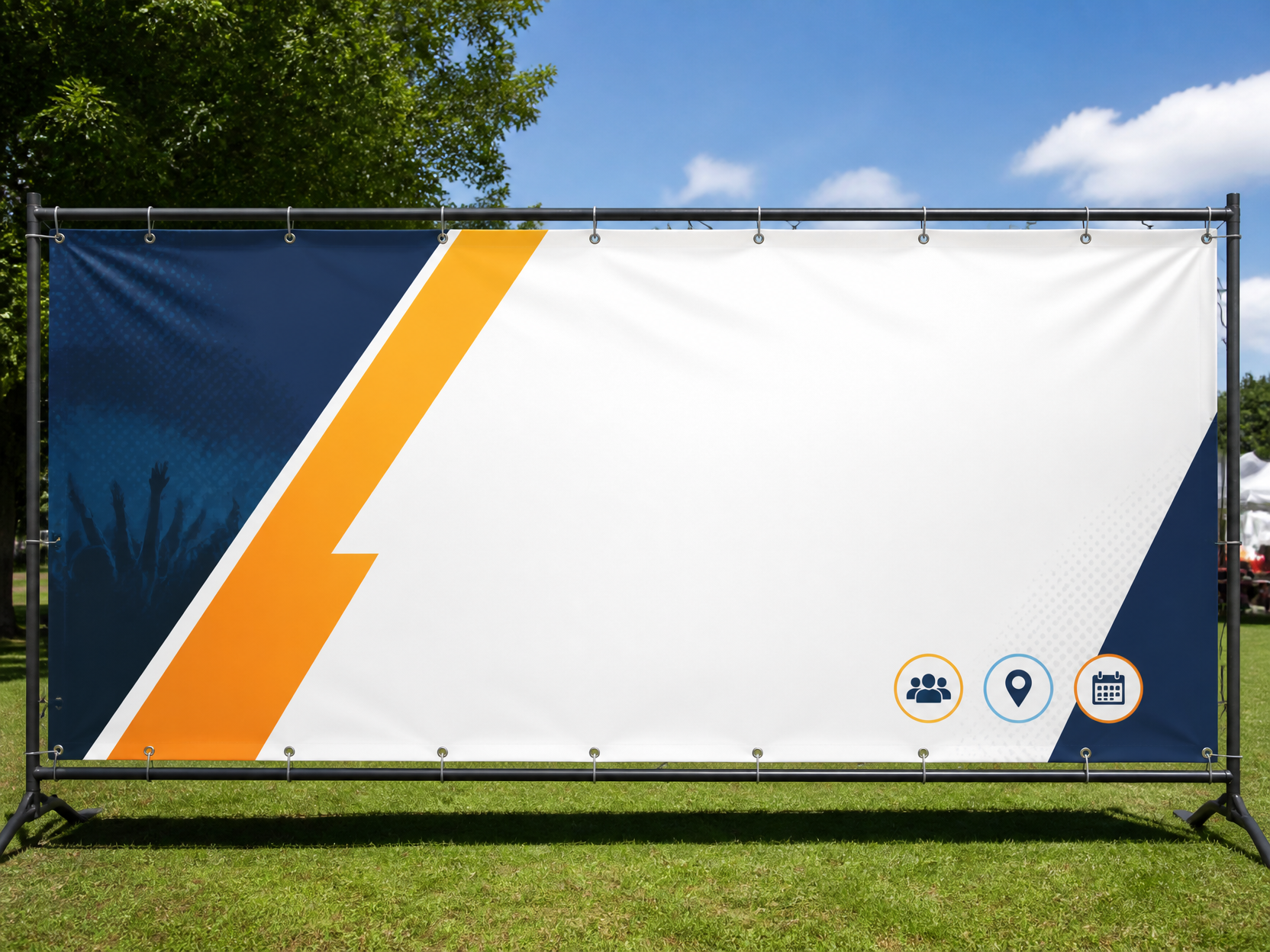
GPT 이미지 2로 생성한 X배너 디자인

X배너 디자인

GPT 이미지 2· Image
매장과 박람회용 세로형 X배너 디자인. 상단 헤드라인, 중앙 핵심 비주얼, 혜택 정보, 하단 연락처와 QR 영역을 구분한 실무 레이아웃. 펼쳐진 X배너 스탠드 목업과 평면 시안을 함께 표현. clean commercial template design, product-friendly layout, clear content blocks, modern Korean design sensibility. three-quarter view with clear silhouette and subtle depth. muted neutral palette with a vivid focal color. Make the subject immediately recognizable at thumbnail size. Use clean composition, purposeful details, and no watermark. Keep the layout organized, readable, and purposeful; avoid clutter and illegible typography.
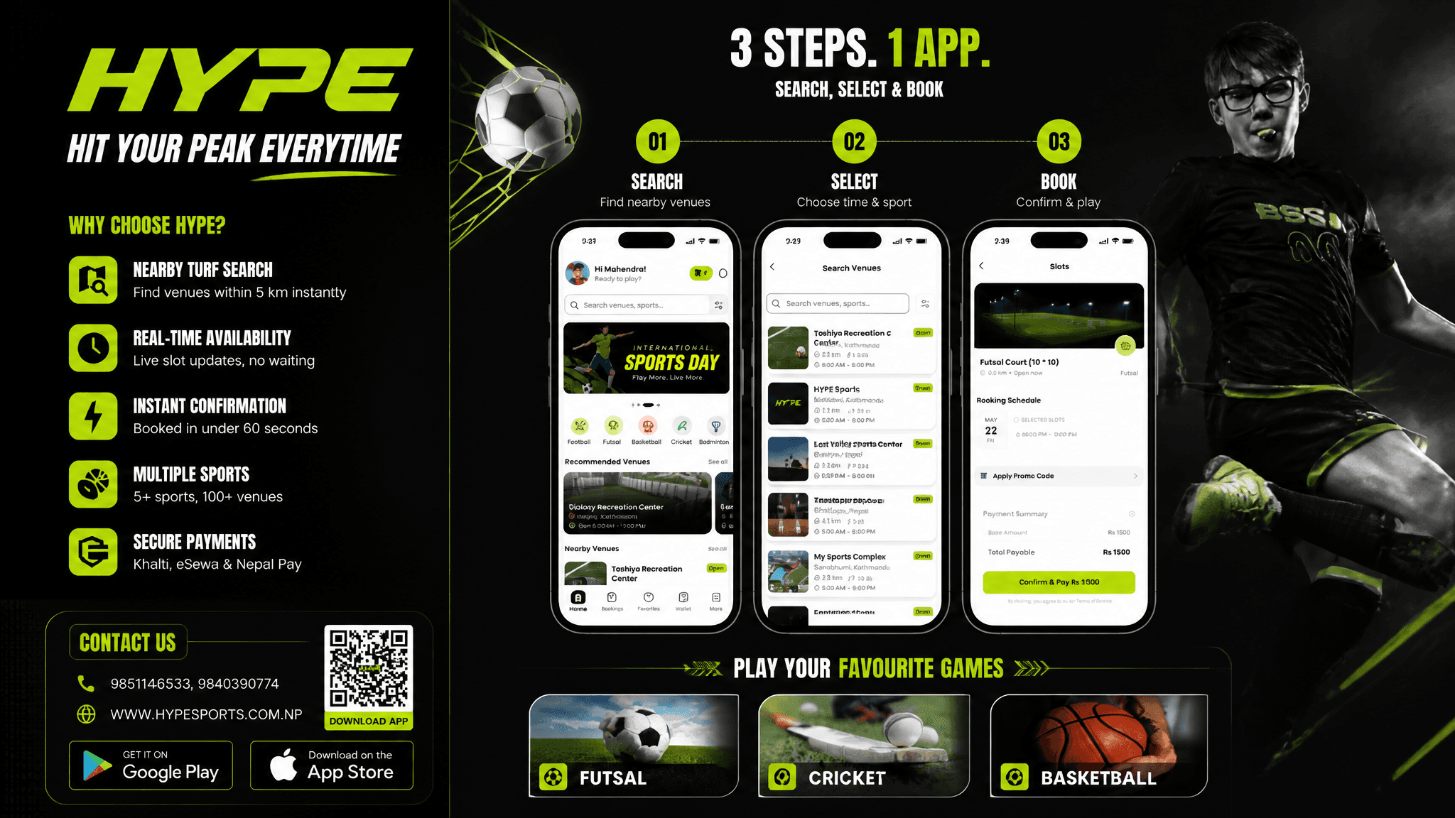
GPT 이미지 2로 생성한 스포츠 예약앱 플렉스 배너

스포츠 예약앱 플렉스 배너

GPT 이미지 2· Image
Based on the given layout Recommended Layout Structure (3ft × 5ft) horizontal flex banner. Overall Grid Use a 2-column layout:Left Column → Branding + Benefits + ContactRight Column → App Flow + Sports Icons Visual Hierarchy LEFT SIDE (40%)Logo Area Top-left large rectangle.Height: ~28%Keep lots of whitespaceUse bold premium typographyAdd tagline if needed Example:HYPE Book Your Sport Instantly Benefits Box Middle-left large box. Use 3–5 short benefit points:✓ Easy Booking ✓ Nearby Turf Search ✓ Instant Confirmation ✓ Multiple Sports Use icons beside each point. 3. Contact Strip Bottom-left horizontal strip. Include:PhoneWebsiteQR code (optional) Example:Call: +91 XXXXX XXXXX www.hypeplay.com RIGHT SIDE (60%) Mobile Screens Section Instead of plain rectangles, show actual mobile mockups. Use 3 phone cards: Screen 1 — SearchTurf listingMapSearch bar Screen 2 — SelectVenue detailsTime slots Screen 3 — BookPayment successConfirmation UI Sports Circles Section Instead of empty circles: Use:FootballCricketBadmintonBasketballTennis Add:Sport icon/photoSmall label below Example arrangement: ⚽ 🏀 🏏 Make circles slightly overlapping for modern look. Better Composition Your current sketch feels very boxed. Modern flex banners use:Consistent paddingLarger imageryFewer bordersStrong contrast Instead of outlines everywhere:Use background color blocksSoft shadowsMinimal separators mportant Design Improvements Avoid: Too many borders Centered italic text Uneven spacing Different box sizes without alignment Use: 24px consistent spacing Alignment grid Real app screenshots High contrast headings Best Layout Ratio Section Width Left Info Panel 35–40% Right Visual Panel 60–65% This creates better balance. Printing Tips For a 3ft × 5ft flex: Design in: 150 DPI minimum CMYK colors Keep text inside safe margin Avoid very thin fonts Extra Premium Touch Add: QR code → “Download App” App Store / Play Store badges Small stadium texture background Dynamic diagonal shapes behind screenshots That will make it feel like a real startup campaign banner instead of a simple poster. Logo colors: #c9fb07 , #0a0a0a
DIVINE MAHENDRA
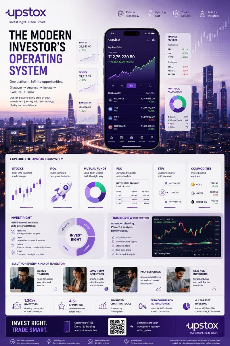
GPT 이미지 2로 생성한 핀테크 투자 인포그래픽 포스터

핀테크 투자 인포그래픽 포스터

GPT 이미지 2· Image
TOPIC: UPSTOX Create an ultra-premium vertical SMM infographic poster for Upstox, designed as a next-generation fintech editorial infographic focused on high-performance investing, intelligent execution, and modern wealth creation. The final design should feel like a fusion of: - Apple Pro Display aesthetics - TradingView interface design - Bloomberg editorial systems - Formula 1 telemetry dashboards - modern Indian investing culture - premium startup branding The design should visually communicate: "INVEST RIGHT. TRADE SMART." CORE CONCEPT: "THE MODERN INVESTOR'S OPERATING SYSTEM" The entire composition should visualize Upstox as the central financial platform powering every stage of investing. The visual narrative should show: DISCOVERY → ANALYSIS → INVESTMENT → EXECUTION → GROWTH Instead of showing random charts and holograms, show a highly structured financial workflow. Everything should feel: - fast - clean - capable - intelligent - efficient - trustworthy NOT chaotic. LAYOUT STYLE: Create a premium modular fintech editorial layout. Use: - floating investment modules - elegant information architecture - structured dashboard systems - large whitespace - asymmetrical composition - premium visual hierarchy The layout should resemble: a luxury financial operating system expanded into a collectible infographic poster. HERO VISUAL: Large central Upstox mobile ecosystem. NOT just a phone mockup. Instead: Create a layered financial command center. At center: large Upstox mobile interface surrounded by: - portfolio systems - investment cards - watchlists - market movers - growth indicators Everything connected through: clean directional pathways representing: the investing journey. BACKGROUND ENVIRONMENT: Beautiful Mumbai financial district atmosphere. Blue-hour cityscape. Subtle references to: - BKC - NSE energy - Indian capital markets Use: soft financial grid overlays thin trajectory lines minimal market architecture NO hologram overload. UPSTOX ECOSYSTEM MODULES: Create premium information cards: STOCKS Real-time investing Visual: clean chart interface IPOs Invest in India's next growth stories Visual: launch trajectory card MUTUAL FUNDS Long-term wealth building Visual: circular diversified portfolio system F&O Advanced trading Visual: structured options matrix ETFs Smart passive investing Visual: connected allocation system COMMODITIES Gold, energy, multi-asset exposure Visual: minimal commodity dashboard THE INVEST RIGHT SYSTEM Large premium section: INVEST RIGHT Visualize: - research - education - decision-making - portfolio building Show: investment clarity NOT gambling energy. TRADINGVIEW POWER MODULE Premium feature card: TradingView Integration Visual: - advanced charting - indicators - drawing tools - market analysis Use sophisticated chart aesthetics. MODERN INVESTOR SECTION Show: young Indian professionals builders creators investors market participants Use: realistic premium lifestyle photography NOT smiling stock-photo energy. The people should feel: ambitious, focused, future-oriented. QUICK STATS SYSTEM Elegant floating metric cards: 1.3Cr+ Investors 4.5+ App Rating Advanced Charting Tools Zero Commission Mutual Funds Multi-Asset Investing Present as: Apple-style information modules NOT corporate blocks. VISUAL KNOWLEDGE ELEMENTS Include: - portfolio allocation wheels - watchlists - market heatmaps - clean candlestick systems - growth trajectories - SIP growth curves - investment timelines - execution indicators Everything should feel: premium, minimal, professional. TYPOGRAPHY SYSTEM Use: large editorial sans-serif strong hierarchy minimal labels clean spacing Typography should resemble: Apple TradingView Stripe Bloomberg Weekend Avoid: techno fonts startup clichés crypto aesthetics COLOR SYSTEM Use actual Upstox-inspired identity: Primary: Deep Upstox Purple
@Diplomeme
GPT 이미지 2로 생성한 뉴스레터 헤더

뉴스레터 헤더

GPT 이미지 2· Image
Square newsletter header artwork with an open envelope releasing layered paper sheets, stars and idea sparks, navy, yellow and coral palette, contemporary publication design. No readable text, no logo, no watermark.

트위터 헤더란?

트위터 헤더는 X(Twitter) 프로필 상단에 표시되는 가로형 배너 이미지입니다. 프로필 사진과 함께 계정의 첫인상을 결정하며, 개인 브랜딩, 기업 홍보, 콘텐츠 홍보, 이벤트 안내 등 다양한 목적으로 활용됩니다. AI로 생성하면 그라데이션, 미니멀, 일러스트, 타이포그래피 등 다양한 스타일의 헤더를 빠르게 제작할 수 있어 개인 사용자와 기업 마케팅에 널리 활용됩니다.

주요 활용 장면

  • 개인 트위터 계정 브랜딩
  • 기업 공식 계정 헤더 이미지
  • 이벤트, 캠페인 홍보 배너
  • 크리에이터, 인플루언서 프로필 커버
  • SNS 마케팅 소재 제작

이 태그가 유용한 이유

트위터 헤더는 계정 방문자에게 전달하는 첫인상입니다. 시선을 끄는 헤더 이미지는 팔로워 전환율과 체류 시간에 직접적 영향을 미칩니다. AI로 생성하면 그라데이션, 미니멀, 일러스트, 타이포그래피 등 다양한 스타일을 빠르게 테스트할 수 있어 초기 컨셉 단계에서 매우 유용합니다. 디자이너 없이도 감각적인 헤더를 만들 수 있어 비용과 시간을 크게 절약할 수 있습니다.

관련 프롬프트 더 보기

  • 배너
  • 블로그 배너
  • 썸네일 디자인
  • 로고
  • 브랜드 이미지

전환 보완 포인트

가로형 배너는 비율 실수로 다시 만드는 경우가 많습니다. 텍스트 위치와 여백 규칙을 페이지 상단에 고정 템플릿으로 제시하면 재시도 횟수를 줄일 수 있습니다.

프롬프트 구성 팁

  1. 헤더 스타일을 구체적으로 적습니다. 그라데이션, 미니멀, 일러스트, 타이포그래피 등으로 명시하면 정확한 분위기가 재현됩니다.
  2. 색상을 지정합니다. 브랜드 컬러, 계절 톤, 감성 톤 등을 넣으면 원하는 분위기가 살아납니다.
  3. 구도를 정합니다. 중앙 정렬, 좌측 여백, 우측 포커스 등을 지정하면 텍스트 배치에 유리한 헤더가 만들어집니다.
  4. 용도를 명시하면 개인용, 기업용, 이벤트용 등 목적에 맞는 헤더가 완성됩니다.

Frequently Asked Questions

Related Prompts

블로그

블로그

12 prompts

블로그 배너

블로그 배너

44 prompts

깃발 디자인

깃발 디자인

46 prompts

깃발 일러스트

깃발 일러스트

46 prompts

Carat Prompt Gallery

Create trending AI prompts instantly

Prompts

  • Logo
  • PPT Design
  • Thumbnail
  • Poster
  • Web Novel Cover
  • ID Photo
  • Caricature
  • Product Detail Page
  • Banner

Models

  • GPT Image 2
  • Seedance 2.0
  • NanoBanana Pro
  • NanoBanana 2

Carat

  • Get started
  • About
  • Blog
  • Careers
  • Contact
  • Partnership
  • Terms
  • Privacy

© 2026 Paradot.Inc All rights reserved.