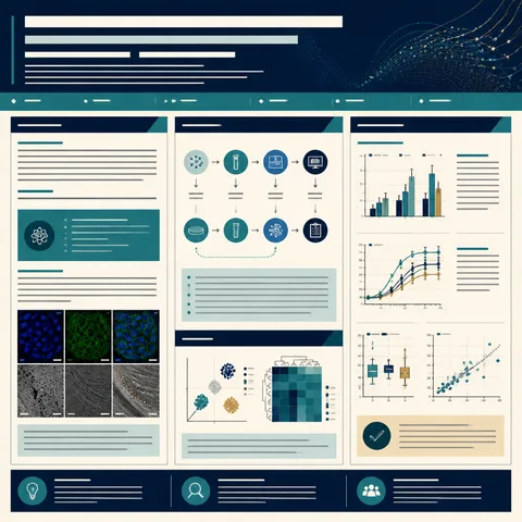
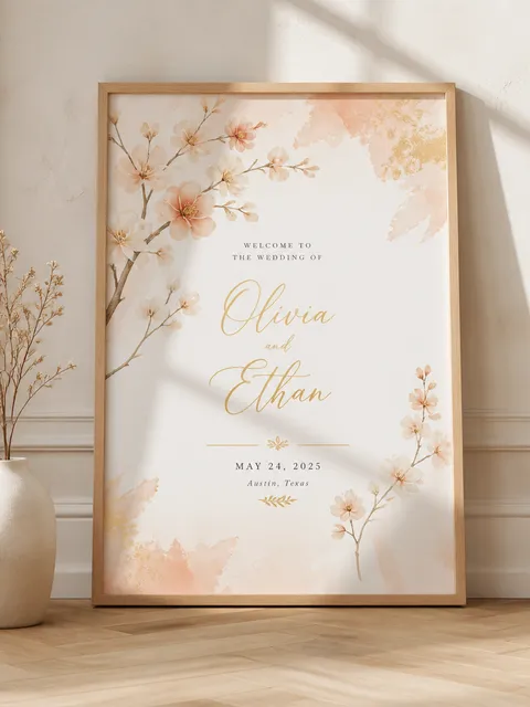
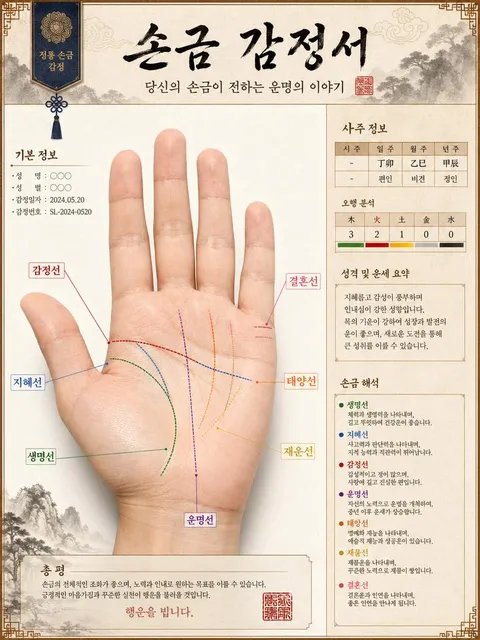
Practical AI prompts and layout guidance for creating a academic poster (research poster).
2026.07.16
Make “Academic Poster (Research Poster)” exactly the way you wantCreate your own “Academic Poster (Research Poster)”
Just ask in plain language — Carat generates optimized images and videos for you.

Start now with 100 free credits daily
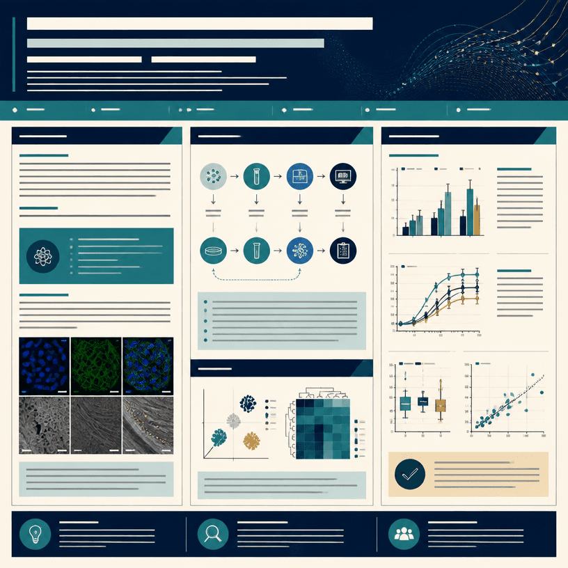
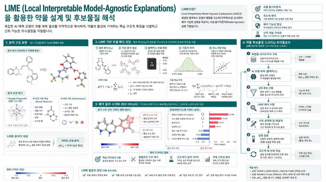
An academic poster helps viewers understand a study in a short visit. It should not merely shrink an entire paper. It should guide the reader through the research question, method, most important result, and interpretation in a clear visual order. At a conference, people see the title from a distance and inspect charts up close, so the hierarchy must work at both distances.
Place the title and affiliation at the top, followed by a concise background and research question. Show methods as a diagram of the sample, procedure, and analysis rather than a dense paragraph. Give the results the largest area, but include only the charts and images that support the main conclusion.
Choose columns and margins according to print size, viewing distance, and orientation. More content does not help if the body text is too small. Keep chart axes, legends, and units close to the data they explain. Use labels or patterns in addition to color so the meaning remains accessible.
Specify the poster ratio, section order, chart locations, visual abstract area, and references zone. Image models may distort exact titles and values, so request blank text areas and add verified copy in an editor after generation. This keeps the visual structure while protecting research accuracy.
Compare the title, authors, affiliation, sample size, units, p-values, and references with the source paper. Check that the conclusion is visible from a distance and that chart annotations are legible up close. Verify print resolution, color settings, and any QR code destination separately.