Department Promotion Poster
Practical AI prompts for structuring a clear and credible department promotion poster.
2026.07.16
Make “Department Promotion Poster” exactly the way you wantCreate your own “Department Promotion Poster”
Just ask in plain language — Carat generates optimized images and videos for you.

Start now with 100 free credits daily
학과 홍보 포스터
Define the poster's primary job
A department promotion poster should help a prospective student understand the field, the learning experience, and the next action within a few seconds. Start by ranking the department name, academic focus, career direction, and event or advising details. Do not compress every curriculum detail into one canvas. Choose a single lead message based on where the poster will appear and how far away the audience will view it. This decision keeps the layout focused and makes later editing easier.
Build a clear information hierarchy
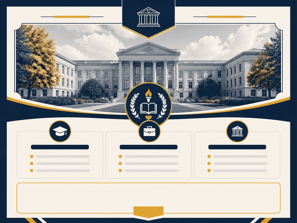
Reserve the top zone for department identification, the central zone for one relevant visual, and the lower zone for three separate modules covering curriculum, career paths, and admissions guidance. Use obvious differences between headline, supporting copy, and utility details. Leave dates, contact information, and calls to action as editable placeholders rather than asking the image model to render exact text. For print, protect trim and safety margins. For social distribution, confirm that the headline and action area remain visible on a small screen.
Represent the discipline with credible visuals
Generic campus imagery can make unrelated departments look identical. Select visual cues tied to real study activities, such as laboratory tools, studio equipment, field research, prototypes, or student projects. Never ask the model to invent an official university logo. Limit the palette to one or two recognizable accent colors and maintain sufficient contrast around all future text areas. If people appear, review whether their activities fit the discipline and whether the scene represents students without relying on narrow stereotypes.
Write an editable image prompt
Specify the aspect ratio, the position of the hero visual, exactly three information cards, a blank headline area, and an empty call-to-action block. Keep department names, phone numbers, dates, and application deadlines out of the generated image because these details require exact spelling. Prohibit pseudo-text, invented marks, excess badges, and decorative clutter. After generation, correct the alignment, card spacing, contrast, and image resolution in a design editor before adding approved copy and brand assets.
Review before publishing
Ask department staff to verify factual claims and ask current students whether the message is understandable without additional explanation. Confirm that curriculum and career statements are current, replace any placeholder QR code with a tested destination, and inspect the result at its actual print size. The same visual system can support an admissions banner, social card, or booth sign, but the amount of information should be adjusted for each format. Compare related structures in academic-poster, education-design, and brochure-design.