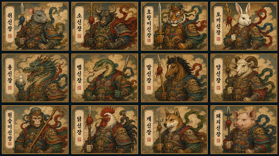
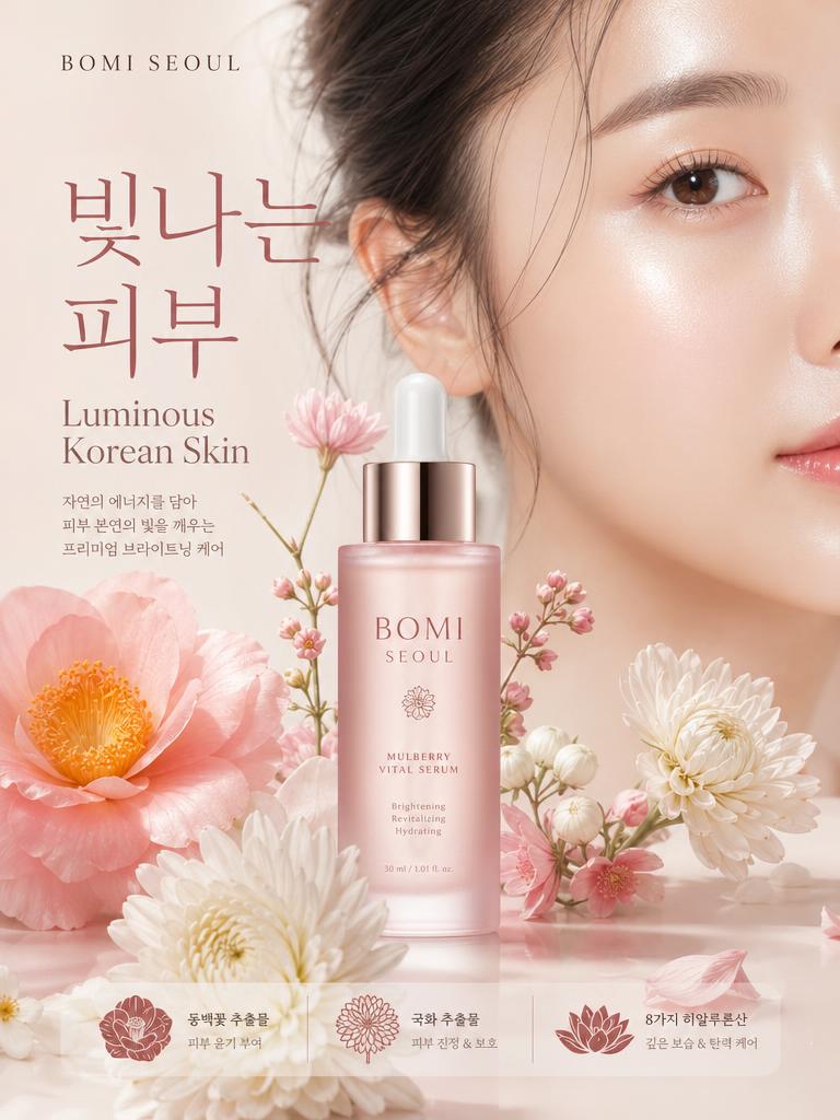
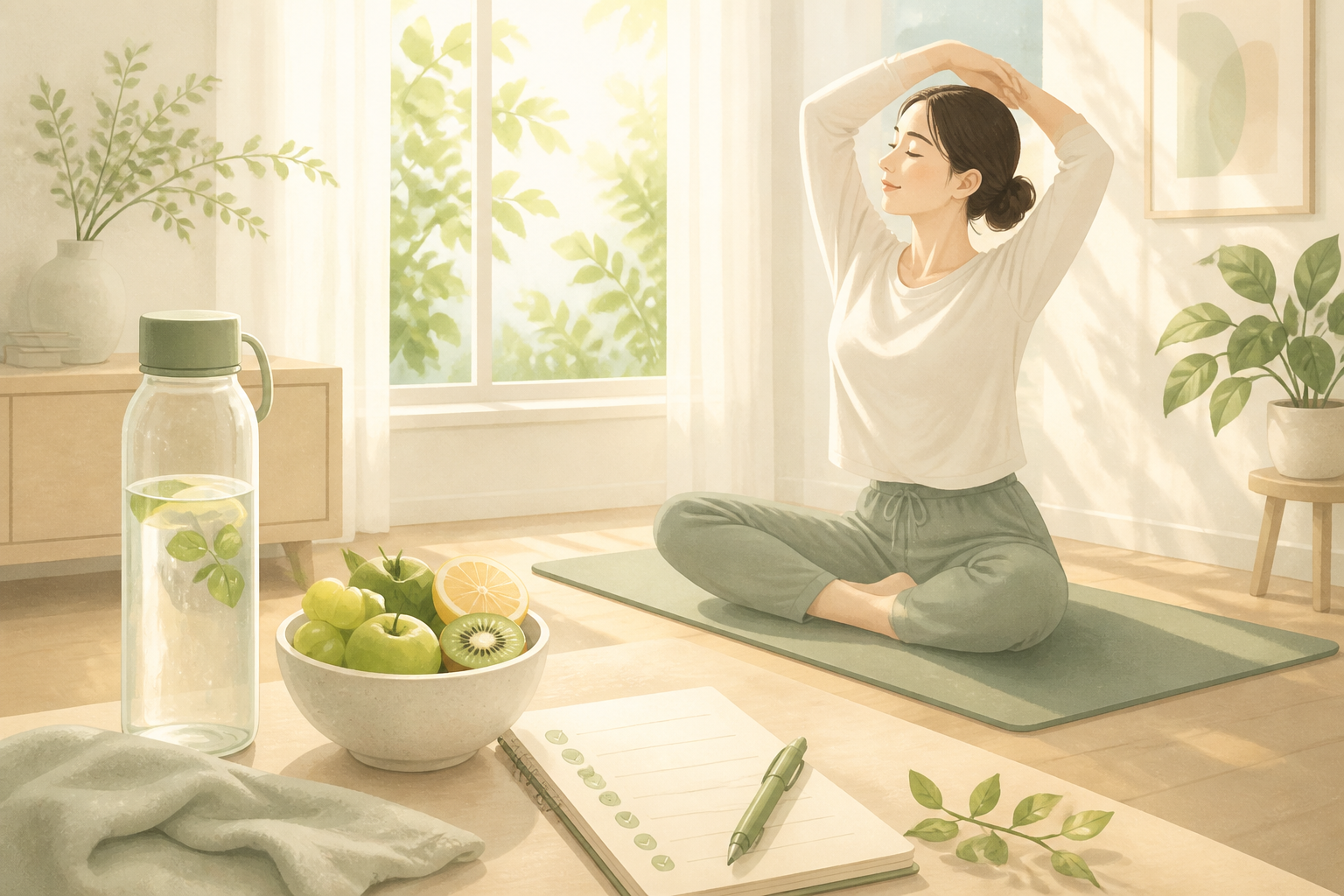
Game Splash Image
Game Splash Image prompts. Copy and use Game Splash Image image generation prompts from Carat right away.
2026.07.12
Make “Game Splash Image” exactly the way you wantCreate your own “Game Splash Image”
Just ask in plain language — Carat generates optimized images and videos for you.

Start now with 100 free credits daily
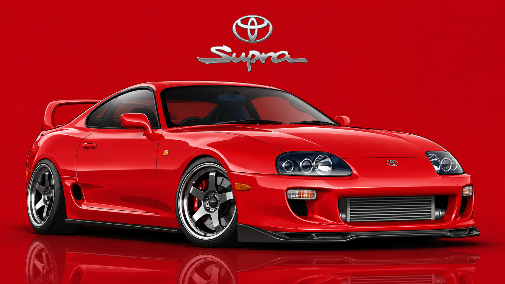
Movie Car Vector Illustration
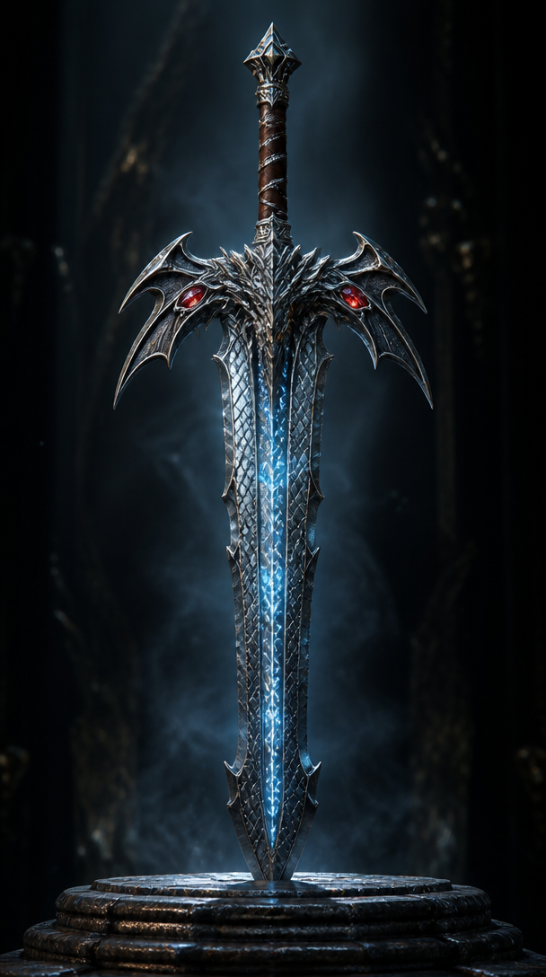
판타지 게임 무기
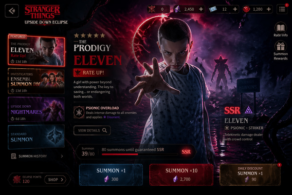
Mobile Game Gacha Summon Screen
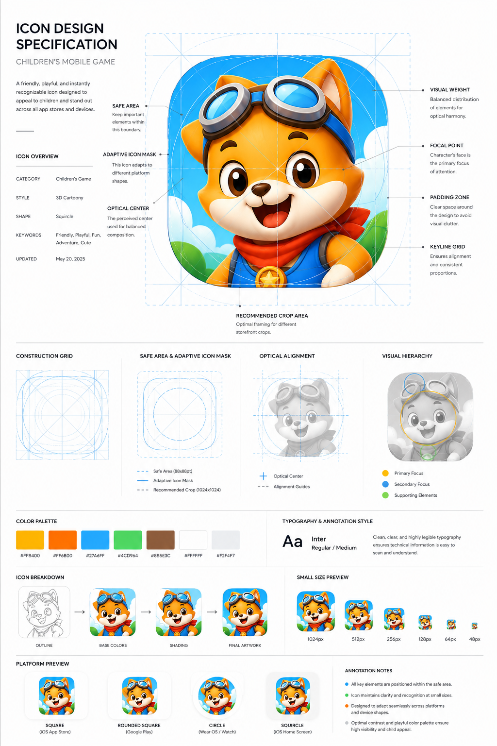
Children’s Game App Icon Board
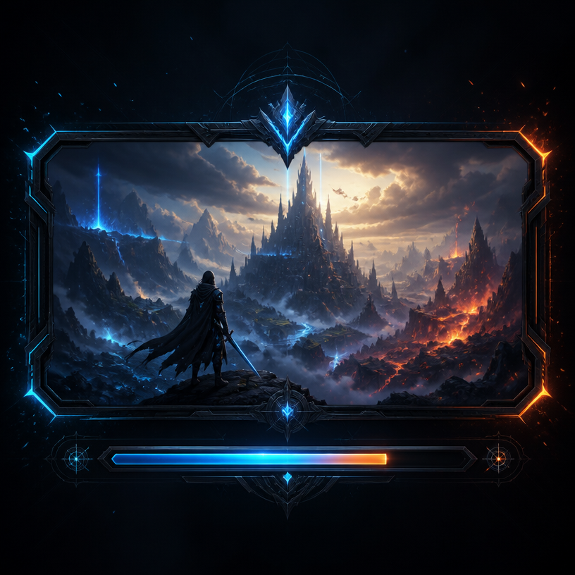
게임 로딩 화면
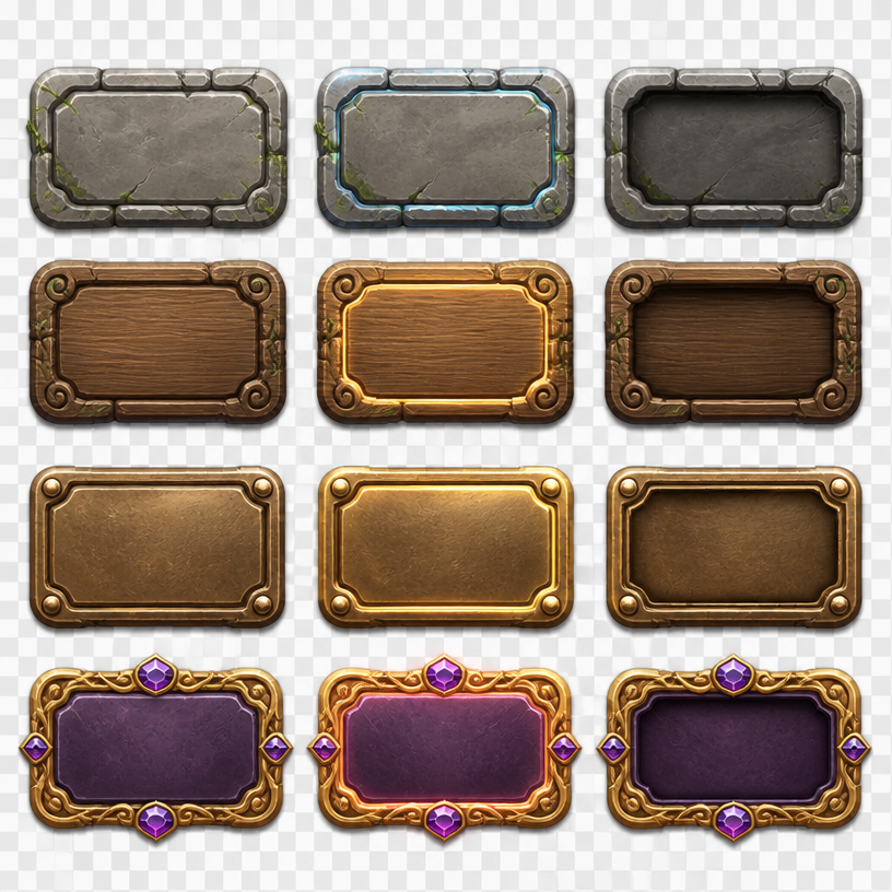
게임 버튼 UI
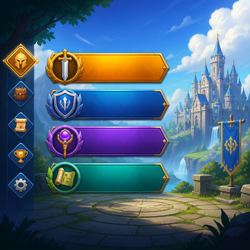
게임 메뉴 UI
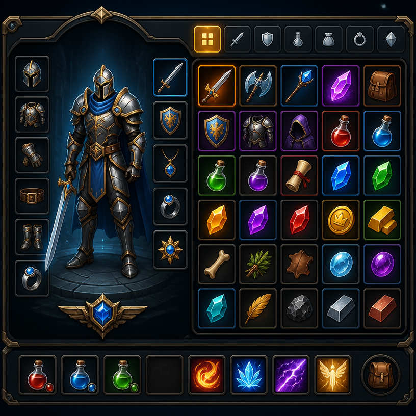
게임 인벤토리 UI
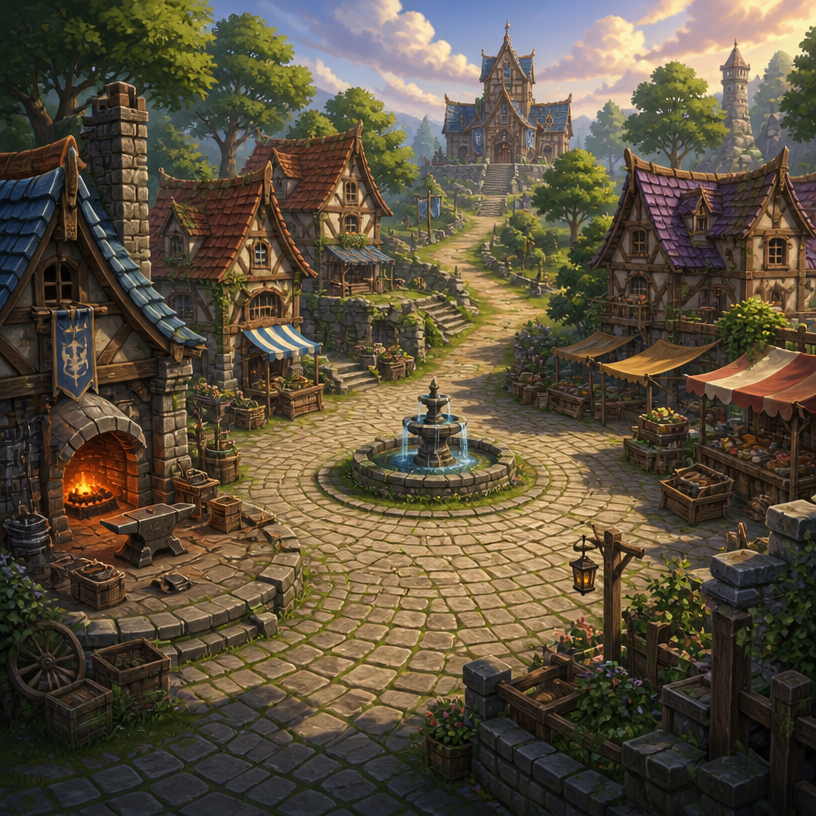
RPG 마을 배경
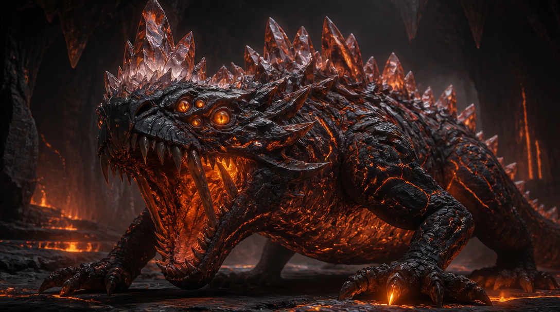
판타지 게임 몬스터
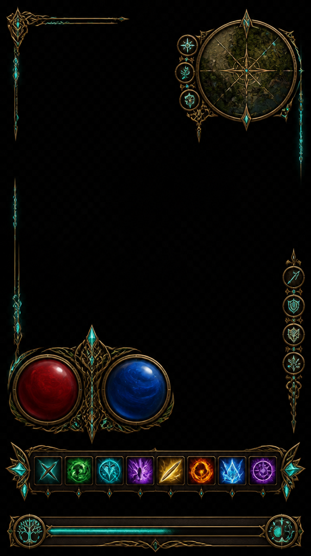
판타지 게임 HUD
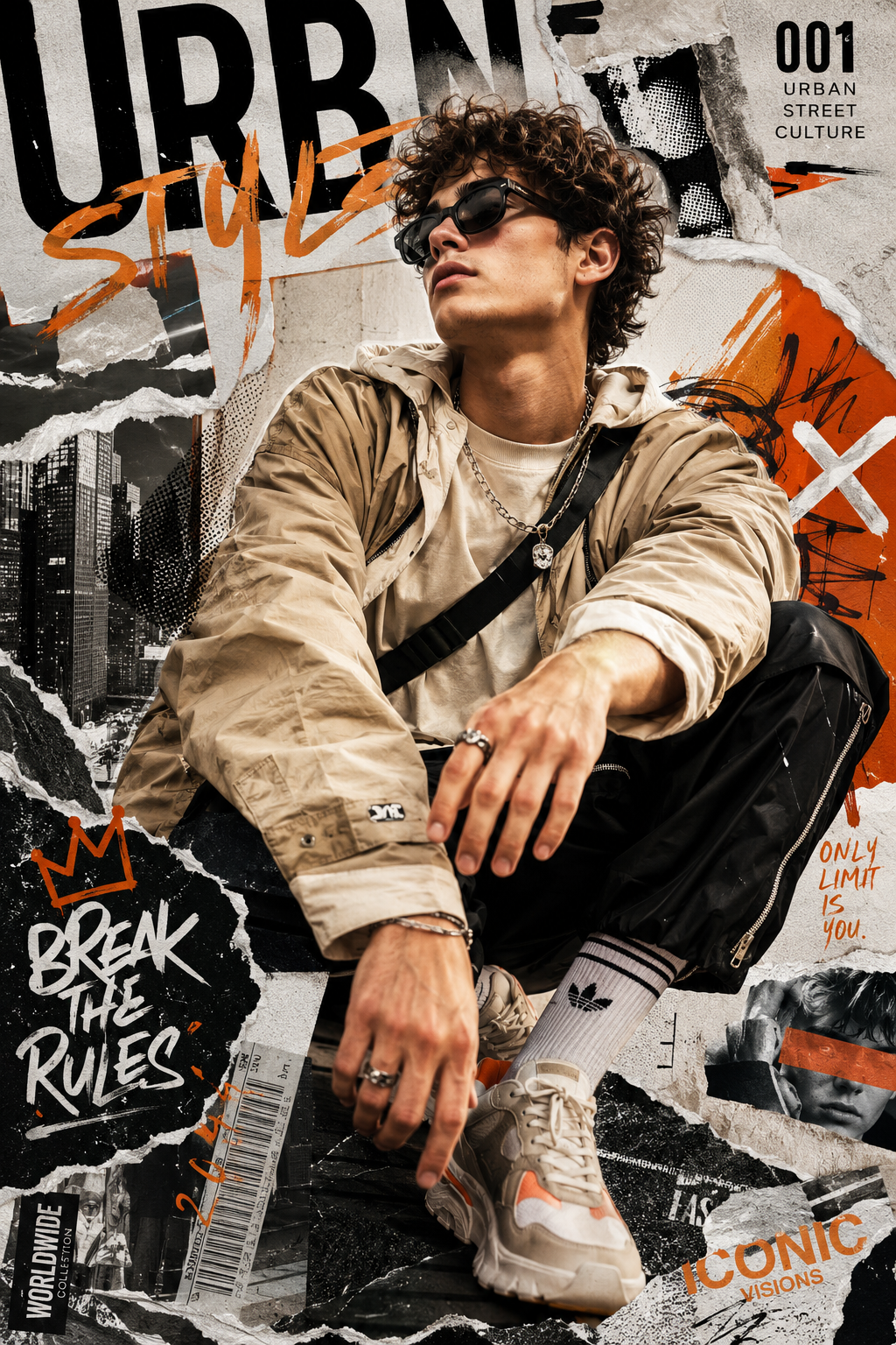
Urban Fashion Editorial Collage
What are Game Splash Image Prompts?
A collection of AI prompts for generating game splash image images. Copy the Game Splash Image prompts provided by Carat and paste them into an AI image generation tool to get professional-grade results.
How to Use Game Splash Image Prompts
- Select and copy your desired prompt.
- Paste it into the Carat agent.
- Modify colors, styles, and composition as needed.
- Download the generated image and use it in your project.
Tips for Writing Game Splash Image Prompts
Specify lighting, texture, composition, and lens information in detail for more precise results. Add "No text, no watermark" to prevent unwanted text overlays.
Game Splash Image Prompt Applications
Game Splash Image prompts are used across content creation, marketing, design, and educational resources. AI-generated images dramatically reduce production time while maintaining professional quality.
Game Splash Image Prompt Optimization Guide
Choose the aspect ratio based on your use case: vertical (9:16) for social media, horizontal (16:9) for web banners, and square (1:1) for product images.