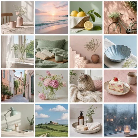
Create Instagram frame prompts with balanced borders, photo windows, color systems, and reusable social layouts.
2026.07.21
Make “Instagram Frame” exactly the way you wantCreate your own “Instagram Frame”
Just ask in plain language — Carat generates optimized images and videos for you.

Start now with 100 free credits daily
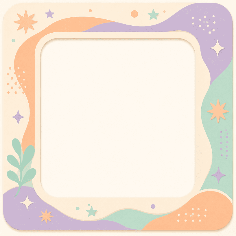
An Instagram frame organizes the mood of a photo and gives a feed a repeatable visual language. It may be a thin border around a square post, a story card with information zones, or a collage frame with seasonal details. A thoughtful frame helps a collection feel coherent even when the photos come from different places and lighting conditions. Carat prompts define the central photo window and border proportions so decoration does not crowd the image.
A square post usually benefits from a balanced border that keeps the photo central. A vertical story needs more planning because the top and bottom may hold a title, account name, or call to action. Travel content can use abstract map lines or ticket-like edges, while cafe content may suit paper texture and small geometric marks. Always establish the photo window first; decoration should support the subject rather than hide it.
A frame can borrow its main color from the average tones in the photo, or use a contrasting neutral to create separation. Mid-tone borders work well with bright images, while cream and pastel borders can lift darker scenes. Keep the border width consistent and place decorative marks in one or two areas instead of all four corners. If a date or handle will be added later, reserve a small quiet space for accurate typography.
Describe the use case, canvas shape, central photo opening, border material, decoration density, and palette in that order. Original color systems, patterns, and abstract symbols are more reusable than a direct copy of a famous logo or character. After generation, test the frame with both bright and dark photos and check whether the visual weight stays balanced.
Carat Instagram frame prompts can support cafe diaries, travel albums, product posts, and personal portfolios. Define the account mood before choosing a border style, then compare variations by changing only the palette or ornament density. Combine the finished frame with the photo and final copy in an editor. Preview the design beside neighboring posts before publishing so the feed feels balanced as a whole.