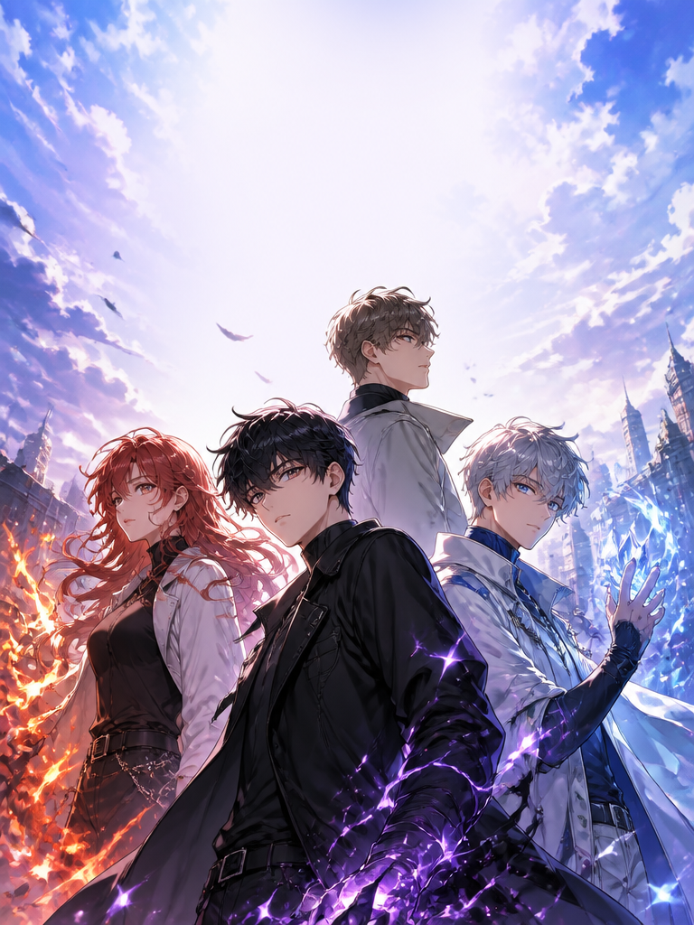
Metal Texture
Discover the best AI prompts for generating high-quality Metal Texture visuals with ease.
2026.07.03
치아 교정 안내 카드뉴스

Necklace Flatlay Photo

Ring Macro Product Photo

Tech Product Photo
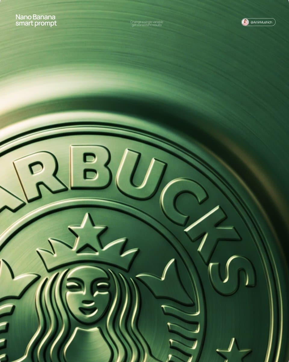
Embossed Metal Logo
What Are Metal Texture AI Prompts?
Metal Texture AI prompts are highly specific sets of linguistic instructions designed to guide generative artificial intelligence models in producing visual content that captures the unique aesthetic and technical characteristics of this particular style. In the realm of AI-generated art and media, a prompt serves as the bridge between human imagination and machine execution. For Metal Texture, the AI processes keywords related to composition, lighting, texture, and subject matter to synthesize a brand new image or video from its vast training dataset. Explore prompts that perfectly capture the fine luster and texture of metallic surfaces in commercial product photography, including embossed metal logos, necklace flatlays, and macro shots of jewelry. The effectiveness of these prompts lies in their ability to describe not just the 'what' but the 'how'-detailing the specific lens effects, the emotional undertone, and the intricate surface details that define a high-quality visual. By mastering these prompts, creators can leverage advanced diffusion models to generate photorealistic or highly stylized results that would traditionally require expensive equipment and years of technical expertise in photography or digital rendering. Furthermore, as AI technology evolves, the precision of these prompts becomes even more critical in achieving consistent results across different generation sessions.
Best Use Cases
The versatility of Metal Texture makes it an essential tool for a wide range of creative and commercial applications in the modern digital landscape. In the professional sector, marketing agencies utilize these prompts to create striking social media campaigns, eye-catching advertisements, and unique brand imagery that stands out in a crowded feed. Editorial designers find immense value in using this style for magazine layouts and digital storytelling where a specific mood or perspective is required to engage the audience. Furthermore, in the world of independent content creation, influencers and digital artists use Metal Texture to maintain a consistent visual identity across their platforms. Whether it is for conceptualizing architectural designs, creating immersive environment concepts for video games, or simply generating beautiful personal artwork, this style provides a robust framework for high-impact visual communication. It is particularly effective for projects that require a sense of dynamism, raw energy, or a futuristic edge that standard photography cannot easily provide. The ability to generate such specific visuals on-demand allows for rapid prototyping and creative exploration that was previously impossible within tight deadlines.
Why This Tag Works
This specific tag is designed to streamline the creative workflow by providing a curated starting point for users looking for consistent and high-quality results. The technical architecture of AI models often responds better to certain keyword combinations that have been proven to trigger specific stylistic responses. By using the Metal Texture tag, creators can tap into a verified set of visual parameters that ensure the AI focuses on the correct aspects of the scene-such as the specific way light interacts with surfaces or how the perspective is warped to create a sense of immersion. This reduces the trial-and-error process significantly, saving time and computational credits. Moreover, this tag helps in maintaining stylistic continuity, which is crucial for professional branding and long-form projects like graphic novels or series-based social media content. It acts as a visual anchor, ensuring that every piece of content generated under this category shares a common DNA of quality and aesthetic coherence. The prompt structure provided here has been optimized through extensive testing to ensure that common pitfalls in AI generation are avoided.
Explore Related Prompts
To further expand your creative horizons and discover complementary styles that pair perfectly with this tag, we recommend exploring the following related categories:
Prompt Building Tips
Creating the perfect Metal Texture image or video requires a nuanced approach to prompt engineering. Start by defining your core subject with high-precision nouns, and then layer on adjectives that describe the environment and atmosphere. Instead of just stating the style, describe the physical properties you want to see-for example, mention 'glinting metallic highlights,' 'soft diffused morning light,' or 'a low-angle perspective that emphasizes scale.' It is also beneficial to include technical camera settings in your prompt, such as 'f/1.8 aperture for shallow depth of field' or 'captured on 35mm film,' as AI models associate these terms with specific visual qualities and textures. Don't forget to experiment with the order of your words; typically, the most important elements should appear at the beginning of the prompt to give them more weight during the generation process. By combining subject, environment, lighting, and technical specifications, you can guide the AI to produce results that are truly unique and professionally polished. Always remember that the most successful prompts are those that provide enough detail to guide the AI without being so restrictive that they stifle its creative potential.