Notification Icon Design
Practical notification icon design prompt guidance.
2026.08.19
Make “Notification Icon Design” exactly the way you wantCreate your own “Notification Icon Design”
Just ask in plain language — Carat generates optimized images and videos for you.

Start now with 100 free credits daily
Notification Icon Design
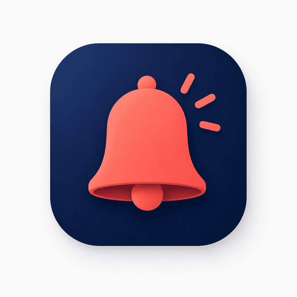
Notification Icon Design prompts define the subject, silhouette, ratio, center, negative space, palette, contrast, lighting, material, shadow, and background. Separate the bell from its signal lines, clarify the envelope flap and outline, and balance node spacing with connector lines. Create original forms rather than copying brands or logos. Change one variable at a time and check thumbnails, placement size, contrast, safe edges, lettering, watermark absence, set consistency, interface spacing, and silhouette after reduction. Record intended use and revision reasons for repeatable reuse. Check foreground separation and confirm that the core structure survives reduction. For states, record active and inactive colors and spacing rules. Save intended use and change reasons for reproducible revisions. Preserve recognizable symbols and limit decoration so it does not interfere with communication. Test the form across screen densities and print sizes.