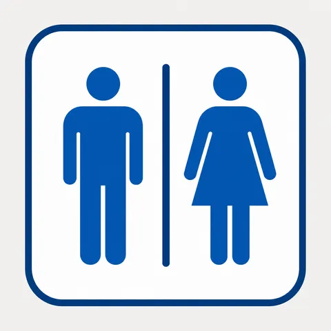
Restroom Pictogram Prompt
Create clearer restroom pictogram designs with practical prompts for signs, maps, and UI guides.
2026.07.26
Make “Restroom Pictogram Prompt” exactly the way you wantCreate your own “Restroom Pictogram Prompt”
Just ask in plain language — Carat generates optimized images and videos for you.

Start now with 100 free credits daily

화장실 픽토그램 일러스트
Core concept
Restroom pictograms are not just small drawings. They work as micro-signals in elevators, maps, signs, and UI overlays where people need instant understanding. This page gives prompt patterns that keep restroom symbols readable across output sizes, backgrounds, and product contexts, from public facilities to mobile applications.
Start with silhouette first
Before adding decoration, lock down the silhouette. A restroom icon should communicate identity in one glance, so the gender symbols, wheelchair cue, and restroom fixture shape must be distinct. In your prompts, describe stroke behavior first, then composition, then optional styling such as rounded corners and corner radius. Example patterns such as 'clean restroom symbol, bold geometric silhouette, high contrast line icon' reduce variation drift during generation.
Line work, spacing, and contrast control
Small icon work is mostly controlled by stroke width, spacing, and edge clarity. If these values are weak, icons blur on signage and app previews. Use phrases like 'balanced stroke width', 'consistent negative space', and 'high legibility at small sizes' to preserve consistency. Adding contrast constraints helps avoid low tone zones and ensures each symbol remains recognizable even under different compression settings.
Multi channel usage
These prompts are suitable for building a full restroom set for maps, wayfinding panels, booking apps, and service dashboards. You can derive variants such as outline, filled, and cutout by changing only a few tokens while keeping the core structure stable. This reduces the time needed to harmonize an icon library across a product ecosystem.
Copy-friendly, generation-aware workflow
You can copy all prompt text from this page for free and adapt it directly in your own projects. Image rendering still follows the platform credit system, so each generated image uses credits. A practical workflow is to refine prompt text first, test wording variations, and then generate only the selected versions to optimize both quality and spending.