Comparison Table
AI prompts for creating comparison tables and charts. Generate product comparison cards, before-after visuals, and infographic-style comparison layouts.
2026.07.09
Make “Comparison Table” exactly the way you wantCreate your own “Comparison Table”
Just ask in plain language — Carat generates optimized images and videos for you.

Start now with 100 free credits daily

Blueprint and 3D Render Split Comparison
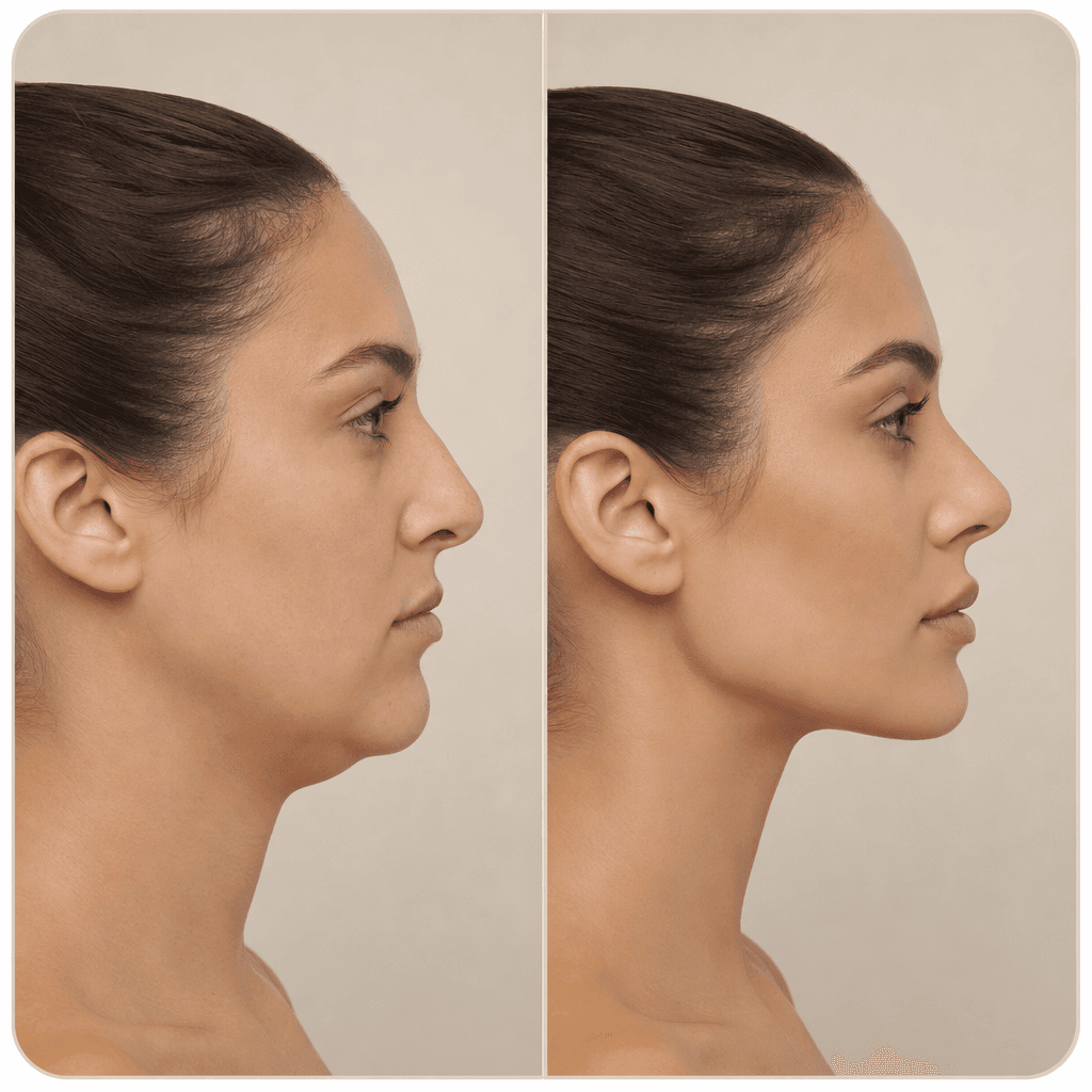
성형 시뮬레이션 전후 비교 카드
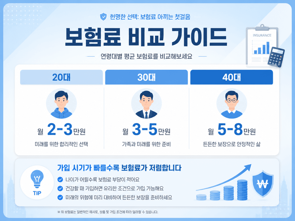
보험료 비교 카드뉴스
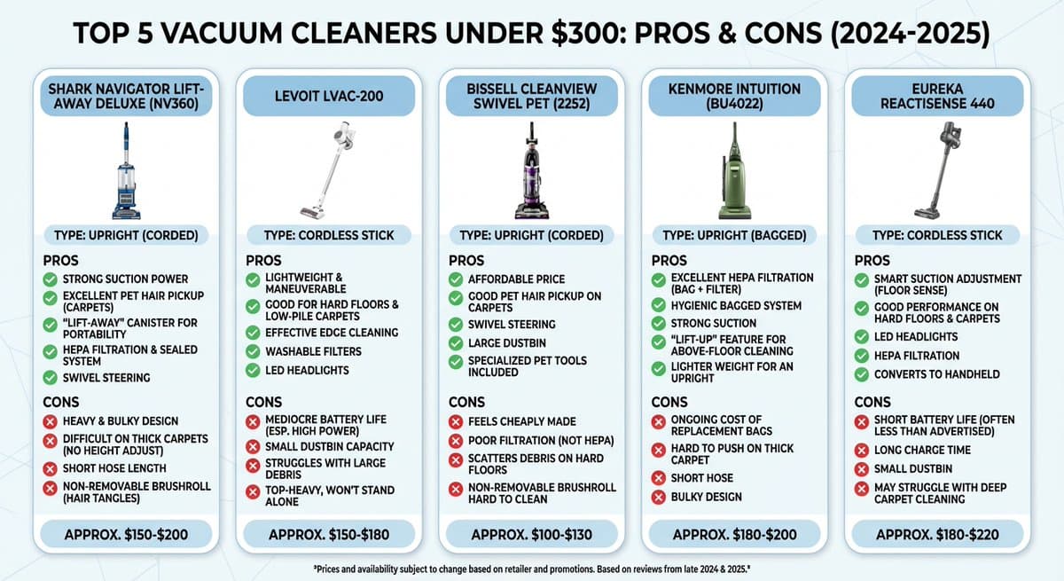
Vacuum Cleaner Comparison Infographic
Comparison tables are visual tools that help consumers evaluate multiple options at a glance. They are widely used in marketing and sales for product specification comparisons, pricing plan comparisons, before-and-after transformations, and competitor analysis. With AI image generation prompts, you can quickly visualize comparison table layouts and designs without manually building spreadsheets or graphics.
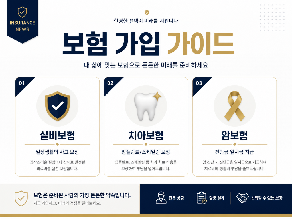
Comparison table prompts use a keyword system that controls table structure (2-column, 3-column, multi-column), item types (checklists, star ratings, bar charts, icons), color contrast, and highlight colors. For example, insurance comparison card news places company logos, monthly premiums, and coverage details side by side, while product comparison infographics visualize price, performance, and design scores as bar graphs.
The main advantage of AI comparison table prompts is dramatic time savings in design. Previously, designers had to manually create tables in Illustrator or Canva. Now, a single prompt can generate comparison tables in various styles including minimal, card news, infographic, and flat design. You can produce vertical comparison tables for social media content, horizontal tables for blog posts, and slide-format tables for presentations, each optimized for its intended platform.
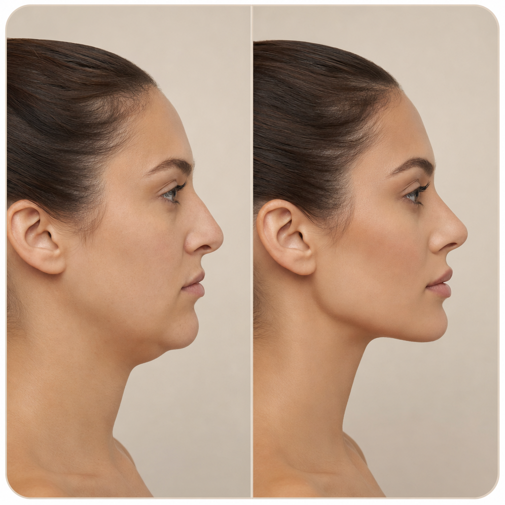
In industries where comparison is frequent such as insurance, finance, telecommunications, and electronics, comparison table content plays a key role in customer decision-making. Before-and-after comparison cards for plastic surgery, diet programs, and interior construction maximize visual transformation to increase persuasiveness. In education, concept comparison tables (animals vs plants, urban vs rural) can be used in teaching materials and textbooks.
To get the best results from comparison table prompts, clearly specify the number of comparison items, which column to highlight (your product column), and the color contrast strategy (accent color vs neutral color). By starting with Carat's comparison table prompts and applying your brand colors and fonts, you can create professional comparison content quickly and consistently.
For more advanced use cases, comparison table prompts can incorporate data visualization elements such as radar charts, progress bars, and percentage indicators. This allows you to create rich, informative comparison graphics that go beyond simple text-based tables. The prompts also support various visual metaphors like balance scales, race tracks, and podium rankings to make comparisons more engaging and memorable for audiences.
Whether you are creating a simple two-way comparison for a social media post or a comprehensive multi-product comparison guide for a landing page, AI prompts provide the flexibility to explore different visual approaches before committing to a final design. This iterative capability is especially valuable for marketing teams that need to test multiple creative directions and choose the most effective one based on audience engagement data.