carat

Prompt Gallery

/

Infographic Poster

Login
Sign Up

Infographic Poster

Explore infographic poster prompts and practical layout ideas for presenting complex information clearly.

2026.07.17

·
GPT 이미지 2로 생성한 SWOT 분석

SWOT 분석

GPT Image 2· Image
Clean editorial business strategy infographic showing a balanced four-quadrant SWOT analysis framework on a white background, each quadrant distinguished by restrained navy, teal, amber, and coral colors, symbolic icons for internal advantages, internal limitations, external opportunities, and external risks, crisp grid alignment, subtle paper texture, polished corporate presentation aesthetic. No text, no letters, no watermark.
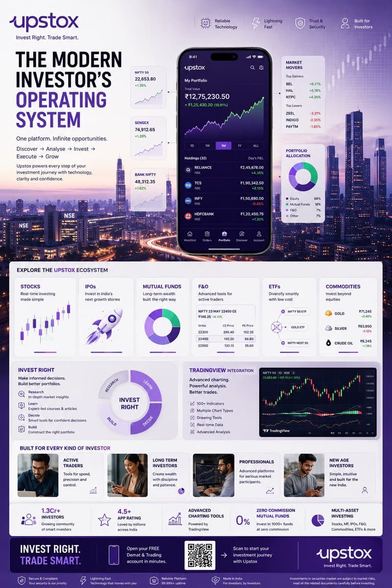
AI-generated Fintech Investing Infographic Poster made with GPT Image 2

Fintech Investing Infographic Poster

GPT Image 2· Image
TOPIC: UPSTOX Create an ultra-premium vertical SMM infographic poster for Upstox, designed as a next-generation fintech editorial infographic focused on high-performance investing, intelligent execution, and modern wealth creation. The final design should feel like a fusion of: - Apple Pro Display aesthetics - TradingView interface design - Bloomberg editorial systems - Formula 1 telemetry dashboards - modern Indian investing culture - premium startup branding The design should visually communicate: "INVEST RIGHT. TRADE SMART." CORE CONCEPT: "THE MODERN INVESTOR'S OPERATING SYSTEM" The entire composition should visualize Upstox as the central financial platform powering every stage of investing. The visual narrative should show: DISCOVERY → ANALYSIS → INVESTMENT → EXECUTION → GROWTH Instead of showing random charts and holograms, show a highly structured financial workflow. Everything should feel: - fast - clean - capable - intelligent - efficient - trustworthy NOT chaotic. LAYOUT STYLE: Create a premium modular fintech editorial layout. Use: - floating investment modules - elegant information architecture - structured dashboard systems - large whitespace - asymmetrical composition - premium visual hierarchy The layout should resemble: a luxury financial operating system expanded into a collectible infographic poster. HERO VISUAL: Large central Upstox mobile ecosystem. NOT just a phone mockup. Instead: Create a layered financial command center. At center: large Upstox mobile interface surrounded by: - portfolio systems - investment cards - watchlists - market movers - growth indicators Everything connected through: clean directional pathways representing: the investing journey. BACKGROUND ENVIRONMENT: Beautiful Mumbai financial district atmosphere. Blue-hour cityscape. Subtle references to: - BKC - NSE energy - Indian capital markets Use: soft financial grid overlays thin trajectory lines minimal market architecture NO hologram overload. UPSTOX ECOSYSTEM MODULES: Create premium information cards: STOCKS Real-time investing Visual: clean chart interface IPOs Invest in India's next growth stories Visual: launch trajectory card MUTUAL FUNDS Long-term wealth building Visual: circular diversified portfolio system F&O Advanced trading Visual: structured options matrix ETFs Smart passive investing Visual: connected allocation system COMMODITIES Gold, energy, multi-asset exposure Visual: minimal commodity dashboard THE INVEST RIGHT SYSTEM Large premium section: INVEST RIGHT Visualize: - research - education - decision-making - portfolio building Show: investment clarity NOT gambling energy. TRADINGVIEW POWER MODULE Premium feature card: TradingView Integration Visual: - advanced charting - indicators - drawing tools - market analysis Use sophisticated chart aesthetics. MODERN INVESTOR SECTION Show: young Indian professionals builders creators investors market participants Use: realistic premium lifestyle photography NOT smiling stock-photo energy. The people should feel: ambitious, focused, future-oriented. QUICK STATS SYSTEM Elegant floating metric cards: 1.3Cr+ Investors 4.5+ App Rating Advanced Charting Tools Zero Commission Mutual Funds Multi-Asset Investing Present as: Apple-style information modules NOT corporate blocks. VISUAL KNOWLEDGE ELEMENTS Include: - portfolio allocation wheels - watchlists - market heatmaps - clean candlestick systems - growth trajectories - SIP growth curves - investment timelines - execution indicators Everything should feel: premium, minimal, professional. TYPOGRAPHY SYSTEM Use: large editorial sans-serif strong hierarchy minimal labels clean spacing Typography should resemble: Apple TradingView Stripe Bloomberg Weekend Avoid: techno fonts startup clichés crypto aesthetics COLOR SYSTEM Use actual Upstox-inspired identity: Primary: Deep Upstox Purple
@Diplomeme
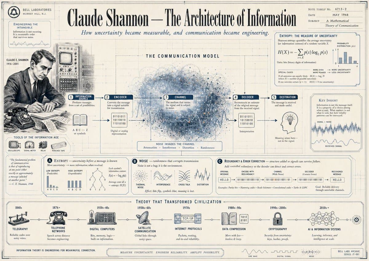
AI-generated Claude Shannon Vintage Infographic Poster made with GPT Image 2

Claude Shannon Vintage Infographic Poster

GPT Image 2· Image
{"type":"vintage editorial infographic poster","subject":"Claude Shannon and information theory","style":{"era":"1940s Bell Labs archival poster","look":"aged cream paper, blueprint drafting grid, thin ink linework, muted navy and charcoal printing, subtle stains and paper wear, technical illustration mixed with newspaper editorial design","rendering":"high-detail diagrammatic collage with engraved portrait, scientific charts, labeled panels, and hand-drawn signal graphics"},"poster":{"headline":"Claude Shannon — The Architecture of Information","subheadline":"How uncertainty became measurable, and communication became engineering.","topRightMeta":{"note":"NOTE TOSELF No. 6713–2","date":"MAY 1948","subject":"A Mathematical Theory of Communication"}},"layout":{"sections":[{"title":"left archival sidebar","position":"far left vertical column","count":5,"labels":["BELL LABORATORIES MURRAY HILL, N.J.","ENGINEERING THE INTANGIBLE","CLAUDE E. SHANNON 1916–2001","TOOLS OF THE INFORMATION AGE","quote panel"]},{"title":"THE COMMUNICATION MODEL","position":"upper middle wide panel","count":5,"labels":["1 INFORMATION SOURCE","2 ENCODER","3 CHANNEL","4 DECODER","5 DESTINATION"]},{"title":"ENTROPY: THE MEASURE OF UNCERTAINTY","position":"upper right box","count":4,"labels":["H(X) = −Σ p(x) log2 p(x)","PROBABILITY DISTRIBUTION p(x)","MORE EVEN MORE MAXED UNCERTAINTY","MORE LOPSIDED LESS UNCERTAINTY"]},{"title":"lower theory panels","position":"middle to lower band","count":3,"labels":["A ENTROPY — uncertainty before a message is known","B NOISE — randomness that corrupts transmission","C Redundancy & Error Correction — structure added so signals can survive failure"]},{"title":"THEORY THAT TRANSFORMED CIVILIZATION","position":"bottom horizontal timeline","count":8,"labels":["1840s TELEGRAPHY","1876+ TELEPHONE NETWORKS","1930s–40s DIGITAL COMPUTERS","1950s–60s SATELLITE COMMUNICATION","1970s INTERNET PROTOCOLS","1980s–90s DATA COMPRESSION","1990s–2000s CRYPTOGRAPHY","2010s+ AI & INFORMATION SYSTEMS"]}],"centerpiece":"a large abstract cloud of blue and gray signal noise, dots, lines, and waveforms behind the communication model, with arrows moving left to right through the five stages"},"visualElements":{"portrait":{"subject":"{argument name="scientist name" default="Claude Shannon"}","placement":"left-center","style":"black-and-white archival seated portrait at a desk with the face intentionally obscured by a pale square censor block, wearing suit and tie, writing on paper"},"objectsLeft":["rotary telephone on desk","open notebook or papers","technical console with CRT screen and knobs behind portrait","small icon row of 4 tools: oscilloscope, signal meter, relay, punched tape"],"communicationModel":["book and symbols under source","binary digits under encoder","large noisy channel cloud with wave overlays","binary digits and interpretation under decoder","light bulb icon under destination"],"chartsAndDiagrams":["bar chart for entropy probabilities","two low vs high entropy mini bar charts","tree diagram and entropy notation","signal distortion sketches labeled thermal noise, cross talk, distortion","error-correction binary pipeline from original message to recovered message"],"bottomDecor":["small waveform legend with sine wave, digital signal, and noise","archival stamp or footer on lower right"]},"color":{"background":"warm ivory paper","primaryInk":"dark navy","secondaryInk":"charcoal gray","accent":"faded steel blue"},"composition":"symmetrical wide poster with dense boxed annotations, fine border lines, and a museum-quality educational infographic feel","textDensity":"very high, with many small labels, formulas, captions, and historical notes in a carefully organized grid","aspectRatio":"16:9 landscape"}
@mob_17

What is an infographic poster?

An infographic poster combines data, short explanations, icons, and visual structure in a single poster-sized composition. Unlike a purely decorative poster, it must help viewers understand a topic quickly. It works well for reports, research findings, educational handouts, public campaigns, event information, and product comparisons. Carat examples can help you compare different visual directions before writing a final prompt.

Build a clear hierarchy

Start with one message that can be summarized in a sentence. Place the title and the most important statistic where they can be found immediately, then organize supporting information into cards, steps, comparisons, or a timeline. Use color consistently so viewers understand which items belong together. Generous spacing and strong contrast matter because the poster may first be seen as a small thumbnail. Decorative elements should support the data rather than compete with it.

Match the layout to the subject

A business report may need charts and metric callouts, while an educational poster may benefit from numbered steps and explanatory icons. A campaign poster can pair a short action statement with one memorable symbol. Historical or research topics often need a timeline and a visible source area. Product posters can combine a feature comparison with a simple usage scene. Choose only the information viewers truly need, then make secondary details visually quieter.

Write a useful generation prompt

Describe the topic, information type, layout, palette, and aspect ratio. A comparison poster, process guide, and data dashboard require different visual languages. For final materials with precise Korean or English copy, ask for empty text zones or short labels and add the exact wording in a design editor afterward. Specify the role of charts, legends, icons, and emphasis colors so the generated image has an intentional reading order.

Explore examples on Carat

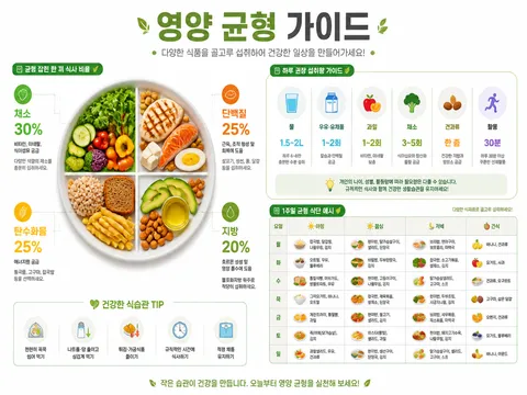
The examples on this page cover several approaches: a finance infographic emphasizes metrics, a vintage information poster uses historical texture, and a SWOT graphic relies on a four-part comparison grid. Use one as a starting point, then replace the subject, data, brand colors, and audience. This process produces a more useful prompt than simply asking for a generic poster.

Frequently Asked Questions

Related Prompts

Infographic

Infographic

67 prompts

Infographic Design

Infographic Design

22 prompts

Poster

Poster

574 prompts

Banner

Banner

69 prompts

Carat Prompt Gallery

Create trending AI prompts instantly

Prompts

  • Logo
  • PPT Design
  • Thumbnail
  • Poster
  • Web Novel Cover
  • ID Photo
  • Caricature
  • Product Detail Page
  • Banner

Models

  • GPT Image 2
  • Seedance 2.0
  • NanoBanana Pro
  • NanoBanana 2

Carat

  • Get started
  • About
  • Blog
  • Careers
  • Contact
  • Partnership
  • Terms
  • Privacy

© 2026 Paradot.Inc All rights reserved.